Park / [H2H8 Semifinals] Allegheny Adventures
-
 05-July 18
- Views 7,231
- Downloads 925
- Fans 5
- Comments 29
-
![Park_4163_[H2H8 Semifinals] Allegheny Adventures](https://www.nedesigns.com/uploads/parks/4163/logot.png)
-
 82.00%(required: 70%)
 Gold
Gold

chorkiel 90% no G Force 90% no bigshootergill 85% no Cocoa 85% no Liampie 85% no Sulakke 85% no CoasterCreator9 80% no geewhzz 80% no Kumba 80% no Faas 75% no Poke 75% no posix 75% no 82.00% 0.00% -
 Description
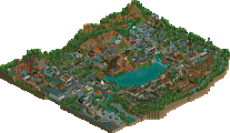
Venture deep into the Appalachians for a backwoods experience like no other. Adventure awaits as you celebrate the places and people that make the Allegheny area iconic...
-
5 fans
 Fans of this park
-
 Full-Size Map
-
 Download Park
925
-
 Objects
529
-
 Tags
Tags
![Park_4163 [H2H8 Semifinals] Allegheny Adventures](https://www.nedesigns.com/uploads/parks/4163/aerialm3904.png)


![park_4121 [H2H8 R4] North Fork Mountain Park](https://www.nedesigns.com/uploads/parks/4121/aerialt3862.png)
![park_3796 [NEDC4 4/15] - Wildfire](https://www.nedesigns.com/uploads/parks/3796/aerialt3454.png)
Semifinals | Match 2
Allegheny Adventures (RCT2)
VS
[FORFEIT]
__________________________________________________________

Heaven's Gallery beats The Replacements!
Allegheny Adventure was made by Cedarpoint6 (49%), Steve (39%), CHE (9%) and IonZer0 (3%).
When you rip off Steve so much in Coors that now this park looks like something I would have done in Coors.
This park is amazing. A top 3 of the contest for me! <3
wow, really lovely park heaven's. I'll leave an early review coz i'm going away for a few days.
firstly, I'm super impressed by how much content there is, without feeling too busy or overhwhelming. I think the rectangle layout is a really good technique for this in future h2hs. I presume the park is vaguely dollywood/sdc inspired? maybe with a touch of knoebels and just vague american frontier park sort of vibes. anyway, there's a lot of really atmospheric stuff all over and the palette suits you guys really well I think. the layouts are all incredible- the woodie and the mine train especially just work so well. kudos on an impressive arrow mine train, I have a soft spot for them.
my favorite building on the map is probably the rapids station, but theres a lot of good archy. I really did spend a lot of time in the park just looking at pretty sights. some is slightly rushed but whatever. that tub ride and accompanying building is also so lovely. I think its interesting that all the teams took a relatively 'reserved' approach to semis parks, which I don't mind at all. we're here to make what we feel like and what we're inspired to- thats whats the most fun at the end of the day. well done to the lot of you, would love to see who did what because it all meshes very well!
The car barn looks really good. I'm sad I won't be the first to make one, but this does it justice so I don't feel so bad.
That diver is killer. Well done guys!
I was hoping to see a strong match, but we still have a pretty neat park to check out.
Architecture is pretty great across the board. In combination with the varying heights, foliage, and ride selection, this park has a wonderful atmosphere. The palette adds some lovely colors to the mix (I really hope these don't disappear after H2H; they can add a lot to a park) and my personal favorite parts of the park are the entrance area and the GCI/B&M. Despite having several full size coasters and a rather large selection of buildings and other rides, the park really didn't feel crammed. Lovely balance between rides and other stuff. Parks like this are always fun to see and excite me for what's to come post-H2H.
Couldn't finish their park?.... or knew they would lose so they didn't bother?!??! ... just kidding dudes! The Replacements have been a stellar team this season, you built some rockin' awesome parks! Hopefully you treat us to your finished Semi-finals park one day soon.
As for AA, it's probably also in my Top 3 favorites for the entire H2H, the 2 lead builders (CP6 & Steve) did absolutely phenomenal work on this park, with some excellent helping hands from Ion and CHE.
So good
The structure of the elevator was nice
The colors of the paths and bricks perfect harmony for me
The houses are beautiful, their roofs look great
Dam loved it and the Rapids got really crazy, good creativity
Storm Shaser I really enjoyed the support
I think the spaces are good, you can see well
I liked the colors, nice harmony
Fantastic little park guys, shame it had to be H2H sized really. Definitely will be a map we explore for years to come, it definitely pulls of the style and trends of Herschened quite well but also feels a bit more like its own thing. Archy and Coasters are obviously fantastic, theming, terrain... everything you could ask for in a park like this is very well done.
Only thing I think that doesn't quite for for me is the palette, colors and textures sort of blend together a bit too much, especially sort of the browns and tans of the path sort of smear together which is sort of weird. Park loses a bit of its edge as a result.
Still though, thats probably the only flaw you could really find here, everything else is top notch. Probably a 90% for me, might just edge out CnC because I sort of prefer this style of park a bit more than CnC. Just don't let this score get to your head Steve.
When looking through your park I kept liking it more and more. Possibly one of those parks where in a few years I'll still find new things to appreciate. For now, I appreciated the atmosphere and original rides / ride executions the most. I'm not the biggest fan of all these new palettes but the blue on that diver is beautiful.
absolutely gorgeous
Great effort Heaven's Gallery.
It reminded me a bit of #DiamondHeights.
I think in RCT aesthetics should always be a more important focus than realism. The fact that this does not mean that you can't make realistic parks in RCT is proven here. You guys clearly put aesthetics first, something I miss with a lot of the newer realistic parks.
Also thank you guys for not abusing steel roofs. I didn't really mind them in this park.
I have mixed feelings about the palette. It didn't really work in some areas, for example the corner with the mine train. The colour of the track in combination with the colour of that train bridge was a bit too much imo.
The palette worked great for the dive machine, so well done. In the architecture around the park the palette didn't always add something, but it definitely didn't make it worse either. I do think a custom palette should do more for a park than "not making it worse" though. Oh well...
The highlight for me was the suspended airplane coaster, maybe one of my favourite coasters of the contest. Those are hard to pull of and you nailed it.
All in all a park I would definitely put in the higher regions of the parks made in this H2H. Thanks for consistently putting in great work, HG!
Wow, what a park this is. Going to do a more stream of consciousness type review here, since I’m mentally drained right now, so forgive me if things are a little out of order.
The entrance area is wonderful. Not too grand, perfect for a park of this type. The archy is wonderful here as well, and the color choices are exquisite. Great use of a palette in the park as a whole. Moving around the park clockwise, we reach the nice arrow suspended. Lovely use of the Iron Dragon-esqe double lift hills, and I love how the layout seemingly darts over the path in and out of the foliage. It would be wonderful to be on that path under the coaster. The airplane themed area to go along with the coaster is very cute, and looks somewhat familiar….
Leaving that area, we come to a wonderfully done stone/brick building. Looks sort of like a castle, church, school….actually I’m really not sure. The tower ride is themed after ammunition, so maybe some kind of ammunition depot? I wish the viewer had a few more clues as to the purpose of the building here, because right now it just feels a bit out of place to me.
Behind this building is possibly one of my favorite layouts of the competition. Peregrine is just phenomenal. The layout itself is great, and then you add in all this interaction with everything in the area. The color is just fantastic as well! The rapids rides, “about-to-burst” damn, the log ride, and the whole area are just wonderfully done. The mine train is an Arrow mine train. Done well, but nothing mind blowing. Mine-themed station is nice.
Finally, coming back to the center of the park, some of the best archy in the park imo. Everything just fits. The GCI is nice, but nothing too mind-blowing. It does fit the park nicely though.
In the end, a great overall park that you guys should be proud of. Realism with great atmosphere!
Absolutely loved this park. The nice thing about this park right from the get go is that the palette isn't as "in your face".. definitely more subtle.
Craftsmen Valley was a great area of the park. the custom flat ride was neat.. I wish I knew how to make these! The archy was really well done as well. The water flume above the path was a nice added detail. The GCI was a nice compact layout as well.
The fort was a cool idea.. wish it were a little bigger. Maybe played up the French/English fort vibe a bit more to add a layer of history to the park.. but thats merely a thought as opposed to a criticism.
As Faas pointed out in the discord, the Arrow swinging coaster was amazing. Such great interaction with the surrounding area. The lift supports are great.
The arrows mine train was a bit crappy though. I know arrows mine trains are notoriously shitty.. but ending on a lift hill is something Im not a fan of. Also I noticed the tunnel with the TNT. Seems like theres a lot of explosives around the park.. is that intentional??
The train storage shed was a nice as well. Jappy must enjoy that! The turntable was cool too.
Congrats on moving to the finals guys!
Amazing park.
The roller coasters were great, the whole composition is also amazing, it looks like a mix of Liseberg and Silver Dollar City. I truly felt a fun vibe all around the map.
The archy was good overall. Too bad there wasn't one particular building that stands out. The colors are also a bit monotone if we forget the roller coasters but I guess you had to do this to respect the theme. A bit classic but so well done, probably not the kind of park I would watch for long minutes but still, excellent quality stuff. Yeah I'm a "fan" of the park, I had to do it to reward the builders of such work even if it's not truly my taste.
80%
Unfortunate forfeit, I hate seeing them - especially at the business end of H2H.
That being said, this park was fantastic, and would have taken some beating. Obviously this is very much my style, with what seems to be Steve's beautiful work with the added functionality and thought of CP6. The result is an interesting, beautiful, believable park, with cool rides that I watched a few times (apart from the mine train, didn't really see the point of that honestly).
Great work guys, can't wait to see what you come up with for the final, very deserved.