H2H8 / H2H8 Semifinals Match 1 - Strangelove vs Team Spacecrab
-
 02-July 18
-
![][ntamin22%s's Photo](https://www.nedesigns.com/uploads/profile/photo-thumb-221.png?_r=1520300638)
 ][ntamin22
Offline

Semifinals | Match 1
--- POLL OPEN FROM Wednesday July 4th 4:00 AM GMT To Saturday July 7th 4:00 AM GMT ---
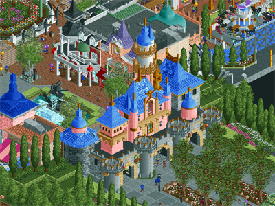
Disney's Fairytale Kingdom (RCT2)
VS

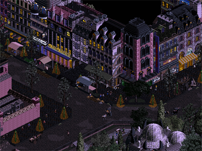
Mobray's Illusions(RCT2)
Voting Rules- You should only vote if you have viewed both parks in game.- Everyone but players belonging to either team in the match may vote.- Voting will be monitored to improve fairness, and anyone found to be abusing votes in any way will be punished.
-

 MrTycoonCoaster
Offline
Jesus Christ when I see these maps and look at mine, I cry hehe.
Sorry for my comments, but for me it's fantastic too, I can spend hours enjoying it.
Disney: it was wonderful, everything stayed 10, loved the visitors walking under the ship, the entrance to the park was beautiful.
Skating on the ice got really crazy, sidewalks, squares, light poles, water, vegetation, too beautiful, the realism is incredible.
Mobrays: detail on the train bridge, it was great.
The horses riding the wagon, sensational.
Showing factory interior with machines, gears, got the maximum, great imagination, the factory really impressed me.
The rays, the hanging lamps, the colors, were perfect.
The shadow detail of the light poles in yellow, was nice.
I loved the style of the buildings.
Voting extremely difficult. -
 Dragons
Offline
Both of these parks are breathtaking, and its is difficult to say which of the two I would like to see win.
Mobray's Illusions has a unique atmosphere, and the night time filter is a risk, which I think payed off in many ways, though perhaps was a little too dark however. It interferes just a little with seeing some of the finer details, which are abundant to say the least. The hammer and ingot in the iron works for example, is a really creative use of rides as scenery, As are the carriages.
As for the attractions in that park, the Schwarzkopf Looper and its teleport effect is awesome. The dueling B&M coasters are amazing, and again we have another coaster telling a story really well this H2H. They are also perhaps my favorite coasters I've seen so far, top notch to whomever built them.
----------------------Disney's Fairytale Kingdom is interesting to me. It seems to be a micro Disney park, and using the castle as the primary entrance is something that stands against standard expectations for their parks, yet it works in a way that's not off putting.
A lot of effort was put into Arendelle, I imagine that it would be rather quite immersive in real life, and I admire how much time was put in to it. In fact, generally, it can be described that the whole park would be very immersive if real. However, I wish that more work was put elsewhere in the park, with more space being used for other IPs. Though one could say that's just a fair parody of how Disney would probably use Frozen given the budget, so I'm actually not going to count against that, for that reason, as silly as it may sound.
Favorite thing about the park for sure though, would definitely be the Mulan Flying Coaster. Its a simple layout, but it was very fun to watch, and something I would actually see Disney Building.
----------------------
So I'm not afraid to admit that I will be giving both of these parks a 95%, but right now, I'm not sure who I want to see win. I can't presume to know how to set up tournaments like these, especially considering that I've not been on the site for long enough to make that kind of judgement, but I think that it would neat to see separate categories for different build styles, because in this case, one park is more grounded in realism and the other in Fantasy.
Either way, excellent work to everyone involved, I can't wait to see what else comes along.
-

 posix
Offline
Both parks very impressive. Spacecrabs I think would've been more likely to get my vote with the default colour palette, but I've not decided yet.
-

 FK+Coastermind
Offline
The screenshots look amazing, but like, I haven't seen them in game. So like, all I can type is hype. Excited to take a look, hopefully tomorrow or Thursday at the latest. Ya know, got some holiday or something that is an excuse to drink! OH RIGHT, American Day! Happy America!
-
 Mattk48
Offline
Id like to shine some light on the tangled area of the disney park. Perfect in my opinion. Tower and general archy is warm and spot on. Internal dark ride has some great details, and the resturant looks exacty like a disney counter service spot. I could easily imagine that area in a disney park.
Overall feel of the morbid park is awesome. Atmosphere is very emmersive love the street lights. Telleporting looper is by far my favorite thing here.
Both parks are exceptional, too much to write about, figured id just touch on a few things.
-

 chorkiel
Offline
I'm not necessarily in awe of either of them. Disney was prettier but the Frozen castle stood out as a bit of an eyesore. Mobray was original but the aesthetics didn't do much for me.
-

 Tolsimir
Offline
Great park Strangelove! You brought up something really good against us and I am eager to see how the final result of this match will be. It's already late and I promise tomorrow I will give you a proper review of your park as I only could make a quick view. Some initial thoughts: Damn that ship! I think it's surpassing the ones I did in Tenochtitlan!
 Area around Rapunzel's tower is super awesome, especially the tower itself! Overall I think the park is quite nicely laid out, I like all the nice little cuts into the buildings. Unfortunately as always I can't get any of the references I must have had a poor childhood it seems with having seen no Disney movie at all (although Frozen and Brave are newer ones already, they don't count)
As I said, proper review tomorrow!
-

 shnupz
Offline
can't leave a proper review, but here are my initial thoughts:
I enjoyed both parks. Both gold worthy imo, and I had a great time looking through. I've had a lot of negative responses to my reviews lately, and I want to make something clear: Nothing I have ever said/reviewed or will do in the future this H2H is emotionally charged. I don't care who built what, I don't care which team made which park and I especially don't care for any of the behind the scenes drama bullshit. I'm just leaving my thoughts on what I see, and none of it is personal. I apologise if people feel as if I have been too harsh, but I had a lot of people tell me they appreciated how I actually left negative criticism because not many others were pointing it out, and somewhere along the line opinions seemed to flip as tensions throughout the contest rose.
Mobray
A real mixed bag imo. My first impressions were that this park was the weird baby of Frankenstein and Parc Guell. I cannot emphasise enough how much I absolutely fucking loved the surrounding streets and architecture. It was absolutely phenomenal and the highlight of the park for me. This is one of those parks I'm always going to look back to as I try to improve my own CSO skills. I don't have a single complaint, other than sometimes the palette made it hard to take in the details. The Mobray estate itself, however, was lackluster in comparison and while not bad, did not have the same level of quality imo. I did rather like the mansion, and I loved the teleporter ride. The B&M's told a cute story, but there were a few parts of the layout I disliked and the support work seemed poor. The supports look good in some angles, but in others they are floaty or missing connectors to the track etc. Overall this whole estate felt like Parc Guell except its London and Fantasy, (which isn't an inherently bad thing, for all I know work on this park started before Shogo did Guell anyway) but Guell did it better. It was good, it just wasn't as good as the rest of the release. The grounds felt a little boring, and the flat rides didn't seem to fit. Thematically yes, but the composition and actual look of it all was weird and I can't quite place why.
Overall? Definitely one of my personal favourites this season, but I don't think it objectively stands up to the likes of Tubiao or Dig Site 4.
Fairytale Kingdom
Look, this is a great park. The builders have displayed excellent creative talent and rct skill. It doesn't really mesh well for me. Emphasis here on for me. I can see that this is a great release objectively, but I don't really connect with the IPs and it feels a bit busy (the same way, I imagine, that people who have never seen an anime felt when they saw Studio Ghibli). The Mulan area is my favourite, but it felt the least Disney out of all of them so I'm not sure what to say about it. The coaster was pretty, but I've never really heard of Disney not trying to hide their coasters behind endless facades other than the Incredicoaster. It felt more like BGA than Disney. Definitely an odd design choice to build it this way, I'm not sure if it was a good or bad thing.
The boat was, quite obviously, the best thing in the park. Bravo to whoever made it. If you aren't CC9 then damn, you've entered his league now. If you are CC9, B O A T S. Great job.
Though i cannot state its accuracy to the film, I preferred this castle to the one in The Icons' Arendelle. I actually felt like the dark ride detracted from it in a way, since the guide rails broke the atmosphere. Realistically though I can't see Disney not doing that, it makes sense to be there.
Brave's area was my least favourite. The archy was cool but I really dislike the coaster layout and the use of dark blue throughout, it seemed to clash with the rest of the area. I also am not a fan of how Liam's chinese tree was used throughout the park, it made each area's foliage feel less unique. It doesn't look bad in either the Brave or Mulan areas (although I hate it in the main street planters), but I would have preferred one or the other tbh. The Grandmother Willow is also really ugly, I'm sorry. The base of the tree and all that is great but the foliage used for the branches and leaves was glitchy and didn't work well.
Tangled was cute! Loved all of it really, although I think some of the buildings are out of scale with the rest of the map. Having 2 water dark rides on the map baffled me tbh, but the area was great.
The entrance and Main Street were lovely except for the planters with the Chinese cedar trees. I absolutely did not like the foliage in those planters at all, and it was a real shame because the archy is so good but the whole area has been let down by these planters imo.
I liked the park overall, it wasn't bad. I just prefer Mobray, I think. I can't help but feel that if you took each of the areas in Fairytale Kingdom, scrubbed them of any IP references and made a whole park or design out of them, those releases would be better than this park is as a whole.
-

 Tolsimir
Offline
Ok now my promised review. I think you are waiting for some reviews them as much as we are so I thought I'll just do one already for you

As I said yesterday I really like Disney's Fairytale Kingdom. Even thought I don't know the movies at all I still can appreciate everything. The skill is definitely there and the overall quality is top notch! I especially like all the technical solutions and little thinks you put into the park.
But let me structure this review a little more, I'll do it area by area this time, starting from the entrance.
The entrance building is very nice, it has exactly the right scale. I especially like the use of virginia reel track on the towers, the fit perfectly! This castle is missing a bit windows though, the high tower doesnt have any, as doesn't the small pink one, also the diagonal corner turrets on the main building could have maybe been cool with some diagonals on the corners, but that's not for sure.On the backside to the park its just a plain pink wall. Other than that I am a little torn on the double chinese cedars. On the one hand they make a nice lush leaf-roof on the other hand the trunks are super repetitive and this leads to a quite unnatural visual. The little mainsteet is nice and has some good archy. The little statue in the fountain I don't know what to think of, I can't quite decipher it. On the path leading from here to the park you have for the first time one of my favourite things in the park: the custom lamps. They look super cool! Whoever came up with that design did a very good job! Shnupz already mentioned the planters here, but in a more negative manner. I actually like them as they give a nice blop of green colour to break up the path, I especially like the realistic use of the mulch under the plants.
Turning right from the main street to the restaurant with the two towers. They look a bit strange and I don't get them (again). What I like a lot on this buildings are the five Strangelove posters on the side of you round robin parks! A very cool feature and it gives your team an identity. A bit sad that one of the five didn't quite fit and is on the wall on the "backside area". But nonetheless this made me smile
 The custom flat here with the planes was a bit strange as you decided to take a leading track below the cars while they are from the suspended coaster and swinging cars and on top glitching through the track. This way you have the railing system on top of the cars all the time which is a bit disturbing. I didn't take away a lot but neither didn't make me like the ride.
Keeping on in this direction we reach the Mulan area. I must say I don't care if the layout is not Disney (because I have never been to a Disney park and don't know shit about it) but it's really cool how it firstly governs this area so much and secondly is framing that castle like building. The layout was nice but also nothing too spectecular. Especially I'm not really sure of the double roll going into the breakrun. Archy-wise this part is more than solid. The long-shapedness of the station building which I am a little unsure about, but I guess it's because of reference reasons like this. I really like the quaintness in the far corner with the turns and the little shrine. Also nice work on the chinese foliage over here, the pink tree sticks out, but not in a bad way, wished there were one or two more to supplement it. The rest of the area is well done I guess the tent village belongs to that area, too. In all honesty nice use of "texture" on the tents. That textureless canvas objects sells perfectly the cloth feel of the tents. Other than that, that orange rooved building is maybe placed a little unfortunate as from a peep's view it is mostly covered by the building below it.
Going now to the Arendelle section I have to praise that ship again. Damn it's super nicely done, that networking gives it so much depth that was missing in any former RCT sailing ship. Also the colouring of it is perfectly done. Great job. The icy castle is very cool. I especially like the ice features on the walls and arches. They look great form wise and texture wise. The plaza in the middle, even the whole structure reminded me somehow of Venice with the canal-like moat around it. Yeah Venice, and that's not a bad thing although I can't quite connect it to the cold theme of Frozen. The outside seating area lies a little in tension with the skating rink. The rink as a whole might be a little logical errror for a theme park, but I dont mind as it fits the theme and I always like to see rides/objects from former round directly recycled.
Going on the Brave area (I have to admit I had to google that area because I had no clue) firstly the connecting bridge from Arendelle sticks out as a little underwhelming and it seems like an afterthought to connect these areas properly. Brave is the weakest part of the park, although I really like the heavy use of that Mekong Palette 2 color and thoses big round towers. On the one hand they are a bit bland on the other hand I somehow exaclty like that. Only the banners I didn't like because they gave that big tower "eyes" and a face which I didn't like. The diagonal gate is ace. The coaster didn't do much for me, it was quite hard to follow and I don't know why you cut off the transfer thingy like that. Either skip the transfer or build it properly, I can live with both, but now like this it bugs me a little. The blue coaster color is the right amout of colour to supplement this area colorwise it goes well with the mekong brown mentioned above! Foliagewise this part was also a little random. I appreciate the choice of trees actually throughout the park as every section comes with it own piece of foliage but in the brave area the tree placement is just pure random with no actual natural guideline behind it. Better clump some patches of trees together than spreading them randomly over the area I'd say.
Last area is the Tangled one. The governing tower is very nice. It has the right amount of details. The surrouding village is well done, too, it sells perfectly the medieval village theme. Also that custom tree in the corner reaching over the houses is cool. The bar in that corner is one of the highlights of the park. Awesome interior and very believable! Good use of frozen staff and perfect details, you can't do this better. The dark ride had nice cut open scenes, maybe they were a little lacking in detail as they most of the time were some frozen staff giving the reference with its name and not much more. A little more love to the detail here would have brought this to another level. I think that is not a problem of this ride but generally with dark rides in RCT. People decide to do some insight views and then just don't commit hundred percent to them. But still it was cool to look at.
In general as I mentioned yesterday already all the given cut aways were great. All the photo scenes! The Pocahontas tree site was just a mini area but it was nice to see it there.
All in all I enjoyed viewing that park can congratulate you for bringing such a nice piece of work to the semis, especially when seeing that the overall interest into the contest just deceased due to the stuff that sadly happend last week. I know from my team that it was quite hard to keep up the motivation, but seeing that we came up with a proper matchup and on top a really good one is reason for both teams to be proud of and for the other members to really value the effort of both teams!
-

 Roomie
Offline
Right lets get this done

Fairytale Kingdom
First off that Galleon is incredible. Like almost perfect! full props to whomever built that I love it.
Secondly some Caveats to this review. I am not the worlds biggest Disney fan so i may miss some references here that are obvious to others.
As someone else said having the castle as the entrance is a nice move. It oddly reminds me of the grand entrance gates to the Fantawild parks in China. Not having a long mainstreet before entering the park proper also breaks from some Disney mainstays and the park is better for it.
The Mulan flyer is excellent and as a strong proponent of good coaster design this caught my eye straight away. The big swooping first drop and speedy banked turn into the Pretzel would be an awesome element combo in real life. My only concern here is it doesnt feel Disney really but I can live with that.
The little tents next to Will O'The Wisp (a reference i clearly miss) are also really simple but lovely.
The tower in the Tangled area is the architecture highlight for me. Its another film i havent seen but it looks amazing. Almost like a wizards hat in some ways and something that would fit right in the Ankh Morpork park I have long planned and never done.
Also really like the Character meet and greet areas. perfectly executed and peepable which is pretty cool.
Things i wasn't a fan of really were the huge Frozen area. It dominates the park and is a bit too imposing for me. And the park in general just doesn't speak too Disney to me. I know i said that was ok with the flyer but when its across the whole park it adds up.
Overall a really solid park and a good SF park thats better than much that came this season.14 out of 20...uhhhh.... 70% from me
Mobray's Illusions
First off here let me say thanks for using the Footballs
 it made me realise how much i need to fix the positioning of them they are off from certain angles. Im amazed how many times those stupid little football cars have turned up this season in different parks (and more than once in this park)
Secondly here is the Palette. Thats the real wow factor of this park hands down. A night time Palette. Its something im sort of used to now as i play Parkitect which has an awesome new night time cycle but something i havent seen done well in RCT before. The light cones from the street lights are a nice touch as well.
It is perhaps a little dark? I have 3 monitors here and there is a noticible difference on them. On the more expensive Dell monitors the parks lighting just about works. On the less well calibrated gaming 120hz monitor its rather too dark to make out some of the details.
The architecture here outside the park is outstanding. It has an almost Noir Robbie92 feel to it in places.
There are little pieces of genius throught this map. The Hammer Ingot interaction is positively delightful, The levitation ride is a novel use of what is ostensibly an age old hack.
This park certainly loses out for me in the coaster stakes. The story of the duellers is nice but the rides themselves just dont hold up for me. Duelling coasters are notoriously hard to pull off well in RCT and this just doesnt quite hit the mark for me. Props for trying it though.
The Mansion in the middle of the coasters is very imposing but pulls it off in a way that the Frozen area in fairytale didn't. Its imposing but in a good way.
This park as a whole gives the feeling of an early 20th century expo run by Doctor Moreau and if thats what you were going for you hit it pretty much spot on.
15 out of 20...uhhhh.... 75% from me
Conclusions
Its a tough choice for me but i feel Illusions just edges it. Perhaps if I was a bigger Disney fan it would be the other way round so sorry Strangelove but Fairytale just wasn't really "me"
I want to commend both teams though. Putting out such high quality parks after the horror show at the end of R5 cant have been easy and these are two really strong parks. All the builders should be proud and as always its a shame someone has to lose. But thats the nature of this contest. just don't let it get you down. Even a losing park can be brilliant

-

 CedarPoint6
Offline
I'm going to leave my full little things review once I catch up after my vacation, but in the interest of giving this thread some additional comments, I'll say these are both really good parks.
Disney parks are tough on an H2H map because I don't think they're given enough room. And a typical pitfall is to cram it in there so densely that you can't see what's going on. Thankfully you've avoided that here with a comfortably spaced park that has some really solid architecture. Highlights include the Tangled area and Frozen courtyard. I'm not and will never be a fan of B&M in Disney parks, but at least the layout is quite nice.
Mobray was at first difficult to read because it was so dark, but as my eyes adjusted I really started enjoying it. There's a bunch of cool ideas and the mood created with the darkness and lighting was just so good. I loved the duelers for how different they were, yet still managing solid layouts. And the whole storyline was quite nice. In the end this took my vote by a hair, but both parks are semi worthy parks. Well done!
-

 BelgianGuy
Offline
^if you guys do wich is still a toss up as not that many votes are in, do it with head held high cuz you guys released a truly wonderful park
-

 Sulakke
Offline
It’s great to see two fantastic parks after all this drama we had and being so late in the season. You made it very hard to decide which park to vote on. Both parks deserve a win in my eyes.Disney´s Fairytale KingdomI haven’t seen any of these new Disney movies, so it took me a while to figure out to what the areas and rides were referring to. Some comments:+ The Frozen castle looked great. The way how you used different roof types to create those castle roofs work surprisingly well. I also love the bridge leading to the castle and the small frozen fountains. The round monorail structures work well here. The small bridge was a bit too small and underwhelming for a Disney park perhaps.+ The Tangled area was my favorite area. The architecture is just one of the best I’ve ever seen. It’s so detailed, yet very clean. The tower, the pub with the tree hanging over it, the tan toilet building and the restaurant next to it were the highlights for me here. Just pure brilliance. I also like the interactive inn interiors. I’m not a fan of all the road lines on the plaza, but I did really like the other details on the plaza.+ The Brave area was really well designed and composed. The new shade of brown, in combination with the blues and tans, looks good here and I also liked the round structures of the castle towers. Everything here seemed very natural and immersive. Not sure if the area felt that Disney to me, but it did look like a real theme park area.+ The pink tree in the Mulan area is really well done and probably the best one I’ve seen yet. Shame the two other, smaller ones are weirdly glitching through the diagonal wall. The tent camp in this area was great too.+ Loved the butterfly object. Is that one new? Can’t remember seeing that one before. It made some delightful scenes. I especially liked the small Pocahontas boat with the butterfly flying above it. Really charming.+ All the photo moment scenes in the park are great. It really enhances that Disney atmosphere.- The entrance area was nice, but not up to par with the rest of the areas. It lacked some details and was rather empty and uninteresting compared to the rest of the park. The castle was well done. It misses some windows, though, like Tolsimir already mentioned.- Although most people here seemed to really like the galleon, I thought it had some weaknesses. The biggest problem I had with it were the sails. They absolutely look too small. Should have been one or two tiles wider, so that the ship doesn’t look this chubby either. Also disliked the messiness of the ladder objects. It didn’t really work out well.- The Mulan area was well constructed, but it didn’t really hold my attention. The buildings were great, but we’ve seen that kind of architecture a lot of times before. The rest of the area was just a lot of landscaping. I also think it doesn’t capture the Disney vibe well. I guess that’s always the case when you try to implement a nude B&M coaster in a Disney park. The ground under the pretzel loop looked blocky and unfinished.- I didn’t really get the big restaurant at the end of the mainstreet. What are the two towers? Is it supposed to be a steamship? Is it inspired of a movie? Also, that small area with the magic carpet ride felt a little bit forced. There was not enough room there to fit in the little bazar.- I’m not a fan of the rocks in the Tangled area. Especially the combination of the rocks under the Tangled tower and the LOTR rocks behind it looks kind of weird.- I don’t weigh originality as heavily as some other members on this site, but I have to mention that this park feels a bit trite. We’ve seen it all before and especially compared to the originality of the other park, it’s a real weakness for this park.Other review is coming later today…
 Tags
Tags
- No Tags

