H2H8 / H2H8 Round 5 Match 2 - Team Spacecrab vs Ultrarealists
-
 12-June 18
-

 posix
Offline
Mandala was wonderful. The right kind of balance for an H2H park. So original and fun to look at. Well done.
-

 Turtle
Offline
spacek531 I have NO idea what you're talking about but it sounds incredibly difficult, and resulted in a really clean and awesome effect. Great work, thanks for taking the time to do this. People still finding new hacks and effects in a 20 year old game, wonderful.
-

 spacek531
Offline
The basic principle is that the train won't merge onto another ride unless the track piece types match. Straight track, brakes, and boosters are different track pieces, so it was a matter of finding the right combination of the three to get what I wanted.
-

 Xeccah
Offline
I had such a hard time liking Romon U Park. I think I am finally appreciating it more. Appreciation probably isn't the right word, though. I respect the park and what it is. It's probably the park that has been so far divorced from aesthetic charm that it possibly couldn't be anything but a recreation. I usually love that, because things IRL have little imperfections that RCT realism usually frowns upon doing. The indoor section is so amazingly ugly to the point where I can't really enjoy it anymore. I don't think I'm even supposed to enjoy it. The outside of the park had a much better balance of IRL tackyness combined with a little sense of care about what would look good in RCT. Competing against a park whose aesthetics are its key feature, I'm inclined to say that this is the more risky park. My main drag with CnC was that it was too nice for the viewer and should have been grittier, and this park gave it to me raw.
Mandala is a lot nicer to look at, and I think that you can't bring up the park without noting the reflections. Its forms and structures are incredible to say the least. You can ream this park a little for the lack of architectural detail, but I doubt that's its meant to be a high resolution photorealism of India anyway. A mandala and how it fractalizes is such a creative and unique base for a park; in fact really every design choice is so far separated from what's been done before in rct that this park should really stand out as one of the greats from this season.
Both parks of this match i believe succeeded in their conceptual goal, which is a pretty rare and exceptional thing to, but creating a piece of art are just so much higher praised in my eyes than creating a model of something that already exists, which is why my top 5 are all of those kinds of parks: Mandala, Metropolis, Dig Site 4, EVIL, and Mekong. Some of them (the first two!) did it better than the others, but I look for pure aestheticism as the hallmark of the best RCT.
PS I really regret only voting 80 on mandala. I think I could have justified it as my first 100 of the contest.
-

 Sulakke
Offline
Romon U-Park
The first finished H2H8 park I've seen in game and I have to say, we've come so far with this game. If this is the average quality of this season the standard has become so high. Amazing new rides, ideas and hacks and I love all the new objects made during this H2H.
I don't have a lot more to say than that what was already said about this park. It's a fun park to watch with lots of little things to discover. I really enjoyed looking at it.
+ Those pastel coloured paths look extremely cheesy and are probably very ugly in real life, but in game they work surprisingly well. I wouldn't have expected that.
+ The diagonal cliff behind the swining ship is executed perfectly.
+ The small ship on wheels.
+ The panda flat ride and the interaction and composition in that corner in general were great.
+ The architecture around Dragon Legend and the topspin was very good. Although the building with purple roofs uses two different kind of purples. Seems like a mistake. The Spacecrab logo was a cool little thing.
- You could have done more with the giant hall walls.
- The LOTR rocks felt out of place and overused, especially outside around the rapids.
- The corner of Poseidon Adventure was very brown, especially in contrast with the rest of the park which was very colorful.
- The wooden building of Knights Battle felt slightly out of place. If it's a recreation you could not have really helped that.
- The road and sidewalks felt a little bit small under detailed. Not sure how it looks in real life though.
- It's a shame Rocking Tug is not peepable.
- The cutaway on Europe Express was useless.
Mandala
While this park was technically a lot better than Romon U-Park, it couldn't held my attention as long. The exectution of this park is fantastic, but I do think it's missing the little things and details to make it really stand out.
+ The reflections are a crazy idea and the execution is perfect. A memorable H2H moment. That must have been a pain in the ass to pull off. Shame there are no reflections for the peeps on the bridges and the coaster trains, although I'm not sure if that would even be possible.
+ The organic roof of Flying Lotus' station is fantastic. Pure class.
+ The star shaped roofs around Rising Lotus.
+ The big sculpture was great.
+ The flume drop with it's round lifthill, the carousel, the paths, mazes, gardens, towers and more stuff in the background. Lovely scene. Especially the small garden with the round steps is looking great. The park could have used more of that stuff.
+ Steps used as docks and leading into water are always looking beautiful.
- Although the architecture is very good and actually quite diverse too, the park felt very monotonous. I might be caused by the mazes that are all over the place.
- Also the paths could have used some variation.
- I thought it was very hard to recognize some form of mandala in the park layout, but that might just be me.
Two great parks and a fantastic match-up. Luckily I don't have to decide on which park to vote anymore.
-

 FredD
Offline
I was on a holiday so couldn't vote on this match-up but both parks deserve a review!
UltraRealists
This park has me interested. I like the concept behind it and the theme, Hindu theme is something we don't see too often in rct. Or at least not this extensive. Kudos for having a maze, I like mazes and think they are underused. The archy is good, really like the texture work and the color choices.
The coasters are OK. I really like the flying for most part... except the mini pretzel loop. Come on guys, never done such a loop irl?! That should have been the center piece of your flying coaster! Not because real flying coasters have those as center piece and way bigger than yours, but also because it's a damn good inversion to experience on a coaster! Flying Lotus seems a fun family coaster.
When I'm viewing the park for a bit longer... I notice you guys build the reflection of the buildings/coaster into the water?! Daaaaaaaamn boys.... That's awesome! That's clearly an idea that makes you win H2H matches. Before this round I'd say EVIL was my favorite park from your team. That changed. 85%
SpaceCrabs
Ha, quite a while we've seen an indoor park! Archy is topnotch, a lot of framework buildings... If I didn't saw this after voting closed I would have guessed Fisch had build on this
 I like the colorful paths inside the building, real indoor parks have playful paths so it's nice to see that translated. It def works here.
The composition inside the building is quite interesting. The building seems of a reasonable size yet there's much to find inside without it being feeling too dense or too full. The pyramid theatre is awesome, just like the corner with the diagonal swinging boat. I also like the center square but also ask myself if an indoor park with limited size indoor and outdoor would spend so much space on just path... on the other hand, it does look good and with rides here it might would feel too cramped. So ignore this.
The outdoor part is also really good, topnotch archy here again. The castle is the best piece of this part. The coasters (here and outside) don't do really much to me. I get that with limited size smaller coasters are the most obvious choice but both coasters looks like regular filler coasters I only would ride to get the credit. Another issue I have with this park is the LOTR rocks. It's fine in some places but in the Egypt corner and at the rapids is just too much and it kills the atmosphere for me.
Another thing: the outside of the building looks plain and boring. Of course you can't theme a whole structure but I would have made the outside entrance at least more appealing. Now guests just feel they enter a steel block (and yeah have the same issue with Toverlands real old entrance
 ). Nonetheless a really good and enjoyable park. 80%
I couldn't vote, but if I could... I would have vote UR. Congrats with the win.
-

 Faas
Offline
Fred you do know our park is based on a real park right? I agree with a lot of stuff you say and thanks for actually reviewing this park, but you don't have to wonder of such a park would spend so much space indoor on path. The answer is yes. Same goes for ''our'' choice of two small coasters.
 -

 FredD
Offline
No I didn't know it was based on a real park. I know most of European and American parks but kinda don't follow/know much about Asian parks
 Excuse me. I was just wondering, it wasn't a real issue for me, it wouldn't change my rating at all.
 But I do stay on my opinion this park, as an rct park, could use a better center piece coaster.
-

 AvanineCommuter
Offline
It's been a while but I've been busy traveling for work. Thought I'd make this post before Semi's started.
Mandala was an idea I had at the beginning of the brainstorming section. Basically I thought the idea of using mazes as fractal images as a base for a park that's a spiral would be very cool, and we have only seen one proper Indian / Hindu park with Carreira da India. We wanted to explore eastern mysticism and the ideas of harmony, balance, stillness, reflection, meditation, etc.
The idea of the reflections came from the image below:
It seems like it fit really well with the ideas we were playing with.
Some images of inspiration:


Alex took the reigns and did a fantastic job with laying out the park with the fractal mazes which loop in spirals, testing reflections, and he built the vast majority of the work including the super dope flyer and the temple in the center. This park really couldn't have happened without his work which is amazing as per usual. There was also quite a bit of testing he needed to do to get the reflections right, including having MK make custom upside-down objects to help, and having the park built really high up to give us space to have taller reflections.
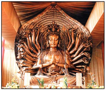
Rene + Biohazard + I took over towards the end as Alex took on EVIL, but Alex was supposed to finish it off when his computer crashed, forcing us to pump this out as fast as we could. It was a shame as we couldn't then get to the level of detail that we wanted to, but Rene and Biohazard were true champs and finished a lot of the reflections and made some incredible work here, as well as some of the very nice temples all around. I added the Lotus-themed spinner and helped around with additional buildings / details. FK did the incredible buddhavista statue as an object.
A breakdown of what was done by who, roughly:

Red is Alex, Blue is AVC, Yellow is Rene, and Purple is Biohazard (the ring around the outside is basically Bio putting in a ton of support blockers and helping with general details all around the park).
The mayan blocks were put to great use and I found a Buddhist chant that my mom used to recite often which was extremely helpful in setting the atmosphere. I think in the end, even with Alex's computer mishap, we were able to create something truly unique and different from what we've seen before, and I'm glad people enjoyed it. -

 Cocoa
Offline
Thanks for the writeup, i like that drawing you did
I reiterate my audible "hmmmmm" at fk doing that statue but not being a builder ... -

 FK+Coastermind
Offline
Cocoa, I actually agree with you. It seemed questionable to me when it first came up with the team. I know had another team done it before I knew it was being allowed, I would have called bullshit. But, with the indication it would be allowed, I was more than willing to provide sculptures for those builders who wanted them, and MK was a good sport to put up with converting them to object pieces. Given how little I contributed to this H2H, I was glad I could at least be somewhat helpful...
 -

 zxbiohazardzx
Offline
Alex took the reigns and did a fantastic job with laying out the park with the fractal mazes which loop in spirals, testing reflections, and he built the vast majority of the work including the super dope flyer and the temple in the center. This park really couldn't have happened without his work which is amazing as per usual. There was also quite a bit of testing he needed to do to get the reflections right, including having MK make custom upside-down objects to help, and having the park built really high up to give us space to have taller reflections.
Rene + MK + I took over towards the end as Alex took on EVIL, but Alex was supposed to finish it off when his computer crashed, forcing us to pump this out as fast as we could. It was a shame as we couldn't then get to the level of detail that we wanted to, but Rene and MK were true champs and finished a lot of the reflections and made some incredible work here, as well as some of the very nice temples all around. I added the Lotus-themed spinner and helped around with additional buildings / details. FK did the incredible buddhavista statue as an object.
A breakdown of what was done by who, roughly:

Red is Alex, Blue is AVC, Yellow is Rene, and Purple is MK (the ring around the outside is basically MK putting in a ton of support blockers and helping with general details all around the park).
The mayan blocks were put to great use and I found a Buddhist chant that my mom used to recite often which was extremely helpful in setting the atmosphere. I think in the end, even with Alex's computer mishap, we were able to create something truly unique and different from what we've seen before, and I'm glad people enjoyed it.im pretty sure some of the purple was me but cheers
-

 saxman1089
Offline
im pretty sure some of the purple was me but cheers
Ooooh so five builders huh.
Hahahaha did bio just admit to ghost building? Interesting....
-

 MK98
Offline
Red is Alex, Blue is AVC, Yellow is Rene, and Purple is MK (the ring around the outside is basically MK putting in a ton of support blockers and helping with general details all around the park).
*MK = Bio, I'm not a builder on this.
 Tags
Tags
- No Tags

