H2H8 / H2H8 Round 4 Match 2 - Icons vs. UltraRealists
-
 01-June 18
-

 Liampie
Offline
The only thing I wished is that there was more to the Barcelona street. I'd have love to have seen something capturing the feel of Las Ramblas.
That wouldn't make sense though. Las Ramblas and Park Guell are quite far apart. It would break the immersion and the realism. Barcelona is the setting, not the theme. You could actually argue this park is not themed at all, and therefore generic.
-

 In:Cities
Offline
That wouldn't make sense though. Las Ramblas and Park Guell are quite far apart. It would break the immersion and the realism. Barcelona is the setting, not the theme. You could actually argue this park is not themed at all, and therefore generic.
I discovered this last week when I wanted to walk from Las Ramblas to Guell, but then pulled up google maps lol.
Ended up in some sweet food market for a couple hours though.
Love the park shogo. It's not my favorite style, but I can appreciate what you were going for. The coaster is great, and I actually really liked the bird cage. I surprisingly wasn't a fan of the surrounding street, but there's not much you could have done with the area.
As for the other park, I'm sorry I don't have as much feedback. I can really appreciate the technicality of it, and the landscaping was great. But the theme conceptually bored me. I don't want to fault you for that though, because people told me the same exact thing about Port Disnot. I applaud you for building what you wanted to build, and I feel that you executed your vision perfectly. I don't really have any complaints about it - I just simply voted for my favorite.
As a whole, I found myself not as amazed by either of these parks despite other people really loving them. I'm probably one of the outliers here on the site though in that I don't follow the typical train of thought and look for the same metrics to judge parks as others.
Regardless, I'll be visiting both of these parks more in the future, and look forward to what both teams have next in store!
Josh -

 MCI
Offline
Sorry for the late reply.
I was in school last week and typing lengthy reviews on my smartphone really isn´t my cup of tea.
This was a close call for me.
Having been to Barcelona just a couple of weeks ago I really loved the vibe of Parc Guell. The architecture is a mixed affair for me. While I absolutly love the buildings flanking the entrance and the buildings on the surrounding street I cant say the same about the buildings in the actual park. They seem to be a bit boring to me, cant really point out why though. Now the "infastructural architecture" (you know, the crazy art shit everywhere) is perfect. I absolutly love the fountain or the plaza above the oservation tower. The arches underneath the diagonal path or the little earthy-tower-thingy near the brake run of Serp as well. The coaster layouts were okay. Not bad, but not mindblowing either. Putting the bird nest element over an actual bird cage was a cool idea though. Another great effort from you shogo!
Now for North Fork.
I just love mountain parks ans this one is one of the better ones I´ve seen.
Landscaping is perfect imo, the foliage is on point. Not to much, but enough to feel realistic.
the underground caverns were a great touch.
The architecture could have been a bit more detailed here and there, but fits the theme of the park well.
Really like the earth shaker station and the roof structure on the Copperhead station.
Speaking of Copperhead... Wow. I really like the layout although the first launch is a bit underwhelming
 Earth Shaker is great as well, but cant really compete with Copperhead. The custom flatrides look fine.
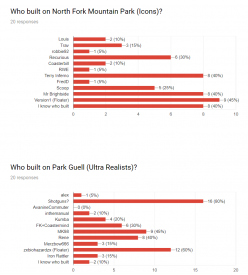
To put this to an end, I think North Fork is just a bit better and I voted that way as well.
By the way I´m curios: did my vote count or am I now considered a "inactive member"? :/
Great job on the park Scoop and Brightside, you created something you can be proud of for sure.
Jan
-

 Faas
Offline
Icons:
Summary: Good park with two great coasters, but the architecture and caves were lacking.
Cool idea to include those caves, but you did too little with it if you ask me. I would have gone for two caves, and work them out to perfection, instead of a lot of caves with seemingly random little rockwork.
The architecture was a miss from me, with a lowpoint being Earth Shaker's station. What's with the checkerboard roofs?
The two main coasters were awesome, especially Earth Shaker, well done!
65%
Ultrarealists:
Having been to Parc Guell and being a bit of a Gaudi fan, I loved this. I think you nailed some aspects, but I would have done some things differently:
- The high platform needed to be a bit bigger imo, since this is truly the central hub of Parc Guell. It also could have used some performers and some more life going on. People selling stuff, etc. That's what its like in real life.
- It could have used some parts with some breathing space. A park should be calming as well, it was all a bit too busy.
This was the winner for me though, because the execution was better, and it did remind me of actual Parc Guell.
70% -

 CedarPoint6
Offline
North Fork Mountain Park
Before I get into the review, I will say that I am glad we didn’t do caves for Allegheny Adventures. Those were planned initially, but cancelled just before this park had come out.
Silver Dollar City and Dollywood are two of my favorite parks, so it’s nice to see an RCT map inspired by them. The caves is a great idea and something I wanted to try for a while. But it also looks like a pain and a half to build so I’m glad someone else tackled it haha. I do think the map size requirement hampered things a little bit here in requiring the content to be much tighter than it otherwise should have been. You end up with not a whole lot of breathing room for the themes and also a few situations where you have coaster footers right over top of a giant void of a cave. But that said, I’m really impressed with this park.
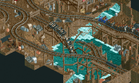
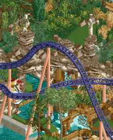
Both of the big coasters are fun to watch and use the terrain really well. The Mack launched coaster is a nice ride with the Time Traveler inspired layout and the Wild Eagle inspired station. I really like the first inversion’s placement to the other immelman. The whole layout has great flow and is probably my favorite thing on the map. The Gravity Group is a little rough around the edges, but that’s not to say I don’t like it. The Timberliner trains are still rare enough that I just enjoy seeing them in the first place. For essentially an out and back layout, there’s a lot of nice variety to it and another great use of terrain. The Little Hotshots ride amuses me because it uses Firechaser Express’ canopy elements except those were left over from a previous attraction that was there before the coaster. I guess that could be the case here too. The Glenwood Caverns style drop tower into the cave is fantastic as well. One of the nicest looking rides in the park. Lastly, I’m happy to see someone do a Gerstlauer Sky Fly. It’s reasonably well done too, though a little color may have helped.
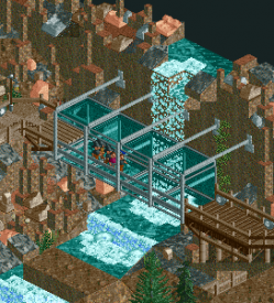
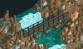
The architecture in general is a little plain, though some of the buildings are pleasantly detailed. The same goes for the landscape on top which is sort of uniform across the whole thing. Some clusters of rock or trees here and there could be nice, including some tree lines of heavier foliage. Underneath is where it gets more exciting with some really great guest bridges and walkways as well as the stalagmites all throughout. The ride interactions down below are very nice too, especially the mine train. The challenge is still being able to remove just the right amount of tiles to view it properly without cutting off any of the scenery. Sometimes it was a little hard to figure out how things related to one another on different levels. But cutaway view has really allowed for some incredible things like this expanse of caves without having to worry about sight lines.
Here are the little things I enjoyed:
So nice to see one of these in game. Great rides.
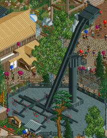
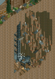
The drop tower is great. Nice realistic details too.
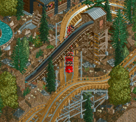
I like this interaction with the scenery.
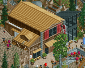
This is one of the better buildings. The multi-level design is very nice.
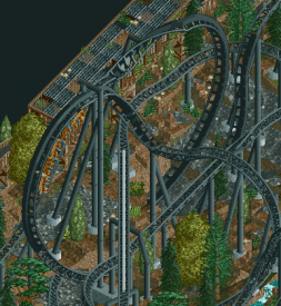
This is a great inversion pair.
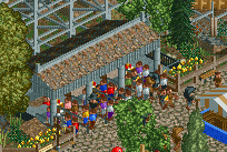
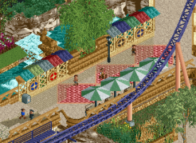
I like the scenery peeps lined up at the food stalls.
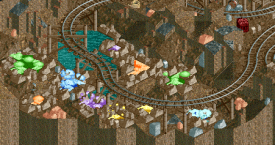
These colors are pretty cool.
I really like this scene, especially with the broken track and train.
This whole walkway area with the glass bridges is really cool.
This bridge is especially nice.
The caves are really what set this map apart and took it from pretty good to very good. The Mack coaster is also one of the better ones in the contest. Redone on a much larger map with additional content, I think this could be a fantastic spotlight.
Park Guell
The premise behind this park is really interesting—to take such a well-known city park and add theme park rides. There’s a fine balance there of maintaining the thematic integrity of the park while still properly integrating rides. I think it’s been done rather well in this case.
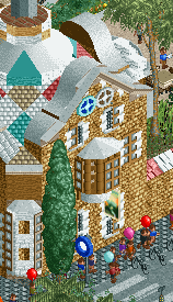
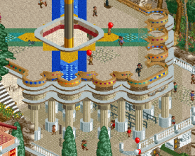
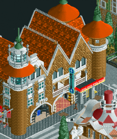
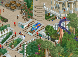
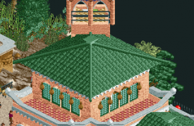
Although I’ve never visited, I’m reasonably familiar with the park and I think it’s very impressive how well some of the areas have been recreated. The entrance has such distinctive buildings and it’s crazy how well some of these weirdly shaped forms work in RCT. It’s a bit messy and glitchy in parts, but I didn’t find things distracting. The real highlight for me are all the little vignettes of decorative things around the park. Like the diagonal path of mosaic tile or the huge fountain in the corner or the rock element inside the Schwarzkopf. The centerpiece with the tower is probably my favorite thing in the park. From the approach with the shallow steps to the arcade of columns to the tower popping up through the middle, it’s such a great layout. Not to mention that it feels reasonably accurate to the real thing.
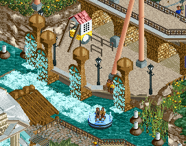
Coaster-wise it’s a bit of a mixed bag. Both coasters have pretty good flow, though the Schwarzkopf is the better of the two layouts. The MCBR isn’t needed, however. But the ride looks great and all the interaction with the path is very nice. The Cheetah Hunt type Intamin is nice although it would be cool to see it run with 3+ trains and interact on the in/out run. Setting the first element above the aviary helps it be less dominating over the rest of the park, which I think is necessary. There’s not one particular thing that sticks out too much. The rapids ride is sort of a hidden gem for me. Although it is missing some details, the setting is just great. I love the big rockwork caves mid-layout. The columns integrated into the natural landscape are very nice.
On the whole, I really appreciate how nature- both wild and tamed is integrated into this kind of a setting. The trees in the round planters in the center are well juxtaposed with the more wild landscape behind it, even though that too is still thoughtfully crafted to frame things and create sight lines. This integrated with the really great Gaudi architecture and all the artistic elements around the park really comes together to make a surprisingly good map.
Here are things I enjoyed:
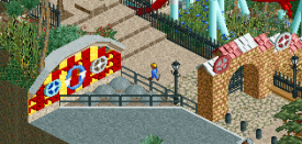
These facades are just so good.
I love the decorative walls like this one that are all around the park.
Favorite section on the map probably. The multicolored awning fringe really helps this.
This is another really great façade along with the cutaways on the backside of this screen.
I like these little pillars with the waterfalls.
The caves behind coaster are a great mix of architecture and rockwork.
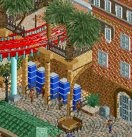
I like how the lockers fit nicely underneath the coaster station.
The mosaic tile on the ground and the path décor on either side are very strong throughout.
The approach up to the tower is great with the low, long steps. I’ve always enjoyed this approach to stairs in-game.
I’m not sure I’ve ever seen this before—using monorails to create roof ridges. It results in a surprisingly clean look.
I didn’t expect to look this park as much as I did. The details are lovely and the approach to some of the theming comes across as very unique. It’s an almost fantasy-like approach to realistic building and works very well at that. Great work.
 Tags
Tags
- No Tags

