H2H8 / H2H8 Round 4 Match 2 - Icons vs. UltraRealists
-
 01-June 18
-

 Liampie
Offline

Round 4 | Match 2
--- POLL WILL BE OPEN JUNE 2nd 20:00 GMT to JUNE 5th 20:00 GMT ---

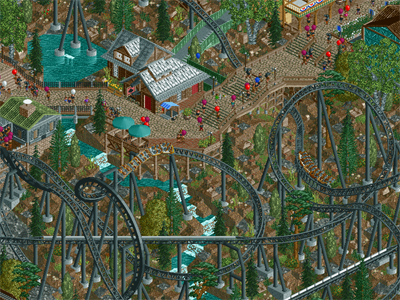
North Fork Mountain Park (RCT2)
VS

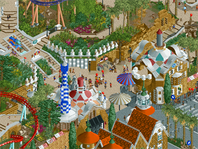
Park Guell (RCT2)
Voting Rules
- You should only vote if you have viewed both parks in game.
- Everyone but players belonging to either team in the match may vote.
- Voting will be monitored to improve fairness, and anyone found to be abusing votes in any way will be punished. -

 Six Frags
Offline
I'll do proper screen-reviews at the end of h2h, but here's my first impression of both parks;
North Fork:
+Awesome cut-away caves! Really gives a nice darkride feel to the park
+Nice landscaping/elevation changes
+Nice broken buildings/broken stuff around the map to get the dilapidated feel across
+Nice woodie, good interactions with logflume and landscape
+Love the ride theming around the map: the stuck/broken minetrains, mouse mine cars in the cave
+/- Copperhead was a bit underwhelming, while nice, could've done a bit more with interactions through broken buildings for example, now it's wandering a bit.. Still a nice ride though..
- Not really any standouts moments, everything feels a bit brown and dull, but maybe that's also kind of the theme anyway.
-The street up to the park, I think the sloped bits look a bit bad texture wise, doesn't really flow, should've gone for the castle style toon slopes I think instead of the concrete ones..
Guell:
+Nice architecture. Those new Liampie brick texture blocks work great here, creates a nice atmosphere.
+Love the flowing paths layout and elevation changes
+Great custom music, really sets a nice Spanish atmosphere
+Vol D'Aguila, awesome layout and flow, may be the best coaster of this H2H yet, design wise
+Foliage, really nice, gets the city-park atmosphere across superbly
+/-Color scheme, works well in some areas, is conflicting in others. Especially the Vol D'Aguila station. The white is too bright for my tastes
-The path borders at the map edge. Seems kinda rushed, and 'just to get it finished' with no real content at some places. I get that you have that at city parks I guess, but I don't think it looks aesthetically pleasing, and missed opportunity as you could've done more with it. Kinda boring now.
2 nice parks again, really hard to make up my mind which park to vote for. They both have excellent moments mixed with some flaws.. I'll think about it some more

-

 Goliath123
Offline
I expect full cut away views for scenes in every park from now on
Apart from that, great parks but North Fork really blew me away. Incredible work
-

 Cocoa
Offline
North Folk:
All up, good park. I think I'll just get straight into things I liked or not, as I can't really think of a structured thing to say- the park neither blew me away or disappointed me. Layouts were all solid, especially the mack/intamin/launcher. I really like the park conceptually, as silver dollar city holds a special place in my heart and it seems you made a lot of references to it, while making it its own thing. There was some good archy, especially on the launcher's station. In some ways, the park didn't quite come together for me though. The landscaping was very 'dirt' and left the park needing atmosphere from somewhere- it all felt quite open and plain which didnt help so much. Maybe it needed more space with just trees or water features, and less 1/4 tile landscapes with stone chucked in randomly and 1/4 tile pine trees on that. I've never found that particular look works well personally. For that reason, I feel that some of that magical SDC atmosphere couldn't come through, and I think some of the scattered-ness of the archy style didn't help. It was a mix of "standard" rct2 western buildings with a lot of multicolored steel rooves and each building its own sort of style, which made the park less cohesive to me. I think a more refined and specific approach would have done the park wonders in building that american sort of theme. I need to see it again with fresh eyes probably, but I'm not sure that I would give it more than a silver. Its definitely good, but it just doesn't quite 'click' the way I'd want this sort of park too. Took me a while to figure out what those cave signs where, because I use units in my game for some reason. neat though, love the blackhole reference

Park Gruel
Why can't you guys get consistent naming schemes for your .sv6 file names?? You all suck lol.
Anyway, this park is incredible. Its one of my favorites of the contest- an architectural and compositional masterpiece from the obvious builder- mature, fully realized, and excellently built. I've never been to Barcelona but I do know some of the Gaudi architecture, and this sort of urban-spanish park (clearly drawing inspiration nearby from Tibidabo) fits that theme so well. There's this incredible fake-plaster-landscaping stuff around the park that is so atmospheric and well constructed, especially that entrance walkway up to the tower with those pillars and birds circling overhead. Lots of curves, beautiful textures and weird shit that is so Gaudi. Really its the curvy, colorful flow that you pulled off that makes it work so well.
The rides are worked into the layered, hilly surroundings excellently, passing under and over the sort of strange, pillared landscaping. the rapids are neat, especially that fountain feature- very very cool. I think that garden structure under the launch hill works less well, but I assume its recreating something I don't know about? Anyway, I'm incredibly impressed by this park- the landscaping, archy, rides, atmosphere, etc are all on point. It comes together into a really mature-feeling, excellently-realized park. great job, in my top 5 so far for sure.
btw, look up park guell in real life to see what this park is coming from if you haven't seen it before!
-

 alex
Offline
Thought I'd post since there aren't many comments but I'll hold off reviewing until the match is over. I'm clearly bias though and I don't think it's inappropriate for me to say I absolutely love ours and I'm very proud of it. The architecture is so so fresh and beautifully executed. Unlike anything I've seen to be honest. Great park by ICONS too, many details to explore.
-

 Louis!
Offline
Im also bias and dont think its Inappropriate to say that I love our park and am also very proud of it. The caves are fantastic and brilliant use of the cutaway view. Lovely park by UR too though.
😉 -

 Liampie
Offline
North Fork Mountain Park
This park is quite laggy for me. No wonder, you guys used as many objects as would fit in a full scale solo. For H2H, using 80-90k object slots is pretty extreme. And all those objects are on the screen at the same time! Doesn't make for the best viewing experience, but it's definitely an impressive accomplishment. Can't say the objects are wasted either... The caves are super cool. Did you make up the names? They sound like how these caves would be called in real life. Super cool. Above ground there's more cool stuff. Copperhead is definitely the coolest thing here. I love the dark colours, the dense and knotted layout that is very aesthetically pleasing, and the sometimes awkward cool supports like under the cork or at the end of the first launch. I liked the others coasters a little less. The woodie had a pretty cool layout (love the cool deep drop in the ravine) with excellent supports, but the landscaping was messy here. The caves below should've been way deeper, or the surface should've been higher. There was no visual barrier and everything blended together. I thought the station building was simply not good. The kiddie coaster is easy to miss, and you wouldn't really miss anything cool. Archy was hit or miss in general. Overall it was quite bland, but with the occasional nice building like the entrance and the saloon. Hit or miss is the way to describe this park. Some cool ideas, some good execution, but also some bad execution, messy landscaping, and lag. It's a very cool park with a unique atmosphere. Forgotten Mekong's cave was the coolest for the surprise factor, but I think you guys have made the best use of the cutaway view feature so far. Good job, guys. Very cool.
Park Guell
Despite having been to Barcelona, I've never visited Park Guell, nor have I been a fan of Gaudi per se. Still, you had me at the name. It promises me something different, and something different is what I got! Hot. First of all, like how North Fork suffered from pretty bad lag, this park suffers from severe glitching. Good for you that some of you have OpenGL, but for me it's harming my enjoyment of this park. It's a shame I enjoy this park much more when the game is paused. I liked the music you picked but I can't hear it with the game paused. May as well look at screenshots. Hot screenshots though. The park's unique selling point is the architecture, and the park sells it well. Not counting queue awnings, I don't think there's a single building that isn't smoking hot. Entrance buildings for example. Are those t-shirts used as ornaments? Brilliant. You're making my new stone objects shine. Also, the tower in front of the entrance (building with the pretty hot bicycle rental) is great. Two buildings to the left... Those shutters somehow are so hot. Then there's the weird stone building to the left of that. Approved. The big tan building in the park, in that corner... stellar. Vol d'Aguila station, hot. Building in the back near the sadly not quite so good looking net structure... hot. Loving the use of the stone texture here. Possibly my favourite despite being one of the more traditional looking buildings in the park: Serp's station. Love the multi-level stuff in this park in general, although it's not always well done. Multi level stuff adds a ton when it's done in a good way, ergo when it's readable. The central area is multi-level shit done well. Great benches btw. Diagonal path towards the ugly net thing is hot, especially where the coaster goes underneath. Ballsy move to use the new tree objects like that but it works really well I think. I haven't talked about the rides yet I think? Both coasters are very good. Vol d'Aguila maybe sprawls a bit too much, and I'm not always sure from what angle you want me to look at the coaster. Serp was much better in that regard, and therefore my favourite ride here. I'm definitely coming back to this park a lot, and I'm sure there's some brilliant details I haven't discovered yet. All in all, this park is super hot and despite the awful glitchyness, it easily trumps North Fork Mountain Park. Excellent work, UltraRealists. -

 Poke
Offline
I think North Fork is gonna take my vote.
Park Guell is very cool in terms of its origanlity and bold decisions. It's conceptually interesting but I think I found it too empty. It appeared that path and trees dominated way too much of the map. And I agree with Liam that the layering of the pathwork I found somewhat frustrating and visually confusing.
North Fork has wonderful ride design, the caves are so cool and well done; and the whole map is just filled with cool stuff. The atmosphere was very cosy for me. The entrance and the roadwork up to it were very cutely done. I just thought the whole park was immersive and showed a great amount of technical skill.
Overall, very good round.
-

 Camcorder22
Offline
From the screens I thought this would be super close but I ended up enjoying North Fork a bit more.
Park Guell
First of all, the entrance scene used in the screenshot is brilliant. You guys pulled off the round-ness of Gaudi's work very well which is especially hard in RCT. Some of the presumed parkmakers have been criticized for not having a distinct style, and after viewing this park I'd say that's not the case. There are a lot of opportunities for refinement of this style however, and the rest of the park didn't quite live up to the hype of my initial impression. First off as Liam mentioned, there's a distracting amount of glitchiness. While obviously some glitchiness is to expected, there were a lot of parts where it seemed totally preventable and a bit lazy (double layered paths, rocks, trees, etc) . On first viewing, this and the overall composition made it pretty hard to read and a bit stressful. Although there's a lot of little things, I think you could've done with a few more moments that are as picturesque and screen-worthy as the entrance. The bird cage was also a bit odd especially since there was nothing particularly interesting inside.
Upon second viewing, I was able to get past some of the issues I had and warmed up to some of the parks micro. Taking each of the buildings on their own, there's an impressive amount of detail and some very intriguing use of texture. Vol. d'Aguila is probably one of the better coasters in the contest, I loved parts of it such as the initial turn into the launch, and the zero g roll by the river rapids. The sculptures are also incredible (both the custom ones and the objects) and added a lot to the atmosphere. I applaud the Ultrarealists for the unique objects they've contributed throughout the contest.
Overall there's some great stuff here, I'd say you guys could've improved it by blending the overall composition a little bit more, and take steps to make things a little easier on the viewer, such as naturally guiding them to the details that you most want to be noticed, and dealing with some of the glitching.
North Fork
This might actually be my favorite park of the contest so far. Its a great combination of a well-composed and cohesive park in a convincing and immersive natural setting. Although I haven't been to West Virginia, this gave me the feeling of an American National Park, and actually reminded me of Bryce Canyon in places, particularly the caves. The entrance area was near perfectly composed on a micro and macro level. The cleanliness of the archy contrasted that of Park Guell quite a bit, and it was obvious the builders took extreme care in choosing the exact deco piece they needed and placing each of them in the exact right spots of the tile. After building on Haystack, I know how easy it is to mix up your inside/outsides on walls and deco pieces and end up with a glitchy mess and they definitely took that into account from the very start.
Copperhead, despite the spaghetti of track, works beautifully in its setting. Would love to ride/watch a coaster like this in such a place. The only complaint is the extremely slow pacing on some of the inversions. Even the junk piles and rubble in this area seem to look very deliberate and thought through. The path interaction at the very end was key as well.
Going around the park some more, the archy throughout continues to be very cohesive but still interesting. There's a shift from the more "main street" look in the front to the more rugged look in the back, yet its still obvious that its all in the same design style. I noticed that the builders decided upon a couple walls, roofs, and trims, and stuck to them throughout, creating distinction through much smaller shifts in objects.
I didn't find the layout of Earth Shaker to be very...earth shaking but it didn't hurt the park either. I loved the look of the station, again looking a bit broken down and overgrown, but somehow in a clean and readable way. The mine details throughout were also great and integrated perfectly through the layout and the supports were seamless as well. I ended up leaving the map open and watching this section of the park while drinking a cup of coffee because it was so nice.
The caves added a literal whole other layer to the park and it wasn't superfluous In a map that's intended to feel natural but is pretty full of rides, it created a much needed peaceful space that balanced out the rest of the park. Although there wasn't any huge differences in each of the caves, I still spent quite some time exploring them and felt as if I was hiking in a park.
Amazing job guys, this might be a 90-95% from me.
-

 dr dirt
Offline
Two really, really awesome parks. Damn, this H2H is really producing some of the highest quality RCT, and even compared to H2H7 I think big jumps are being made.
North Fork took a second viewing to grow on me. I took a first glance through, and saw some wild landscaping choices, like all quarter blocks and the super-thin stalagmites and stalactites and wasn't sure of it. It's a major part of the park, clearly, and I was concerned it would come across as mine-craft is or something. I've never played this game, but I find a lot of quarter landscaping to turn out how I imagine it. Here on second and longer viewing, I came around to it. The use of the stalagmites I ended up really liking. I still do think it could use some larger, smoother sections of landscaping as it does break up the grid-ness of the quarter tile work despite actually being blockier. It sort of shifted the whole thing into the micro-realm and makes the macro harder to appreciate, but that's not necessarily a bad thing.
Going across the map, there were parts that were really brilliant and executed so effectively - no frills, just conveying the vision so straightforward and I'm not sure how you did it in these places. For example, the brewery; I looked at it, had no specific reason why, but I immediately thought "hey this looks like it should be brewery". Lo and behold, that's what it was. Same thing goes for the saloon - I wouldn't even need the sign to know exactly what the vision here is. Same goes for the mining company buildings, and the watermill. It somehow conveys the essence of these through and through (for example, even if I look at the watermill without being able to see the water wheel itself). Admittedly, there were also buildings that didn't have this quality scattered about the map where it fell into the trap of making a nice looking building without giving it the character of its purpose. The cutaways were a highlight and I love the fact that I can actually actually pick out the main feature (Finger of Hades, Black Hole, etc.) without it having to use different colors/textures to stand out. The use of the mine theming around the flume and mine train cutaways was fantastic - you pulled that off well.
The coasters were really great, I liked both of the layouts a lot and each had some really exciting features and elements. I'm also a fan of the support style seen here that originated in Voyager. They also fit well into the landscaping, which I always appreciate. The flume was really awesome, and I found the log jam that eventually spits out a boat hilarious and not a big deal at all. The bungee-like coaster/ride (I've never seen these before in real life, so don't know what it should be called!) was all sorts of cool. The fog elements were really nice at the base and gave it that extra factor which I love. For me, the front part of the park was the weakest, with the road leading up to it not quite executed well. I understand that this is a difficult thing to pull off, but sloped roads really need a ton of love or I think something else should be considered. The texture and color of the slopes for example throw it off as mentioned before, and the flat-slope-flat-slope, etc, isn't really something that's going to look stellar in rct. Again, this is something possibly currently impossible to pull off well, so I get it. Overall, the park is really excellent and a great addition to the lineup of parks H2H has given us.
Park Guell was, for me, completely brilliant. There's the obvious thing that stands out to me, and that's the use of curves and diagonals, not to mention how well the elevation was handled. It's like the whole thing turned out so organically, it was really a treat to view. This park really pushed the 'not built on a grid' look - and I love that. The coasters weaving in and out of the landscape and paths was really inspirational.
It's sort of a difficult park to review linearly, so I'll break it down by each parkmaking element. The architecture was top-tier: incredible forms, texture work, each one was unique without standing out too much. This last point is impressive considering how wild the two entrance buildings especially translate into RCT, but even they fit in so well. I enjoyed the layouts immensely. The looper was tucked into it's setting so beautifully, and a purple Intamin with kaleidoscope train colors? You found the key to my heart. The landscaping was hidden in the background, with the elevation changes disguised, and I think that's the point. It's deceptive in how much landscaping there is and I find this as a big positive. As mentioned, the organic paths were executed brilliantly. The foliage was nice and made it feel warm, there was a section that had the saturated green trees, which is bold, and I'm not sure how I feel about them yet. On the color note - wow did this thing feel so sunny and bright - I can see where someone mentioned a nuke is getting dropped on it as it looks like a nuke did explode off the map and this is soaking in bright radiation. I think this is generally a good element to the park, but maybe it could've taken a few more uses of blacks and some cool colors.
The weak point was the bird enclosure for me, as the netting just got a little extreme. There were sections that were a solid flat gray color where the net objects overlapped. The columns of it were nice, but comparing the form of it to how advanced the surrounds were made it a let down there. Another possible thing that could've used a little more love is the wall sectioning off the front of the park. I think it just needed a little bit more here and there to break up the single texture/color of it. I can't comment on glitching as I didn't have any and generally can get over it unless it's absolutely wild. But anyways, this is one of my favorite parks of the contest, and definitely up there on my favorite parks of all time. I honestly closed out of it and thought 'damn, I wish it was me who built this.'
-

 Roomie
Offline
Before i write proper reviews just want to say well done for both teams for getting some really good coasters in. Something that oddly I find has been rare this season. Both Vol d'Aguila and Copperhead are brilliant.
-

 Turtle
Offline
My first impressions were that i'd vote for Park Guell, I love Gaudi and the other park looked like a pretty dull theme..
However, I spent so long looking at the Mountain park. The caves are awesome. So much to see. Two really interesting coasters. It got my vote.
-

 saxman1089
Offline
I don't really have time for a full review, but here's what I'll say.
Guell was fantastic. Great archy, ride design, macro, and micro (although lots of glitching). Great concept for a park and well executed.North Fork was also great. Really cool idea and had tons to explore. I loved the caves, and the instructions for the viewer to look at them. Coaster designs were good too, but Copperhead's pacing was really off in some places; could the coaster make it through those inversions unloaded?
In the end, I went with Guell. But this was a really hard decision for me. I'll try to leave a full review later for all the builders involved. -
 Jappy
Offline
I don't have that much time left for reviews, my thesis is due shortly.
Gueli: great park, but difficult to grasp my mind around the first time viewing. For the first few minutes it was fantasy until I made the connection with the park in Barcelona. I've never been there sadly so any of the references are lost on me apart from the ones I recognise thanks to the article somebody linked in the Discord. It's a great recreation and a cool concept but not easy on the eye. It's quite busy with all the different levels, colours and textures. This also might sound harsh but I found it felt a bit dead to me as well. It's mostly archy and trees. A few extra rides or moving gimmicks might have made this stand out more. Nonetheless the builders should be proud of what they achieved, I think it looks wonderful even if it has its flaws.
North Fork: Before I start, let me first make a plea not to overload parks with a shittonne of objects anymore and just assume everyone can get OpenGL running for their game? I can't for example which results in a laggy park experience. Not that fun. Okay, rant over, I really, really like this. I like the concept and the execution. The cut-away mines were great and the rides all felt like they belonged there. I agree with Liam though and felt that at some point more room between the caves and the surface would've stopped them from blending, a problem mostly felt near the wooden coaster. The rest of the park displayed a high-quality level of archy and it delivered on most aspects I've come te expect from a H2H park. Gueli felt a little dead, this on the other hand feels alive.
-

 posix
Offline
Easily Guell for me. Like alex said it's such a fresh style. Looks like someone experimented visually, found something great, and then just executed it quickly with solid macro skill flow. I love it when this happens, and we don't see it near enough anymore.North Fork was fun and I enjoyed the coasters, but aesthetically it falls short behind Guell quite a bit, and it felt somewhat disorganised. Great effort still, just not as much to my liking.
 -
 CHE
Offline
North Fork
The caves are the most spectacular stuff on the map. The cutaway tool is used to its full potential here and I liked the additional signs and naming. Sadly everything above ground is dominantly brown or black, even the rides and coasters. My favourite little thing was the Haunted Mine Drop and its station building.
Güell
I love the lush feeling and the amount of green spaces in the park. The music adds to that atmosphere. You absolutely did justice to the original and created one of my favourite parks this H2H. The little sculptures are great, especially the eagle.
-

 Julow
Offline
I accidentaly voted. I forgot I wasn't allowed to. Just wanted to say before anybody thinks I'm suspicious. ♥
 Tags
Tags
- No Tags
