H2H8 / H2H8 Round 4 Match 1 - Heaven's Gallery vs The Replacements
-
 29-May 18
-
 WhosLeon
Offline
Thanks everybody for the reviews. Congrats to Gallery for winning the match. I enjoyed your park and there were plenty of great things to explore. My favourite ride is probably the chocolate dipper. So simple but so brilliant. As many people mentioned the gumball machine is sick too. I love how it completely breaks the Heavens formula and pretty much took everyone by suprise. I think that is one of the reasons that you guy got the W here. Also very clever play with all the little fun details. This match has been pretty tense to follow and I enjoyed the race. I'm a bit bummed to lose ofcourse but I can't do anything else than respect the creativity and work that went into your park. Good stuff guys! We had a blast building this.
-

 djbrcace1234
Offline
It's crazy that our park was completed in 2 weeks. Great parks guys, well done.
 -

 bigshootergill
Offline
Great match @the replacements. You put together one stellar park, and it was a nail biter for 3 days straight. Every time I checked out the match poll (which was a lot!), there were 1 or 2 players from each team checking at the same time, if there were some new votes that came in, it was so back and forth it was crazy!!! Even right now both parks have the identical community vote %.
 I tip my hat to Pac, Leon, Sammy & Gamma for a great park.
This was not the Candyland park I had envisioned when I suggested it on the team forum. I imagined an entire park of made candy, simple concept. But damn is it hard to execute that and actually make it look good. We had to revamp foliage altogether, from bushes,rocks and shrubs to candy, candy and candy. I tried the 1st attempt at putting a map together, which ended up being abhorrent. Then Steve came up with the idea of the exploding candy factory, so he put together a map. And again the idea flopped. As Liam said, we cancelled the park, which sat stagnant for 4 or 5 weeks probably. But once Liam got the ball rolling after R2, we had a solid direction to go. All 4 builders had a writer's block while building this park, but we forged ahead with a stellar final week of building to get it done. It was a solid team park effort for sure, and the end result was better than my original vision. Glad it was well received by the community.
All the best as we get into the tail end of H2H7 to all teams! Round 5 is shaping up to be very meaningful! It's going to be insane!
-

 Tolsimir
Offline
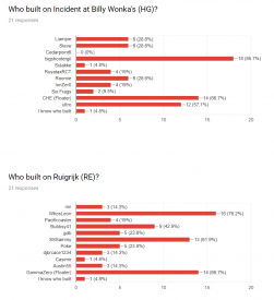
I went with Heaven's Gallery. Billy Wonka, while not being the best park in terms of execution quality it is imo the park with the most heart until now. It is just full of cool ideas and very cool visuals. I mean the supporting archy like for example the village houses outside of the factory were the prettiest and could have been done better with more details and more courage to texture, but it didn't bother at all from viewing the park because this lack in quality did not take away from the experience as obviously this park is not about archy. So I don't care if that is not perfect. You get the idea and it doesn't really look bad. In the village I especially liked the sidewalks, they were effective and convincingly done. The demonstration scene was cool, the cars were a bit blocky though. The detail with the guard lifting the fencing is just super cool.
Speaking of the factory, the general idea of the explosion and the following contamination is extremely well thought of and extremely well converted onto the map. I like how all the candy converts the paths, buildings and foliage. Also the exploded factory building was well done and convincing. Coming to the coaster, damn that coloring is sexy! Refreshing looks! The coaster itself was going a bit slow though. The back part was also cool, good job on the conveyer belt ride, looks really cool. The almond monster was a bit plain and not so good looking though. The coke ride was a nice idea aswell, I especially liked the never ending stream of mentos coming out of the factory. Also the continuity to the background story of the explosion fitted here. The little car ride was nice, especially the trucks going more slowly through the candy was cool. Finally, the area around the swimming pond again just extremely well done. So overall you have so many neat and cool ideas, implemented perfectly into the very cool concept. As I said above I don't really mind that the qualtiative aspects as archy aren't top notch because this park evens it out easily with care to love and fun.
Ruigrijk is also a very nice park. It's on a high technical level, what would you expect less from the builders. I think you succeeded quite well in reconstructing netherland architecture! Tall but narrow houses. First of all I have to agree with schnupz about the whiteness. Liampie's urban window is quite badly shadowed and especially on the bright colours it distracts a lot. That's because the window stays almost white while the rest gets dark on wall facing left (RCT shadow) such that you have an eye tearing contrast. It's not in a way that I can't appreciate it anymore but still it is distracting. The two boats are nicely done, I liked that on one you have a restaurant with terrace which is rather realistic. The panorama ride I don't know if I really liked it. It is quite hugely scaled, the top seems to large for the arm to hold it and lastly the turning panorama cafe on top, while actually quite cool was turning way to fast! You can't see nothing or concentrate on something in your view when you are turning that fast up there! The two mansion like buildings on this side of the map were very well done, I also like the small river promenade over there. Switching to the other side there you have the kick ass duelers. I liked this coaster pair a lot! Nicely embedded into the landscape! Of the station I wasn't too fond, mainly because of the object choice. The roof object doesn't fit too well into RCT graphics, it's just too textureless. The dragon sculptures were okay, but in general these kind of sculptures don't appeal to me that much in RCT. The statue with the froyen knight on the other side of the queue line was a cool touch though, fitting to the dueling theme. Right next to it you have my favourite area of the park. The small bunch of houses with the track of the water coaster running around it is very picturesque! And yes I noticed these houses also have the same roof piece I damned two sentences before. But here they don't distract so much because the roof structure isn't a large piece on its own and broken up by free space, trees and so on. Speaking of the water coaster, apart from this very cool part there isn't so much to talk about it as it's not so long and a large part is hidden by either scenery or because it's underground.
Remains the last part, the mining area. Myself being from a mining town I really appreciate all the nice structures. The lifttowers were extremely well done! Maybe just the chairlift cable was a little too gentle, but that's not a big deal! The coaster was cool, but I don't know if I like the teal that much, it didn't fit so well into the mining theme in my opinion. Nonetheless still nicely done! Also I have to say I don't know anything from Efteling (or theme parks in general) so if I don't get or know the references don't judge me! I'm just judging myself from what I think looks/is cool.
So Ruigrijk was extremly well done but had some minor things that distracted me, but still high quality. I went in the with Billy Wonka just because that park had more (better: showed more) love, hold my attention longer, made me smile.
-

 Liampie
Offline
Absolutely stellar, Roy. Your best video yet. You made our park look so epic.
I'd like to thank everyone for the reviews by the way. Don't think I said that before. Every review is a beautiful gift.
-

 bigshootergill
Offline
Great stuff dude! I love the lead up in the opening seconds of the video... really captured the concept of the park!
-

 Cocoa
Offline
wait... how did you give the peeps protest signs? is that a ride? the custom ride creativity is off the hook, i cant keep up. great video, the narrative structure really worked well for it
-

 Cocoa
Offline
I think I may make a post at the end of h2h just looking back at some of the meta / innovations
custom mumpercars, that krypton cliff object, liampie's brick wall, etc
-
 CedarPoint6
Offline
Incident at Billy Wonka’s
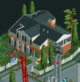
I was worried about this park as it was getting built. Early concepts were all over the place and just weeks before the deadline I could’ve bet money that we were heading for a landslide loss. But as with any Liam driven park, it came together fantastically well in the end and the finished product is almost unrecognizable from where it was just before the deadline. The team put in a really great effort at the end and the result is a fun and unique park with a lot of little details.Conceptually I enjoy how the park started as just a candy theme park and turned into a full storyline of some strange accident at a candy factory which is taking over the surrounding area and causing all sorts of havoc. This is made even better by the Billy Wonka overlay—a jealous candymaker trying some potentially unscrupulous tactics. What I like best about the map are the buildings that are half changed. You can see what it was and watch as the candy fallout slowly transforms it into something crazy. It’s a great way to take the purposefully drab brown and gray and add in some wild color on top.
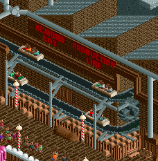
The rides are really secondary to the theme here, which is necessary with this kind of theme. The custom color on the B&M is interesting from how it can be anything from yellow to red to pink to magenta based on how you look at it. I love the Fenix inspired layout though it’s almost funny to see something so realistic on a map like this. Roomie did some wild things with custom rides too. The moving conveyer for the almond candy is so impressive especially for how glitch-free it is. The conveyer dropping the mintos into the soda bottle is also super well done.
All the jokes really make the map. From the dentist office with the line out the door to the off-brand candy (Clittles?), it’s full of clever ideas. The gumball machine dumping them into the lake with all the stuck swimmers is amusing—the bubbling goo turned out really well. In additional, all the named staff really help bring the detail of this park together.
Here are the little things I enjoyed:
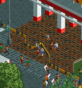
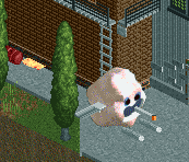
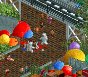
This guy holding up the police tape.
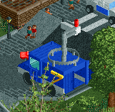
The news van.
Long line for the dentist’s office.
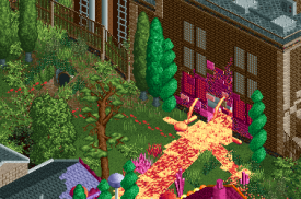
This hole in the wall with the candy spilling out of it and the mysterious footprints leading into the animal hole.
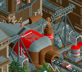
The broken conveyer with the mintos just happening to fall right into the giant soda. Also points for using a very rare coaster type.
This conveyer was super impressive. Great new style of dark ride. Hope to see this used elsewhere. Maybe as an omnimover style?
Fun twist on the classic NE trope.
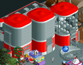
The transformation of the silos from normal to a gumball machine.
The goo creatures slowly forming within all the disaster.
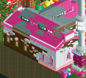
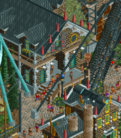
The half taken over buildings are some of the best architecture on the map.
The way the candy spill takes over the path looks really nice.
One of my favorite details--nin getting run over by the gumball.
There are so many additional details and fun things to be had that it was hard to pick just a few. It’s nice to have a break from ‘serious’ RCT and enjoy something as fun as this park. It’s finished to a high quality and filled with so much clever stuff. I would be happy to see some more things come out like this one.
Ruigrijk
I had to look a few times to make sure I spelled this properly. This was a nice little surprise of a park. It looks as If it was meant to be a section of a much larger park, which makes sense given the map constraints and this Efteling inspired theme. It’s still pretty dense, however, and manages to fit a lot of really high detail work without becoming too crowded.
The coasters are my favorite part of this map, though ride-wise that’s the majority. A dark ride could have been cool with the Efteling theme, but I’m not sure how you might have squeezed it in. The duelers are my favorite of the rides. Nice to see them inspired by real Joris without totally copying it. While it doesn’t exactly meet the clearance test on some of the elements, it’s a great layout with excellent racing and dueling points. For as big as it is, there’s enough overlapping track that the ride doesn’t seem to take up too much of the map. Baron has a much nicer layout than the real thing since there’s a little more to it. I think you might have been better served with the smaller trains, but I get that those don’t show the rolls. Great support work on this one too—a good attempt at copying the real thing. Flying Dutchman’s splashdown looks great—as does the whole ride, really. This might have been a good one to do the dark ride portion on.
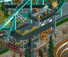
My favorite ride on the whole map is the Flying Island only because I’ve always wanted to do one in RCT but just never got around to it. The cabin is really well done with the roof peaks though the vehicles should probably be spinning a bit more slowly. The landing spot is also very nice with the stacked monorail walls. The launch tower is very well themed and I like how it loads underground and has the path surrounding on all sides above. Really the whole mine area is super well done-- Most notably the conveyer structures. I think this may be some of the best I’ve ever seen regarding this theme. It’s easily my favorite area in the park.
Jumping over to architecture as a whole, I appreciate the detailing of the buildings though they do tend to get a bit repetitive. Every single quarter tile of every single floor has a window which gets to be a little much after a while. I know this is the typical streetscape of this kind of Dutch theme, but I would have enjoyed perhaps a bit more variation in spacing or detailing. Just something to break it up. But in general the streetscapes are nicely detailed and feel very lively on the whole.
Here are the details I enjoyed:
Favorite ride on the map. This looks awesome.
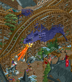
One of the best entry icons as well. Love George as the knight entertainer fighting the huge dragon.
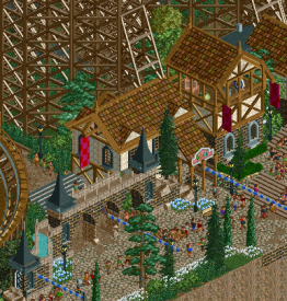
I like this little colonnade of arches here leading into the Joris area.
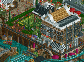
This is a really great façade.
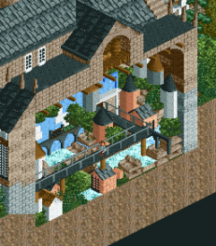
This diorama was pretty neat too. Something different.
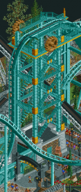
Great support work.
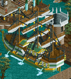
Even though this is the smaller of the ships, I like this one the best.
This is a nicely crafted scene with the architecture and the little path along the river. I like the arches overlaying the brick as well.
The pan for gold attraction is cool.
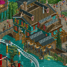
This is one of my favorite buildings on the map. I love the seating area on the water, the doors for stowing a boat, and the blue on the main building. Really nicely detailed.
Great work on the whole. Aside from the coasters, I’m not super familiar with Efteling, so this gave me a good excuse to go explore a little bit and learn some more. This would be cool to see expanded into a larger park with other rides and themes too. It’s especially impressive to see a park come together at this quality as quickly as it was. I think that alone is a commendable effort. Well done!
-

 Xeccah
Offline
It seems like the pinnacle of RCT is just translating photographs and videos into scenery objects, track, and sprites; essentially the "best RCT2 park ever made" will just be the one that takes what is considered "one of the best parks in real life" and photorealisitcally capturing something that already exists. We're beating ourselves to death with this. It says little of the validity of our own little niche artform if all we do is to aspire to reinvent the wheel in an isometric viewform. And just as traditional art in a lot of ways distanced itself from photorealism once photography became a mainstream thing, we too may need to distance ourselves from "what exists" to something more visceral. This is in no way telling people what they should or shouldn't create. And hell, maybe i'm looking too deeply into something I care too much about, and that the abstraction between the tangibility and detail from either real life experiences or of photographs, and the two dimensional, late 90s simulation aesthetic of RCT is by itself enough abstraction to warrant the validity of what we do.Asteroid Fields and Billy Wonka's are openly cathartic to me. I've shared thoughts of AF previously in a post i made in 2015, citing the nostalgia of playing the game for your first time and the fun i had trying to fine everything, but i didn't question its aesthetic very much. In fact I conceded falsely that I liked it in spite of its aesthetic as if somehow it is a drawback to the park. I can see how a lot of people (including me) who are entitled understandably of capturing the essence of real life, as that is the leading camp among RCT philosophy. We want the most detailed buildings, the lushest foliage with perfectly placed rocks amongst the trees and grass, the coasters that looked like Bolliger and Mallibard themselves used your ride design as a blueprint for one of their own coasters. Among people who disagree with this philosophy are people who want to go back to a simpler time where we all pretended to be natelox and build the most well-composed areas areas possible. I've been in both camps; I've built for both groups of people. The olive branch between the recreationalists and the old school nostalgia bros is wanting to capture something in real life, whether it be the minute details or the larger, rougher picture. It's a shame, really, because this art form has a lot more to offer than just that, and Asteroid fields proves it. It doesn't seek to manipulate the innate RCT aesthetic but embraces it wholly to its fullest potential. It doesn't cherrypick the things that we often find sour, usually the cartoony or wackier aspects of RCT, but instead incorporates these things. Asteroid Fields/Billy Wonka respects this game more for what it is than anything else on this website does. Unpretentious maximalism that relies on finding a way to make every part of the design interactive and dynamic (shit that moves) as well as use of the games more cartoony elements rings true that, among the other ways people can capture theme parks- be it video or even more detailed games meant for specifically modeling such parks- RCT has a timeless niche carved in it. We dont have avant garde realism or traditions of old, the things that we venerate on New Element, for keeping RCT relavent. We have people who embrace less the limitations of RCT but the aesthetic of RCT. After all, one can look at any modern RCT spotlight and ask "why does this exist, why not just play planet coaster or nolimits instead?" but that same person cant say that if they'd see any of bigshootergill's parkography. In a way the fun aesthetic is winning out. BSG have never had a leading role in an h2h park and not won. He has a spotlight to his name. And to have beat the king of realism twice, to boot.Anyone who has played RCT as a child has feelings of visceral, unrestrained fun. This in it of itself is an aesthetic, the ace in the sleeve for RCT. It's an aesthetic that we haven't just abandoned post CedarPoint6 but one that is the antithesis of what NE stands for. We are much more willing to worship a drab, intentionally ugly park for how well it captures real life than we are to forego the need for real life and make art that identifies itself as "pure RCT". I'm not soothsaying the death of RCT for our want to create things based on real life inspiration, but you have to wonder why all of this exists to cultivate an aesthetic that can be better executed in other art media when we have one that is truly ours. And by ours, I dont mean NE members, I mean as RCT players.
 -

 Liampie
Offline
Rediscovering H2H8
It's been a while now. Time to re-view the H2H8 parks with a fresh eyes and not clouded with emotion. I'm going to view every H2H8 park and post one focused screenshot that stood out to me or that I think deserves more love.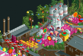
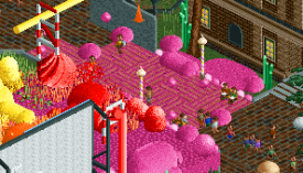
One of my favourite examples of the 'candification' idea that I had, showing the gradual transformation of every stuff like trees and industrial tanks into all kinds of sweetness.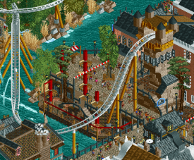
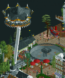
Just seems like an unusual angle/crop. Not intentional and I'm not sure whether I like it or dislike it, but the way the closed umbrellas align make the terraces kind of look like a ship with masts.
 Tags
Tags
- No Tags
