H2H8 / H2H8 Round 4 Match 1 - Heaven's Gallery vs The Replacements
-
 29-May 18
-

 Liampie
Offline

Round 4 | Match 1
--- POLL CLOSED ---
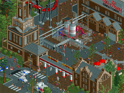
Incident at Billy Wonka's (RCT2)
VS

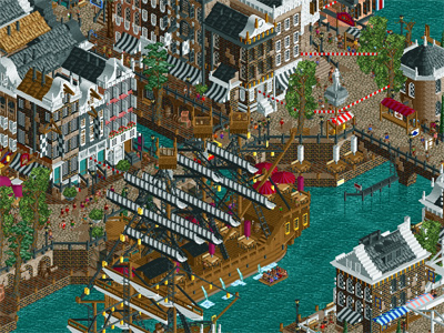
Ruigrijk (RCT2)
Voting Rules
- You should only vote if you have viewed both parks in game.
- Everyone but players belonging to either team in the match may vote.
- Voting will be monitored to improve fairness, and anyone found to be abusing votes in any way will be punished. -

 Louis!
Offline
wow first review is by me, what an honour.
wonka factory. bit too ott for me with colour and schizz. but at the same time so brown. how odd that something can be too brown but also too colourful. not enough polish or sparkle. very garish, but im sure others will appreciate.
dutch park, tons of atmosphere but tons of texture. hmmm. that e though <3 and the layouts are really pretty. i like it.
-

 ottersalad
Offline
Initial review of the parks.. more just a list of pro's and con's.
Ruigrijk:
+ Great atmosphere and detail.. impressed by the architecture everywhere in the park
+ I think this park's dueling wooden coaster rivals the dueler in ACGTH as the best coaster(s) in h2h. It was fun to watch and the turn over the water in synchonization was great.
+ Baron 1898 was done very well. Love the lift tower. That whole area of the park was well done with the mining stuff and the trackitecture usage.
+ The diorama was cool.. don't quite understand it though. Is that a real thing?
- The larger boat.. just looks overdetailed? I like the smaller green/yellow one.
- Maybe it's just me but I'm not a fan of the graveyard quarter blocks and walls.
Billy Wonka:
+ Really colorful and creative.. definitely seems like the builders enjoyed making this.
+ The main coaster is a nice layout I think.. definitely a cool first drop.
- I think the main factory building that houses the wing coaster should've been a cutaway.. really confusing when trying to figure out the building shape and layout and how all the floods of candy work in the grand scheme of things. Comes off as messy to me.
+ Having said that, each area the ride traverses are well done.
- "Clittles Fuck the Rainbow" ... not a fan.
+/- The gumball killing nin is weird. Not sure if I like it.. just figured it was noteworthy.
+ The mentos factory was very well done.. cool use of the football custom ride and conveyor belts.
- I think the use of the colors and the metallic-ish color in the palette was a bit gaudy.
-

 CoasterCreator9
Offline
First impressions;
Ruigrijk: Hard to spell, well built, rather dense for my tastes.
Billy Wonka: Whimsical, iffy humor, colors.
More to come soon.
-

 dr dirt
Offline
I'll preface my review with I think the teams put together two really awesome parks in what may prove to be an important match-up, and that's fun to see. I usually get the sense of which park is my favorite really obviously when opening them side-to-side, but this time I'm not sure who I'll vote for.
Billy Wonka is such a fun and quirky park it's unbelievable. The whole thing really gets the punchy comedic and entertaining park vision across. I consider 'good' and 'entertaining' two separate categories - for example in movies - and to a degree it applies to RCT. I think this park is both. You peruse through this and you find so many cool little considerations that were taken that it really makes it one to explore. For example, the cotton candy workers not being just one group, but there's another across the map. It's that sort of stuff I love, a detail that's not just there for show but actually provides the story that a portion of his labor is sentient cotton candy.
Anyways, I'll review through the park: The entrance town and surroundings was probably the most lacking technically, but that's not to say it's bad by any means. It's quaint and kept the fun factor with the protesters, dentist office, the leak turning things into candy and making everything colorful and zany (including the spiraling of the trees!), and somehow the garages/covers were sort of some of the coolest parts of it. The actual brick factory and gates were really great and I would say some of the factory buildings were amazing. The towered building next to the gates was actually the biggest drawback of the park where it felt like the top/tower was added just for content's sake - sort of reminds me of a JK quirk (and the whole park's style is reminiscent of some of his stuff). The exploded building as a cutaway was a cool idea, and the wingcoaster was nice, if it did take the immelmann a bit slow, and I liked how it was over top of a lot of stuff, but never really distracted.
All the little 'zones' and rides were just phenomenal - the silos with one being a gumball machine is so cool, then the whole course they roll out into the pond was unholy awesome. The giant coke bottle spilling, the top half empty - just wow. Log flumes on the conveyer, the giant chocolate guy bending the pipe, the vats throughout the park, giant cotton candy maker, workers in hazmat gear, the quirky smoke pouring out of exhaust vents, dental carries jokes, actually jokes everywhere. There's so much to love here, none of it felt forced (except maybe the lollipop tower, a bit) and all of it was just great. If I had to critique anything it would be the path texture in the front really isn't my sort of bag, and there was a few parts I thought were sort of sectioned off the path with a strip of grass in between where it might've looked a bit more integrated if a few more things were allowed to sit on the path a bit. Really this is pretty minimal and more of a personal taste; I wouldn't see too many people seeing this as a concern. Great trucks and stuff, too. Yeah this one was so much fun and I'm really impressed with how original it is - almost like Willy Wonka meets Adult Swim.
Ruigrijk - so for an overall statement, this is another really impressively crafted Replacements park and has character on top of that. If I read off a list of things like architecture, foliage, rides, etc - Ruigrijk is solid in them all. The coasters were all great, the GCI dueler's quite excellent and the dive machine was a solid layout that held an awesome presence in it's surroundings. The water coaster's lift was odd like that, but it's hidden so it's not that huge of a deal. Continuing this review starting with the rides - I enjoyed them all, from the viking ship, the elevator and launch tower in the mining structures (I'm not sure the actual name, but loved them), and the river ride was a good inclusion - I'm confused as to if the boats are on a guided course or operated independently as there wasn't an guides for them I could see. And the panorama was really badass.
The architecture of the front was very well done and had some great street level details, and the roof-work was excellent. I did find at times the white in the windows to get a little bit jarring. The work along the river/canal was fantastic; I love how there's a level down at the water! But it's devoid of peeps, unfortunately. Man, I would've loved to have them sitting down there too. But yeah, it's really a great waterline and very memorable if it could've used some touches of underwater foliage. The mining area was my favorite here, the conveyers, the lifts, the way the dive machine was settled in - this area is just all sorts of badass. It did have the park's weak point for me which was the walled of square tunnel exit into the first immelmann, I would've liked to see it more open and have an organic profile. The panning-for-gold was a great inclusion as well. The medieval village area was cool too, it took some textural risks compared to the rest of the park and largely paid off. The use of the light blue flowers I really enjoyed and made a nice complement to the GCI and the colors of the area. I also like that the manor area was there to provide some open spaces. There's maybe a few tiny nitpicks like the steep stairs down to the bridge looking strange, and the well that just sits on the path and isn't a really a well. But it's no different than any nitpicks I'd had of Billy Wonka. They're just that - minor nitpicks. You guys really should be proud of this park, for something I think we've seen tackled before, it turned out with it's own character and has the 'well built' aspect on top of it.
Really awesome match-up. I'll have to honestly put a lot of thought into my vote here - both parks might be my favorite from each of the respective teams so far. Both are honestly impressive and each for it's own reasons.
-
 Mr.Brightside711
Offline
I wanna say that this is the first match-up where I'm really, really torn. I think both parks are fantastic. They are both very different and it's gonna be so hard to pick which.
-

 shnupz
Offline
I mostly agree with Dr. Dirt and will probably put out a longer review later, but I was baffled by something in Ruigrijk
Why directly rip rides out of Efteling? This wasn't a recreation, and it was way too dense to be an actual theme park, but it didn't feel whimsical or surreal enough to be a twisted fantastical version of Efteling or anything (but I've never been there, so forgive me if I'm wrong). I got the impression that the theme of the park was just "Dutch" but there's more to the Dutch theme park industry than just Efteling, I think it would have worked better to do something like All Coasters go to Heaven and pick rides from multiple Dutch parks to work in there. It's not really a recreation either, its just The Netherlands feat. Efteling cutouts??
Another glaring thing about this park for me was all the white. I can't say how authentic or accurate all the architecture and theming is, but damn it actually hurt my eyes to have so much white contrasting everything across half the map. Maybe that's realistic, but it was very hard to take in the details with the holy light of Liam's asshole shining in my face.
I liked the park, don't get me wrong. And I agree that both parks are just about even and this will be a really tough match up to vote on, but I was just confused and would like some clarification. Its not like there was a readme or anything -
 inthemanual
Offline
@geewhzz the ride looks all wonky colorful and metallic because the custom palette they used has one shade that has the colors get more purple as it gets darker, and more red as it gets lighter
-

 inthemanual
Offline
It's hard to keep reminding myself that the poll says "Which park is your favorite?" instead of "Which park is better?". The two are different in this matchup.
I laughed out loud at the line to the dentist's office, and the single space ring inside representing the dentist's chair. I thought several areas could have been executed much better, but the ideas, humor, entertainment value, and replay value on this park are all fantastic.
Ruigrijk (?) is technical perfection. There's so many things that are done here so much better than they've ever been done before, but they all seem like they've been done before. It's a fantastic level of execution, but the only only thing that's truly going to keep pulling me back to this park again and again is the amazing dueling woody. Shipmaking continues to surprise me: there's no way I could match some of the boats you guys made either. -

 FredD
Offline
Heavens Gallery
What the fuck is going on here... Waking up with a headache and opening this park isn't a good idea. It's kinda funny and remarkable how this park is both brown-ish and yet extreme colorful. I like the idea of Willy Wonka having a competing brother. I think you executed your idea really good. The factory really looks like it blow up and it was messed up with some kind of psychedelic candy...
I guess someone is looking forward to Toverland's Fenix, because the wing coaster over here is almost an exact replica
 I do hope the real one doesn't crawl through its Immelman because djeez, pacing is very bad on that piece over here. While the coaster itself looks good this is really a bummer for me...
 Overall this park is not my cup of tea, therefore it's too colorful and the music annoys me as hell. But of course, that all fits the story well... What this parks really makes great and enjoyable for me, looking past my dislikings, is the neat details everywhere. The dentist appointment is hilarious, gumball coaster, mentos/cola, stuck in gum pool...
Good job HG. Great idea executed well. However due the colors and annoying music this isn't a park that I can view for a long time
 Doesn't mean I appreciate what you guys have built. 75%
Replacements
So much Dutchness! I think you guys nailed the Dutch-feeling perfectly, archy is spot on. Also, those two boats are amazing. I am a bit stunned by the park, it has great immersive theming which I think the real Efteling lacks a bit here and there. Real Efteling has most of the times that 'just not it' feeling, like they do some great stuff but it's just not that. This park shows how Efteling could look like if they went all the way.
The coasters are the best example of this. I think it's funny how you elevated the real Efteling coasters and made them better looking and more interesting. I wish these were the real ones. Especially kudos for Joris en de Draak, making a dueling coaster where the coaster trains keep so close is hard.
It's kinda ironic how this park goes up against the team of Liam, who still made the best Efteling archy/park yet. This park is however also very good. For me, the clear winner of this match-up. 85%
-

 saxman1089
Offline
First impressions:
HG - Wow! I love it! So fun, interesting, great content everywhere. For both my limited viewings I was lost in it, which is the most important thing for me. The concept is great, and the execution is there imo. Still trying to decide if I like or hate the candy orange color you introduced.
RE - I've now looked at the park twice now, and while it's good, I can't get over the bright white windows on dark archy. It gives me the impression I'm looking at a chess board everywhere I look, which makes it really jarring to the eyes and hard to focus on everything else. The number of brick textures also isn't easy on the eyes. The rides however, are incredibly designed, especially the dueling woodies. Baron 1898 is great too.
It'll take me some time to ponder, but I'm leaning towards HG at the moment. -

 nin
Offline
Shnupz, perhaps you need to check your monitor settings because on more than one occasion was there a park with more white than ours. We tried to keep it racially diverse.
 -

 Roomie
Offline
- "Clittles Fuck the Rainbow" ... not a fan.
Not that it will change your opinion but I'm pretty sure thats not what it says haha.
On the Replacement park i shall do a proper review post match but the Baron ride is pretty slick.
-

 Cocoa
Offline
Replacements- rijiuigiki
Firstly, I'd love to see the conversation where you pitch to your captain "we make a park thats Dutch... and thats it". Hilariously bold in the done-and-dusted-ness of the theme. But still, very good. The architecture is the clear highlight. While I agree with shnupz and maybe others that the colors weren't always on point, the actual forms and composition and atmosphere were excellent. As for the colors, it gets a bit samey and blendy, especially near baron where there is just too much turqoise. the ride, buildings, and water blend and nothing sticks out as a focus in that area. A secret trick is that those crown moulding objects are too bright when colored white, so I usually just make at least one of the colors if not both grey and usually it doesn't get noticed as not being white. The layouts were top though, especially the dueling woodies which we don't see enough of for sure. My favorite part of the park was probably actually the side section where the diorama is. It had more space to breathe and even a nice creek going down the far edge. Really added some needed context and made it feel a bit more like a 'park'. Anyway, really good work. Your team has been pumping out high quality, clean, and well-made parks. I don't even care that the creativity level could be said to be a little lower than others, you guys are still maybe my favorite of the contest, and certainly the most consistent. BTW, the extra steep paths is a really neat trick I dont understand
Willy Bonka
Before I opened this, I thought there was no way it was getting my vote. Turns out I may be wrong...
Parks like this always make me question my own (lack of) creativity with this game. I would have pishaw'ed this idea within 1 minute if someone suggested it to me. But somehow the idea of "magic candy formula is leaking and turning things into divinity ridge" is actually so appealing and led to so many awesome ideas. I love the leaky bit that's converted the house, the ridiculous line for the dentist, the conveyor belt idea (WOW), the candied drowning pool, the coaster colors (decent layout too), and all the funny little things. Theres a lot to see here. Some stuff is done really well, like the two center factory buildings and some of the vans, and the chocolate factory building. Some is executed less well good, like a few of the "filler-y" factory buildings that are less architecturally impressive. I think the transformative goop is pulled off excellently though, and really helps distract me from some of the less-good archy or detailing. It really shines and makes me smile. I do wish we could see a little bit inside some of the other buildings though, at least with an opening on the map edge.
-
 Ling
Offline
The "incident" portion of Billy Wonka was really cute and I kind of wish that had been explored more (similar to how some older H2H maps have told specific stories of series of events - a la Escape from Rockwood Prison). The music was a nice touch and the bright and colorful atmosphere is a perfect contrast for this round. Some of the humor worked really nicely (dentist's office), some didn't (clittles). One thing that bothered me is that I couldn't get a strong sense of what is supposed to be outdoors and what is supposed to be indoors behind a cutaway. The roof over The Formula looks broken and dilapidated but the shift in structure suggests this whole area is actually internal to a large factory building... but only from one side. That bothered me a bit as I perused the park. The Formula is an okay design, but the other two primary selections (Twizztler and Mintos) both seemed a little boring in comparison to Ruigrijk's wider gamut of design styles, though I do appreciate seeing a reverse freefall coaster used in a high-profile park; we don't get to see those often enough. Another thing that bothered me is I never quite got to understanding whether this "incident" is supposed to be a facility-wide failure or just the stuff at the entrance where the police cars are, and everything else is just part of the quirkiness. This is another point where I think building it all into one large factory with a cutaway might have made things clearer for both the people building and the viewer. Maybe there was a dispute over the direction of the park, or how "seriously" different aspects were meant to be taken by the builders. On the whole though this is something I can't remember ever seeing before, and I've been around for a while, so that counts for something.
Ruigrijk is the "boring" park of the two, with a much softer color palette and a really dense but achingly realistic presentation that gives it a really pleasant atmosphere. As others have noted it rides a line between being too dense to be a real park and not ridiculous enough to be fantasy. I love how incredibly thick the foliage is in the area surrounding Joris en de Draak, and the little path that cuts through it to complete the circle around the park that you can barely see. I love how that balances against the very industrial looking Baron 1898, and the fundamentally different style and feel of that area, and I love that the city/wharf area feels totally different again. These three spaces are sized and separated perfectly, in my mind. I don't know anything about Efteling so I can't speak to that, but the rides and architecture all feel real and believable. The presentation here is great, but I don't think the idea for the park is as great as Billy Wonka.
This matchup reminds me so much of Round 1 Match 1, with a really wonderful and creative thing, well-suited to H2H, up against a more traditional, "boring", but damn-near-perfectly executed park. I guess I'm finally starting to see the pattern in The Replacements' work. In R1M1 I leaned ever so slightly towards All Coasters, and here I think I'm leaning ever so slightly towards Ruigrijk, but I'm in awe at the consistently phenomenal level of quality on display throughout this season, by all teams.
-

 CoasterCreator9
Offline
This is weird. Neither park is jumping out at me this match, and I'm not sure why. Both are very, very different and both are (arguably) done well when looking at one without the context of the other. When directly compared, I think this is a really tough decision.
Billy Wonka's
I really liked the idea of this rouge candy experiment turning normal things into candy. It's especially well done where it's leaking out into the adjacent neighborhood - that was really well done. I thought that parts of this in the factory itself were less well executed as parts of it just became a mess of vague candy colored stuff. The architecture is nice, if a bit repetitive. Beach in a factory? Interesting choice. The integration of rides into the theme was also well done. Coaster's pacing was a little iffy in places, but I really liked the reverse freefall mint cola thing. Overall, it's fun; some of the humor didn't appeal to me, but the park itself is enjoyable.
Dutch Park
Lotte World but Efteling? I can't be the only one that sees this. The rides are the highlight here, I think. Joris and Baron (along with their respective surroundings) were my favorite parts. Strong architecture, perhaps a bit repetitive. Love the gardens and the balance between rides and other stuff. If I had a primary issue with this park, it'd be the density. There's a lot of stuff to look at, which isn't necessarily a bad thing, but there's a bit of an imbalance of most of the rides being localized to one part of the park. Not as intense as Ghibli, but it's the same feeling of being on the border of simply too much in a small space. Of course I have to comment on the ships; I liked the smaller one a lot!
I think I know which direction I'm leaning, but I honestly don't know where I stand so far.
-

 Xeccah
Offline
I don't think i have anything BAD to say about the Replacement's park. At all. I think that's the first park this season I can actually say that. As much as i want to *like* it though....It's missing a level ambition, creativity, risk. Everything is very safe, even more than Carts and Coasters was (consider that doing a cheap american park in h2h IS a risk that barely paid off). I felt like I saw everything within 5 minutes. There was nothing to peel back, or anything to wonder "how'd they do that?". Superficial and perfect. 90%WOW the Heaven's park is UGLY. I appreciate the sanity of the outskirts, which allows the insane to contrast with. Really my only beef with this park is the factory itself; I'd love to see something massive that the rest of the stuff can be inside, but that's fairly minor and NOT the focus here. My jaw certainly dropped a few times while viewing this. While I reamed Haystack for in all reality being nothing but details, I think I appreciate it more here as they contribute to a narrative that was obvious to me from the first second.You've really captured the innocence of this game that was last done three years ago, in Asteroid Fields. And while this was uglier than that, nothing in this map was disjointed like parts of AF were. I've been viewing this for 25 minutes and I swear I haven't seen everything yet. 80%While I will rate the Replacements park higher, I think I'm going with Heaven's Atlas here.
 Tags
Tags
- No Tags

