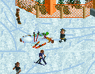
H2H8 / H2H8 Round 4 Match 3 - Team Spacecrab vs Strangelove
-
 27-May 18
-

 Cocoa
Offline
I cant believe i didnt get a thanks for that sexy concept art
Nah good writeup. This round was sort of a floaters-take-on actually -

 ida
Offline
I would've thanked you but i couldn't remember if you made it or if Jappy did.

I got most of the WIP screenshots from the Discord and he posted it there, so yeah.
-

 saxman1089
Offline
Great writeup Wouter, amazing how you guys scrapped basically 3/4 of the park and then came around to finish it up nicely!
-

 chorkiel
Offline
It's super impressive that Haystack was built by the bottom four picks of Spacecrabs. Congratulations, good job.
-
 Camcorder22
Offline
Some more "behind the scenes" stuff going off what sax said, since everyone loves these posts.
I moved to New England in 2015 and pretty much fell in love with Vermont right away. I ended up getting back into snowboarding at the beginning of last year and started trying to go to as many resorts in New England (mostly in VT) as I could. Sax and I pushed hard for an east coast ski resort, apologiess to coup and spacek as they probably would've been more comfortable with a west coast setting. Even if it wasn’t super obvious and the specific Vermont references went over most people’s heads, I believe going all in on a setting we were excited about helped to create a sense of immersiveness. Most of the buildings in the park were based off real places in New England (check my last post), and the chains we included mostly based in Vermont, as well as a ton of smaller New England easter eggs and jokes hidden too. It became obvious early in the building process that we were missing some textures needed for the park, and I ended up making new walls/blocks for the hotel, which I used on every single building I built in the park. I think this piece contributed a lot to the fresh feeling people have described in the park.
People have said both that there were some weird decisions, and also near-perfect execution, and I stand behind most of those decisions and would argue they were integral to the execution. If we were to do the New England setting completely realistically, there would’ve been much less snow at the base of the mountain and on trees, more on the roofs, and mostly leafless, deciduous trees in the lower part of the mountain. However, we would’ve ended up with an ugly ass brownish landscape at the base, with bright ass white roofs against white slopes. It may have also helped to include a weather report in the ski map, as the weather at New England resorts (as well as the spirit of new englanders) is a little unintuitive to people used to higher altitude resorts. About 30-40% of my ski days in New England (even in jan-feb) have been near or above freezing, and a lot of the snowfall happens right around the freezing line too. I imagine the weather in Haystack when you open the park to be sunny and high 30’s/low 40’s. Its been a snowy winter so there’s decent snow pack, but hasn’t snowed in over a week so most snow on paths and roofs has melted. In this setting, I could totally expect (and have personally experienced) spending time outside drinking on a patio or on a balcony, especially bundled up in warm clothes after having ridden all day. Of course these are all risks we took with the theme, but nothing we did was accidental (except the origin of the river which we kind of shit the bed on...). Overall, I learned a lot about balancing accurate representation with aesthetics.
Probably a lot of people are saying “holy shit their 9 and 10 picks led one of the highest scoring parks of the season” and it wouldn’t have been possible without our teammates and a lot of perseverance. As sax said, I spent most of April solo building and put in a ton of hours, most of which were spent continuously re-building parts of the hotel and village. The earlier iterations were far from where they are now, and while I might’ve settled with that in a solo setting, my teammates encouraged me to keep improving and pushing my building abilities. Fisch, dr dirt, and ][ntamin were particularly helpful providing constant feedback and also creating some basic Paint sketches when we would get stumped with stuff. For younger players looking to get better, or experienced players who find themselves in a rut or getting screwed in this contest, I’d say don’t be afraid of rebuilding shit over and over and over. Also listen to your teammates’ advice because they'll call you out on your most self-defeating building habits.
It was also not only super smooth, but a blast to work with my teammates. We had a great time shooting the shit, sharing our ski stories, and adding fun references to the park as we built. Sax and I in particular ended up collaborating on a lot of the mountain itself and I felt our workflow was very natural. Sax is a very speedy, but also deliberate builder, while I have a much more chaotic building style. For example, I created a sort of template for foliage on the right side of the map around the mountain coaster, which sax refined and added to the rest of the mountain, and I went back and improved my side similarly. There were so many things on the mountain that would’ve been a nightmare for my ADD (the skiier rides and all their logistics, RMC supports) and sax handled those brilliantly. He's also responsible for most of the fun ski scenes on the slopes. While coupon’s share was smaller than most people may have anticipated, his lodge was really the architectural centerpiece of the park. His elegantly detailed yet clean building style is brilliant and I was astounded watching how methodically and quickly he built the lodge. He also made possibly the coolest interiors I’ve seen so far in game with the lodge. Of course spacek’s CTR work was amazing as always. It was like waking up on Christmas morning getting to see the skiiers, gondolas, and quad all working in game with the rest of the park. Also have to give major props to Tolsimir for the pallette, without which we would’ve been stuck staring at nasty ass blue ice. It became almost unnoticeable that we were using a palette at all, as it made the rct snow finally look natural.
Thank you to anyone who's given us constructive feedback so far. I still owe Grand Central a full review, don't let me forget guys! -

 Six Frags
Offline
I just wanted to say, very pleasantly surprised by you (Haystack) guys! This may be my favorite park so far of the whole contest and I thought Fisch was on it (which is a big compliment btw
 ). I'll probably do screen-reviews at the end of h2h, but just wanted to pop in here and say well done all, especially Camcorder. I think I underestimated you, if I look what you did on the who-did-what I can safely say your stuff blows me away and definitely the best work I've seen from you!
Also, those ski-rides are awesome and how you hacked them with those backflips, really clever and impressive Spacek!
-

 ottersalad
Offline
Just wanted to say congratulations to the Spacecrabs. It was an amazing park, and I've said in our team discord how I've always wanted to do a ski resort and what you guys did knocked it outta the park! Amazing work too Saxman on your share.. same too to Cam, Coups, and Spacek. Incredible. I don't think theres anything more I can add other than what has already been said.
In terms of our park, I want to say thank you to Jappy, Wouter, Roy, and Russ for letting me to a big share of this park. In the original 4 seasons idea.. It was almost 30/30/30/10 until we changed the layout of the park.. and the really hard part for me was that everything I had built got deleted. That was a huge blow to me personally, but regardless I rebuilt the factory, modeling it after the Glasgow Carpet Factory. I definitely agree with the factory island appearing rushed.. I wasn't sure in the building process how to make the backside of the building more busy with pipes and stuff.. so I kinda kept it. What was done on Willy Bonka was what I wish I did with the football custom ride thing! Darn.
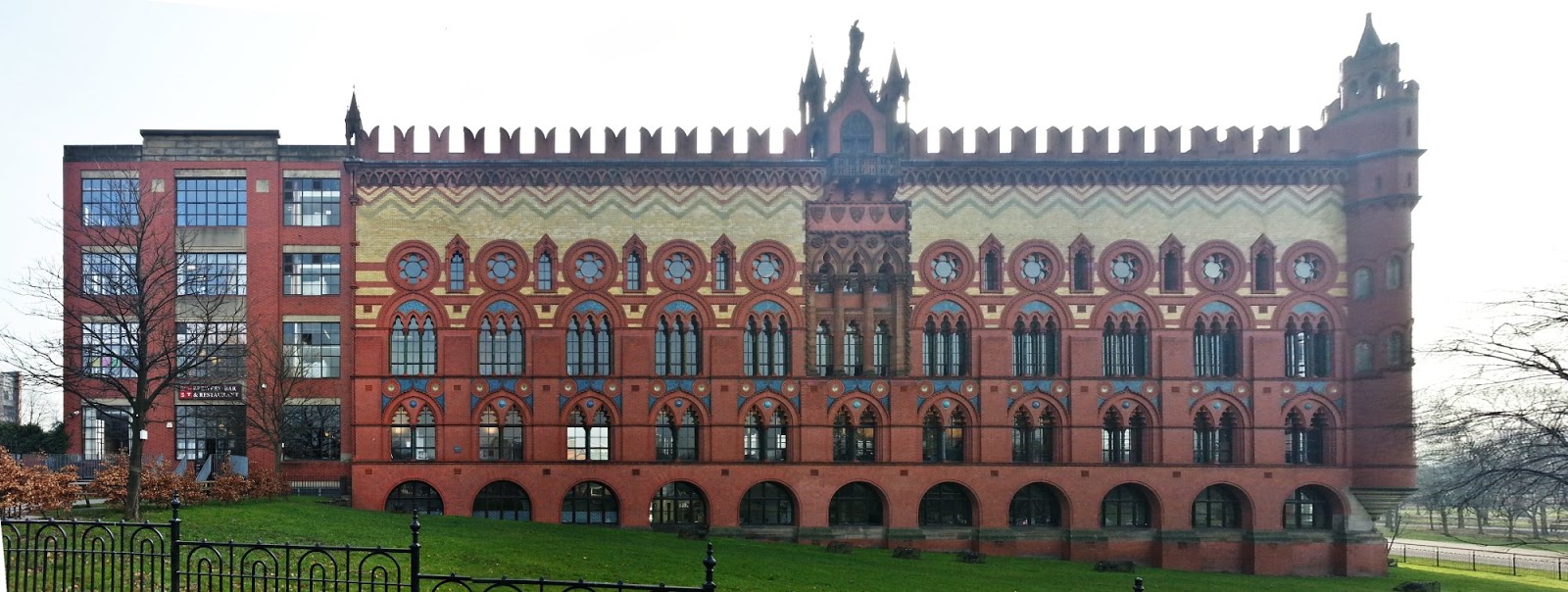
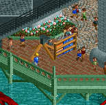
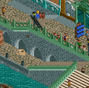
Not sure how well I pulled that off, but it was my inspiration. The rest of the work I did was the two-tiered bridge with help from wouter, and then the boardwalk with the skeeball, sandwich shop, and ice cream parlor. Also, the stock market building was almost a copy of what I previously built on the original map.
All in all, it was a tough project for me, but it pushed my limits as a builder and I think the work I did here was better than the work I did with Arcanis Mineralis.. sorry Avanine!! I had a lot of fun working with everyone, and our team has been very supportive of one another and it's been a real pleasure to have been drafted this year. Even though we lost this round, I hope I justified my draft pick!!!
-

 Cocoa
Offline
just realized I forgot to give a good review. actually I'll quickly chat about both parks
spacecrab
As soon as I saw your park, I knew we were done. Its really fantastic, probably top 10 of the contest. You guys have been hitting hard with your bottom half of the draft! I've only spent one day skiing but it was enough to get and appreciate a lot of the work put into this. The custom rides are incredible- while in some respects I may agree with Shogo that it maybe distracts in a negative way from judging the rest of the park, I think we may just have to accept that custom rides are just a new part of the H2H meta. At the end of the day, that shit enriches the community so much anyway. The tiny thing I loved the most was the pizza skiers, which was me for the whole day, even when my ex dragged me on the harder runs she wanted to do. I think the RMC station being in that little indoor pool complex was incredible and something I would go nuts for IRL. Atmosphere and details were all on point. Great park.
strangelove
I'm really happy with what you guys managed to make here, salvaging a disaster planning/communication-wise and making a solid park. I still back my original idea which you guys immediately proceeded to not really follow
 but enough of that. Watching it come together in the last week was a joy and huge credit to all the builders- Roy for putting his foot down and fixing everything, Wouter for his incredibly archy, jappy for his unending enthusiasm, and otter for being the keenest helper and surprise amazing builder here.
well done all around, maybe we'll see the crabs in the playoffs

-
 Jappy
Offline
You were all great to build with. Despite some initial problems mostly due to poor planning and inexperience, I thorougly enjoyed it!
-

 Recurious
Offline
So I promised saxman a review yesterday on discord for Mount Haystack so I decided to just review the whole round. Also I did not vote in this match up because I was to busy irl, but if I would have to vote I would have voted for Mt. Haystack, seeing as this park won by a large margin, I don't think my vote was really required
 .
.Mt. Haystack
Not gonna lie, I knew I was going to like this park from the moment it was leaked. This park is by far my favourite park of H2H this season. I love everything about it, the concept, the execution, the little details, the new objects, the atmosphere, everything. About two years ago I actually also started working on a ski resort park but never finished it. I had a lot of similar ideas for the park, including skiing and snowboarding guests and ski lifts. However I did not have the patience to finish all the objects. However I am glad you guys made them because they will fit right into my park! Enough about me, lets talk about the park, most of this will probably be in a very random order, I'm just gonna point out stuff that I like as I go over the park:
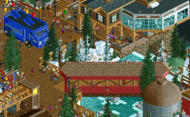
I'm a big fan of these large lodge buildings in the village. It instantly sets the mood of the park and reminds me of my own ski trips. I love the little details like the ski racks and the transition from snow to dirt on the walkway under the building. I also liked the ice skating rink in the village, it also adds a lot of atmosphere I think. The only thing I wish you guys had done was to extend the lines with lampions/flags/whatever (???) which are near the foodtruck and the coffee stand so it would also cover the ice skating rink, I also would have liked perhaps another stand or some more tables near the green building to really create an even more cozy environment around the ice skating rink.
Both ski-lifts are great, especially the stations of the chair lift look very true to real life. The only thing I wish you guys had done differently was the size of the cables. They are now very thick which doesn't look that good imo.
I like the working snow machines on the slope, really a neat idea. The restaurant beneath the snow machines is also great, it is so true to real life. The ski racks and the ski's outside the restaurant also look very recognizable and add instant atmosphere to me.
I also like that every now and then you have a guest snowboarding/skiing of the big cliff in the top. I thought that was a fun little detail.
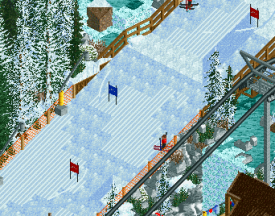
The rennstrecke was also a nice detail, well executed and I especially liked the finish area. Also I'm a big fan of the piste sign at the top of the rennstrecke. It looks exactly like these signs look like in real life.
Then the elephant in the room, the RMC. A lot of people did not like it. I thought it was pretty cool. The tunnel in the lift hill was nice, and overall the layout was one of the better coaster layouts we have seen this H2H imo. I thought the hill over the kiddie piste was also a cool detail. Talking about the kiddie piste, I liked that as well. The usage of dinghy track for the lift was nice and fun but what I liked most was that guests actually went on the lift with their ski's and snowboards on. I guess you guys probably just merged the track here? But it looks great and was a fun little detail to me!
Snowville was a cute little area. Liked that.
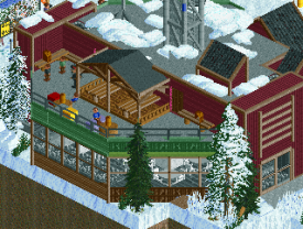
Then the red building, I really liked the entrance area of that. I'm a big fan of these big triangular wooden structures. The interaction between the RMC and the water slide was also really cool on the inside. I can't imagine how this would work with ventilation and keeping the temperature right in real life but it doesn't matter because it just looks so damn cool.
Another thing that I really liked is the waterfall on the mountain next to the rennstrecke, I love the orange fences and overall it just looks how I would expect it to look like in real life. Especially the way the balcony of the restaurant hangs over the waterfall looks pleasing.
The helicopter rescue was also a fun detail which I liked.
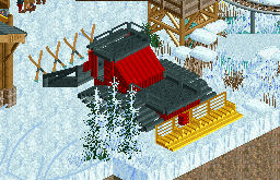
Lastly, I really liked the weather station, it looked great and the snow piles on top really sold it even more.
As you can probably tell by all the dicksucking in this comment, I really really liked this park. To me this park is about as good as it's gonna get. It really reminds me of my ski trips with my family and gave me a bit of nostalgia. Well done guys! 100% from me.
Grand Central
What most people don't know about me, is that I too, really like trains. Therefore I also really liked this park. What I like most about this park is the layering. There is so much happening on so many levels which really makes this park great to me. There is always another layer to look at.
I liked the high speed experiment rollercoaster and how it interacted with the environment, looked really nice imo. However the block of architecture near the high speed experiment rollercoaster did not really do a lot for me, it looked nice, but I feel like just a bit more details would really have helped carry this over the top. I do however like the interaction of this block of architecture with the coaster, especially how the coaster comes out of the tunnel from underneath it.
I'm a big fan of how the central station was elevated above buildings, like I already said I like this multilayeredness.
Then the island with the dive machine on it. The circular lift on the dive machine was very cool, neat idea. Also I think that technically this area was quite cool. However because this area was so remote I feel like it lacked atmosphere and movement a bit. I still liked the crane and the poster pole or whatever you call it. What was also nice was the loading platform for the train with the conveyor belt, well done on that! I also thought the red and green tanks where cool.
What I unfortunately did not really like was the bridge leading to this island. (The green and grey one). It just felt a little underwhelming and empty to me compared to the rest of the park.
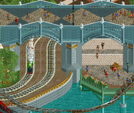
Speaking of bridges, I adore the diagonal bridge connecting the grand central station with the other block of architecture. The way the two train tracks move under it is really cool. The architecture between this bridge and the other bridge looks a bit lifeless to me with the exception of the black building. It is still good, but it just looks very flat, especially the building that has the coaster coming out of it.
Speaking of buildings, I like the building with the green roof next to the water area of the high speed experiment coaster. Especially the interaction between the coaster, the building, the bridge over the water and the rockwall looks great.
The "poor people neighborhood" area was a neat idea although the buildings itself did not really look that aesthetically pleasing, but ofcourse that was how it was intended. I really liked the way the train track just went through the neighborhood and the interaction with the high speed experiment was also great.
Overall I also really liked this park, even though there were some small things I would probably like to see different. I would still give this a solid 80-85%
-
 Coasterbill
Offline
Fuck, I’m sorry guys. I fucked up that vote.
I just switched my phone the other day because my old one was a glitchy POS. I was sort of worried it might have glitched out on this.
I meant to give this an 80-85 -

 CedarPoint6
Offline
Grand Central
This seems to have been one of the least talked about parks during the entire contest and that’s a shame. There’s a lot really cool things here. The general ‘trains’ theme is a bit scattered perhaps, but the details and the spaces created around the map are all really great.
Wouter’s stacked path style is so incredibly distinctive mainly because it’s so unique compared to what others are building. And while it is a little odd in places structurally, I like it. The elevation changes as a whole are just really good. I love that pretty much everywhere you look there’s at least 2 levels connected with all sorts of stairs and elevators. It also allows for the buildings to be bigger and work on a couple of different levels, which is nice. The whole area around the main station building has the most life. Although you didn’t complete the interiors on some of the spaces, I do like the visible parts through the glass all have nice details like the restaurant tables or shop shelves. That NE Mansion dark ride is easily my favorite detail on the map- great job on the various scenes.
While I like the industrial area on its own, it doesn’t really seem to jive as much with the rest of the map. It’s not as lively, but is full of some really great details like the cranes and the chute down to the hopper cars. The dive coaster is neat with the unique lift hill. I don’t think those wide cars would work super well with the 1 tile tunnels, however! I think I like the other coaster better just because it’s all over the place, though I question why there are two layers of track here. I would think the mine train rails work fine. The supports are nice, though.
For all the trains, I almost felt like I wanted to see more tracks beyond the main loop criss-crossing elsewhere on the map. I didn’t necessarily like how two of the buildings just housed big hills to move the trains across different levels. I feel like you could have used the levels to your advantage with several different railroads all coming together at the multi-level main station. But I get that this may not have been the idea. The trains do provide some great movement across the map so there’s always something going on. Between that and all the little details and cutaways, I found it was easy to spend quite a while enjoying what the map had to offer.
Here’s the little things I enjoyed:
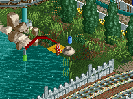
This interaction is very cool with the diagonals, the trains, the paths, and the bridge.
Photographer
Hopscotch
Fixing a light
Fisherman. I know there were even more beyond this, but these are just a few of the cool little details that were fun to discover.
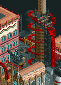
Even though the tunnels may not work, this is a neat idea to wrap the stack with the lift. The crane is great too.
This island with the central elevator tower is very neat.
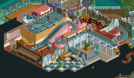
My favorite thing in the map. Such a fun little ride and a nice easter egg since you’ve got to use cutaway to enjoy it.
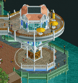
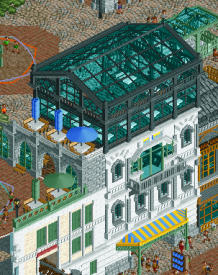
I like this building with the glass top restaurant.
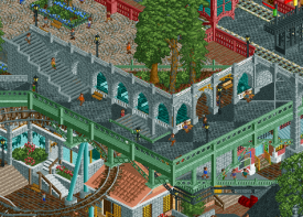
This is a great example of all the elevation changes and how well it all works. Over, under, on top of, inside… the relationships between different elements of this shot is very cool.
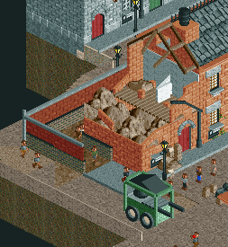
I like the demolished building in the slums area.
I hope over time this park gets some more comments because it really is a great map with a ton of small details. The park could use a little more refinement of style to help everything work together a bit more. But this was a lot of fun to explore and enjoy. Great work!
Mount Haystack Ski Resort
This is one of the parks I’ve been most excited to review as I’ve been going through these. It stands out as easily one of the best of the contest. Snow parks have been done and ski parks have been done, but I don’t think I’ve ever seen one come together just as well as this.
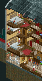
I’ve always enjoyed lodge type architecture, so the buildings at the base of the mountain all look very nice. The big wooden building is my favorite with the balconies and the big roof overhangs. That’s a lot of roof area, but it isn’t overpowering thanks to the building shape. The hotel reminds me of the main building at Buffalo Bill’s in Vegas. The forms are a bit all over the place in some sections, but I do like the overall look. There’s so much detail in the cutaway portion of the hotel from the saunas and working water slide to the proper structural details for the roof. I’d love to know how loud that RMC would be inside this box, but it would be pretty incredible to stand in there and watch it pass by. Up the mountain, the mid slope cafeteria is very nicely nestled into the hillside and the adjacency with stream and the ski slope is very nice.
There’s so much to look at from a rides perspective on this map. I’m so happy that we finally have an alpine coaster vehicle to work with. It looks great. It’s a shame the track is so wide, but you’ve gotta work with what you have. It turned out really well. The new ski lift vehicles are wonderful. So nicely detailed and with the custom tower supports they look awesome. I hope to see these used more frequently. I'm still on the fence about the RMC. I said it didn’t really fit in Mzima Springs, and there’s a part of me that agrees with that here too. I don’t dislike it entirely and it helps that the layout frames the ski slopes but also looks like it came afterwards, which I expect is accurate. This map feels like the right balance of rides while keeping the general focus on the ski slopes themselves.
The amount of movement on this map is what constantly surprises me. I love how many paths there are down the mountain for the skiiers and the varying speeds. It really makes it feel random. The specialty courses are great too like the slalom, the black diamond with the big cliff dropoff, and the technical course with the pipes. It’s so cool to see peeps actually using these. It seems like we’ve come such a long way from building all this sort of thing as scenic to be at a point where these are now operable. Just wow. And this is one of the best maps I’ve seen in terms of the snow application. You didn’t pick and choose which areas had snow on the ground—it’s across the whole map and then the detail is added over top to give it some variation. Between the 1k blocks in gray and ice blue, the Krypton blocks, and the various snow pieces, it’s a varied landscape and doesn’t seem repetitive or homogenous. Everything here feels believable, looks realistic, and is incredibly aesthetically pleasing.
Here are some of the many things I enjoyed:
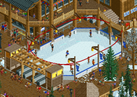
The skating rink is very pretty and the figure skater in the middle is a nice touch.
I like this diagonal covered bridge.
The equipment is all nicely put together.
This little hidden bar at the top of the mountain is fun.
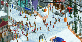
The mess of skis and tracks, and people is so cool. I love this look.
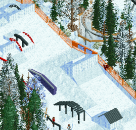
The rail course is incredible.
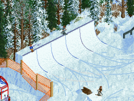
I love the quarter pipe too. It’s a nice way of doing a halfpipe type element without the challenge of building a whole pipe course.
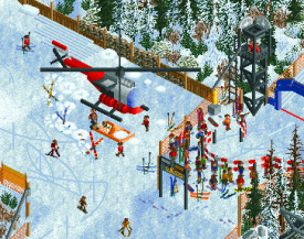
The helicopter is super detailed.
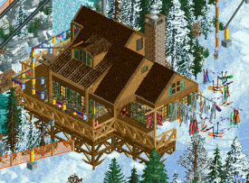
I like this building mid-slope. Very cozy.
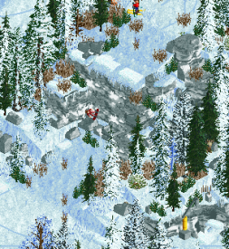
This dropoff is super cool with the mix of rock types and snow pieces.
I like the texture for groomed snow and the more worn skiing lane.
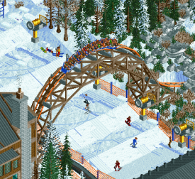
Regardless of my thoughts on the rest of the coaster, this arch is super cool. Feels very RMC.
The detail with the music notes coming from the peeps is neat. I like this entire cutaway setup.
The staff names are great for finding the little details like this. “In:Cities checks on idiots”
I really do love this park. It’s a top 3 of the contest for me I think. The nicest execution of a snow theme I’ve seen and full of so many good details. Great job on this map. Would love to see more.
 Tags
Tags
- No Tags


