H2H8 / H2H8 Round 3 Match 1 - Heaven's Gallery vs. Team Spacecrab
-
 18-May 18
-

 Tolsimir
Offline
Ok I think there are some people interested in the working process of our park. Saxman already stated some stuff but I'll try to go more into detail and maybe explain some of the decisions we took.
But first of all I want to gratulate to Sulakke and Six Frags on the win and they great park they produced. It is one of my favourites this season! I'm not sad or mad or whatever to have lost against your park. It was the well deserved winner and I think we gave you a good matchup, although in the end it wasn't that close anymore. Also, you got your personal revenge on me for the H2H5 matchup Altantic Realms vs Schweizer Valley
 . I don't have the time to do a proper review now, please apologize! But in short, what really made your park were the super fine optics. The textures, colors and forms go along perfectly and just produce a park very nice to look at. The large houses at the street are exactly how I always imagined the city of rome during my latin lessons. Great job on that! Also all the little details you put everywhere were really cool. I especially liked the human sized Go (?) field. Also the small arenes (racing court and gladiator arena) were very well done. The only area that didn't reach the rest qualitywise was the water area around the ships. Well the ships are really cool, I liked the ramming scene, reminded me of Ben Hur (as does the chariot race). However I got a little confused on the ships and the water sitting there on almost the highest point of the map (correct me if I'm wrong), especially the ships there at all, as they didn't fit as much into the realism scope of the park. I know that they flooded the collosseum in ancient Rome to have some staged sea battles, but your "pool" of water didn't really seem too artificial. But nonetheless, this negative point wasn't a too big one in the end. Also like everybody else already mentioned the powering of the coasters was very clever and a really cool detail. So in total the park is really great on the aesthetical side but also on the details it doesn't halt.
My comment on the general concept discussion on the Heaven's franchise: I don't really care. I must say, you can't deny similarities to Tenochtitlan for example (set in historical site, brown, large boats, heavy use of Tenoch's horse object
 ) but still this park goes into another direction being an (more or less satirical) approach on an actual park at that time. I mean this isn't also the first time it has been done, but I can't think of an example, where it has been done better. So, I can see why people say this is the typical Heaven's park, but I think the reason for this is more, that people connect Liam's parks on a 1 to 1 basis to Heaven's in total. And Sulakke and Liam just do have a very similar parkmaking style (see the result of the guessing game). I for myself found the idea of the park good but what's more important, the execution of it is what is acing here and that's why you won this round. I'm not a fan of rating parks on the scope of the whole contest and putting a park behind just "because it's too similar to what has already been done". I think you always should just see the parks in their actual matchup and don't consider parks outside of this scope for the vote.
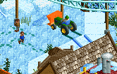
Ok speaking of this I know want to talk a little about our park because it picks up the thought here. I think we took a very huge risk with the park and unfortunately it didn't pay off. Because the park didn't quite come to the result as I/we wished but also because the park went against a really strong contender. So while Forum is a very well executed park in terms of style we put our bets on the execution of the main idea and effect. We relied on the "never done before". Trying to baffle people such that when they viewed the park for the first time they really get surprised by it. But we knew that this wouldn't be enough and put tons of stuff for people to dig into the park and search for changes and such. I think on the first point we succeeded seeing from the reactions here in the forum and on the day of the release in the discord (although I didn't like that people were spoiled there, but whatever). That was really a joy to see how people literally dropped their jaws. However, apparently on the second point we did not succeed. Lots of people thought there wasn't much behind the what they called the "gimmick". It's a shame we couldn't achieve to hold their attention long enough, although we thought we put lots content into the park in terms of little scenes with cool details and clickable stuff all around but also stuff to convey the changes in the seasons to the last detail like the change in the waterlevel during the seasons (well I guess as a viewer I wouldn't have noticed either). Maybe the details were just too invisble and we didn't make them prominent enough like the working snowball fight, I don't know if anyone noticed, but I thought it was a cool detail. It just doesn't jump into your face. So as you can see, a lot of thought went into the park trying to make it interesting. So we really put a lot of thought into this map, knowing what difficulties there would be and trying to compensate them. If you agree on that it's very disappointing to just get comments on the park like "The execution was bad." or "Archy has been done before better". Not one word what made the execution bad. Now I have to guess.
Like I said we also knew what the downsides of the park would be. The most obvious one is the size. With just a quarter of a normal map it's clear that you don't the same space as the opposing team. My argument on this was, that for the price of the shrinking of the map we gain an extra dimension, the time. So what we would lose in space we get as a new axis in the forthgoing of time and to have the map changing while viewing instead of having the static map like any other park. We had the opportunity to tell stories. Well this risk didn't pay off, because maybe we didn't force the time changes enough and didn't put enough little stories.
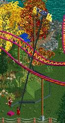
The second risk was the coaster in the park. We had a discussion on if we wanted to conclude one or not. Due to the size we were also limited on this size, so any kind of larger coaster was already excluded. The coaster was built when there was only the large tower of the castle on the map and a general outline of the village. Faas proposed a cheesy spiral lift around the tower so we decided to do this. The layout after that was hard to find. We had a lot of tries and none were really satisfactory. In the end I came up with the second launch and the portion around the church's towers which I found rather cool. But still, I know I'm not good at all with coasters so I can see why people think the coaster is shit. I think it fits well enough into the village. I will come back to the coaster when I talk about the main idea of the park. But yes, this critism I can understand and maybe we would have run off better with no rides at all.
So these two are the mayor negative points this park had and that were clear from the beginning. In the end I think I overestimated the Wow effect the park would bring.
Now let me talk a little about the history of the park and the idea itself. I came up with the idea around five years ago I think when working on a park with incredibly high scenery and it always annoyed me when I turned the camera that I had to find the place where I worked before (you notice this when viewing the Coco park for example). So this way I found out how RCT handle the rotation, and it results that the camera rotates around the landtile in the middle of the screen, regardless what pieces of scenery were in front. After this I thought of ways how to take advantages of this and come up with the rotational map change and the other stuff hidden behind black walls. I also always wanted to do a four seasons park and so it comes that the whole concept was born. As Liam already told in H2H7 I proposed this idea and the idea did fall onto fruitful ground, some ideas came up (however not to such a level as Liam maybe wants to believe). In the end however Liam as a captain decided that the risks from above were too high (he should be right three years later) and the project got cancelled. As I don't play a lot of RCT outside H2H/contests the idea went into the cupboard undone. Three years later now I really wanted to this regardless of what the captain said. ][ did let me go, inspite of the same concerns as before. So I started working on the park outlining the areas and coming up with the background story. I thought of there should be added something more than just then four seasons feature. So I made up the story of the curse lying on the village keeping it in a endless time loop just like groundhog day but in a whole year. The initial story was rather cool I thought, Intamin took it as the inspiration for the super awesome readme. However because of the slow progress on the park I couldn't add the story into the park as I wished and it ended up there halfed assed with the boring heist of Karlo.
Like I said the progress was going slowly on this. Faas and I were sheduled to work on this. Unfortunately Faas couldn't contribute very much. On the one hand because he had some availability issues but also I guess because he didn't get the rotation thing until close to the end :P So most of the primary work I had to do solo. First the castle for which I decided to take the saturated orange as roof color which is a choice I would take everytime again. I think the form/architecture of the castle ended nicely, however I think it missed some details. Especially from the inner courtyard the walls are quite bland and I should have put some more work into it.
In the village I really like how I achieved the pathing with the central square and from there going upwards to the part on the other side of the stream. The corner around the library is the worst part of the park I think as it doesn't have a lot to offer and also because the archy style differs from the rest of the village. The library was an approach on something modern the green house on the other side I should have redone I think as now it looks more like it fled from some town in the toscana. So the park was done in the way that I first built the whole map normally from all four angles on the ground map. No seasonal details were included yet. After that I copied the whole map on a 6*6 grid of 36 freefall towers. By raising the bases of the ride to the exact spots it fast rather fast to do the copying (once after I found everything out already 3/4 were done). Still doing this all was a pain in the ass. After the copying was done we went over to add the seasonal details. Faas let off a comment like "Am I right in saying we finish this thing in two multiplayer sessions?". Well he was wrong. In a lot of places for perspective reasons we had to copy the ground with landtiles and im very glad I got the help of Saxman who did a lot a the work for which I am just too much of a lazy ass. He really helped on everything technical in the park. In the end I wished to have put some more stuff into the map but in the end the deadline approached too fast.
The town is set somewhere in southern Germany, but not in bavaria, more into the direction of the Schwarzwald. Fisch came up with its name. In case you didn't look it up "Winkel" means angle in german. Speaking of which, it was very convenient to build on this once the angles were fixed because we could build in one perspective-style: placing the objects such that it fits from this angle, not caring if its in a good position at all. I also exploited this to have full tile objects on quarter positions or like the walls of the church being also on quarter positions.
Breaking down on who did what;
Faas did the front of the town hall, the christmas market, the sleighing hill, hid tons of clickable stuff in the library and elsewhere
Saxman already said what he did, the biggest part being on black tiling, hiding supports, peepability, copying the coaster and doing supports, adding landtiles and snow on the roofs.
I did everything else
I think in the end we made a very cool park, I agree on that it can be improved on some parts but it's also some kind of pioneering work. It's cool to see it's being discussed on so controversely as you also can see on the broad spectrum of accolade votes. And especially I think the park will be one of the more memorable ones this season which is also nice to know of his work albeit not because of being the best one.
-

 CedarPoint6
Offline
Starting up these reviews again after vacation. Sorry for the delay!
Forum Celeste
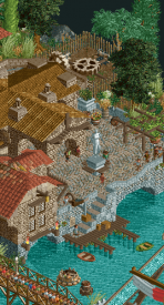
As the competition has gone on, people have seemed to be increasingly hating on custom palettes. That’s a shame because it’s a park like this where the custom look really helps the map shine. I’m a big fan of Forum Celeste. The concept of a ‘dirtier’ Roman theme is a new spin on the typical gleaming white temples and is a refreshing change. I like too that the map is built to look like this is an actual amusement park from Roman times. It interjects a lot of fun on top of a park which is already built to a high technical level.
My favorite part of the map isn’t even in the park—it’s the street at the bottom of the hill with all the villas. The architecture is wonderfully detailed and surprisingly varied while still feeling like part of a cohesive whole. There’s a bunch of really great details, some of which I’ll highlight below. But it’s a pleasure to slowly explore. Color choice is maybe the strongest aspect here. The tri color roof tiles are used to great advantage and the argonath detailing add some dimension to the walls which is quite nice. From being in the team forum, I know how well all of this was researched, which adds even more depth to the park.
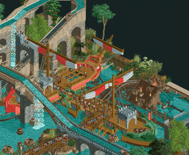
Jumping into the park itself, there are a couple of instant highlights for me. The 2 ships with both the rapids and the flume around them are incredible. The way the queue line runs onto one and transitions to the other is masterful and the definition of good interaction between path, theming, and ride. When I first saw the unthemed layout of the mine train I was a bit worried, but with the theme around it, the ride fits very well. It’s certainly an unorthodox layout, but the interaction really helps it work. The big bridge immediately followed by the side by side dives under the path is a highlight and I love how the terrain rises up so the ride’s turnaround is on the ground and snaking through the arches for the flume. The supporting of the side friction coaster with the stone arches is fantastic. It looks like it must have been a pain to complete, but it’s a great final product.
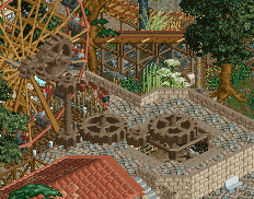
I love all the little details to try and sell the fact that the park isn’t set in modern times. The slaves or the horses pushing the cranks for the lift hills and all the gears and cogs are great. I enjoy all the statues and water features as detailing throughout. Although it is a lot of brown, the foliage really works to cut that (and does a good job).
Here are the little things I enjoyed:
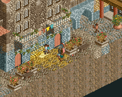
Starting it off classy with Faas getting caught peeing behind one of the buildings. The Roman-ized names were a lot of fun.
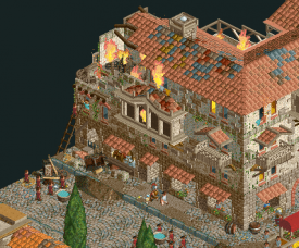
The first and negotiation of the price for firefighters were a fun touch… especially since it was a legit thing back then.
Not so much little, but this area is super well crafted. The queue is well placed.
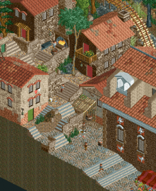
One of the best architectural areas on the map. The elevation change and the little details like the blacksmith are great. Also the church on the right is probably my favorite individual building on the map.
More by the water rides, but I like the arched pathways over the water and also the horses turning the gears at the top.
These gears are great too. And the peek at the horses below the path.
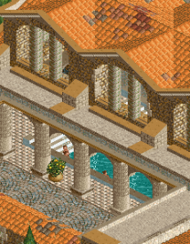
The baths took up a lot of space, but I enjoyed the more orange roof than other buildings and the little bit of a look at the pools with all the appropriate detailing.
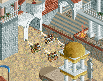
The chariot races were fun.
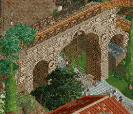
This bridge.
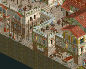
Stompus Grapus was a pretty amusing staff name and all the little detailing here like the scaffolding, and rooftop café are so nice.
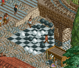
The chess game.
The technical quality of this park combined with the detail and humor made this one of the favorites that our team put out this year. It’s a great looking map with tons of little details to enjoy.
A Year in Winkelheim
Holy cow what a cool concept. I was super confused when I first opened the map until I figured out what was going on. It’s so clever. I can appreciate how long this must have taken to properly set up and complete. A change to one thing would have to be replicated 4 times over. I’m not sure I have the patience for that.
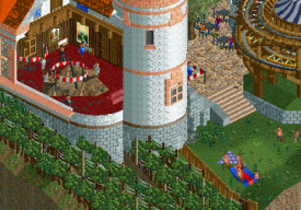
With the smaller map, you really had to pack in the detail and you sure did. Even aside from the incredible storyline of the heist, there’s just a bunch to look at. I did find myself getting frustrated at wanting to see the seasons in different angles than the one we got, but only because I wanted to get more. The cutaways on the buildings helped to give more to look at as well. I was especially impressed with the micro detailing on the insides of buildings. It’s crazy how much was able to get crammed in there and how cleanly it reads.
I think I could have done without the coaster, though I know that’s always a controversial topic. Sure it’s nice to have the movement, but this one really doesn’t have any kind of flow and I found that in general I would have preferred it missing so I could enjoy the stuff behind it. There was a nice attempt to interact the ride with everything at least, but I’d really like to see more of the rest rather than that.
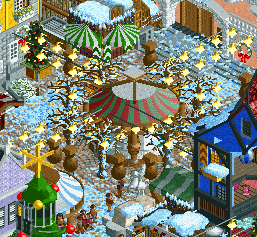
But back to the rest and main idea: seasons. I really love how everything changes per season. The rides and foliage are so cool to watch shift from season to season. The seasonally appropriate activities are great too. Kite flying, sledding hills, picnicking, etc. I think winter is probably my favorite but just because of the amount that the map changed with all the ice and the winter market type thing in the square.
Here are the little things I enjoyed:
Tunneling to the art gallery complete with dripping water from overhead.
The aftermath of the robbery plus the winery alongside the castle was fun to watch grow through the seasons.
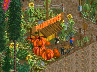
Pumpkin patch.
This cutaway really shows how great the micro detailing is.
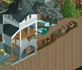
Jakob is a hard worker.
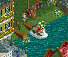
I love the swan boat ride here and how it backs into the dock when it’s done.
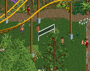
So many great details in the little meadow like Roomie’s soccer ball as a volleyball.
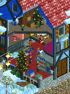
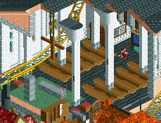
I like this interior cutaway with the columns.
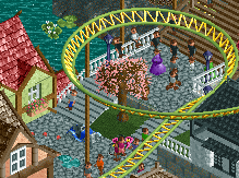
The wedding is a nice touch. Looks like cans behind the car—great detail.
The detailing in this market is super cool.
Kite flying is another great detail.
It’s crazy to me that multiple teams were working on this concept because it’s the last thing I would have thought of. The innovation in the game so many years after its release is incredible. I hope to see other people attempt this concept as it seems like there’s plenty you can do with it. This map sets the bar very high to start.
-

 Liampie
Offline
Holy shit, the cans behind the car! I didn't notice that before even though I already completely dissected the park in an attempt to find every little idea. Shows how ridiculously packed Winkelheim is. Best detailing of the contest?
 Tags
Tags
- No Tags

