H2H8 / H2H8 Round 3 Match 3 - The Replacements vs UltraRealists
-
 13-May 18
-

 Liampie
Offline

Round 3 | Match 3
--- POLL CLOSED ---

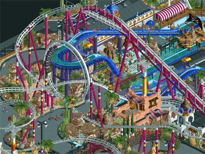
Castles-n-Coasters (RCT2)
VS

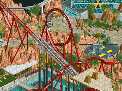
E.V.I.L. (RCT2)
Voting Rules
- You should only vote if you have viewed both parks in game.
- Everyone but players belonging to either team in the match may vote.
- Voting will be monitored to improve fairness, and anyone found to be abusing votes in any way will be punished. -

 Version1
Online
E.V.I.L.:
+Very good atmosphere
+I bet the plane on the golf course is a great joke that I don't get
+Solid coaster layouts
+Both the greenhouse and the chemical factory are really cool
+Torture Device is an amazing idea
+The amount of spy villain themed ideas is great in general
+Also, very amusing in general
+/- The banner/logo isn't really all that eccentric
-Rock spam leads to the map being difficult to take in
Conclusion: My favorite Ultrarealist park yet. I would probably vote in the mid/low 80s.
Castles-n-Coasters
+Very cool postcard and the readme is the only reason I know, that this is a recreation
+Very good main building
+Great surroundings
+All coaster layouts seem solid
+Great architecture in the park
+The mini golf is pretty great
+All around great atmosphere for this type of park
+Great interiors for the cutaway view
-Maybe a bit chaotic (something that you can't really avoid, I guess)
Conclusion: Great park with basically no real negatives. Mid/High 80s here for me
Overall conclusion:
Difficult for me to vote on this matchup. Will I vote for the technically better park or for the more creative one? I guess you'll see once the voting started

-

 saxman1089
Offline
Had a few minutes to check these out before work this morning, will give full looks and reviews later. I feel as though this will be a very close matchup, both parks on first glance appear to be great. Looking forward to sinking my teeth in later.
-

 alex
Offline
Obviously i'm very nervous here - this match is make or break for us. :0
Congratulations on a great park Replacements. I'm very proud of ours of course. Will post a review after the votes. -

 Louis!
Offline
holy moly what a park replacements. love it.
UR, i love what you did with the architecture, flat plane roofs and pillars, someone went to architecture school
-

 Coasterbill
Offline
can we all lol at the identical screenshot thumbnails on the frontpage?
Yeah, I got a kick out of that also.
-

 ottersalad
Offline
Wow, really cool parks to start round 3!
E.V.I.L
+ The rockwork I thought was really good.. it was repetitive, but definitely set the environment
+ The shark tank was neat.. definitely a reference to James Bond.
+ The underground chemical plant was neat.. definitely a full scale underground compared to the base we had in Mekong.
+ The missile turrets and the machine gun pillbox were great additions that gave the feel of the entire map being a secret base.
+ The helicopter is amazing
- Wasn't a fan of the layout of the coaster Arsine (?).. sorry if I butchered the name.
Hard to find negatives!
Castles-n-Coasters
+ cool cutaway views of almost every interior.. such attention to detail.
+ I loved the endless interaction of all the rides... The go karts weaving in and around the coaster supports was nice.
+ The architecture here was also quite stunning.. minus the giant Arabian dome thing. Even the chairlift stations were great.
+ Family coaster with the striped supports was pleasant to look at. I realize it was in the readme, but looks cool to see it in game.
+ While I've never been to the real CnC.. I can definitely tell this was a recreation where you guys tried to work as close as possible with the source material and it paid off quite nicely.
- Didn't really like the wooden coaster layout. It wasn't bad, but was my least favorite bit of the park. Some of the 90 degree turns on the out and back hurt the flow for me. I'd prefer more diagonals that would mimic White Lightning at Funspot. But thats just me nitpicking.
Not sure who to vote for.. definitely enjoyed both parks.
-

 Julow
Offline
E.V.I.L
- Awesome architecture, this building was my big favorite :
+ Roller coasters are great !
+ The whole idea/concept is very well achieved
+ The trackitecture is used right in a veeery pleasing way
+ The helicopter with the tramway cockpit is genius (with other of very powerful ideas over the map)
- Rockwork is very difficult to get into... It's not bad but it's not as powerful and credible than the rest of things of the map, which are near perfection. It's the risk with LOTR rocks, and the color you chose doesn't feel very natural too in my opinion.
An incredible park overall ! Also my favorite of UltraRealists team !
Castle's n Coasters
I'm just amazed by this park... It's so tasteful, the atmosphere is so good !
Every single part of the park was a delight for me, the wooden coaster and supports are so well done !
It could have been another boring "american park" but you chose to recreate CnC and it's a superb idea.
I love how you created new aesthetics, the main building with the dome is incredible, I love how you integrated NCSO stuff here and here, it gives a really warm feel and adds tons of fun to this park.
So joyful and doesn't feel forced at all, it doesn't look messy at all for me.
Clearly my favorite park of H2H8 and it's probably one of the best park of its kind ever done in my opinion !
It's terrible because I really wish my ex team (UltraRealists) to go further in the competition but for me the clear winner here is The Replacements.
Good job everyone though !
(sorry for the quick review)
-

 dr dirt
Offline
After initial viewing I’m about 75% sure I’ll be voting for the Ultrarealists here. It has so much character and uniqueness that it’s hard to not love. I appreciate the scene setting of it too - where not everything is content but is still actively setting the scene.
Replacements park I looked at comparatively less on the first viewing, but want to go in more yet. It looked exceptionally well made, but I’m concerned that’ll be the main thing I can say about it, especially in comparison to EVIL. -

 djbrcace1234
Offline
After initial viewing Im about 75% sure Ill be voting for the Ultrarealists here. It has so much character and uniqueness that its hard to not love. I appreciate the scene setting of it too - where not everything is content but is still actively setting the scene.
Replacements park I looked at comparatively less on the first viewing, but want to go in more yet. It looked exceptionally well made, but Im concerned thatll be the main thing I can say about it, especially in comparison to EVIL.
-

 In:Cities
Offline
Initial impressions from the screens are indicating that this is yet another round of high quality submissions!
Will not be able to download these until next Sunday, but I absolutely love the aesthetic and concept of the UR park from what I can see. Really hoping it meets those expectations once I'm able to view in game, as it would be nice to see them pick up a W this round.
Nin's Spicy Squad looks to gave turned in yet another incredibly executed park as well from what I can see. Always love finding little details, and it looks like this one won't disappoint.
Great work guys! -

 CoasterCreator9
Offline
This is an interesting round. Both parks strong for similar reasons and weak for similar reasons. I'll get around to a full review later when I've been able to explore a little more, but I can tell it's going to be a tough choice for me.
-

 spacek531
Offline
I'm going to Phoenix in June so I guess this matchup is pretty important. Taliesin West 2910 vs. Castles n' Coasters.
-

 Liampie
Offline
Castles-n-Coasters
Wow, that's a lot of very realistic things going on! I see weird coasters. Sadly no castles, unless you count the giant mosque. The most interesting looking thing on the map is definitely the combination of Desert Storm (I like its crappy charm) and the super well executed go karts (I forgive you that the karts are 'jumping' in the turns). The curvy platform in the go karts is interestingly one of my favourite details I've spotted so far. And there's a ton of details! Like the car wash, the Tahendo easter egg and the alex handyman.
The other coasters are well done too. Patriot has an impressively compact layout and cool supports. And actually, literally that for Arizona Wildcat too. Great job. For the rest... all the custom rides and buildings are kinda 'there'. They're cool and perfectly executed, but not the most interesting. I like the music express, the flume and the fastfoud restaurant outside the park.
Okay, on to the interiors that this park apparantly has! Now the mosque becomes the highlight. The checkered floor pattern is great. Looks like some disgusting 80s 90s carpet. All the different arcade machines are sick. They all look different but they all look like they belong. The laser tag bit is fantastic. Downstairs, there's the amazing bowling alley. Again, perfect. Great use of the new ball ride. These little interiors are on par with gee's best moments from past H2Hs.
Sadly, the rest of the interiors were all a bit meh. It's cool that you fleshed out all the bathroom interiors and maintenance rooms, I respect the effort, but it doesn't do anything for me at this point. Staff on smoking break has also become one of the most meaningless NE cliches.
All in all: perfect execution. Some brilliant stuff. You pulled off the ugliness well, but that also works against you as half the park is probably as dull as the real park.
E.V.I.L.
Okay, this park is different. No typical dense H2H madness, but a clear overall composition and room to breath. Looks relatively sparse. Is it though? Not really. It's not TOO sparse, at least. The density is perfect.
The concept was clear before I even opened it. The park name alone tells you everything you need to know. Just 'Evil' doesn't work, making it an acronym tells you that it's a park with a wink. An homage to silly movie villain lairs. And I love it. So simple, but instantly unique. And what really helps this concept is that you didn't get tempted to fill every tile with content. There's no fluff or filler, everything servers the park's concept. And yeah as a result the amount of LOTR rocks is a bit high, but the rocks are well done and don't obstruct my viewing experiences. I appreciate the boldness of going with this look.
Warhead is a good coaster. The lifthill idea is ingenious. Love how you used a swimming pool as a base, reminds me of the Thunderbirds. Not a villain lair, but also an inspiration I suppose? Nice little immelmann. Arsine Wenger in the chemical plant was a little less impressive, but it was good fun watching it. The tunnels kept me guessing where the train would go next. Theming was excellent here. Love all the different vats and things. Love how all the paths are elevated. There weren't many other rides. But the few others rides that were there, again, all served a meaningful purpose. Every single flat ride was good looking and cleverly themed.
The real star of this park is not the rides, but the architecture. It's so different and so cool. You can tell it was made by someone with a real background in design. All those modernist buildings looking like intersecting shards of glass looked amazing in their simplicity. Highlights include the mansion and the industrial looking entrance to the chemical area. The greenhouses are in a separate category I suppose, but they were also absolutely fantastic. The nuclear waste symbols are just next level.
The details in this park were also top notch. All the different vehicles, the lasers and the technology the lasers were protecting, the signal jammer, the plane (with fucking tire tracks!?), the toxic rope course I only just discovered, crocodiles, the mansion interior... No, the park is definitely not as sparse as it looks a first sight. I liked how you didn't litter the place in frozen staff, other than your own team (with clever names). All the staff just served a purpose. Again, great dedication to the theme and focus.
You nailed the theme. The henchmen, the animals, the absurd mix of military equipment and gadgets, expensive luxury goods, local culture (pueblos), and the animals. This is the ultimate villain lair.
Overall I can say this park is fantastic. With a lot of H2H parks I feel like I've seen it all before. Either because it's recycled, or the revival of an old concept, or simply something predictable or common. There's always a few parks that completely take me by surprise though. Dig Site 4 did it in round 1, Forgotten Mekong in round 2, and now you're doing it in round 3. This is what I want from H2H. I want to see new ideas with fresh execution. Only the coasters could've been stronger I think. Otherwise you nailed it. Poll is not open yet and I will look at both parks more, but I think I'm pretty certain that this park will get my V.O.T.E. (Verification Of Tasteful Effort).
One negative point: rotate your fucking trees. Who built this, Fred!? -

 Lagom
Offline
Wish I had more tim[e] to write reviews...
I'm [v]ery impressed by both parks, and both teams should be really proud.
There was one park [i] liked more than the other. Actually, I [l]oved it. -

 FredD
Offline
Replacements
I don't know how much of a recreation this is. I've once seen the real park and it was funny because it looked so weird, well you guys succeeded that recreate that feeling at least very well. It's definitely an original park/theme to do. We thought we saw enough of American realism parks but this one clearly proves there are much more styles of American parks that can be done.
Archy is really, really good. Yet it has a certain dirty feeling as well, and it screams weirdness and awkwardness. Good job. The coasters are good, the small GCI woodie is topnotch! It looks really well there and I really dig that lay-out. It has some serious White Lightning (FunSpot Orlando) vibes, we have a copy of that in Belgium and I really like it. So much fun.
Execution is almost perfect. That's clearly the strongest point of this park: everything looks clean and the theme is executed very well. I really like the park, it looks like the builders also had great fun building it and that's always a good thing to see. 80%
Ultrarealists
First thing thinking when opening this park for the first time: all this pink rocks! You guys definitely went way too crazy with the LOTR rocks, less of them would be better. But the more I view this park, the less it bothers me somehow.
The archy we see here is quite original, someone indeed followed architecture classes... The coasters are good, I like the bit unusual lay-out for the Beemer. The arsene coaster is great too, mainly because it's great environment ofc. Love all the little details: peeps queuing for a torture device, spies plane, the underground stuff, missiles, golf course,... But the helicopter and shark tank are really fucking amazing

I think this is the best UR park yet. Wits End had a vague concept, Mictlan had not so good execution. This park has good concept and good execution! 80%
Hard to chose a winner from these two parks. This will be tight match-up I think since both are great parks. In the end I'll be voting for Ultrarealists. That park kept my attention longer and is somehow more appealing to me. It has a certain 'je ne sais quoi'.
 Tags
Tags
- No Tags


