H2H8 / H2H8 Round 2 Match 3 - The Replacements vs. Team Spacecrab
-
 03-May 18
-

 RWE
Offline
Mzima Springs:
+ landscaping is pretty cool
+ definitely feeling the love i've missed in the last rehashments park
+ Mfalme is a pretty great coaster, was really fun watching it
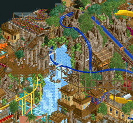
+ Mfalma supports & waterfall shot is lovely
- not really liking the path choices
- archy didn't really amazed me, missing some kind of innoavations and wow moments i wanna see in a h2h park
- feels familiar....
A great park with some cool stuff in it and some cool details. 75%.
Studio Ghibli:
+ very many things to explore
+ viewing experience really is fun, this feels very cute and lovely
+ atmosphere is new and refreshing
+ ferris wheel is pretty cool
- maybe a bit chaotic in some places and hard to read
- feels familiar too...
i think all in all this is a tad better than the other park. Great concept and well executed, makes me wanna come back and look at it again! 80%.
A tough matchup, in the end i decided to vote for Studio Ghibli.
-

 alex
Offline
Ghibli:
Finally someone makes a Studio Ghibli park haha. I seem to recall it being talked about loads and some concept art floating around at one point. This is a really amazing effort which is sadly let down for me by being compositionally almost-illegible. It’s just SO dense. Dig Site was also dense, but somehow it had better spacial definition. Anyway, I’ll talk about the good stuff, as there was plenty. The castle in the sky complex was very striking, especially the stacked town buildings and huge plane front. The hanglider ride for Nausicaa was a perfect match (although what is with this weird lift?) and I love the windmills and how you structured the hill with the rapids and toxic jungle. I just wish there was some more space to really make the jungle as magical as it is in the film. Overall the park captured very well the way Ghibli films combine heavy industry, nature and fantasy in a dreamlike way.
Mzima:
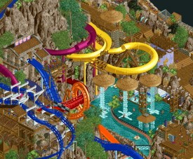
This was a very beautiful park. I think you handled strong and bright colours here really well. Particularly the yellow monorail. All the slides stood out beautifully against all the browns in the rockwork and architecture. It’s great how balanced and cohesive the overall picture is. I don’t mind at all that the concept is very straightforward, infant I would happily see more H2H parks along these lines.
For me the only weak point was the RMC. I think maybe the braces were too sparse or the colours were odd because it just read as schwartkopf track to me. I don’t think it flowed so well either. Finally, the way vertical space is used here is breathtaking:
In the end I voted Mzima.
-

 Iron Rattler
Offline
Studio Ghibli
Ok so I have to start off my review by saying I have never watched any ghibli. So all of the careful references and details this park is crammed with are lost on me. I think most of why this park falls short for me comes from this fact, if I understood the references, I would love the density of the park, but as it stands now, there is just so much going on and not nearly enough room for everything to breathe. This park just throws so much at you, between the lack of my IP knowledge, and the parks business, it was tough to digest. But enough of the negativity, because this is still a damn good park, and the technical ability is incredible.
+The ferris wheel. It's incredible, good shape, smoothly hacked, Awesome.
From an architecture standpoint I think this park really suceeded on the smaller structures. Most of the small buildings were perfectly charming.
+ The entrance. Maybe my favorite area, so charming and atmospheric.
+The mine train. Of all the coasters this was the one I enjoyed the most, it was a lot of fun to watch its journey, felt very cinematic, which is a great thing for a studio park.
+Overall its a great park, and I feel bad for not liking it more, but the density and my lack of knowledge about it held it back in my opinion. I'd give it a 70 personally.
Mzima Springs
- A finished h2h waterpark! That's a success on its own!
- Those sculptures at the entrance. So nice
- Probably my favorite part of this park is its color choice. The muted park colors with the bold bright slide colors is amazing.
- I love wimpi. Great execution of a never used ride type
- I wasn't a fan of the rmc. Good idea, but the execution was lacking
- Still this park does a ton in terms of atmosphere and charm, and won my vote over. Less was more for me in this matchup. Great job replacements.
-

 posix
Offline
I couldn't enjoy Ghibli much, I'm sorry. It has so much effort put into it, but it's way overambitious and crammed. In this case the excessive quantity kills the quality which is otherwise there, just rendered pretty much incomprehensible.
Mzima was nice. So full of detail - also a bit too much, but more digestable. Good colours, good vibe, good love for little things, eg wonderful path work. The big elevation and rock work got a bit out of hand. It's compositionally unfitting. Still got my vote.
-

 Liampie
Offline
Studio Ghibli
Opening the save: music from Coco. Shit. Let me get the files... ... ... Opening the game again. Strings. A piano waltz. Goosebumps! I love Ghibli. Nice that someone finally made a proper park with Ghibli themes. Let's see how you fared!
Beautiful entrance. What happens after is already a little hard to read. For more thoughts on what I think of the readability of the park, see Avanine's review which I agree with pretty much completely. Takes me some time to focus but I can find a lot of nice things here: the entrenched coaster/train with the bridges, the tall tower, the little pink carriage thingy, and the archy in general is pretty nice. The palace looks cool but a bit out of touch with the rest of the map and the interior is anticlimactic. Dead corner.
Totoro was mostly foliage. Think you could've executed the few non-foliage thingies with more care. Is that the rain/umbrella scene at the train station? Nice. Liking the maze too despite super glitchy tree.
Kiki's Delivery Service: I think this area was one of the most succesful ones. It's very charming. Love the two custom flats. The Stockholm townhall looks great. Really good clock.
Castle in the Sky: WOW. What an amazing structure! And the look of the mine train, even though it's not a spectacular coaster with all the flat track, is great. Custom flat: awesome. Everything is awesome here. The archy is deceivingly complex. Brilliant texture use. A ton of details are hidden in the stack of little buildings. I have to say, something that this area did right that the others failed to do, is show Miyazaki's airplane fascination. I think not even Porco Rosso did that well enough. This area is perfect though. Great job.
Spirited Away: some great archy. Some great rides and ride ideas like the dodgems (very clever). I can tell a lot of thought went into the bathhouse interiors, but it was definitely too messy. Again, I can make out some things and references that I like a lot, when I focus. I'm also noticing a lot of glitches sadly. Even with glitches the custom tree next to the bathhouse looks geat though. Neat little area: the path between this area and Mononoke, with the monkey tree. Pretty.
Mononoke: loving the Nightwalker idea and the spikes on the lift. Irontown looks fiiine. Also in this area: Porco Rosso? Should've cut it, dudes! Too cramped and encapsulated by Mononoke.
Nausicaa: the one movie I haven't seen yet. I can say that I like the overall colours. Appreciating the coaster and the windmill design. Rapids are a bit lost between everything, but still with some nice moments. Meanwhile, the tunes from the Spirited Away fade away and I'm hearing the beautiful notes of the Howl's Moving Castle soundtrack again. Goosebumps everytime! So good. Alright, let's wrap this up...
Great park. It's a mess but it has a lot of great shit. Could've been greater with 3 areas cut. Expected/hoped for more airplanes. Soundtrack added a lot but the next time I open this save I'll hear other, irrelevant music sadly. Hopefully not Coco. What I loved about this park that I haven't mentioned yet is that there is A LOT of creative object use here. Partly makes up for the composition problems. There's definitely no lack of creativity (or content) here.
Mzima Springs
It's a water park!! Beautiful entrance, loving the miniatures/signs. Entrance archy is great, mostly on the backside. Not sure where to go next... Left, right, straight, it all kinda looks the same. The entire map looks kinda the same. Which is great because the style is excellent and pleasant, but not great because some variation makes things more interesting and because we've seen this stuff before. I'm going left, towards the halfpipe slide. The colours of these slides look great. Scratch that, the colours overall look great. Congratulations on finding one of the most attractive colour schemes ever. And congrats on making all the slides peepable. What's with the peeps falling down everywhere though?
The red monorail station stands out nicely because of its tallness. Beautiful. The corner with the twisty slides beside it is the only area in the park that looks differently, and I like it. The slides are embedded in the landscape very well. Moving on, there is an area with a lot of path bridges and things, and a badass cluster of thrilling slides. Again, fantastic colours, well integrated, lovely interactions. The composition is so precise here it reminds me of a Swiss watch.
Hey, you included an RMC! Bold choice. I like it more than I don't like it. Wish you picked a different colour for the white bracess. Layout is cool but hard to follow when it enters the mountain. Nice exit over the waterfall though. Wheres the station? You gave the monorail that cool red building, and the RMC gets that little thingy?
Salt cave was a very clever idea. White is the only colour that looks off on this map though. And peach maybe. It's glitchy too, so not my favourite bit of the map despite the coolness of the idea. Last corner of the map: another cluster of slides, and it's quite well done again. The pink/purple slide has the coolest colours on the map and that says a lot. Cool treehouse. Cool poolbar - bit cramped sadly. Is that a little backstage area? Two tiles? Looking around the map there's ten tiles total of backstage. Should've left that immersion breaking stuff out.
Overall: you found a winning formula many months ago. It's still winning now. Composition is very good in this park. Atmosphere is super warm and cheerful. I have to give my vote to Studio Ghibli though, because its composition and atmosphere was a lot less good, it had more balls, more 'magic', and the creative object use. You guys did a stellar job though. This is exceptionally pretty work. -

 ottersalad
Offline
Studio Ghibli
I'll start by saying I have seen some of the movies referenced here, but not all.. so I'm not sure on all of the details you guys chose.
+ just how jam packed the park is.. theres so much here, and the attention to detail I think helped you guys pull it off quite well.
+ custom airplanes were well done.. really neat stuff.
- Nightwalker was a cool layout.. just didn't like how crowded that area was with the rapids ride and the suspended flyer ride. Maybe Porco Russo was too much too. Nightwalker needed more space to breathe.
- Abyss Engine looked messy to me.. the scenery and archy was great.. but the diagonal track and how big the coaster was distracted me a bit.
Mzima Springs
+ The entrance area was really well done.. much like Tahendo.. really sets the scene.
+ Monorail stations were super cool. It is funny how the best stations are for a monorail!
+ I can definitely imagine myself riding rides like Duara and the blue/magenta/red water slides.
+ The waterfall for the RMC was a great vista. Absolutely loved that.
- I think this park suffers the same issue as Ghibli.. super cramped at times
- The RMC just looked funny.. maybe it was the Schwarzkopf track or the white support beams.. Idk. I did like the layout though.
Ultimately I voted for Mzima.. I definitely could picture myself in this park moreso than Ghibli.. also the fun factor of the water park just pushed it past Ghibli for me. Both are super intricate and have great interactions, but Mzima was more appealing to me.
Added a screen of my favorite part.
-

 Louis!
Offline
Studio Ghibli
never seen any of the films, but could appreciate the park and loved it, also helped to understand the source material with the read me.
Mzima Springs
a nice finished water park but very similar to the obvious creator's previous work, but hey ho, good stuff.
biggest review from me so far. good job guys. voted ghibli
-

 Six Frags
Offline
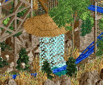
Anyone else have this?:

I have it in more parks, not only here.. Is it an Open problem?
-

 saxman1089
Offline
Duplicate objects maybe? Perhaps someone replaced a version with supports for one without and didn't change the name of the dat?
-

 Six Frags
Offline
it's weird, because there is a support blocker on the tiles of the thatch roof (jasupblk.dat), but it somehow doesn't block those supports. Kumba's wooden support blocker (1kwspblk.dat) does block them though.
I think it's really weird that for some people the ja227 support blocker does block those supports and for me it doesn't.
@recurious, if you delete all the scenery on those tiles, do the thatch roofs still have no supports?
-

 Liampie
Offline
Maybe there's two object blockers with the same name in circulation. But I also know that OpenRCT's collision detection or whatever it's called is slightly different from ClosedRCT. If you open old parks you will often find these black supports in places where they shouldn't be.
Last hours before the poll closes people! Pick a side -

 Recurious
Offline
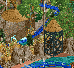
Still doesn't have any supports. If I build them in a different spot they do have supports.
Also while I am here, I voted blank. Couldn't choose between the two parks. I thought both parks were very well made.
I think I may have liked Zula a bit more execution wise but I don't really find it fair that it was already released pre-H2H. (just joking ofc
 ) The waterpark aspect was really nice as I am a sucker for waterparks.
For Studio Ghibli I wasn't really blown away by the overall park but all the little details were pretty cool.
Overall it felt like comparing apples to oranges and in since I like both parks about the same I wouldn't find it fair to vote for either park.
-

 Ziscor
Offline
Mzima SpringsThe first thing one notices while opening the park is how much more cleaner and easier to view it is in comparison to Ghibli. The fact that there is a uniform style and theme across everywhere helps with that a lot and undeniably reminds of Zula except it's much more polished and focused. Having it be a waterpark with a coaster in the middle really appeals to me much like Tahendo did. It's a brilliantly executed idea that doesn't seem to have any major flaws in it, in my eyes. Then, the only place the two differ would be everything outside technical skill. For one, the atmosphere is entirely different from what Ghibli has. It does achieve the exotic waterpark atmosphere very very well, and I can't stop looking everywhere at once. With Ghibli, one had to make sure the field of view was small and the pace of exploration was a lot slower. Not that I think one is any better than the other. Over here you've got yourself pretty much bouncing around everywhere because everything blends with everything else and the amount of detail is never even close to being overwhelming. Kudos on that!The waterfall scene was quite possibly my best view in the park, but you can pretty much say everything in the park looks great. The entrance looks so beautiful and so does the view near "Tone Kubwa" and "Mlima Mkubwa".I think one thing the park would have benefitted from a little would be some text signs to help distinguish areas and specific locations. When nothing stands out too much, there's also not much to remember in particular in retrospect besides 'that one building' or 'the thing with the stuff on it'. Maybe it's a conscious decision to make it more immersive on a peep scale, idk, but something I'd personally appreciate. Helps add character for a park like this.In the end I think I'll go with Ghibli although this was way too close to reliably call. Though, I'll probably regret voting one way or the other in the future anyway. It's just that right now, Ghibli Studio resonated a lot more with me and is one park I think I'll come back to more than this one. Maybe? Probably. This was such an amazing end to Round 2, damn. Both teams did such a good job, definitely a fan of both.
 -

 Scoop
Offline
I apologize for the post I thought it was past the deadline cause I went off of the posted time.
 Tags
Tags
- No Tags
