H2H8 / H2H8 Round 2 Match 1 - The Icons vs. Heaven's Gallery
-
 29-April 18
-

 Roomie
Offline
Howdy all
Thanks to CP6's dissertation I think most about this park has been explained but a little from my side.

I clearly surprised a few people building on this which is kind of cool and I thoroughly enjoyed building with both CP6 and Ultro.
It Sucks we had to lose but if we had to lose I'm call with it being to Tubiao and Robbie. Its funny that I got to play with one of my best friends in the community on this park and then promptly lost to the other one.
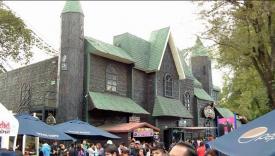
in terms of references I think this picture shows one of undoubted influences really well.
This is the real ghost train at La Feria which was modified (see stolen) for this park
As mentioned by CP6 I did most of the custom built new rides in this park like the Football games, the dragster, the rotating ghost train etc etc.
In response to some of SpaceK's comments about why rides like the Dragster were done in a certain way I actually learnt ride building from scratch when we started this park. The reason Dragster ended up being done the way it was was because at that point in my learning process I simply didn't know any other way to do it. Obviously as things progressed things got better and I did things more complex and simplified my processes.
And I have to thank X7123M3-256 here for giving me plenty of advise on the structure of files and some good references to look at as i learnt to build new rides.
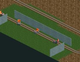
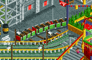
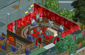
In the case of the Ghost Train which I think is one of the stars of the show here. (even if i do say so myself) with CP6 doing an exquisite interior around a modified ride type that was an absolute pain in the ass to create. I will publish a full tutorial on how rides like the ghost train work at the end of H2H but for now here's a couple of screens from earlier test versions of the ride
Early version allowed 360 degree rotation and had different car type. But the animation wasn't really smooth enough for what we wanted so it was switched to 180 degree total rotation (90 either side) and a smoother animation
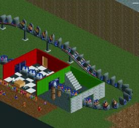
A much later design shows the 180 degree rotation having been setup and now fully peepable. One of the quirks of using the 4D system to do this is there are 8 possible animation positions. Doing 90 degrees each side used only 7 of these. -90 -60 -30 0 30 60 90 which left one over. So i used it to turn peeps into ghosts which was used in the final scene in La Feira
This test screen also shows the ride setup as an Omnimover. Which looks great but doesn't work that well in RCT due to the loading process (the whole ride loads at once cycles once and then unloads in its entirety. Not quite how an Omnimover works.
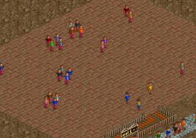
A lot of people commented on the Dancing peeps which is also one of my fav little details. The ride is essentially a reskinned Virginia Reel. The trains were made invisible while being set to spin slower while the peep sprites were replaced with some sprites taken from the g1.dat file in RCT2. The problem with these is the sprites in the G1.dat show peeps at only 4 angles where a ride like the reel has many many more angles. I tried multiple animation sequences of the peeps but most of them looked like the peeps were having an epileptic fit.
Scrolling through the peep frames in the g1 i discovered the animation of a peep looking directly at the viewer and waving to get their attention. I cant think when this is used in the game proper? but it made such a funny dance animation I just had to leave it

An early much larger test version
Anyway I'm glad people enjoyed the park and although we lost i think its a piece of work all 3 of us should be proud of.
And on the silver linings front. Next time I go for a drink with Robbie its 100% his round first

-

 saxman1089
Offline
I cant think when this is used in the game proper?
It's when you beat a scenario. They all look at you and clap.
-

 AvanineCommuter
Offline
It's when you beat a scenario. They all look at you and clap.
Its kind of creepy AF -

 bigshootergill
Offline
Tubiao Action Park:
Top 5:
[1] Incredible architecture, really sold the setting for China... just real life, very down to earth... Robbie managed to take it to another level once again
[2] So many little details to sell the setting of the park (as H2H should)... like the car crash, the bustling highway, various trains (operational and broken down), bike tours
[3] Just like FF, the way you were able to integrate such a variety of extremely well designed, true to life rides was amazing... so much more forethought & planning goes into parks like this
[4] I know it wasn't the most well received palette, I actually like it. I guess I can see it being smoggy, but just overall I think the new palette's are adding another dimension that NE needs to keep interest alive on the site. Also, just the colorfulness of the park, while also being realistic, was great. I love a park that pops.
[5] I really think the archy inside the park was on point too, it was quirky and fun, but nails the proper atmosphere this park should have.
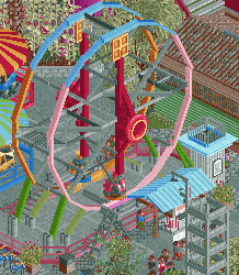
My only real complaint is I'm not a fan of the huge ferris wheels... it's amazing that we can actually build them with all the hacking skills out there, and it has good reason to be there... but I just don't feel it looks great.
Feira da Flamengo:
Top 5:
[1] The atmosphere around the park entrance was a high point as I saw this being built, I love the little shops and stalls, the strings of lights were tastefully done (not overused), the subway entrances, little soccer game off to the side (great ride design by Roomie).
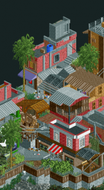
[2] Back side of the park had it's own highlights, the favelas by ultro were dynamite. Obviously a larger map could have created this look even more so, but given the restrictions of H2H, total hats off for pulling that off with the right amount of grunge, garbage and graffiti. And who does like a good gang fight?
[3] Inside the park, the new ride developments/hacked rides were great. A few personal favorites were the slingshot, the Screamin's Swing, Samba & Condor (and all friggin peepable too!!!!).
[4] I loved seeing these coasters come together. CP6 is like a world class brain surgeon of rct coaster construction, unbelieveable amount of skill and knowledge in each of these rides.
[5] The way this park came together in such a tight space, like Tubaio, is awesome. When the idea was proposed to put this park together, and even as it was being built, I did really have the vision of it's completion, but the planning and harmony within the park itself is fantastic.
- Improvements? I guess the area that Tubaio excelled in was it's surrounding architecture, where as the street buildings in FF were more flat, so more attention to the archy.
-

 Six Frags
Offline
<3 Roy, excellent video once again, really love it! Especially loved the cutaway view of the ghost train dark ride and the effects you used with that.
-

 robbie92
Offline
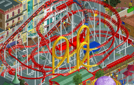
Wow, I'm incredibly surprised with how the vote turned out! FdF is a phenomenally atmospheric and immersive park, with some of the most ingenious ideas I've ever seen in the game. Rarely has a park felt so damn alive to me, and the composition surrounding that gorgeous woodie was absolutely fantastic; the diagonal double-down is as potent of a coaster moment as SPQR's diagonal triple down and Denali's batwing.
I first just wanted to say thank you for the feedback to this park. I know that my history in past H2H seasons can really be boiled down to failing to match expectations (whether those of the community or my own, I can't fully say), so my intention for Tubiao was to do what I can do best, which is execute a simple concept. I've gotten bogged down in themes and narratives before, so my intention was to do something where I could focus pretty much entirely on execution and smaller ideas without worrying so much about "the big idea." That's mostly why I stuck with a more strict realism park, almost as both a way to make sure I didn't run off the rails while building but also as an ode to some of my favourite H2H parks like Belmont Shores and Sea World Sydney, both realistic parks executed flawlessly.
The park itself was almost a means to an end for me. My trip to Shanghai in January left me incredibly inspired to replicate that type of urban atmosphere, from the lived-in intricacies of the architecture to the unplanned and chaotic urban infrastructure that supported it, to the bustle of activity that made the city such an incredibly vibrant experience. I initially wanted the map to be predominantly city, with the park itself being a smaller element of the whole instead of the focal point. However, I realized that the site would probably be more receptive to a park setting, so the idea of the park itself grew from a tiny children's park to a larger entity.
While the execution of the city was meant to be a love letter to what I experienced while in China, the park itself was an atmosphere I wasn't too knowledgeable of, so I found myself relying heavily on the various trip reports of all of the off-kilter parks that enthusiasts have visited over the years. In these reports, I found that everyone seemed to have an appreciation for the spirit of these parks, that there was a loveability to them even if the coasters were rough, the theming was beaten-up, and the flats straight-up wonky. It's from these reports that we decided to move forward with having an enthusiast group visiting the park, being the audience mirror in a way. Certain things were planned that didn't make it in, like peeps taking a group photo or peeps lamenting that their 300th coaster was a crappy loop-screw, but we were able to capture that again in the readme, which Coasterbill did a fantastic job writing and Version1 did a fantastic editing job on.
Part of the reason this ended up a solo was mostly from me being so inspired that I'd just keep building, and I appreciate my team giving me the leeway to just follow what I was feeling. Louis did a fantastic job on the corkscrew layout, and Version1 was a great help with finishing off the freeway supports for me.
I'm especially happy with the comments about object use and detail in this park, as that's a goal I always try to push forward with my work; I may not be a big ideas guy, but I'm pretty happy with my execution, and it feels really nice to see that acknowledged haha.
Anyways, I didn't mean for this to get so long, but I'm incredibly grateful and astonished by the reaction to the park. Love you all!
-

 CoasterCreator9
Offline
we were able to capture that again in the readme, which Coasterbill did a fantastic job writing and Version1 did a fantastic editing job on.
Knew Coasterbill had a hand in that readme somehow! Well done.
-

 FredD
Offline
Since my team is involved in this match-up, I've waited to review them but both are very great and deserve a well written review!
Icons
It was great to follow the building process, and also ofc great to see another Robbie solo! The love you invested in this is partly the reason you finished it on your own a week before the deadline. Who else could have done that?! Kudos for that! I'm a coaster enthusiast myself, traveling around the world doing roller coasters and these kind of Chinese parks are famous, lol. We haven't seen it done on NE yet so you definitely picked a good idea and theme to execute (instead of my 'laugh with Russians-park' in R1
 ).
).I once said that outskirts are overrated and don't do nothing. More and more I'm being proven wrong. I mean, if you delete the outskirts here the park would still be good but it's pretty obvious the outskirts give it the right context and pulls it up to another level. The outskirts are beautifully executed, I love the messy wires, the signs, the traffic (jam),... I know you were afraid it was too messy but it's not. It just has the right balance between messy and clean. This outskirts are just like how I imagine Chinese cities to be.
The park itself is amazing. If you can make an ugly park looking good, well, than you have skills. The same goes for the coasters. They don't seem fun or smooth to ride, but in some way they look good. Overall a great park to be proud of. And of course, the first win for our team!
Heaven's Gallery
Funny how you guys came with almost the same concept, but in a whole other setting. Just as China, Brazil is also a quite original theme/setting. I like how the theme park is right in between a rich and poor part. Though the archy around the entrance (in the rich part) wasn't always up to par imo. Some buildings were great, others didn't do much for me. The favelas however were great, the best part of outskirts on this map.
The coasters were fun to look at. We don't see these old Schwarzkopf coasters enough! But of course the highlight of this park are the custom flat rides. The dancing peeps and footballing peeps were amazing and a shocker to see. Other details were also great to see: peeps from the favelas sneaking in, street football, metro station, the olympic rings...
One thing that was strange for me is the placement of the old broken down Vertigem coaster... Can someone explain this to me?! I can't see any path how it must have been, surely the wooden coaster must have had a cut-out for this coaster? Can't imagine it was outside of the park limits either... It kinda looks like it was added thinking much about the history of it.
Nonetheless, great submission. I thought the score would be tighter but ok... since our team won I don't care

-

 Gustav Goblin
Offline
I'm glad Tubiao Action Park won this round. Feira De Flamengo was gorgeous, but Tubiao had the character of a cheap bootleg Asian park. The coasters are spot on, with that distinct Asian charm offset by a horrendous riding experience. I feel like the use of bootleg Asian manufacturers allowed some creativity with the designs, especially Jet Star Super 3000 (whose name I absolutely adore). The rest of the park is great too, and I love the little touches like the derailed kiddie coaster. While I'm no expert on Chinese architecture, there's so much attention to detail in the park's surroundings. Although the smog palette hurts my eyes, it's the cherry on top of this sundae. That is, if said sundae were artificially manufactured in a dirty laboratory under the name Jen Berry.
-

 CedarPoint6
Offline
@FredD: Vertigem was meant to take a big loop around the park. Sort of like a jet coaster style ride. The lift would have been pretty short-- almost where it was stopped in the ride. The pathway is there already, just broken. if you look in the middle of the wooden coaster, there's a fence up in front of it. But then the abandoned section of the path goes over the flume before fading out into nothing. It picks up again at the base of the tower.
-

 GammaZero
Offline
china #1
I don't want to rain on your parade, but both parks have done this very well. Since people have more of an interest on Asian parks, most of the clever references and research on Brazilian rides, fun fairs, architecture and lifestyle went unnoticed.
I absolutely loved both entries, but I would have voted for Flamengo. However, I didn't vote, fearing that bias might cloud my judgment. Maybe more people should think like that
-

 Tolsimir
Offline
A little review from my mobile. I thought that both parks in the park area were equal but Tubio exceeded in the outeriors. Thus I voted for it.
Flamingo:
The park setting is a refreshing idea and rather well executed! The Rio setting was convincing as was the little torn downness of the park. All felt a little old, which from the readme should be achieved! Good job on that. I particulary liked all the rubbish lying around (what a stupid cliché though ). The favelas around were really well done, the rest of the city a little too sterile and unispired, especially the interiors were a little boring. What made this park great are the ride ideas. The soccer was really cool, the dancing creepy but also cool. The ghosttrain didnt work for me. What i found a little disappointing was the note on using the cutaway view but the inside was actually somehow almost unthemed and boring. The other ride/activities ideas were executed very nicely. Although i doubt the existance of a drag race in a theme park
The archy in the park was nice and hat cool details. I really liked the use of the colored bushes as decoration.
All in all a very nice park that lived mostly from the ideas and ridedesign. The duelers were cool!
Tubio:
Wow, this park felt so close to actually depicting the reality. The outside buildings felt so liveful and did, what the ones in Flamengo missed! They actually felt like people living and working there, there was none of the strange sterile feeling that comes in RCT more too often. Chapeau robbie on achieving it! The trafic was also well done, the highway was so cool! What was a little strange was the tramline under it. It looked a little unfinished? With the cables just stopping in mid air and the rails leading onto the crossing and just ending there. This is the only weak part of the map. The park itself was also very cool! Ride design again was really nice and the (awesome) readme added perfectly to it. Just the ferris wheel/octagon was a letdown as it imo just looks bad. Colours were spot on, the smog was a cool touch!
As I said in the beginning I thought the parks were equal more or less. Flamengo had the cooler ideas but in the end I went with Tubio. It is an example that not always the cool ideas win matches. This time it was the flawless execution that led to the final decision. Good job both teams! -

 Roomie
Offline
Thanks for the review Tolsimir but just to pick up on this bit

The other ride/activities ideas were executed very nicely. Although i doubt the existance of a drag race in a theme park

Cmon Tolsimir you know me better than that

The dragsters are very real rides although not ones that lasted a hugely long time. A few existed at some fairly well known although smaller theme parks in the USA including Lagoon.
The ride i think still hold the record for the fastest acceleration on any thrill ride in the world going from 0 to 120mph in under 2 seconds. Which is twice as fast as TTD at Cedar Point.
Some examples
Top Eliminator Dragster - Lagoon
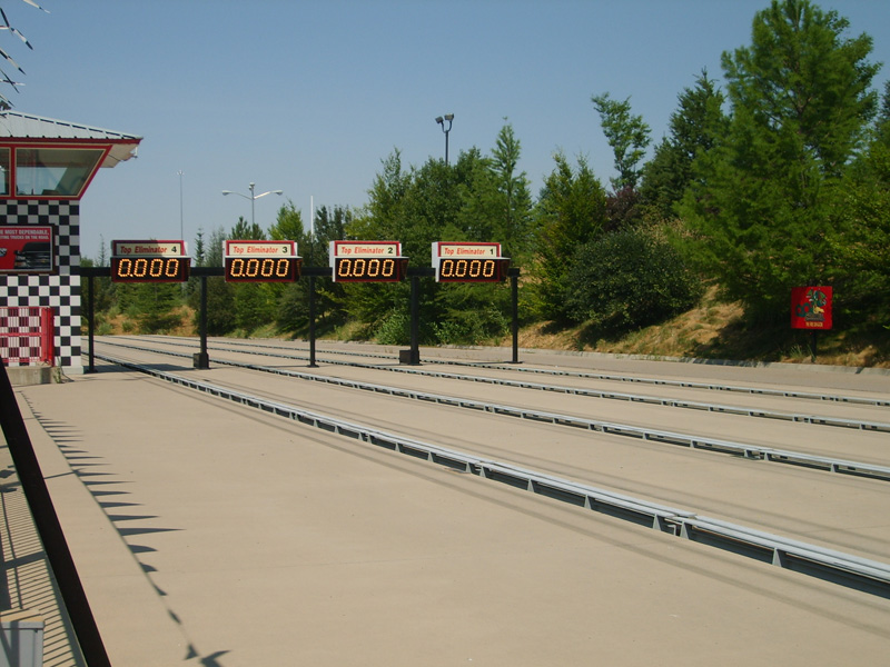
http://lagoonhistory...top-eliminator/
G-Force Dragster - Fun Spot (Old Town)

https://www.youtube.com/watch?v=8X4zYEgYDoE
Speed Zone - Dallas, Texas

you can still buy them if you want
http://www.rideenter...ator-dragsters/
Although in this case the idea was the ride came from somewhere like Fun Spot 2nd hand.
-

 Turtle
Offline
OK time for some proper reviews. Just train of thought stuff.
Flamengo - Very lively to begin with, although the architecture around the entrance isn't the strongest.. very 2x3. Blocky. Maybe this is like Brazil though? I wouldn't know... Great Brazilian flag, nice composition and that coaster looks very cool. Those fuckers are playing football. That's ridiculous. Ridemaking has got ridiculous. The wild mouse is very small and kinda boring... not much to say about that. Architecture inside the park is a bit more interesting, some more shapes here. Again, super lively, the custom rides are awesome and interesting. The Schwarzkopf is incredible, I always loved the way they look. Also, that custom ride with the bobsled cars is genius. Why has no one thought of that.
Moving onto the haunted house, I didn't notice that the cars are turning until I saw someone comment in here.. one of those things that is probably SUPER difficult to achieve, but isn't really showcased well enough in this park, possibly? The Olympic rings made me laugh, love clever touches like that. The woodies are big and dominate the middle of the park without being the least bit interesting to me... i'm sure they're historically accurate and possibly a nod to something I don't understand, but I didn't feel the need to watch them more than once. Also the yellow, red and green is getting a little garish for me, now.
The other rides are cool, god there's LOADS of them isn't there. Most of them have interesting touches though, like the dragsters, that's awesome. Again, no idea how you've done that, very clever. Overall this park has tons going on, I like how lively it is, but there's no cohesive atmosphere, really... hard to explain. Might be a limitation of the theme, that may have even been what you were going for. I just don't love it.
Tubiao - How strange to have two parks with such similar themes against each other, madness! Straight away this park looks a lot more cohesive though, certain things are just given that little bit extra space to breathe that makes it more realistic. The composition is better, I think. Again, totally underwhelming entrance (i'm aware that's the idea) but there's enough around the entrance to make it interesting. In fact, i'm drawn to the outside of the park more. Bold strategy. God, it's really fucking GOOD though isn't it. Those buildings are incredible. The traffic is excellent, and the guy on the bikes is brilliant. The different speeds of the traffic makes such a difference. It's just so believable, the whole outside. Each building looks perfect, the traffic jam is brilliant, just really really nice work. Even the boring building like the tower block is more detailed than the other park.
The park itself isn't all that, I probably prefer the other park in terms of rides and stuff... but everything works well. Overall it's not as fun as the Brazilian park, but it's tons more believable and a couple of notches more skillful I think (in terms of theming). The big wheel is a cool centerpiece and dominates the map well. It feels washed out and dingy which is the theme, I guess.
Another bold choice putting a highway there, the roar of the cars is actually a pretty cool effect, though. Almost overwhelming.
Overall, I liked this a bit more than the other one, but again, two really cool parks! Thanks everyone.
-

 CedarPoint6
Offline
Feira do Flamengo
I’ve already talked extensively enough about our park, so I’ll skip straight to the little things that I especially enjoyed and/or am proud of:
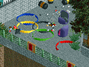
The broken Olympic rings were a great last minute touch. (Roomie)
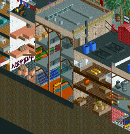
I love the interiors of these buildings. The one that’s collapsed inside is also closed on the front side. Nice little library and museum too. (Roomie)
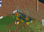
Open fire grills. I used these in a few spots within the park. (me)
On the favela side, there’s a hole in the fence that people are certainly using to their advantage, despite the police car blocking the way. (me)
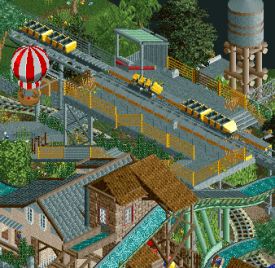
The abandoned coaster was a fun one to build. I like the car tilted on its side. (me) You can also see the hot air balloon which floats over the park every once in a while. (Roomie)
The wooden coaster used to have other trains from NAD. Now it runs Morgan trains. (me)
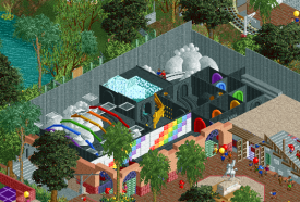
There’s a little hidden dark ride under the wild mouse. It’s themed to rainbows and storms. (me)
The haunted house has a whole storyline too, but the big show scene at the end uses Roomie’s awesome turning cars and also turns the peeps into ghosts! (Roomie and me)
Really proud of these supports. (me)
The composition here is just excellent. (ultro)
Tubiao Action Park
I’ve been excited to get to this park as I’ve been wanting to do a proper review for a little while. Wow. It’s currently my favorite park of the contest and also one of my favorite parks of recent memory. From the concept to the execution and composition it’s about perfect. I like so much about this.
You can tell that Jin Jiang was one of your primary inspirations with the giant highway right next to the park. The highway is a great backdrop and frames Tubaio nicely alongside the surrounding cityscape. I appreciate that you have the city grid but not totally square. The little bump out for the Starbucks and the subway line and the variation of road types adds so much interest. It gives the park and surrounding layout a really great character makes it feel that much more natural and real.
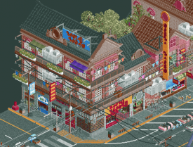
Before I jump into the park, I need to talk about the surroundings. These were really the star of this map. Such great detail and atmosphere. A large amount of the tiles were dedicated to roads and sidewalks. A bold move typically, but necessary in the case of this theme. And it works really well. I like the double wide sidewalks in most places because it gives you the space to throw in the shade trees as well as all the little stands and shops. It’s undoubtedly messy, but it doesn’t bother me. If anything it’s almost too much for your eyes to keep track of. But it’s accurate. I appreciate the yellow strips on either side of the crosswalks. Architecturally, the buildings are just amazing. I see ‘overdetailed’ being thrown out a lot, but I’d disagree. It all has purpose. I’m not even sure I’d call them messy. From A/C units to window boxes to escape ladders to clothing drying on lines, it’s all there. I like that you’ve proven a spectacular Chinese theme can be achieved without the need for oriental roofs. Your mouldings and detailing like signs and shops convey the theme well enough that you don’t need the typical hallmarks of a Chinese theme.
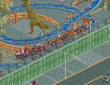
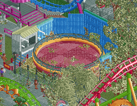
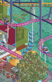
Diving into the park, it’s just the epitome of these small Chinese parks. You’ve got the giant Ferris wheel, you’ve got the weird Chinese rides, you’ve got abandoned stuff… it checks all the boxes. Good move on using cloned coasters for all the layouts. It’s hard not to branch out, but these work well. I don’t particularly like the s bend between the corks on Jet Star, but it’s a nice way of keeping this sort of layout compact. The super slow lift hill is appropriate too. At first I wasn’t liking the SLC either—it takes up a huge section of a relatively small park and being that it would be on the newer side, it seems like the park wouldn’t have had the space for it. But as I look at it more, it’s clear that they *didn’t* have space and made it fit. The pond underneath used to have fountains and bumper boats, which can’t work anymore and the corner of the park could easily be bulldozed to make the ride fit. So it makes a lot of sense! And those supports are wonderful. Absolutely sells the ride. I’m constantly impressed by how even small buildings can have a ton of detail. There isn’t much in the way of architecture within this park, but what’s there has all the necessary details. The round motif carries well across a lot of the buildings and signage. And this kind of theme lets you get away with absolutely garish colors which fit the park like a glove.
Here are the little things I enjoyed:
This is a hilarious little detail along with the storyline in the readme.
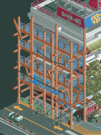
Bamboo scaffolding! Also I see you Texas Giant sign.
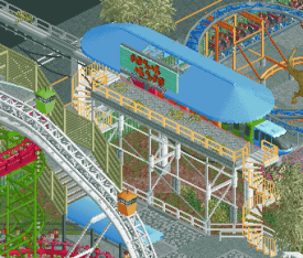
The abandoned monorail is super cool. I love the look of the station and the wires hanging down. It makes me wonder what’s on the other side and where it goes.
Tagadas were maybe my favorite ride in China. So much fun but so dangerous. I’m happy you added one.
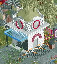
Clever use of the suspended monorail as the ticket booths.
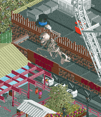
Nice way to work in the standard skeleton object.
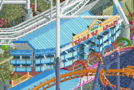
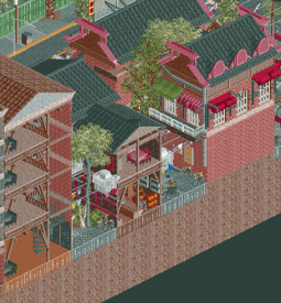
I could really pick any building as a shining example of architecture, but I’ll pick this one. The composition is just stunning. From the textures to the details, it all really works together. All the mess of cables doesn’t hurt either!
Another China-only ride that I got to do out there. I was fat, but somehow fit. People laughed and took pictures. It was a terrible experience. So well done for tossing this in there.
Abandoned boats
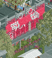
All the signage was nice, but I especially liked this Coke sign.
I love this little ticket booth. So much detail in such a small space.
The back alley and interior peaks here are great. I like the interior structural supports in the buildings.
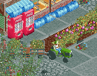
The gardener with his little cart of plants is a nice small detail but it rounds out the park so nicely.
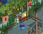
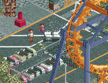
I wish this crash wasn’t hidden as much as it was. Such cool detail, especially with the peeps taking pictures.
I could spend hours looking at this map (and I have!) picking out all the details. There’s just so much to see. This level of realism is what I aspire to. It conveys the area perfectly and feels like a legitimate park. That, combined with the fact that we really haven’t seen this region covered so well before really draws me to this map. Congratulations on producing a fine piece of work. It’s something to be very proud of!
-
![][ntamin22%s's Photo](https://www.nedesigns.com/uploads/profile/photo-thumb-221.png?_r=1520300638)
 ][ntamin22
Offline
This was probably about as close as we've come to a mirror match in H2H even when you take the bedroom parks into consideration.
Feira:
This is a park that tried to achieve a lot of different perspectives on the same subject matter. That multi-faceted approach leads to a lot to see, which is usually a good thing for an H2H park, but can also feel disjunct or disconnected.The highlights for me were the "flavor" that identified the park as uniquely brazilian, which was mostly the outskirts. The favelas are exceptionally well-done, up there with the best slum housing I can remember seeing in RCT2. The "street of cutaway buildings on map edge" is de rigeur at this point, but the facades were good and the abandoned storefront and christ mural were lovely. The outskirts focus on telling one story at a time; colonial district, slums, futbol. The main park itself is a little more confused. Dirty Brazilian Realism is the intended genre, but it's all super bright colors and pristine paths. The colors stand out against the backdrop of the faded, pastel surrounding buildings, and together with the newer coasters muddle the "struggling park with abandoned rides" narrative. It may be true to the inspiration to have a counter-intuitive mix of flashy new investment and crumbling last-century infrastructure, but especially when you stack this park up against Tubiao it feels less cohesive.
The looping shuttle was very nicely implemented, and for me that rang the truest as the kind of once-headliner-now-also-ran attraction this type of park would have. The wooden coaster was nice to see but ultimately not that impressive for me. Might have been better in a non-h2h setting, but it soaked up a lot of real estate here. I did enjoy the pepsi billboard on the lift.
The three-lobes split-level area is a welcome alternative to a midway. I really enjoy the character it brings and how it feels like an appropriately Brazilian mid-century cast-concrete solution to add to the run-down older park narrative.
-
![][ntamin22%s's Photo](https://www.nedesigns.com/uploads/profile/photo-thumb-221.png?_r=1520300638)
 ][ntamin22
Offline
Tubiao:
Very engaging park, and an excellent use of the palette to pull some of the things that don't fit quite as well in line and feel connected.
I'll get my big complaint out of the way up front: there's no way this park needed to be bound on four sides by highway. It eats into the park realestate and makes viewing pretty obnoxious, no matter how neat the traffic is or how flavorful the constant background noise is to the park concept. The "Urban Park" format on NE has fallen into this sort of unintentionally-group-decided format where you want to show it's an Urban Park but it isn't really about the surroundings or you're near a map edge so the shorthand is just road + cutaway buildings. I think we can do better - the stuff on the perimeter here is great, but it didn't all need to be across a four-lane highway.
That aside - park content is mostly excellent. The mix of rides and coasters feels very authentically offbeat; I think most of the stuff in the park I'd raise an eyebrow and think twice about riding, which is exactly on-tone. The giant ferris wheel feels a little undercooked. I can sort of buy it as the star attraction of this little urban park, but it doesn't get a lot of fanfare. It's not quite centered on the crossroads of the main footpaths as the park centerpiece and the station is neat but not really played up how it could be for a ride experience that's often a separate tourist draw unto itself, so it feels like a missed opportunity.
I don't usually pay much attention to supports, but I did really enjoy that all the coaster supports were just off enough from the polished smooth B&M standard to be noticeably knockoff. The shallow artificial pond was absolutely spot-on as well. Stuff like that and the tagada really sells the asian park feel; I think what's missing is some Romon-style contextless european landmarks / "romantic" european architecture.
The outskirts are really great, honestly. They steal the show a little bit. The vernacular brick architecture is really great at telling the story of this park and it's setting, and the details are (though very busy visually) enough to keep you poking around for a long time exploring. The bamboo scaffolding, back-alley bikes, some really really really great storefronts, and the wild nest of power lines were all executed strongly.
 Tags
Tags
- No Tags
