H2H8 / H2H8 Round 1 Match 1 - The Replacements vs Strangelove
-
 19-April 18
-

 Louis!
Offline

Round 1 | Match 1
--- Poll Closed ---

Tahendo Zoo (RCT2)
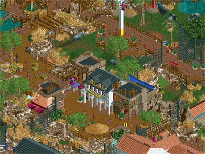
VS

All Coasters Go To Heaven (RCT2)
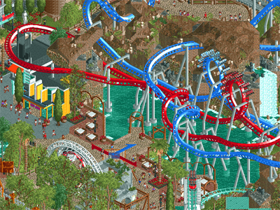
Voting Rules
- You should only vote if you have viewed both parks in game.
- Everyone but players belonging to either team in the match may vote.
- Voting will be monitored to improve fairness, and anyone found to be abusing votes in any way will be punished. -

 Liampie
Offline
Remember, no public speculation on who built what even if it seems obvious. It sounds like a petty rule but if we allow some speculation it's a slippery slope with no more secrets at the end. This includes speculation in videos! (Looking at you, Scoop and MCI and friends!)
Good luck to both teams.
-

 dr dirt
Offline
I think this'll be a great match up. From the screens I thought for I would prefer Tahendo Zoo, upon looking at the parks for a few minutes, I think it may be dead even for me. It's so weird how you can find ways in which these matchup parks are the antithesis of each other.
On first run through, I found Tahendo to be constructed to a much higher quality, but I kept feeling that it was missing a signature (either adventure ride or centerpiece). This was probably a conscious choice, but still it left me craving that one thing more. All Coasters didn't feel as sophisticated in how it was built, but has several signatures - all of which felt like solid layouts on first look, though I feel didn't quite hit critical mass on the integration with the landscape/paths/general setting.
Just some initial impressions. I'll look more into these tomorrow before deciding to vote. I'm really torn here at first go - one side is elite level construction and execution but wants something to grab onto, the other has lots to grab onto, but may not have as advanced-looking construction.
-

 shnupz
Offline
Tahendo Zoo
Well, Replacements, you certainly built a good zoo. Archy was great, Africa area was too.Rock climbing and the miniature train were cute. I liked that you went for something different and a non-park was a pretty bold move. It isn't bad by any means, and the technical skill behind it is definitely worth praise (I'd rate it on the border of high silver/low gold for reference), so you should be commended for it. It does, however, have some glaring flaws to me.
Namely, it feels like half of a zoo closed off. I can't help but feel like it should have been bigger and more spread out. I think its in the enclosures, some seem really small even for zoo standards. I've only been to Melbourne/Werribee/Healseville here in Australia, but in my experience there was much more space for the savannah animals (and yeah, I know there's a size limit in play, but still). Also a bit of a lack of barriers between peeps and animals in some areas, the elephants for instance could easily reach over the path. The textures were very cluttered and I am not a fan of the way the LOTR and Krypton rocks were used so much, they can be done tastefully when blended in to the environment but here they stick out like a sore thumb.
I'm sorry if I seem harsh. I really did enjoy viewing your release and I look forward to future ones, it just wasn't the sort of park (zoo, whatever) for me
All Coasters Go To Heaven
Absolutely stunning. I'm definitely going to wait a while before making my mind up here but so far? Definitely one of my favourite H2H parks of all time. The theme is incredible and it is executed superbly. Archy was on point, as was landscaping, layouts, colours etc you name it. Don't really have negative criticism (though more experienced players probably have better feedback for you). It was sad and beautiful to see all those defunct rides given the recognition they deserve, and you definitely did them justice. Loved all the rides in hell, Son of Kumba had me cracking up. Sea Viper should have orange track btw (or just be called Corkscrew either way), but that's incredibly minor c: -

 nin
Offline
I dont like to intrude on critiques, but youd be surprised by how little it takes to contain an elephant, shnupz.
 -

 Six Frags
Offline
At first glance I was blown away by Tahendo and all it's details/architecture/atmosphere, but the more I delve into it, the more flaws I see and definitely felt the same as shnupz about the exhibit size. In every zoo I've been in the safari part was big in size and the paths high up with bridges if you crossed it. Now you guys have those pathways in between on a very low level, and the animals can't move from one part to the other (like the giraffes are stuck on little 5x5m square for the whole day!). If you go for (ultra) realism, then go all the way!
I certainly am going to dive way more into both parks, but they sure (again) are polar opposites..
Like trav said on our discord; RCT vs Zoo Tycoon..
-

 chorkiel
Offline
From the screens I really thought Tahendo would be my favorite park, but All Coasters surprised me.
Tahendo zoo was superbly executed and I would probably give it an 85% or higher. I always feel bad for the animals in city zoos because they often don't seem to have enough space. That's not a critique on the park, I guess. My problem with this park as a H2H entry is that it did not really capture my attention for a long time. There was no ride to watch go around a couple of times and the sprites of the animals weren't anything new. No extremely clever exhibit designs.
On the other hand is All Coasters Go To Heaven which may not have been executed as superbly but it brought a very cool concept and delivered on that too. The part around Hypersonic was my least favorite but it still kept my attention longer because there was something to watch. The person - of who I assume he built most of it - was low on my h2h radar because I wondered how his usual style of parks and parkmaking could work for h2h but he proved me wrong.
I'm most likely going to vote for Strangelove. It was the superior park in most aspects that I deem important for a h2h entry.
-
 G Force
Offline
I think this match is just so intriguing because of how different the parks are. Really couldn't have planned it better.
First non-coaster H2H park in ages, vs a park focused on the coasters completely.
That being said I completely agree with the critisims of our park, it's not the most well made map in the world, but ultimately the builders wanted to just have fun with the concept and include the things they thought would be fun to build.
I think both teams had a similar approach here, which makes it all the more interesting to see such different results. -

 Ling
Offline
Oh my... what a lovely idea for a park, and so perfectly suited to H2H. All Coasters Go To Heaven might be my favorite H2H concept ever, will have to look at the parks more to make a clear decision though. This is an incredible start to the season.
-

 FredD
Offline
Strangelove
First of all, I really like the concept. It's always sad to see some great coasters being demolished, how cool would it be to ride them in the afterlife (if there would be an afterlife). It's also a great excuse to build some cool coasters, though I haven't ridden any of them I assume they are all quite recreated very close to the reality. Correct me if I'm wrong?!
The dueling dragons are of course the main coasters imo, recreating a real coaster is hard enough, let alone two dueling each other. Whoever made this did a great job at that, kudos. One note: it's really American, the coasters chosen. I don't have a problem with that, I just think it's a missed opportunity to include a demolished European coaster, not all (European) NE'ers are coaster fanatics like me and maybe won't recognize some references and coaster. Above all, I do feel like Blackpools wooden wild mouse needed to be here, since every European coaster fan was sad about that removal. It was an icon in the European coaster landscape. Enough about USA - Europe, don't want to set up two groups against each other, just placing down it's a missed opportunity imo.
As a coaster fanatic, it's a pretty fun park with some fun details. The drown Batman loop, RMC tree of life, Son of Kumba.... Overall as a park, I'm however not quite feeling it. The archy is not the best we've seen so far (it also not the worst or bad at all, don't worry) and it more feels like some ideas clutched together. I also think the heaven idea could be executed a little better because besides of the entrance gate and the clouds here and there, I don't get the idea this park is located in heaven really. But don't mind me, it's still a good and fun park. 75%
Replacements
I can't recall a full zoo in H2H, but I wasn't here before H2H6 so... to me it's definitely a good concept. A risky one too, because without moving rides you run the danger of having a lifeless park. But that really isn't the case over here, in fact the park kept me quite a while looking at it.
The archy is really great, but really! I love it. That phenomenal archy is backed by really great landscaping and foliage too. All the rockwork combined with great foliage and archy makes this park so atmospheric. The park really feels alive, without really any rides. Hats off to the builder(s). I will make you guy(s) even a bigger compliment: this just feels like a little and very dense Pairi Daiza. Which is imo the most beatiful zoo in the world.
It might feel a bit too dense for some for a zoo, but personally I don't care. The exhibits are large enough and in proportion and the whole is pleasant and nice to look at. It takes skill to make something this dense look so good without looking too busy or too messy. This park is just right when it comes to that. I'm a big fan of atmospheric parks, so this park scores very high imo. Second best or even better than DKS from HG... I don't know. I do know Tahendo Zoo will get my vote this match-up. 85%
-

 RWE
Offline
Tahendo Zoo:
+ shows high technical and sompositional skill
+ Ice landscaping is lovely
+ the asian area has a really nice atmosphere to it
+ ropes course is probably one of the best we've seen around here
- while this is a really great executed park, it misses those h2h moments where you see new refreshing stuff, that has never been done before, same goes for clever details i would expect in a h2h park
- it felt very messy and cramped in some places, this park really would have been better as a full scale park on a big map than squeezed in like that
- while in some 'non-themeparks' i don't miss rides, i missed rides overhere, JWAK showed perfectly how to mix rides and animals, i think something like that would have been great for this park
That's all i have to say about this park. Don't get confused too much by my negative points, i like this park, it's mostly well done in terms of technical aspects, i just can't see the love and depth in it, a h2h parks needs to have for me. Would have been much better probably, if it would have been a normal park release. 70%
All Coaster go to heaven:
+ very strong concept, probably the most original park of this round
+ entrance gate is really beautiful
+ Son of Kumba was such a nice small reference.
+ Dueling dragons station with waterfalls below it is probably one of my favorite moments this h2h so far, i spent many minutes looking at the peeps queueing. Very well done!
- looking at SoK i thought myself why this hadn't much more of this small details in it, i mean the coasters and all are awesome, but i would have loved more small things to explore too
- i agree with fred, some european coasters would have made this much better, i was a little bit disappointed by that
With some minor negative aspects this is all in all a very amazing and well done h2h park. I'm glad someone finally made this concept real and i hope we'll see more of this cool and original concepts the next rounds. 80%
So this matchup has a clear winner for me. My vote will go to All Coaster go to heaven.
-

 AvanineCommuter
Offline
Tahendo Zoo
- A zoo! Not a novel concept but not one we've seen many times before
- Would have preferred opening on the entrance, it was a strange place to start the park, had to reorient myself to find the entry
- Lovely bits of archy in many different themes, well executed and pretty, but nothing popped out as anything new or had any "wow" factor
- Love the ropes course! Really well done and looks like something I'd love to do in real life
- Really doesn't have a lot of action overall, it feels so dead... I think the lack of any rides is part of the issue, and not having that motion means the park overall feels lifeless
- The whole park feels very flat, some elevation changes would have really helped give the park more personality and may help with the lifeless-vibe of the park
- I enjoyed the search for the monkey, a cute little easter egg. And I found the monkey!
- That school bus is great! Mega double decker school bus
- Would have loved to see some more creative interpretations of animals... like the crabs in Mario Kart, and the eels in Monstrocity, or even just some homemade sculptures / custom objects. But I guess the scale isn't appropriate for what you were going for so I understand the need to rely on those animated animal objects.
Overall in terms of content there was a lack of anything of intrigue. Durham was beautifully boring but it had some interesting hacks and unique ideas, Wits End featured so many cool hacks / glitches / concepts, as did Dig Site 4, and even Motherland kept my interest because it had so many russian-jokes and russian references everywhere. Your competitor park did this better too, with all the references to coasters in coaster hell and names of famous coaster designers as mechanics. I feel like there was a lack of content here - besides the monkey search, what else was there to keep me interested? What new ideas were there here that we haven't seen before? What elements or content in here screams "wow"? And even if there weren't those singular wow moments, did the overall composition / idea pop and create something immersive and beautiful, like Durham did? There were no rides, the architecture was not especially interesting, the atmosphere didn't change much from section to section despite the different themes, and the whole thing was so flat. I found it quite uncreative and it bored me more than any other park this round so far. I'm sorry if I'm being so harsh but I found this very underwhelming, as skillfully and beautifully crafted as it was.
Score: 60 - 70
All Coasters Go to Heaven
- First off, love the concept! I'm sure it resonates with plenty of us coaster enthusiasts that have mourned the death of our favorite coasters
- The pearly gates is a great idea, but the entrance was underwhelming. If this is the entrance to heaven, I would imagine it to be grand and majestic. It looks thin and flimsy (albeit very beautifully crafted), and there isn't much of a large statement
- Drachen fire was great! I love the twist on the original layout while still keeping all the elements, and the diagonal lift really added a new dimension to it.
- The architecture throughout was nothing to write home about. Perfectly pleasant with generic themes that fit the ride. It serves its purpose but the atmosphere was not amazing
- The clouds is a good idea but was very poorly executed - with random blops around it didn't look very good Could have been fluffier and thicker to really give the illusion of "on a sea of clouds"
- Loved the inclusion of SoK and all the other terribad woodies in coaster hell, very funny!
- RIP all the legendary coaster designers... great inclusion
- Timing on Batman and Robin was a little off, and the hangtime was sooooooo long I was worried it would stall
- The centerpiece - Dueling Dragons, was the highlight of the park. Beautiful layout and was a nice recreation with some artistic license
- Dragon sculptures were a nice touch, but very messy. Could use more refinement
- Way too much pathing throughout
- I do like the black spots between islands, splitting them up that was was a nice touch
- Foliage looks messy in some places, not particularly well done.
I know the focus was on roller coasters and not anything else, and on that note I would say your team achieved its goal: the coasters were great, and the rest was not. There wasn't enough archy / foliage / details to really create a nice, heavenly atmosphere, and it didn't feel particularly immersive. There feels like there was a lack of attention to detail in the surroundings and the overall park suffers because of that.
Score: 60 - 70
As always I'll revisit these again, but this was the weakest match up of the three so far. I'm not sure which one I will pick yet because Tahendo Zoo was executed on a higher level of detail, but was so dead throughout. Coasters had a great concept and very nice rides and struck a chord with my nostalgia, but the overall attention to detail / archy was severly lacking in comparison.
-

 Coasterbill
Offline
UUUUUUUUUUUGH These parks are both so good. I seriously have no idea what to do here.
-

 robbie92
Offline
Full review coming later, but man, the more I dig into Tahendo Zoo, the more and more I love it. There's so many fantastic little things in this, both in a traditional "this is a cool little detail" way but also in a wider parkmaking way, like the use of objects or textures. This is absolutely gorgeous, and I can see myself getting lost in this park for a long long time. I think it might be my favourite of the round....
-

 Gustav Goblin
Offline
I'm not really good enough to rate parks, but I loved Son of Kumba in Hell under All Coasters Go To Heaven.
-

 IonZer0
Offline
So many awesome details in both of these parks. I seriously have to consider my options here. It's not going to be easy by any stretch of the imagination.
I'm still in denial about Dueling Dragons though...
-

 Liampie
Offline
Tahendo Zoo
I don't know how to start reviewing this park. It's a zoo. There's few rides and lots of animals. The map is relatively small. The architecture is good. The landscaping ranges from awesome (canyon objects, make a nice combo with grass too) to ugly (land textures in safari). Loved seeing all the differnent exhibits and buildings. HA! I beat you to doing smoke object bees. Good thing I pulled that idea from the shelf NOW, after six years. Best thing about this park may be the signs. There's a two or three really cool ones around the entrance (the column!), but I also love the African tapestry over the path entering the safari. Texas Giant were a bit obsessive, I was shaking my head as I found them behind waterfalls, hidden in sheds and buried in a reptile house. But it was also admittedly amusing. The Starpointe-trackitecture gate on another safari path entrance was awful though. The park has good details: the vet, the monkey hanging from the scissor lift, and a backstage dumpster that used four different objects for trash that's barely even visible. Guys, separate your waste.
All in all it was all good work that was fun to explore. The park also offered not much new or surprising. I feel like I've seen this park already ten years ago. I'm glad someone got this out of his system so he can focus on making new parks instead of new old parks!
Great effort, not the greatest H2H park.
All Coasters Go to Heaven
Well, this park single handedly compensates for the lack of coasters in other parks. And I liked them all! I thought the park concept was quite clever in the sense that it offered an excuse for A. combining quite a rich varied array of themes and different coasters and B. a combination of pure realism fetishism and fantasy and normally immersion-breaking illogical things. I think the fantasy and realism could've been combined better, away from the cloud edges it often looked like an average generic park. Maybe above average, because it looked very pleasant. Architecture was somtimes good (entrance, observatory) and sometimes meh (castle). Landscaping overall was not too interesting, I thought the rockwork around Dueling Dragons could've been done better. The clouds carrying the park were paper thing, they looked like an afterthought while they're crucial to making the park work, so I wish you spent some more time on them. Looks like a job for a floater. I liked the humour and details, all the buried coasters and such. Batman was brilliant. Son of Kumba needed that cat head though. The cleverest detail in my opinion, and a subtle one, is the years in the ride names. We're so used to seeing those in realism parks that you wouldn't really think about it, but here they're the year of removal/year of being installed in Heaven. Nice! Lastly, good job on the sky swatter.
All in all, the park was not too ambitious, and execution was a bit inconsistent, but the fun makes up for it a bit. Good park.
I'd say the match is pretty even. Will reveal who gets my vote in the poll later!
 Tags
Tags
- No Tags


