H2H8 / H2H8 Round 1 Match 2 - Team Spacecrab vs The Icons
-
 18-April 18
-

 alex
Offline
Motherland:
I found the tone sometimes Juvenile or the motifs cliche, however It looks like the builders had loads of fun making this, and it’s always a big plus when that comes through IMO.
Architecture is mostly really decent! Occasionally the scale feels off; kremlin towers were too squat and also St Basil's a bit square and squat. Yet I didn’t spot any squatting slav’s in tracksuits?
Diver layout was great. Simple but effective with a nice shape.
Main gripe with the park was that it didn’t look so good. Ofc some of the drab stuff is not supposed to look pretty, but what I mean is the composition was poor. It was very flat and quite boring path layout. It also looked imbalanced because all the colourful stuff on one side. I also found the colour choices a bit awkward.
It’s a great park though, I’m just a stickler when it comes to aesthetics.
Dig site comment coming soon

-
![][ntamin22%s's Photo](https://www.nedesigns.com/uploads/profile/photo-thumb-221.png?_r=1520300638)
 ][ntamin22
Offline
Voting Closed

Team Spacecrab beat The Icons
Team Spacecrab vote count: 65 (94.20%)
The Icons vote count: 4 (5.80%)
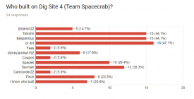
Dig Site 4 was made by dr dirt (60%), BelgianGuy (20%), disneylandian192 (12%), and saxman1089 (8%).
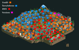
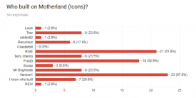
Motherland was made by FredD (33%), Terry Inferno (33%), RWE (33%), and Version1 (1%). -

 dr dirt
Offline
Thanks for all the kind words about the park! I'll try to give a little bit about the backstage stuff and tidbits about our park and give you all an overview of who did what:
I think this one loosely started in the Heaven's Atlas brainstorming with someone (maybe Tolsimir?) posting a picture of a flying pyramid. I brought up a jungle excavation digging up strange items with subtle mysterious undertones all around it. Then BG and I wanted to put a pyramid in a pit, and it pretty much took off. I handled the macro of the map for the most part, and loved the idea of white canvas tents, a base camp up top, then big pits with scaffolding, and ruins, obviously. Also a thought was to play on the top being more subdued and spread out with the pits being denser. I love inverts in a trench and wanted a flagship coaster to dominate the map, but this wasn't decided immediately. The El Loco was probably one of the earliest decisions, with it right up against scaffolding.
The landscape was laid out quickly and there was maybe a day of debating about the coaster lineup, in the end I think I strong-armed in the trenched invert - I always wanted to produce a top-tier invert and Kianto might be my favorite layout I've done. I think I probably had a solid week of just me working on the park and I think my building style ended up making it harder for the other guys to really dive in (I apologize for that!). I ended up doing all the layouts (mine train came last) and the immediate surroundings of them. BG completed the base camp incredibly quickly at this point, and did work on the surroundings of the train and the jungle area at the transition point in the invert (on the map). Disney came in and installed the adventure golf (Field Training) and temples by the (secondary) entrance up top, then did the sacrificial chamber and tomb on the other side. I did the majority of the pits, except for by the Excawheel and Ancient Dance which was saxman. He is also to thank for the peepability. Disney & sax did renovations of the drop area of Journey to Chaac. The park was 'done' rather early, and we were all around for details and touch-ups, notably with BG building the cenote underneath the jungle.
The sweet readme was courtesy of ][ntamin, and of course Spacek made the incredible El Loco cars and the cool mine train hack. Disney also was the main solidifier of taking it from 'jungle excavation' to a storyline. Naming was mostly ][, Disney, and Saxman.
Fun facts about the park (some I'm not sure were mentioned in the comments):
- The original coaster line-up was an Intamin Catapult mimicking Volcano: the Blast Coaster, and a RMC in the mine train's location.
- Kianto was gold for a while towards the end, but was changed back to purple.
- The train masses were hacked to try to adjust for the full peeps of Kianto (if you remove them it may run slow), and the El Loco was made heavier to bring it back to original pacing after the new trains were made.
- The paths were changed probably 5 times before we found how to do the current ones.
- The memes hidden are all marked by little white signs; this was Tolsimir's idea (use the dig tool, but everyone seems to use cutaway!) and was originally alien artifacts, but then changed for NE memes.
- Above the Field Training is Ponce de Leon with a fountain of youth.
- There's a dinosaur nest by Kianto's first wingover & dinosaurs attacking Excavator Express.
- No idea where the underground monster skeleton came from.
- There was a crystal vein in the jungle that was scrapped.
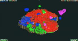
Here's the overview showing who did what (Sax's flat ride pit area is hidden in this view, but represented in the air, as are the underground sections) - dr dirt = red, BelgianGuy = blue, disneylandian = green, saxman = pink:
I should add there was a lot of overlap, especially concerning applying finish or renovating each area, which was mostly me and saxman.
-

 FredD
Offline
First of all, congrats to Team Spacecrabs and its builders (Dr Dirt, BG, Disneylandian and Saxman). It is a great park and we had no luck going against it. Honest and well deserved win. Of course your park deserves a review as well, I just wanted to wait with it since I didn't want to influence a match-up my team and myself are involved in.
Spacecrabs
Well, if there's a way to do a readme... it's this way! It really brings you into the story, atmosphere and it does just that without too much information but not too less either. Reading it really makes you want to open the park even more. And the park doesn't let down. There's so much to see, so much interesting stuff going on.
The invert is of course the eyecatcher and to me it's the best coaster we've seen in R1. It has that close to the ground feeling and yet it has some of the impressiveness like Raptor or Katun have too. The other coaster is really cool too, damn I thought we had a special one but this S&S El Loco thing is also unique to see in rct! What really makes this park so great is the immersive interaction between rides, archy and landscaping & foliage. That must have been a hell of a job to pull of, so I can only take my hat off for that!
There were many great little details. Like me being chased by a jaguar, lol, in real life I'd give up already since I can't run fast and warn the jaguar not to overeat himself. I must say, everyone went crazy about the coke truck and I admit it's funny but I'd never known it since I will never use cut away view while viewing a park. So to me it doesn't do that much. Other issue with this park I have is that it's really too dense. There's so much to see and explore but there's no resting point for my eyes. It's still an amazing park don't get me wrong, but some resting point would have taken this even to another level imo. Anyway, really great park. Therefore I'm not ashamed of losing to out. Well deserved. 85%
Icons
First of all I can't say enough thanks to RWE and Terry for building with me, I really had a blast and hope you guys had to. The idea of a Russian park came from me. Nowhere I had the idea of a second "Kim Jong Il presents to his people park". I guess it's the same kind of humor, though Russia and North-Korea are hard to compare when it comes to culture, archy and even politics.
Russia is a thankful country to translate into rct. The country is so big, has so much and interesting history that a H2H sized park might be just too small to do it best. We decided to go for a theme park themed to the whole of Russia, maybe it would have been better to just go for St Petersburg, Moscow or Siberia in specific year or setting... but of course that's easy to say afterwards. We wanted to capture as much of Russia possible and I think we did that well given the size. We've not seen complete Russian themed parks outside of some Russian theme zones in some showcase parks, so I'm pretty happy with what we have built.
Some critique I find harsh, some completely legit. Not gonna go in detail about that. We lost because we weren't good enough and Spacecrabs came up with a really good park that was just better. Doesn't mean I don't like or am not proud on Motherland. I really had fun building it, it was never my or any of our builders intention to offend anyone with our little jokes or Gulag maze. Yes, it's horrible what happened there, not any of us want to minimalism the gulags and other cruel aspects of Soviet Russia but it is only meant as a park filling reference to Soviet Russia. Nothing more. I feel it's kinda a shame some focused on this and not the other fun, positive details like shirtless Putin, the drop towers with the opposition not launching very high while Putin goes all up, hiding Anastacia,... It are all jokes, I get some might find it juvenile. Everyone his own taste and opinion. But we all three and Version1 had a really great time while building it. We were pushing each other to include more content and jokes in the hope it would amuse the viewer.
-

 SSSammy
Offline
fuckin huge congrats to the builders of dig site. you guys have a whole lot to be very proud of.
its a real shame that motherlands competent parkmaking was soured for me by the old memes. people are right when they say it feels more like older h2h's, and i didn't like these kind of parks back then either. i think the builders did a great job though, the largest other weak point was overall composition. the park didn't really flow, as it felt like joke - joke - joke as opposed to giving them room to breathe. legit just something that will come with more experience building on smaller maps
-
 Coasterbill
Offline
Great job guys. You always hate to lose, but we lost to an absolutely brilliant park.
The atmosphere was phenomenal, the hacks were great (SpaceK god damn...) and overall you guys did an excellent job. Other than maybe the pacing of the El loco (which I see is necessary to prevent a valley with an empty train) I can't think of a single complaint.
-

 Xeccah
Offline
I felt that Motherland was very superficial interpretation of Soviet Russia. That's fine, if you can execute things well, but it does kill the immersion if you were going for that. I can't really say that I think anything in this park is executed to a level that I would have expected out of H2H8. The architecture is either drab without nuance or overdetailed fluff. Saint Basil's was definitely a let down; everytime I see it I'm just reminded of "damn, stoksy did this so well..." Definitely the best stuff in the map was around the dive machine; I think with a less heavy-handed approach this area would have made this area really special. The humor didn't do much for me, not only because I'm a soulless robot, but because humor will never replace parkmaking skill.Either way, I know how negative this review is and I know how much effort and emotion is poured into such a park in so little time, so take it with a grain of salt. I think this would have been a good contending park in H2H5 or H2H6, but times change and no one builds in a vacuum.60%Dig Site 4 was wonderful. Density is certainly a risk and it paid off here. Having so much content in a 60x60 map is incredible and I love the primary focus on this park being the rides rather than architecture. Insane to think that you could fit an el loco, invert, mine train, railway, and splash boats into this. That invert is the best ride someone has done in a while, dare i say better than Jerusalem
 Great focus on using thematic elements to convey the theme (redundant, I realize). I loved going through the park, combing it for details and hidden gems. I think this is the quintessential H2H park and may be the best park of the round robin.Dr dirt showed himself as an amazing sleeper pick; we all knew he was good but at least I thought he'd be rusty and not finish much, as that what precedent showed. I'm glad to be proven wrong.90%, may be 95.
 -

 CedarPoint6
Offline
Motherland
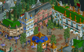
I feel like the concept for this park started really well and then it sort of devolved from there. That’s not to say it’s a terrible park by any means, but I also don’t think it was able to stand up against the extraordinary quality we’ve seen throughout the contest otherwise. The theme of Russia (or more accurately, memes about Russia) is super broad and I’m not sure the transitions between spaces worked as well as they could. The entrance area is superb architecture as is the red square. I think Basil’s could have been really good too if it weren’t for the colors and the central spire. Some of the lower sections are actually really well made.
The cityscape almost felt like you might have run out of time. I get the look being appropriately Soviet austere, but there are some general details that would have helped (like deco blocks, A/C units, etc). Some of the things just felt forced, though, like the powered coaster in the center. I’d have much rather seen that Russian driving school ride expanded as well as Kolkhoz Tour. These were good ideas, but needed a bit more room to breathe perhaps.
I know there was a lot of talk about the Gulag, but that didn’t really bother me. I wasn’t a fan of the firing squad in the back, but it is what it is. For a lighthearted map based on jokes, this section didn’t hit so well. I like seeing a themed maze at least. Aside from Kumba, this is an underutilized ride type.
Here are the little things I liked:
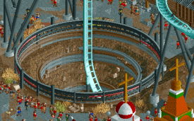
The hole was one of my favorite things on the whole map. Simple, but really well done.
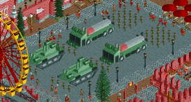
The detail in the vehicles was excellent and the peeps as an object work well in this situation where you want it to be structured.
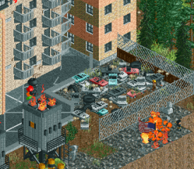
Nice pile of junk! Would have been great to have this carry on more if you had removed the powered coaster.
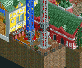
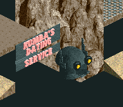
This was a clever joke. I appreciate the detail of the load platform and how the rides were set to perform.
Not so much a little thing as much as it is excellent architecture. Maybe the most atmospheric part of the map.
Props to trying a Pax coaster though I would have expected proper trains and maybe a bit more detail on the supports. Feels rushed. But I’m happy to see rarer coaster types.
[not pictured]
Also like the train operating in shuttle mode.
On the whole, I think the individual areas here were pretty nice but the park suffered from the same problem Russia has—there’s too much of it to cover. It tried to go 5 directions at once and did an ok job when it could have been 2 or 3 things done way better.
Dig Site 4
What a pretty map. For a park that’s essentially brown and green, it’s so vibrant. There’s so much going on that it’s almost hard to stay focused on one thing to enjoy it for long enough. The map honestly feels huge, which I think is a testament to the quality layering done here. I appreciate that the park takes a pretty familiar theme and really expands on that with a pretty in depth story.
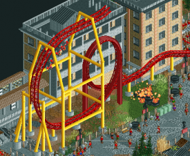
For the most part all the rides work really well. The park is very much a fantasy type setting but then you have your ultrarealistic B&M invert plonked in the center. It works, but it’s sort of an odd fit. The ride is fabulous though. Works great with the theming and is pretty interesting and unique without being unrealistic. While I’m happy to see the El Loco cars in the game now, I’m not sure the coaster fit as well as it could have. It kind of sticks out in the middle there. I wish there were track shapes that could make this look better, but it comes across as a little awkward despite the good attempt. I really like the adventure ride as well. The way it circles the Aztec looking pyramid is really picturesque.
Architecturally I really appreciate how after the entrance area there weren’t really any permanent structures. It was all tents and scaffolding. And it was all varied enough so it didn’t feel repeated. There are so many different styles of ruins mixed throughout. It was kind of interesting to see the various takes on everything. The use of the pyramid object while not actually having a straight up pyramid was super well done.
Here are the little things I liked:
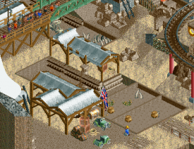
The stock huts blend in so well here. It’s a perfect fit thematically.
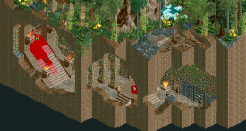
This was the best of the cutaway underground stuff. The different colored stairs with the dripping blood was perfect. And the Frontierland rock columns work super well here. Not sure anything else would have.
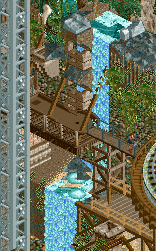
I love this miniature golf hole. The supports holding it out from the waterfall is great.
Despite how packed the map was, you still found space a proper looking dig site. I like all the little features sticking up in the excavation zone.
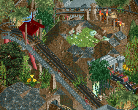
Really good move using the Togo track here. It’s perfect.
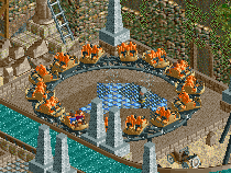
Great custom ride. I like the theming in the middle and the ride seems like it would be a lot of fun too.
Lol.
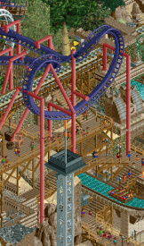
I just love the layering here. Invert with supports that work properly with the path which is stacked over top of the water ride and more path. It’s busy but it’s also readable and I appreciate that.
Dig Site 4 became an early favorite for me. Tons of atmosphere and a bunch of details that kept me exploring for quite a while. I still love my hardline realism, but I’d be happy to get lost in more parks like this in the future. Seems like it was a lot of fun to build and the passion for it showed through into the final product. Be proud of this one.
-

 Liampie
Online
Rediscovering H2H8
It's been a while now. Time to re-view the H2H8 parks with a fresh eyes and not clouded with emotion. I'm going to view every H2H8 park and post one focused screenshot that stood out to me or that I think deserves more love.
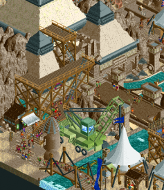
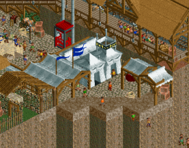
The pits in Dig Site 4 were a bit messy and hard to read, and I think that therefore they benefit from tigther crop. There are many cool details in the camps.
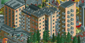
The apartment blocks are the best area in Motherland.
 Tags
Tags
- No Tags

