H2H8 / H2H8 Round 1 Match 3 - UltraRealists vs Heaven's Gallery
-
 14-April 18
-

 Liampie
Offline
Voting Closed

Heaven's Gallery beat UltraRealists
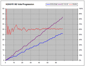
UltraRealists vote count: 26 (38.81%)
Heaven's Gallery vote count: 41 (61.19%)
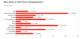
Wit's End was made by Shotguns? (80%), alex (13%) and zxbiohazardzx (7%).
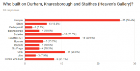
Durham, Knaresborough & Staithes was made by Liampie (70%), RuyataxRCT (20%) and CHE (10%). -

 Liampie
Offline
Wit's End
80% Shogo vs. 70% me. I did not plan on it happening but I knew it would! Classic. When I opened this I was as intimidated as I was when I first opened Port of Entry. Reading the comments here, especially on the first few pages, the match really seemed to tilt in your favour. Just like Port of Entry. Classic!
It's a really cool park and a big improvement over Port of Entry. There's plenty of glitches to be found (not everyone uses, can use, or wants to use OpenGL. Relying on that was a risky and it didn't pay off) but overall it's super clean for you, Shogo! And not just the glitches, you also seem to be cured of your trim fetish that was still problematic three years ago. Props, dude.
It's sad that so much of the comments were about what has been done before and that it looks like other parks, but that's a result of the way you built your park. I also found it to be way too derivative. I wanted to do some side by side screenshot comparisons and it got way out of hand. I apologise but I want to share it anyway. Some of these similarities are coincidental and far fetched, but alongside the obvious they do increase the uncanny resemblance to Le Reve, Corsair Veredian, and also Vampyre, Agencia and Earl Grey. A lot of the connections are implicit as you mixed and matched and just looked at the overall texture palettes a bit too much. There's some more obvious connections I didn't include.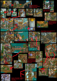
I also thought Avanine worked on this. That makes you a very good copycat, but if it were Avanine it would be a bit conservative and predictable. Not knowing who built this, most people took it as conservative and predictable, which also doesn't reflect well on Avanine. I wish someone on your team would've stopped this because honestly I think it's weird to blatantly copy a contemporary builder who is even on your own team. If I were Avanine I would find the whole thing very awkward.
I have to say that alongside all the borrowed stuff there was also plenty of fresh content to be found, and I think that as often as the stuff was overly derivate you also managed to mix and match borrowed elements quite tastefully into something new. It may not be the most strategic thing to do in a contest but I think it's an legit way of building and I do it myself too sometimes, especially in LL. Overall I'd say the park is 50% original and 50% borrowed. You guys definitely deserve credit for the good work too.
Okay, more good stuff: unlike the majority I think, I LOVED the yellow building. That area in general worked great I think. Tall tree with mushrooms in it? Fantastic. The invert area was also great and I loved the hack at the end. Good work on all the spires. I liked the mushroom objects. The area around vertigo was pleasant, but nothing stood out about it. Compared to the rest of the park the scale was off here. Going to the castle area: the castle itself was quite beautiful in places also messy, like a random stack of building and domes. The mine train didn't do much for me either but the way it wrapped around and was supported by the castle was fantastic. The splash boats had some problems I think. You had a few ideas for the ride like the whirlpool and the upwards splash but seemingly didn't know how to combine them and where to put them in the park. Aside from the two signature elements the ride was awkward and meh. I somehow wasn't affected by the whirlpool everyone loves, but I'm a huge fan of the upwards splash. So unexpected!
Overall the park had a really nice atmosphere with a ton of shit to see. You can easily spend an hour having fun with this. So great job there! Sadly you can also spend an hour having fun with making screenshot comparisons (which I did, didn't intend to make it such a big thing). The theme had a lot of potential and to an extent you used it well, but you also replaced some of the potential with unexplained fairytale stuff. That made it confusing whether the park was about the fairytale kind of mushrooms or about the drugs. At least the mushrooms + castles made for a great atmosphere and aesthetic, so taking the park at face value it was a great theme I think.
Shogo, you're a great parkmaker with some problems I think you're solving those problems one by one. Next step: less borrowing! It may be the last piece of the puzzle.
Durham, Knaresborough and Staithes
First impression: holy shit! Wow! Just kidding, I built this. Who would've guessed? I think most of the reviews are pretty fair, however none of this park was rushed, and some of the more spread out areas were spread out by design. A bit risky and it did worry me a little from time to time... I can talk about the history of the park addressing some of the comments people have made in the progress.
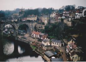
Firstly, what spawned this park was visuals from movies set in England (and other parts of Europe) in the 60s and 70s roughly. It's all a bit gloomy, dirty, and sometimes even apathical. The Italian Job, Get Carter, The Wicker Man, Frenzy, The Eagle has Landed, the Day of the Jackal, A Fish Called Wanda, some James Bond shit, Pierrot Le Fou, the Ipcress File, that kind of stuff. What pushed me over the edge were finding pictures of places like Staithes and Knaresborough:
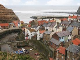
https://encrypted-tb...1KI2OHNQiiY_A5g
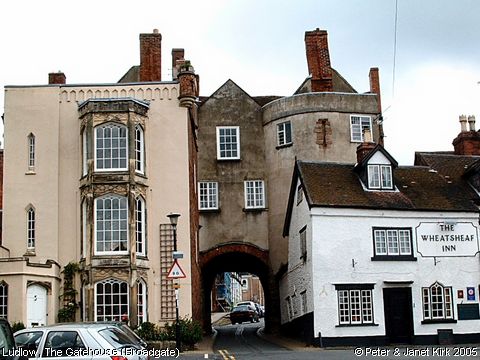
Especially the Knaresborough picture I thought was very inspiring. I envision a dense spaghetti of paths, roads and trains, on two hills with a river splitting the map. It would've been more fantastical and with more Industrial influences (the green steel stuff). As I began to collect the things I wanted to include and tried to see how they all fit on a map, it became less crazy and more realistic in a way. Sadly the trains which were supposed to be a focal point got pushed more and more into the background until I could barely even fit a station in... I started out as trying to make an English Lijiang, but I ended up making an English version of The Three Villages. In hindsight that could've been a good park name as well, easier to spell.
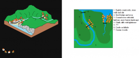
I knew i wanted to include a Staithes-like village and a Knaresborough-like village, but I also had inspiration for some white cliffs (wrong side of England, but whatever) and some countryside shit like all the stone walls and stone bridges, as well as lone old trees on a field of grass as you may encounter them in English meadows or in front of the Alton Towers even. That look is really hard to pull off and not very H2H-friendly. I tried doing it a little in the Steeplechase area but it's not the most succesful thing I did. The countryside area ended up being a third village which I named Durham, even though it bears no intentional resemblance to the real Durham. I did gather Durham pictures for inspiration but wasn't able to fit in anything. The name was randomly chosen last minute. Here's some early sketches:
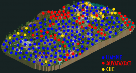
Thanks to Roy and CHE for their help. I was quite passionate about this park so not always the easiest to work with, but in the end we found common ground I think. You both were great helps! Here's who did what. We edited each other's work and mixed it so each dot is only a rough indication of someone's presence in that area.
Thanks for the fantastic write-ups, video reviews and votes everyone. I built what I liked and thank god you guys liked it too! Definitely not my most mindblowing H2H park but I'm very happy with the end result.
Oh, here's something fun and nerdy I'm probably not going to repeat:
-

 Cocoa
Offline
awesome writeup, I'd love it if we could get in a tradition of posting our inspiration/planning/etc at the end of rounds. I love seeing other people's stuff, and I sure have a lot I could post myself!
I remember saying to itm that I thought paredoila's station reminded me a lot of the woodie station in corsair veredian- glad you agree! he told me I was crazy
-

 FredD
Offline
Liam on DKS is no surprise at all, and I guessed right Shogo was on the other side! Congrats Heaven Gallery with the first win.
-

 Austin55
Offline
Wow, I'm really surprised by this. I guess it's not an upset when the split was so big but I thought the loser was going to walk away with this.
-

 Coasterbill
Offline
Wow, I'm really surprised by this. I guess it's not an upset when the split was so big but I thought the loser was going to walk away with this.
Agreed. I'm shocked.
That said, both parks were great.
-

 Xeccah
Offline
congrats to liam first of all. great park, and i think if i were voting on this i can see myself voting either way.
im quite disappointed in my park. not that it lost, but that it wasn't what i wanted it to be. my primary goal when making it was "i want this to be the next la reve" because i wanted to go down as having at least one good h2h run before i quit (which will probably be later this year).... but i knew right away that i simply don't have the vision to pull it off, so i ended up constantly looking at things that i wanted to emulate. liam is basically correct on all points with his screenshot, by the way, and theres more he didn't end up finding.
this is one of those types of parks that the only way i'd be proud of it is if it were well-received, and because it wasn't, i'm not. does that make me a sore loser? i dunno. -

 AvanineCommuter
Offline
Congrats to Heaven's Gallery on the win!
My review of Durham below:
- The color palette is gorgeous, contributed to atmosphere atmosphere atmosphere! The whole thing reeks of Liampie
- Architecture was on point. I think it has the best archy of any round 1 parks thusfar, with Wits End coming in second.
- Loved the cliffs, and the splashing of the ocean onto the beach. Great effect.
- Woodie has pacing issues. The wrap around the building by the train bridge is one of those beautiful moments that sticks with you.
- I didn't know what maypole or cheese rolling was so I had to google it. Well executed little details
- Found the back end of the park the weakest. The conservatory was bland and boring, and the hunter / fox ride was a great idea that had really bad execution. IMO it was the worst ride of Round 1 simply by the terrible layout and terrible pacing. Good case of fantastic idea, terrible execution.
- The station for locomotion was my favorite structure in the park, along with the bridge
Despite the beautiful atmosphere which is a signature Liampie style, the park had lots of little details, but overall it felt underwhelming. Conceptually it was nothing special, and a lot of the English references were lost on me as someone who has never been to England. There were no real wow moments for me, and I'm sure I'm not the only one who's not particularly intrigued by rural European towns. I am hoping to see more risk taking from Liampie in terms of concept and style instead of defaulting to more XXXXXXX cultural city / town / place.
Score: 85
I won't give a full review for Wits End, as I've seen it throughout, but I will say this: I wish it had gone further. During construction I was urging Zack to push the boundaries more and use crazier colors, kaleidoscopes, fractals, neon acid-trip warp, so that what starts as a sober village at the base gets trippier and trippier as it ascends to the top of the hill. More of the black holes all around the top would have been amazing to really push the concept. From what it looks like, it feels like a Medieval Mushroom Kingdom more than anything else. I agree with a lot of the other critiques about some of the architecture falling a little flat - but I think Zack did a phenomenal job overall with this park and I think it's a shame that some people didn't see that.
And on that note, something I've been wanting to say since R1M1 began:
I for one was QUITE frustrated with some of the critiques coming towards Wits End. Having been a fantasy player throughout 3 H2Hs, I'm familiar with people disliking a park because they dislike fantasy, or disliking a park because they "don't get it", or disliking a park because "it's too extra". Fine by me, that's a stylistic preference. But when people start assuming they know who the builders of a park is, then take that assumption and base their critiques with that assumed fact in mind, that's when I get miffed. Plenty of you assumed I was a builder on this park, and we had anticipated that; seeing the building process, we were all aware of Zack using a lot of Le Reve and other fantasy parks as inspiration, so it wasn't a surprise to me that people thought I was a builder - we were hoping that the unique elements of the park would differentiate it from my work enough that it wouldn't be an issue. What WAS a surprise to me, however, was when that assumption then colored people's outlooks on the park because they assumed it was my work, therefore XYZ and what have you. Also that the comparisons were so strong that it overtook the conversation beyond looking at the unique content of Wits End itself.
This is a 15+ year old game in which we've seen many many many themes repeated ad nauseum every year (Western theme, generic Oriental theme, Boardwalk parks, Disney parks, SF parks, etc.) but we don't necessary see that as a critique when a park comes out doing a unique take on that theme in H2H - we still focus on the content in reviews more so than "oh but we've already seen western themes so NEXT." "Oh it wasn't as good as Le Reve so now I'm gonna score it harsher bc it didn't compare to another park from another competition from years ago rather than compare it to the park that it's going up against". It seems like the comparison was the only thing that people talked about for a hot second, and it even felt like a lot of people wrote off Wits End; I think people's assumption that I was a builder here added to that negative perception of the really great stuff that was shown which is a shame, because I believe that Wits End had more creative ideas than any other Round 1 park.
To requote Cam's wise words that I agree with 100% here:
There's nothing that makes building in rct different than composing a song/album, writing a book, or painting, and this site is the best in the world at its respective medium. Keeping that in perspective, the readme this and pallate that, ripoff of old parks, etc feel like petty complaints in comparison to the amazing art being produced. There's simultaneous complaints that anything vaguely resembling a previous park is a ripoff, yet any innovation is a gimmick.... There's always a lot of hype and speculation and backstory to this competition, but ultimately voting based on the contents of a team's zip file and how much you enjoyed it in that moment does the most justice to the builder's work.
And that's my two cents on this match. I'm hoping in moving forward to the next rounds, that you guys can keep away from letting your incorrect assumptions about builders and reputations and history and whatever influence your outlook on the content that is being presented, and fairly give each and every park your full attention in the present without letting unrelated bullshit color your perception of the work shown... -

 CoasterCreator9
Offline
Wit's End -
I'm torn on this park, because it's so close to being incredible... Overall I felt like it was technically more impressive than the other, but also felt like the merging of two themes. It's actually really close to being an incredible fairytale/medieval park, just on face value. I think I would have really liked that, just by itself.
But then it seems that the main theme is meant to be tripping... in which case, i'd have liked to have seen you run with that even further. Go full Mala, make ridiculous things that shouldn't exist, stupid coasters, amazing landscapes, alien structures.. as it is there's always this undercurrent of really nice stone and wood buildings that don't really fit with my idea of that. Maybe that's just my feeling, though.
Since I did mention Le Reve in my prior comments as an offhand remark, thought I'd mention a few things here. That didn't impact my vote, and nor did who I thought built what. Turtle explained my issues with Wit's End much better than I did; it felt too confused between park and over the top which combined with some of my issues with the architectural decisions resulted in my vote otherwise. In my eyes, Wit's End didn't succeed in telling the story it was supposed to tell and I simply enjoyed DKS more.
-

 saxman1089
Offline
Nah, he just knew everyone was here and wanted to self-promote. Sounds good to me!
-

 In:Cities
Offline
I wasn't able to download the parks in time to be able to vote properly, but I finally got a chance to look today. I would have voted for Wit's End surprisingly. Although it's not my favorite style of parkmaking,i thought the rides were so much more enjoyable to watch. That whirlpool was so cool and well done. Although I loved the double bridge on the wooden coaster in the Gallery park. Ultimately I found myself finding more fun things in the Wit's End park than I did in the other. Which is surprising because I totally thought I would prefer the other way around.
Great job Liam and crew, and especially great job to Zack. Always love seeing work from you. -

 G Force
Offline
Am I the only one who doesn't really see Avanine's style in Wits at all? There's definitely a lot of Le Reve, but I don't know how much of that is actually AVC's work or a mix of the three builders on the park.
When I think Avanine, I think of something like this:
https://www.nedesign...hot/1041/vichi/
or:
https://www.nedesign...14/atlas-gorge/
To me the park feels a lot more like Turtles more heavy fantasy work with a bit of inspiration from the other builders work on Le Reve, in a way that doesn't feel like a ripoff either. Maybe its just me not associating those elements specifically to those builders, which could be a result of my unfamiliarity with these builders as they haven't been very active the past three years.
If anything I take it as a bit more of a love letter to those type or parks, rather than a ripoff. Not sure if there is any difference between those two really, but I think I take in the park differently as a result.
With DKS, it felt like pure Liampie to me, the moment I saw the textures and composition of the archy I knew who it was. As good as this was made, I look at the way you build and stuff and just feel there are a lot more interesting ideas out there I'd prefer to see you make. Maybe its just me having no connection to this area of England, but I just get nothing out of it from that sense and I think a lot of people did and it made a difference in the voting.
-

 Julow
Offline
First of all, I didn't read any of the reviews so sorry if I may repeat some things.
Also I'm writing this quickly, I will try to be as understandable as possible.

my favorite part
Wit's End:
Don't know if I'm allowed to say that, but I was planned to build on that park and saw how it evolved until I left the competition. It was really a long way to go, I thought it was gonna be very chaotic and the final result is better than what I expected.
+ Overall atmosphere
+ Little details like the peeps drowning exit of the castle, insectorium, the whirpool boat ride, etc..
+ Invert layout
- Still too chaotic for my taste : I can't really enjoy aesthetics in that park, it's like a plop of colors, textures and terrible contrasts everywhere. For me a park has to be "perfect" in at least one angle, and here I don't know how to look and can't find the "highlights".
- A lot of the things in the map seems random
- The archy could have been nice, like the invert station for example, but the colors and the overall messiness ruins it. Here are two examples of areas I couldn't enjoy at all, it was really to unrefined for my taste :


For me it's 65-70% or something like that, if it was cleanier and better textured/contrasted it could have been a lot higher. Sorry if I'm a bit harsh, it's still excellent work !
Durham, Knaresborough and Staithes
Really lovely work, I had a crush for this park, it's clearly all about the beauty. That color palette is amazing and I think it will be used a lot after the contest.

so beautiful, deserved to win just for this little part
+ Beautiful in all angles
+ Composition, path layouts, wooden coaster layout, ancient roads, etc..
+ The colors are exquisite
+ The coastal village.. ♥
+ It's clean and full of soul, something that I really like about your work Liampie
+ Foliage and landscape, love the sea cliffs
+ The circus ♥ simple but so effective
+ Almost everything...
- Not a fan of the steeplechase area
- Wooden coaster lift hill too close of the map border

love that too ♥
Overall 80 or 85% for me. Or even 90% for the use of the incredible english palette. I don't know, I'm so much in love with that.
Good job and congrats on the two teams, you opened H2H with high level releases and clearly established the tone of the contest !
-

 Royr
Offline
Yeah you´re right, i was kinda drunk last night when i posted it so i must somehow reversed the links, damnI think you posted the wrong link Royr.

-

 AvanineCommuter
Offline
Since I did mention Le Reve in my prior comments as an offhand remark, thought I'd mention a few things here. That didn't impact my vote, and nor did who I thought built what. Turtle explained my issues with Wit's End much better than I did; it felt too confused between park and over the top which combined with some of my issues with the architectural decisions resulted in my vote otherwise. In my eyes, Wit's End didn't succeed in telling the story it was supposed to tell and I simply enjoyed DKS more.
Dont get me wrong, I also agree that it shouldve been more over the top and that was my main critique of the park. Wits end isnt without its faults. Im more speaking to those who wrote it off as derivative as if being inspired by previous parks is a bad thing, and those who had builders in mind and judged it partially based on those assumptions. -

 posix
Offline
Okay that video is so in line with what I was after back then. Really beautifully done - I'm impressed.
- Change up the blur effect a little. Don't always have it in the same position.
- Improve capture to be more fluent for 60fps YouTube (especially the night shot).
- Improve English (we would help you)
And please talk to us once before using our graphics and files. The download you've included in the description should totally link to our site here where the park is released. Please can you fix that? -

 CoasterCreator9
Offline
Dont get me wrong, I also agree that it shouldve been more over the top and that was my main critique of the park. Wits end isnt without its faults. Im more speaking to those who wrote it off as derivative as if being inspired by previous parks is a bad thing, and those who had builders in mind and judged it partially based on those assumptions.Glad we're seeing eye to eye, just wanted to clarify my thoughts!
Also; Here's who people thought built on both parks:
 Tags
Tags
- No Tags

