RCT Discussion / How does one achieve a "gritty" style?
-
 26-September 16
-
 G Force
Offline
This is something I've been struggling with for quite a while now. For quite a while now, the "style" I build in has been quite displeasing to me. Everything feels a bit too "cartoonish" or a bit to "RCT" for what I'd prefer.
I've been trying to achieve more "photo" realistic aesthetics with my building, that would more closely mimic a rundown, small, urban park. I've made a couple of attempts and each times it just feel a bit too simplistic, a bit too clean, a bit too basic.
For example, here is something I'm trying to make:
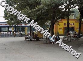
(ignore the copyright claim, that's a load of BS)
But it just looks like the run of the mill, standard, realism style that I've grown tired of in my own parks.
Does anyone have suggestions on how I can better achieve a "gritty" style, objects, textures they think would better match real life than the usual ones that appear in most parks now? Or maybe some lesser known examples of gritty parkmaking that doesn't fall in like with the cartoony, "RCT", aesthetics so popular in parks like Lisaberg, or Starpointe?
Would you suggest using more trackitecture to introduce new textures, or more of a focus on deco objects that add that extra little detail to the architecture?
Perhaps this is just a lost cause and what I'm trying to build is just not possible at the standards I want it to be at.
I'm really in a rut of disliking just about everything I make, or at least it not meeting what I envisioned or the standards I set for myself. Hopefully I dont sound pretentious or ass like, at least anymore than usual. But some suggestions would really be appreciated! -

 alex
Offline
There has to be tonnes of ways. It might require some creative object use but here are some obvious details:
-generally lots of subtle changes in texture to show dirt and discolouring. this shouldn't be hard given the variety of quarter blocks.
-weeds/cracks on paths.
-weeds/cracks on walls.
-signs with letters missing
-boarded up windows/doors
-very visible industrial details like pipes and AC units, fire escapes etc.
-closed/unused shops and rides
-generally more overgrown/unkept foliage
-
 Jappy
Offline
Hmmm... Well, in my opinion it looks like you actually may have hit the limits of RCT. The cartoonish style you want surpass, the typical RCT atmosphere can't be changed if you ask me. We've got a limited number of colours available to us (we can change those but I don't know how, and if your parks will still be able to be shared with the community) and a limited number of textures. This last one isn't actually true but when someone makes new objects for the game, he/she tries to make them work within the aesthetics of the game. Objects that do have other textures are normally seen as ugly and not matching. So if you want to change the aesthetic from cartoonish, I'm afraid you're going to have to design a complete new set of objects and colours...
But what do I know

-

 Liampie
Offline
Alex names a few little things you can add. It's all in the imperfections (cracks, weeds, erosion, missing letters) and inconveniences (ugly fire escapes, organic planning). Don't be afraid to be ugly. Interestingly you've mentioned Liseberg as being of the cartoonish realism type, whereas I'd say it's much much more related to the geewhzz/RRP brand of gritty realism. It is all the imperfections that made Liseberg such an immersive experience to me. As some people noted in the Liseberg comments, Liseberg had a notable amount of blind walls. That's a good example of an inconvenience/imperfection. Don't go overboard though, there's a perfect balance that I'd like to call 'perfect imperfectionism' that I think all gritty realism parkmakers should strive for.
I'd be very interested in seeing your attempt at recreating that picture. Maybe we can identify what your work needs. It's fun discussion matter at least! -

 dr dirt
Offline
Use more textures not included in the game / aren't the norm that disaster bench might give you some ideas. Avoid the cement texture (especially on roofs) that looks rather cartoony, but everyone uses. Keep flat roofs that higher-textured version rather than cement. Try/make some new path textures. Use rock objects for any cliffs / underwater shore drop offs. Drop most/all in game foliage and stick to harsher textures.
This was my take at what I think you're going for. I released a bench somewhere that was going towards it, and originally wanted to drop cement blocks altogether and make a new brick texture. Just never got to doing it before I lost access to the object editor. I think someone did make some new decent bricks too, though.
-
 Jaguar
Offline
Maybe look to That Guy's Wasteland for inspiration, it doesn't use any strange objects to my knowledge, yet its atmosphere is just amazing in my opinion.
Other than that, changing the color palette as mentioned earlier could help. I believe Locomotion has a more muted palette than Roller Coaster Tycoon, giving it a bit of a duller, grittier look. Although that kind of look just doesn't work on the RCT engine, it's ugly without reflections or high-detailed textures. Simply modifying the existing palette by muting its colors should work.
Also, I know I'm going to receive a fair amount of flak for this but as dr. dirt mentioned, different textures can work. Because of this, there are a few ugly but useful textures from WW (the corrugated metal roofs/walls for instance). If you want something that looks shitty and plastic or metallic, the expansion scenery works pretty well.
-

 G Force
Offline
Thanks guys for the suggestions. Changing the color pallet was something I considered to try, not really sure how to do that but it can't be that difficult.
Dr. Dirt, did spend some time looking at your bench and some of the objects you included, kind of wish I would of used your bench form the start, but I've spent quite a bit of time on some hacks already so I don't want to have to restart. Might just heavily modify the bench I have which is thankfully possible with Open.
I've found a lot of stuff that I like and works well, the objects are just really limited in selection compared to the more common textures so there's a bit of a roadblock there. Might try to experiment a bit more and see what is out there.
I'm not sure how so or if at all I'll have a screen of the progress. It might come to a point where I just give in an try to take a different approach. But none the less I'll keep working at it.
-

 chorkiel
Offline
Essentially you're trying to do something that hasn't been done before in the game, I believe. Perhaps it's a good idea to look at other visual art forms and see how they've done similar things. You're probably going for a feel rather than something that's seen in details. The colors in films like Batman v Superman aren't always normal (or even realistic), but they help achieve a feel. It's not always about dark colors though. The Social Network has a very gritty feel, but at times has a very light palet. Green Room is super dark through monotony. Then there's Lawless that has a really gritty feel without ever straying from realistic colors. Don't know if this approach would work for you personally, but it's something that I'd recommend.
-

 posix
Offline
Good to see you finally take the next step in your game. You're still thinking way too superficially, so you're looking for practical solutions like specific objects, trackitecture amounts, colour palettes. My advice is to become less dependent on real life references and "tools" you may see, and build more from within. Say hello to the macro level. Train you imagination and purely emotional-aesthetic preference. Not everything is formulaic. If you want a style and feeling, your creativity, if you have, will lead the way there.
 Tags
Tags
- No Tags


