NE Olympics '16 / June 30th: Vertical Sprint
-
 06-May 16
-

 Liampie
Offline
We're changing the order of the disciplines. Parade of Flags was due yesterday, Vertical Sprint will be held in November, after the NEDC3.
 -

 Lilith
Offline
Jokes on you the skyscraper I submitted Thursday is actually my parade of flags entry
 -

 Liampie
Offline
Great entries, no weak ones! Excited and annoyed at the same time that there are ten very cool towers to choose from. Will post my reviews in the next few days.
 -

 Lilith
Offline
That's what Aesthetica's was based off, if anyone was wondering.
All of the entries were super fun, although Arrowmania's doesn't seem to open in Vanilla. (maybe its just me) X7's entry was too fun, and done so well. Kumba's and Jaguar's entry was also unique and very cool. Zai suggested I make Godzilla attacking a tower because I was reading a book about Godzilla earlier this week. Iron Rattler's brought back some hilarious memories of Furious 7. I love all of the entries, Parkmenistan's are especially cute. This event was a blast.
-

 Stoksy
Offline
Kumba, what the fuck did you add to your entry? I tried to load the park, OpenRCT crashed. And now I can't even open the game anymore :/ it goes through the 'adding objects to cache' and then it crashes...
-

 G Force
Offline
Its not a kumba entry without a million new objects.
Great entries all around, special shutout to Merzbow666 for the only LL entry. Had to go with Iron Rattlers F&tF map because it made me laugh for 5 minutes after opening it. Liam's seemed to stand out the most after that and got my 2nd place vote. Rest were all nice but hard to really distinguish, outside of the unfinished bits on a few of them.
Also, glad that the park pages are open to comments, always bothers me that contest parks re-direct to a thread and you aren't able to comment on the park pages themselves. Hope this is the method used going forward.
-

 Stoksy
Offline
Mmkay, so it wasn't actually Kumba's entry specifically, seems that my objdata folder might actually be too full...as it happens whenever it needs to re-sync after new objects are added.
-

 Sulakke
Offline
Also, glad that the park pages are open to comments, always bothers me that contest parks re-direct to a thread and you aren't able to comment on the park pages themselves. Hope this is the method used going forward.
I have to agree.
The Domtoren was fantastic, but it is not a skyscraper. And it should have been a lot bigger scale wise, compared to the real one. Stoksy's entry was easily the best skyscraper, but what a shame it was unfinished. The finished angle looked great. Faas' one was the best of the rest. It's hard to vote on this...
-

 chorkiel
Offline
1. Blackwood Tower
2. TVRB Headquarter
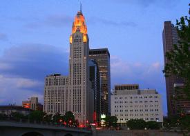
3. Guardian Building
4. De Domtoren
5. Terminal Towers
6. Fast and Furious
7. LeSthetica Tower
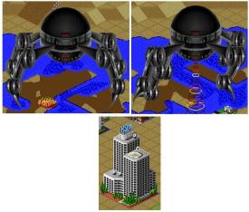
8. SimCIty 2000 Monster Attack
9. Q1 Tower
10. Arrowmania
Blackwood Tower was just a solid entry. It didn't stand out through an original idea, but it was one of the best skyscrapers, with good supporting surroundings. I liked it. 80%
Arrowmania's building wasn't particularly interesting. And I was really annoyed by the way you did the blacktiling. Not only because it wasn't black, but also because it had multiple colors. The atmosphere of the whole was quite nice though. 40%
TVRB Headquarter was a really well-done skyscraper. Liked it a lot. The only thing missing was some more life around it. 75%
LeSthetica Tower - Props for being the only LL entry. Liked your building. Texture was well-chosen. Top of the building was quite good. Generally, though, I feel like LL isn't per se the best tool for an architecture round but I'd say you pulled it off about as good as possible. 55%
SimCity had a strong concept even though it didn't really strike a cord with me. The building was a bit of an eye-sore, which I didn't really like either. 50%
Q1 could have been one of the top entries had it been finished. Bummer.
45%
Terminal Towers had some really strong theme park content, but should have been more finished to go for the win.
60%
De Domtoren looks very nice, and has that enjoyable Liam atmosphere. Would have liked to see everything a bit bigger, and indeed it isn't a skyscraper. 70%
Fast and Furious made me smile quite much. Towers look quite nice too. Enjoyed it. 60%
Guardian Building was on the one hand one of the better buildings but on the other hand I found it too busy. I wouldn't call it an eye-sore but it was quite exhausting to look at it. 70%
In the end I gave the win to Blackwood because I felt they fulfilled the objective in the best way. Would have loved to see more entries with rides. -
 X7123M3-256
Offline
It's probably because of the invisible entrances. Try opening it with OpenRCT2, or just don't scroll over the carousel. I get an access violation in vanilla whenever the carousel enters the viewport, but it works fine in OpenRCT2.
-

 Iron Rattler
Offline
1. Guardian Tower
2. Blackwood Tower
3. Sim City 2000
4. De Domtoren
5. TVRB Building
6. Lesthetica
7. Terminal Tower
8. Q1 Building
9. Skyscraper
I absolutely loved Faas's entry. It won this in a landslide for me. Not only did it have the most detailed skyscraper but I also really enjoyed and understood the atmosphere he was going for. The cutaway on the back was great too. 2nd place was harder to decide for me. I ended up going with Blackwood. I thought it was really nice and clean. I really liked Sim City but having never played the game I wasn't quite as intrigued by the idea. Liampie's entry was really nice and detailed, but I thought didn't fit the discipline quite as well as the top three. Much respect for Coaster Rica and Aesthetica for their ambitious concepts and ideas they were fun to look at.
-

 GammaZero
Offline
TVRB - Props for building one of the tallest buildings on the contest! Looks really nice, the only thing missing here are the surroundings. I think peeps would really help.
Arrowmania - I'd really recommend building with vanilla RCT2, too many of your entries are giving me error trappers
 Oh well, looks pretty from the overview, albeit a tad too small.
LeSthetica - I know this was built with LL, but it's missing liveliness. Maybe if you used more textures, or made the area peepable. Still, looked really clean and well done.
SimCity 2000 - Oh, the nostalgia
 I liked this one a lot because of the atmosphere, but the building is too bulky and repetitive (I guess that can't be helped) for me.
Q1 - Would have gotten my vote if it was finished. The tower shows a lot of potential, shame you guys didn't have enough time

Terminal Towers - Really liked the integration of rides into the building, but surroundings are quite dull and the tower itself looks a bit underdetailed (is that even a word?).
De Domtoren - Wow, this one is filled to the brim with detail! The building and surroundings are gorgeous, but it's too short to be a skyscraper.
The Fast and the Furious - Didn't watch the movie, but the "escape" didn't fail to make me laugh
 Probably the cleanest and prettiest entry. but suffers a bit due to the size of the buildings. Just like the last one, not a skyscraper, but one of the best entries nonetheless.
Guardian Building - IMO the best building. Didn't like the colors that much, but the attention to detail and atmosphere in general made this entry my favorite.
Blackwood - Of course, the best entry of all
 Jokes aside, I had a lot of fun building this one, but time made it hard for me to add much detail to the tower. G Force helped me with the surroundings, which came out nicely. All in all, I think it was a good entry, and good practice for me
After a bit of thinking, I voted for Faas's entry, because it had the best building and atmosphere. I'm really impressed, all of the entries were good this time

-
 Jappy
Offline
Great entries from everyone! Glad to see the contest is taking up speed and the entries getting better and better. Also glad to see H2H-like humour coming to the Olympics! Monster attack, what the hell??

 Tags
Tags
- No Tags
