H2H7 / [H2H7 Round 5 Match 1] - Italian Stallions vs The Rat Pack
-
 08-June 15
-

 BelgianGuy
Offline
the fact is it doesn't look different at all that's why it's being compared... Just saying
-

 MCI
Offline
MCI the coasters where not working for me either.
Thanks, that makes it all the more disturbing...
-

 AvanineCommuter
Offline
Still can't seem to get the park to work. Deleted the three objects, copied another one in the objdat folder, and still crashes. I'll try redownloading.
-

 MCI
Offline
No it´s not. It´s a bug you get using 8cars after opening the rides to peeps. That´s why I asked, I wanted to know if this is a bug only happening to me, or if everyone else just chooses to ignore it.
I wont complain about badly/not at all working block sections anymore, because that´s something NE doesn´t seem to care about.
-

 AvanineCommuter
Offline
No it´s not. It´s a bug you get using 8cars after opening the rides to peeps. That´s why I asked, I wanted to know if this is a bug only happening to me, or if everyone else just chooses to ignore it.
I wont complain about badly/not at all working block sections, because that´s something NE doesn´t seem to care about.
Funny how NE is all about realism but bad blocked sections isn't a concern in that sense.
-

 Six Frags
Offline
Do you just post with the intention of starting shit with everyone? Airtime's work was deleted. Airtime will not be getting any credit for this as none of his work is on the park. Of course the buildings are going to look similar - they're the same fucking building in real life.
Can we please comment on the park without the Airtime comparisons? Not fair on the current builders at all.
Why would I want to 'start shit with everyone'? I was just saying it was really obvious to me the structures (object choice, composition of the buildings, placement of details, most color choices) in the screen I linked are the same, and thus it seems unfair to me. It's fine if you choose to copy him, but at least give him credit for thinking up the way the structure is build. I don't buy the 'they're the same fucking building in real life' argument either.
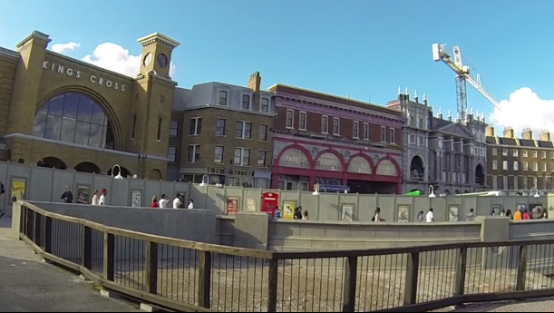
I can name 100 examples, but I'll just point out 1; King's Cross' tower is flat in real life, but airtime added a spire and your park has one too.
Maybe I'm just nitpicky here, but I just feel this is kinda unfair.. Ah well, I'm not even in the competition anymore so why should I care right?

-

 trav
Offline

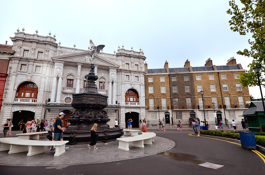
The unfair aspect here is that you're giving shitty feedback because you've seen it done before, originally on the same park. Why not just ignore that factor and comment on what's there? Does it give you some feeling of superiority shitting on the hard work of these guys? Do you think we knew that Airtime was going to post those screens?
If you don't have actual criticism or something beneficial to the builders, don't post. No one wants to read it and I speak for my whole team in confidence when I say that we've had enough of this bullshit and again, the builders deserve more.
-

 Six Frags
Offline
If you actually read what I posted you would notice I did give feedback and said what I liked and didn't like. The 'inspiration' was not really a big thing for me though, but you choose to pick that out and started crying about it.
-

 Ride6
Offline
These two parks couldn't be more philosophically opposed if they tried.
Universal Studios is a "realistic" park in the most cut-and-dried sense. It's an obviously Herculean effort, technically adept, with lots of thought put into it. But it's somehow lacking in vibrancy or joy. The lack of music is a big contributing factor. Besides that the map planning that put massive blank building backs to the map edge also hurt. 1 or 2 tile backstage areas, or just open backs that let us see the layouts would've been preferred in my book.
The Harry Potter corner was extremely well done and recognizable even to me - neither an avid reader of the books, nor watcher of the movies. It just exuded the right look and feel. I especially liked the knight bus and the "pops" truck.
I wanted to award the effort, but it does little in inspire or excite me personally.
Area 52 - OMG YES! Everything about this was amazing. The hacks on "men who stare at goats" made me feel like I was looking at a Emperor of the Forgotten Realms again. The use of "Danger Zone" was hysterical and blended really well with the game's "Rock 1" option. Saturn V had a breathtaking sculpture and the model VAB for a station! *drools*. I really liked the floorless' layout, and the lab tours, and the flying cars... And the condor! ^___________^ SO GOOD!
I feel like I've seen some of these ideas executed well in RCT2, but avoided like the plague in LL and it was wonderful to see them executed so joyously.But the real selling point of Area 52 is that it felt alive and joyful. It felt like a place I wanted to imagine myself being because it was so absurd and wonderful. I wanted to get wrapped up in it. So it'll get my vote.
-
 inthemanual
Offline
POLL IS NOW LIVE AND WILL REMAIN OPEN FOR ROUGHLY 72 HOURS.
If you cannot vote, please use the 'null vote' option underneath the poll which will enable you to view the results like everyone else. -

 Cocoa
Offline
I see a whole lot of difference in the two screens. . Look at them side by side and i think it's pretty clear theyre not the same
 -

 Stoksy
Offline
Why would I want to 'start shit with everyone'? I was just saying it was really obvious to me the structures (object choice, composition of the buildings, placement of details, most color choices) in the screen I linked are the same, and thus it seems unfair to me. It's fine if you choose to copy him, but at least give him credit for thinking up the way the structure is build. I don't buy the 'they're the same fucking building in real life' argument either.

I can name 100 examples, but I'll just point out 1; King's Cross' tower is flat in real life, but airtime added a spire and your park has one too.
Well, considering that the photo you posted is an under construction one, probably not the best example that you could have come up with [there's a steeple on the real one, it's just quite shallow, so if you're saying that using a steep tower is the problem then okay I guess(?)]. Colour choice isn't a particularly strong argument either, but whatever.
Good LL v RCT2 matchup! The helicopter in the Rat Pack's screen looks quality! And after watching MCI's video, although the curvy landscape looks really cool I kind of wish that there was a way to make the transition from the ground level into the sheer cliffs a little more gradual. Still, some awesome features here. Not sure if the glitched flying saucer cars was intentional...certainly looked cool

Interesting that the Hyper didn't work, considering that the train on the lift has a clear block section to move into...
-

 navalin
Offline
Can't open the LL park but I'm generally... underwhelmed with the Italian Stallions park? Don't get me wrong, the architecture is gorgeous, but it kind of ends there for me. The park generally feels too cramped so that you can only see the upper 2/3 of a building and totally miss out on what's going on at street level. And for something so building/dark ride based, I'd like to catch a glimpse of what's inside, especially if it's right on the edge of the map like the Maurer Schoene spinner (and seriously, you're going to use a brand new coaster type and not make it at all visible until I turn scenery off?). I really did like the way the hyper was presented with the chain tube and general layout, but everything else just seemed to be too crowded and lost my attention pretty fast.
-

 AvanineCommuter
Offline
Oh my, this really is the battle of the season isn't it? High quality fantasy LL vs. realism RCT2 in round 5 that determines which team goes into semis.
-

 Coasterbill
Offline
Both of these parks were excellent but after spending a lot of time looking at both of these my vote goes to Area 52.
Unfortunately to pick a winner between 2 amazing parks you have to scrutinize the hell out of them and while I loved Universal Studios it seemed very rushed and there were a lot of simple but important things that were overlooked here. I still loved the park and the architectural detailing was phenomenal but great architectural details aren't enough to push a park over the edge when it's facing such stiff competition.
Universal Studios
Pros:
+ NYC Dreamin looked great and had great flow. Obviously this is based on Hollywood Dream but the Rip Ride Rockit inspiration was there too with the block section that was totally unnecessary except at universal where they need to pump out an astronomical amount of trains to get the capacity where they need it to be (seriously, look at all the brake runs on Rockit)
+ I loved the waterfront and the facade of Diagon Alley... excellent detailing and atmosphere here.
+ I loved the food trucks
+ Making Despicable Me a mouse ride is a very clever idea.
+ Excellent Atmosphere
Cons:
- As soon as the park opens, NYC Dreamin is the focal point and it's stuck on the lift and needs to be re-set. The minimum dispatches on this need adjustment so the ride doesn't constantly block stop but I can overlook that more than the ride being stuck forever until it's re-set due to zero clearencing.
- The Vekoma in the back will never run because peeps can't get to it and it has no maximum waiting time. The fact that 2 of the coasters didn't work really bothered me.
- There was very little attention paid to sightlines, both from the viewers of the park in RCT and the peeps. For example, I know this is how it is in real life but from the air, Diagon Alley was very hard to see due to the tall buildings and narrow walkways. Also, at one point I noticed a food truck near the front that I really liked but it was being blocked from every angle... one time by a tree that added far less to the park than that truck did.
Also, the idea of having plain walls that guests can't see and impressive facades that they can on rides like Gringots is a great idea, but unfortunately the plain walls are in plain sight. That walkway to the roof is 100% visible from Diagon Alley and I wanted more detail on that brown brick facade on either side of the 3 town home style buildings up top. That seemed very plain for something that was supposed to be in Diagon Alley.
Also, Grongots puts a huge, ugly wall as a very visible backdrop to the midway in front of the Vekoma.
Overall I loved the park and I hope my review didn't come off as being negative, but these things held it back for me.
Area 52
Pros:
+ I loved the Six Flags Fiesta Texas inspired mountain quarry, this was very well done and you added an extra dynamic by having Taranis tunnel through it at one point.
+ I was a big fan of Taranis, the layout was excellent
+ Dat Condor Doe
+ I loved Jurrasic Cascade and the views inside it near the edge of the map
+ The use of Rapids walls is excellent everywhere
+ The Rocket Coaster was simple but I liked it a lot. The rocket was an excellent touch and you made that horrible candy object look great there. Great station too.
+ Great atmosphere
Cons:
- I actually thought the station of Taranis left something to be desired. It could have benefited a ton from just a few more details.
- I didn't really like the Roswell incident, I wasn't a fan of the layout at all and felt that it totally overpowered an otherwise very nice area by the water.
Again, I'm being very judgemental but you have to be to pick a favorite between 2 parks that are this good. Both parks deserve gold and this was one of the best matchups of H2H so far. Great work everyone!
-

 djbrcace1234
Offline
I sort of wish the Stallions built only a diagon alley area. Everything is cramped and just feels way out of scale because of trying to compress so much in a little bit of area. I get that the actual alley is cramped, but some things need to be altered for the benefit of the viewer in RCT, like bill mentioned. There were a lot of things that I wish I could have seen more clearly, like shrek's swamp, the food truck.
Area 52 is very ______, which is good and bad. This park had more ideas in it that were clever, and that's good because a lot of the hacks ______ does tend to be just eye candy. This time was different. Good effort.
This is a hard choice. I may just null my vote. Every other park that I have chosen ( and sorry for not giving more reviews this time around. I'll make up for that!) has been very easy for me, whether they have won or lost. I may just null my vote.
Good work teams, good luck!
-

 nin
Offline
Also, the idea of having plain walls that guests can't see and impressive facades that they can on rides like Gringots is a great idea, but unfortunately the plain walls are in plain sight. That walkway to the roof is 100% visible from Diagon Alley and I wanted more detail on that brown brick facade on either side of the 3 town home style buildings up top. That seemed very plain for something that was supposed to be in Diagon Alley.
I will say that this is a practice Universal does fairly often. At IOA, the Hogwarts facade blocks the warehouse showbuilding from Potterland, but it's clearly visible from any other land in the park, especially the neighboring Jurassic Park land. Those plain walls kill the atmosphere, but it's definitely something that suits Universal.
Universal is one of my favorite parks of the season, but it certainly isn't the best. I find the park make-up interesting, but being that it's branded US I'm overly critical on it. It irks me that it's SO CLOSE to being great, but it misses a few marks to be just that.
It's like being a fan of a bad movie; you can appreciate what went into it, but in the end you know that it could've been so much better.
I'm sure that if the park had more time (and a bit better planning) it could've been something spectacular. Props to those builders.
 Tags
Tags
- No Tags

