H2H7 / [H2H7 Round 4 Match 1] - The Rat Pack vs Robber Barons
-
 28-May 15
-

 FredD
Offline
Arcanis Mineralis
It looks really impressive from above. And it keeps impressing when zooming in. The buildings seems too huge, but in this context it's not an eyesore. I love the pink energy pylon and the geysers. Not a fan of the coaster layouts, especially the flying coaster. I get that fantasy is building without caring about any 'rules' or guidelines, but I just ask myself: why are some parts supported and some aren't? I get that the coaster doesn't have to be supported in fantasy but supporting some parts and not other parts just seems weird. And I have to agree with most here that bringing in peeps would have brought more vibe to the park.
Archelaus
It looks cleaner than the Mineralispark. The flying shark idea is great, just as the boats. I like the coasters more but they aren't convincing me as well. Same question here: why supporting tiny bits of the inverted while 90% of it isn't supported... I just don't get it...
Overall a though match for me, as I'm not into fantasy. Arcanis Mineralis was able to grab my attention more so they get my vote.
-

 Louis!
Offline
Arcanis Mineralis
What a park. I loved this. The woodie layout was brilliant. The double launch, I love that it took on aspects from an Intamin multi-launch, but it was wooden. The crystals were executed well and the architecture was top quality. I think the lack of peeps actually helped with the atmosphere and that the park didn't feel dead at all. I loved the dark tone it had and this added greatly to the atmosphere. I wasn't a fan of the flyer, it was just too long and boring, it had parts that were interesting, but they were lost in the sprawl of track. A lovely park, my third favourite of the round behind my own team's and Diamond Heights, but still something to be proud of as I would still rank this highly against the other parks we've seen this season. Great stuff, and hopefully a great win to pick your team up with!
Archelaus
Opened this first and knowing who was on this, was surprised that it wasn't better than it was. It was a good park, but to me, nothing really special. Saying that though, the layout of Cutlass was really lovely, but Spectre wasn't as good as Cutlass due to bad pacing really. I felt the architecture was too busy with texture and colour and just wasn't my cup of tea. The coloured ships were nicely done, perhaps a bit too colourful again for my liking, but still I could appreciate the work that went into it all. On the whole, a decent park and I loved all the little touches like the flying sharks etc. The concept of the park was also really nice, and the readme was a good background to help deliver the concept. It would have made more sense IMO to have the land totally black tiled to give the illusion of these islands floating, I guess the ice was to show that they float in the sky and form clouds below, but I think black tiling would have helped a bit better. But regardless, I enjoyed the park.
Good work from both teams, but one park to me was superior. Vote goes to The Rat Pack.
-

 Wanted
Offline
Fantasy is my thing so I'll do a full review later...
Man, I was really disappointed by both parks
 I'm assuming two of my favorite parkmakers worked on these and I was hoping for something that felt more alive. Both parks were so empty
Voting for The Rat Pack for the fun woodie and cystals
-

 Tolsimir
Offline
Just viewed both parks for the first time, and I must say they are impressive from the overview. Great use of height and depth on the large scale in both parks. I like both concepts well pulled of and nice atmosphere.
Don't know where my vote will go but I'll take a second look tomorrow and will write a proper review.
-
 inthemanual
Offline
Going for a quick and dirty +/- post this time. If anyone wants clarification or expansion on this, I'll gladly do it if you ask.

Archelaus:
+ Amazing concept - we had a similar idea, actually, but we would not have pulled it off so well.
+ details - Boats flying, airborne sharks, both adding to the story plus the fade between the sea and the clouds+ coasters were innovative and fun, if a bit crazy.
+ I loved the custom ships
- difficult to read - the different levels made reading certain areas a bit difficult
- generic(?) - a lot of the map felt like "generic fantasy city 12" which didn't feed in to or reflect off the story as much as I'd have liked.
- Colors
- square/gridlock - A concept like this lends itself to organic shapes well, so the blockiness of the whole thing wasn't very fitting, imo
Arcanis Mineralis
+ Colors
+ giant crystals
+ story consistency - almost everything on the map seemed to make sense and add into other parts of the map.
+ layers
+ hot springs were cool
+ Woodie was great
- Flyer was fun, but too long.
- readability - things got lost in a mess of brown from time to time (sometimes it was a gold/purple mess instead)
- some areas felt blocky/rushed
- lack of peeps
Really close overall. Still don't know who to vote for.
-

 inthemanual
Offline
Voting Closed
Rat Pack beat Robber Barons
Rat Pack vote count: 32 (71.11%)
Robber Barons vote count: 13 (28.89%)
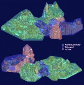
Arcanis Mineralis was made by AvanineCommuter(60%), Ottersalad(30%), and in:cities(10%).
Archelaus was made by FK+Coastermind(80%), seb(15%) and BelgianGuy(5%). -

 ottersalad
Offline
Bust out the champagne bottles, the Rat Pack won a round!
But in all seriousness, this was a wonderful matchup.. fantasy vs. fantasy is probably something everyone was anticipating and I think the two parks were a good match in terms of quality. It is really exciting for me to simply be a part of H2H, and to say I might have possibly helped win a round? That makes me really glad Roomie picked me to be on the team.
-

 Roomie
Offline
Wow we won
 thank God we got our first win idea our belt.
Well done guys.
As you may have figured this park only just made it in at all and fancy all down to avanines hard work in the last few days. He really put in a shift. it's a shame the peep issue was only spotted late and was too tough to fixed.
Ottersalad surpassed all expectations and proved an excellent pick here. Really impressed. IC took up his new job on the cruise ships mid round so he was able to contribute a little less than planned but he did add some great architecture.
All in all I'm proud of the guys. Always enjoy a good fantasy match and robbies team put in a great park too. Sorry guys. -

 alex
Offline
I didn't get chance to vote in time but it would've gone to Arcanis Mineralis anyway. Here's my comments:
Arcanis Mineralis:
Although this won I'm surprised there wasn't a bigger reaction to this. I found it stunning and visually unlike anything I've seen before. It's basically the sort of RCT2 I would aspire to make. Gorgeous colour schemes, crazy landscaping, and huge multi-layered structures.
Concept wise it was cool and allowed for some depth and variety in theming - big fancy architecture up top, raw industrial underbelly. The crystal's were original and really nicely executed.
Rides: For me this was the parks weakness. I felt that both didn't have enough presence in the park. Both coasters were tucked off to the sides. They were used like theming elements which blended into the surroundings and added decoration whereas I would have really liked to see at least one of them having some bigger, standout moments. The rapids was particularly uneventful and hidden away. That said there were some cool details which I'm gonna mention along with non ride stuff:
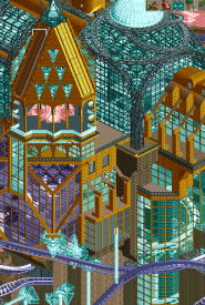
This spiral lift reminiscent of a stairwell was awesome.
So is the gold spire above. Refreshing change from all the glass roofs and domes and because of the texture choices the gold really shone.
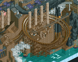
Loved these big interlocking turns. Especially with the walkway weaving through and the columns.
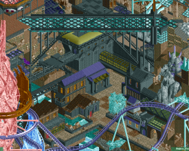
This bridge looks really impressive from this angle with the way it towers over all the industrial buildings below.
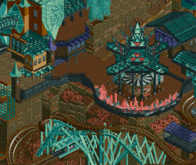
How neon-bright the crystals looked when it rained!
I've ran out of things to say, but to summarise: I loved it but would've loved it more had the rides been more prominent.
Archelaus
Lovely concept for a fantasy park. It was great how you had these cool fantasy tropes like huge waterfalls and flying boats and it actually made sense from a story perspective, not just 'because fantasy'.
On first impressions the overview isn't as beautiful Arcanis. The colour scheme isn't as tight and the snow's an eye sore and isn't really working as cloud tops. Maybe you just needed to make the surface bumpy. The landscaping is really nice though, the way you've blended it into the different levels of brickwork is very clever. Architecture is great too, I like how it's an eclectic mix with a mostly greek/turkish look. Screams fantasy and adventure. There's just a few too many colours for my liking.
Cutlass was really nice. Loved the big impressive elements and the interactions. The tight turnaround over the waterfall was particularly cool. It's just a shame that the majority of it was framed against the flat snow texture. Spectre suffered from this too but was otherwise a great layout. Really liked the vertical hills and drops, usually they would look awkward but because of the landscape integration they work really well.
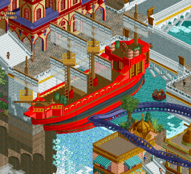
The boats were obviously all stunning and version1 will be upset so that's a bonus. Really loved this red one and the way it was about to 'take off':
Here's a couple more of my favourite bits:
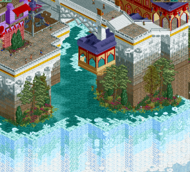
The area around this waterfall looked great. The transformation from natural landscaping with the foliage and waterfalls beneath into the bricks and overhanging paths is excellent.
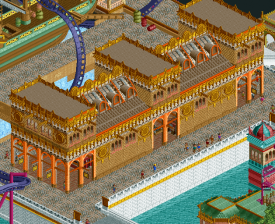
This building!
That's all I got. Amazing stuff but I would have preferred it if you stripped the colour palette back a bit and found a better way to represent clouds.
-

 AvanineCommuter
Offline
Yay! Very excited to have won a round, and excited to have seen a fantasy vs. fantasy matchup.
Overall I think the concept behind our park was unique and we tried to approach it in a way that was never done before. I can't recall any park that had crystals as a central theme in all aspects from backstory to rides to architecture to landscaping. We tried to create a darker underground feel and add height variation so it's not a traditional park layout with different sections being separate - instead we wanted them integrated together so one wove in and out of the other. Tried to also play with landscaping and terracing hot springs and geysers to add to the theme and feel.
As roomie said, there was a real time crunch with this park and unfortunately peeping it wasn't possible even with the extension. We barely made the macro in before it needed to be submitted. @bigshootergrill if you've ever peeped a park with stairwells and underground pathing, you'll know that it isn't simply letting the peeps flood in for 5 minutes.
Major thanks to otter salad who really stepped up to fill in Josh's shoes when he had to leave for his work. It was a tough spot for me as well because I came into the competition with a restricted schedule, hoping to be more a supplementary build than a lead. But otter really helped with motivation to keep going and he improved with nearly every round he sent the park back, it was rather impressive to see how quickly he grew as a builder. .
Also major thanks to Dave for guiding us along in the last critical hours before submission with feedback and tips. It was really quite a stressful experience having to rush and decide to cut out certain things / half ass other things. Given a couple of extra days and Josh's help, I expect this park could have been a real competitor for top of the season.
I'll post a who did what soon.
On a separate note, I'd like to be the one who brings back the age old debate of realism vs. Fantasy. While I understand that most of the community has a preference for realism, I don't understand how that bars you from knowing "how to judge" a fantasy park. As a fantasy builder myself, I don't think it bars me from knowing how to judge a realistic park, and I still give my reviews and judgment the same way: are the layouts beautifully made? How's the flow? Is the park well composed? Is the aesthetic clear and well presented? Is the detailing on point? The colors? The textures? The concept? Etc. Fantasy or not, you should all be able to judge what has been created. When you have reviews that are literally: "bland archi, boats are whatever, bad colors", it makes me mad. It's a huge disservice to both parks and their park makers to see this "who cares" attitude simply because it's not realism. And, to point out, we've had our fair share of fantasy this season with Bermuda, Carreira, Meizhou, etc. Yet this was the first time it felt like people had to preface a review. Just my two cents.
For the Robber Baron's park, we all had an inkling that FK would be going this week and I'm so glad to see new work from you FK! It was a beautiful concept and piece of fantasy RCT. The architecture was surprising effective when on first impression I thought it was too blocky. I absolutely loved the gradient transition of stone to brick up the walls of the platforms. A beautiful detail. The boats were unfairly criticized I think, they are truly some of the best of the season and of all time. I'm actually surprised that people didn't like them... Seriously? Even tenochtitlan's boats, which we praised beyond belief, were merely on the same level as these. The colors were beautiful on the boats and the shape / forms were spot on for fantasy ships! I wasn't a huge fan of either coaster though, as one was complete fantasy but with pacing issues and the other was too realistic and didn't fit the theme. Overall I loved the grandeur and you had some really beautiful ideas and elements that came together very well. Great park!
I know scheduling is tough, but FK we really do need to work together. I think the RCT community will melt.
-

 Tolsimir
Offline
In the end I went with Arcanis Mineralis. It had the better atmosphere.
Arcanis Mineralis
This is a great example for well thought out fantasy. You have a nice concept and stick to it throughout the park. It is easy to make out the two sided society with the wizards in their majestic golden and glass towers and the social weak in the brown mines. Only the connection between them I did not like that much. That is the glass bridge from my interpretation. While it looks good from the side the two other angles were much confusing and not pleasent to the eye.
The large shape in the park were top notch. As were the colors. Perfectly convincing dark atmosphere overall with nice bright color accents. I liked all those water ponds.
The flying coaster was a bit boring because it was too long. I liked the spiral lift thought especially being at the end of the ride. Overall I had the feeling that in the wizard area there were a little too few rides or they weren't presented well enough. I liked the flying crystals they looked amazing. Also great take on the sharp edges to the background.
In the slum area it was better with the launched wooden coaster dominating the scene. The coaster fitted nice into its surroundings. I liked the fast turns.
The lack of peeps was no big bummer for me but I feel that the park would benefit from peeps on the small scale. But only 400 peeps not 1400 would have fit. I mean the park shouldn't be to liveful but now it lacks a bit action.
Only large critique I have is the bad landscaping in some points. On some backsides there are sharp edges with ruins objects thrown on it with no care. That looks really shitty.
However that's not bringing down the park a lot, I was great to see some good effort on this type of park.
My vote is 80%
Archelaus
On the first glance this park is very impressive. Nice setting, lovely, sunny atmosphere. I mean the park screams freshness on every corner. I liked those color gradients on the waterfalls. Can't say I agree on the snow ground on the outer rim but I can see that you didn't want the black ground there.
The ships were great. I liked the depth they had, colors were nice, maybe a bit more variation in forms could have be even better. What annoyed me were the flying boat rides (rapids and rescue boats I think) especially seeing them going through buildings. The sharks were okay.
The best building was the market hall. I loved it, looked really awesome and had a nice purpose. The village on the hill looked nice but was nothing special.
From the two coasters I preferred the launched one. It had a decent layout and pacing was ok. Thats what you cannot say about the inverted. In times when my RCT (don't know why it was that strong on your park) did not lag the train just rushed through the track. And dear Robber Barons, it is the second time you forgot to reset you ride with block brakes just before submitting it, again!

Overall Archelaus is a good park but it lacks real highlights. It is flat in terms of excitement, even though the quality is high already. Nothing really stands out. The boats could have been some but the sheer number of them makes them common in the park already.
75%, almost 70%
-

 In:Cities
Offline
I barely was able to build anything!
Haha I appreciate it though man. I really wasn't able to touch the park for the last month or so. Aside from one day last week where I downloaded it onto my phone, transferred to my laptop, built for an hour, then put it back on my phone to post it in the forum haha. They charge me by the megabyte on the ship because it's satellite internet, so I have to be stingy with my data. Fortunately, I like you guys so I can spare the extra cost
My team may not have the best record, but man they're a blast to work with. I think we get along and have the best team chemistry with one another without a doubt. -

 Xeccah
Offline
(I know I've been a lazy fuck lately, not giving builders the proper respect to reply, but I'm trying to make that up now.)
Arcanis Mineralis
First of all, to which probably how rushed things were can be attributed to, i feel Arcanis Mineralis was attempting to tap into the surrealism that Le Reve Parapluie and Agencia exude with, and, despite some of the best details with such a theme entails, it falls short both in sight and in execution. This was far less readable than either of those two works and a lot of the diversity that Le Reve had (e.g. the darker, smaller, more intimate architecture of the town juxtaposed with the grandeur, scale, and glass-work of the 'factory' only highlighted more by the use of elevation) was a lost opportunity here. This, ironically, is one of the largest complaints I have about FK's works. Though the larger-scale stuff was done justice in Aracanis, the fact that the textures don't vary enough from area-to-area give it the same feel as the smaller-scale stuff, with only the path layout and elevation confusing everything even more. This in general felt like a superficial attempt of what made previous avanine work fantastic, and the one release by him that's akin to the disorganization- his 'Vesper Island' design- was done with more finesse and atmosphere than this.
The creative details of this, however, rival Kumba's stuff. The crystals wrapped around the flyer, the crystals poking out of rock, and the mineral springs were all fantastic and what won me the vote. Both layouts accentuate the surrealism, and, though the flyer not all that memorable, were good on their own.
I would have gone with either a 65 or a 70% on this. It's always a pleasure to see new Avanine work, and I'll say this seems to be the best stuff the other two builders have contributed on, too.Archaelus
Onto Archaelus, It shares a lot of the same problems as Aracanis Mineralis does. It's very disjointed and unreadable in its path layout and the basic (2x2,2x3,2x4) forms of all the architecture mean that it's compositionally unmemorable no matter how well they may be detailed. An issue that is unique to this park was the uncohesiveness in all of the architectural colors and details, and left me feeling that i was supposed to view everything by itself and disregard the larger picture. The buildings are aesthetically beautiful, with some great texturing ideas and standalone some of the best-looking structures i've seen in-game, but they don't contribute to a unified atmosphere. My favorite thing in the park, that being the inverted coaster, was sadly too bare for me to enjoy.
Some of the ideas, architectural details, and pirate ships all signify to what would have been, if composed better, an 80%+ vote and a sure-fire winner for me, but nothing came together as a whole. FK, you have some of the most interesting shit in the game, but you're too unrelenting to let the negative aspects in your work go. 60%
-

 wheres_walto
Offline
Eh, I disagree with the negative comments. The thing that Avanine and FK both do better than ANYBODY EVER is use objects in creative ways. I implore you to look around the parks and study the way the buildings and structures are put together, try to imagine how they were built, and compare it to how you would copy that look. That's the enjoyment that I got from exploring: imagining the discovery of new uses for objects (different shapes, colors, and functions) and thinking of my own ways to be innovative. When I look at fantasy, the park's functionality doesn't matter as much as the ability to create a different world. Immersion in reality comes from familiarity and accuracy; immersion in fantasy comes from separation from the ordinary, which is why both parks succeeded in my eyes.
-

 Xeccah
Offline
I completely understand in the appeal that fantasy brings, and my outlook on the parks may be biased given the fact that neither person put in their best work and objectively am rating based on that, but I still feel this way regardless.
-

 FK+Coastermind
Offline
Congrats to Rat Pack, especially AVC. Always exciting to see more fantasy work, especially something as creative as this. This style of fantasy is so different than mine, i'm glad to see more variety developing in the genre.
Obviously pretty disappointed about the outcome, not so much of loosing as responses to the park. I thought a lot of our park was really well done, but it doesn't seem a good use of time trying to defend the work. Thanks to Seb and BG for helping me out.
 Tags
Tags
- No Tags
