H2H7 / [H2H7 Round 4 Match 3] - Italian Stallions vs Heaven's Atlas
-
 25-May 15
-

 Steve
Offline
Nice! Glad the builders were finally announced
I pretty much echo everything Liam said. This was pretty much his baby and I was along for the ride but I will say that I've never enjoyed building on a park as much as I did this one. Really felt great to be building again and have a such a solid new release all these years later. Liam truly is a great team mate and made the entire building process a blast. I hope this isn't the last you'll see of the two of us outside of the contest
Thank you everyone for the comments, and Stallions thank you for putting in a decent effort! I realize there were probably some issues within the team for this one and you could have just as easily forfeited this but you submitted anyway. From the video posted earlier it seems like you had some nice stuff! Hope to see it finished someday. -

 In:Cities
Offline
I had a blast building this park. Thank you for the opportunity Liam.
- Steve
#hipster -

 alex
Offline
Liam and Steve - Well done on an amazing park and sorry for not being able to deliver a proper contender. I'll post a longer comment about your park tomorrow when I can get to my computer and view it ingame again.
 -

 Steve
Offline
I was wondering if that was so blatantly obvious no one bothered to remark on it or that simply just no noticed, hahah. Glad everyone continues to find new things to like on this. The map shape was all Liam!You know I just realized that DH's map is shaped like a diamond...
-

6ca Offline
Macro (Park Impression):
The park looks kinda messy from above and has this strange cut-away corner.I thought the same thing and then realized that if you rotate it 90*, it is meant to look like a cut diamond. http://www.diamondex...8-8-442x300.JPG
EDIT: aaaaaand I should read the 4th page before I reply to a post on the first page

-

 alex
Offline
This might be my favourite park of the season. Not only is it clever and funny but it's beautiful (even in spite of the filter) and packed with well thought out details.
It's great to see Agorophobia and Claustrophobia recreated with more flowing, realistic (or plausible) layouts. They look fantastic whilst staying true to the originals in essence. This is true of the park as a whole - you didn't make it a geographical accurate recreation, instead you opted for subtle nods to the original park. They're brilliantly executed too. Here's the ones I noticed:-The steps leading up alongside Doppleganger
-The twist on an island
-The turn around the carousel
-Arachnophobia being mostly above water
-low railway bridges over the water
One thing which would've been nice to see would be the entrance area elevated a bit.
The theming was very neutral, in the way that classic RCT1 scenarios are and It's amazing how you've got all this cool architecture, foliage, wide paths yet it still has the old school rct feel.
The food huts were brilliant and I like how even though you made custom supports you chose to use tiny, rct style footers. In general it was funny to see all the clunky things we consider ugly and usually attempt to hide being meticulously recreated with tiny cso objects. It would have been cool to see one of the default fountains or statues recreated somewhere too.
Don't have much else to say. Loved it and I'm looking forward to #threemonkeyspark
-

 Turtle
Offline
Working with Liam is definitely the best time i've ever had playing RCT, glad Steve got to experience it too. He also has the most ridiculously awesome ideas. MVP.
-
 Jappy
Offline
The twist on an island a nod to the original scenario? As far as I know, there is no twist in the original scenario...
-

 Steve
Offline
What this guy said.Working with Liam is definitely the best time i've ever had playing RCT, glad Steve got to experience it too. He also has the most ridiculously awesome ideas. MVP.
-

 Steve
Offline
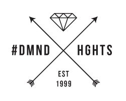
thats hilariously awesome. Thanks Alex!I made you a hipster logo - #diamondheights.gif
-

 Kumba
Offline
Parque los Muertos - Great potential here, but yeah it was barely half a park. I really liked the uniformed staff for the running of the bulls and the boxing ring. I would love to see this get finished because it could be solid LL work.
DH - Very cool idea and a really fun park for sure. I think both coasters did a fairly good job of representing their phobias. The bike racks were a bit overdone, but a great idea/object. The over-sized custom made default scenery was very nice, I always love when people do that. It reminds me of RCT in legos. These things make it clear to me why Six Frags liked the park so much. Me and him were close to doing something like this with custom default buildings when planning parks at the start of the season. Doppelganger was really awesome. I kinda hate you for the frozen staff changing the garbage bag as that's a first I wanted to do as part of a bank robbery theme idea. Oh and I loved the great use of my T-Shirts object! On the small negative side... I think the log flume was kinda uninspired and then 1/4 of the map was cutoff. Overall, one of the top parks this season for sure. Wonderful job!
 Tags
Tags
- No Tags
