H2H7 / [H2H7 Round 3 Match 3] - Rat Pack vs Hurricanes
-
 12-May 15
-
 inthemanual
Offline

Round 3 | Match 2
 VS
VS 
_____________________________________________________________________
Rat Pack - The Village and The Park (RCT2)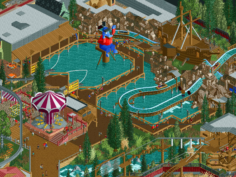
VS
Hurricanes - Lotte World (RCT2)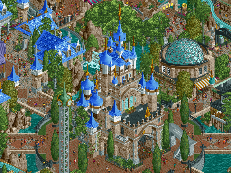
_____________________________________________________________________
How to vote:
- This season we're back to using polls to count the votes. THE POLL WILL OPEN IN 24 HOURS.
- Everyone but players belonging to either team in the match may vote.
- You can only vote if you have viewed both parks in game.
- Voting will be monitored and anyone found to be abusing votes in any way will be punished.
NEW RULE: next match will be posted as normal, on the condition that this match has at least 15 reviews of both parks within 24 hours. If not, the next match will be posted 24 hours beyond the deadline. -

 inthemanual
Offline
Week 1 was boats, week 2 was balloons, week 3 is ropes courses.
Fantastic job to both teams. Possibly my top two parks for the round. -

 Version1
Offline
Week 3's theme is also german parks.
Just looked at it before going to bed. It seems as the Hurricanes Out-Tripsdrilled the Robber Barons.
-

 Steve
Offline
Holy shit Hurricanes that castle is on point in that screen. Can't wait to check this out.
 -

 Fisch
Offline
Just looked at it before going to bed. It seems as the Hurricanes Out-Tripsdrilled the Robber Barons.
bahahahaha I thought the same. After having viewed your video and seeing the Canes' water ride I thought man this looks a lot like Tripsdrill. haha
_________________
In regards to this match up:
On first impression it appears that the Canes' park has the higher technical skill level while the Rat Pack's park was made with love...not saying the Canes' park wasn't but it doesn't give me that vibe. I thought the protest in the Rat Pack's park was absolutely hilarious haha.
________________________
ALSO how crazy is it that this round so many parks have similarities?
Lotte World's Asian archy has shades of Meizhou whereas Meizhou looked like Lijiang.
Calico Canyon and Raubritter had almost the exact same ideas just in a different setting.
The Village and the Park is a small park that's forced itself into a rural German setting exactly like Raubritter.
Lotte World's water ride looks exactly like Tripsdrill which Raubritter intended and it also has an Indian theme which we've seen this season too.
3 Parks this week had little climbing sections, 2 had Christian churches, another 2 had big castles.
A bunch of really funny coincidences haha
-

 Ling
Offline
Lotte World -
I'm not strictly sure what the overall theme is supposed to be, despite having a perhaps rather obvious collection of themes for each area. The custom flats were all impressive in themselves but the way you've gotten them to "work" is actually rather ingenious and I enjoyed the overall liveliness of the park with absolutely every queue crammed full of peeps. That's actually the thing I like most about the whole thing - the queues are just gorgeous. Vertigo's blocky buildings are so clean, Log Jammer is just so inviting and feels very Disney. Hurrikor Rapids's station is beautifully executed and the island that the majority of the Atlantis ride takes place on is probably the most awesome thing on the map. Shame it isn't more of a centerpiece and you can only really see it from the least populated area of the park. With all that weaving in and out of the terrain and scenery that the ride itself does, though, it's a shame the queue is all hidden away in the basement of the station. On an unrelated note I also REALLY like the building for World Tower, although I can't really put my finger on why...
The Village and the Park -
For such a simple setup the corkboard PDF really sets up the surroundings well, although it's hard to sympathize with the protesters when the only context we have for this lovely park is what looks to be a few buildings in a semi-rural area of the countryside. Is there some kind of mass-deforestation controversy for this tiny little park? I feel like we need to see more of the surroundings to appreciate what's going on here, but at least it lets you give the surroundings a little more to do. The entrance area for the park itself is a bit weak. The facades aren't very colorful and the giant castle wall isn't the most inviting thing in the universe. Especially contrasted with some of the better touches in the park, like the lovely Märchenblitz station, the quaint little haunted house ride beside it, and the ship you exit 13.5 Abenteuer (?) through. I did feel like there was a lot of stuff that I would "get" about the names or ride choices if I knew more about Germany (maybe current events or other amusement parks?) but on the whole it's a classy little entry. I'm not the biggest fan of Schluchtflitzer's layout (especially the triple-station-fly-through which smacks very much of "Well shit, the path has to go through here somewhere...") or the fact that it would be completely incapable of using its own transfer track, and I also think almost all of the paths are too thin (except maybe the area near the back cliff, the bridge in the middle of the park, and the entrance plaza), but those are my only real gripes with it.
Overall I think Lotte Park takes this for me, but by sheer spectacle, because I still don't really "get" it.
-

 AvanineCommuter
Offline
As far as I know Lotte World is a real park in Korea. I haven't opened the park so I don't know if that's what their inspiration was, but I'd reckon so.
 -

 G Force
Offline
Yes, Lotte World is a real park in Korea, some inspiration was taken.
Quite enjoyed the Rat's park, the abandoned entrance was cool. I'll post a full review sometime tonight hopefully. -

 Austin55
Offline
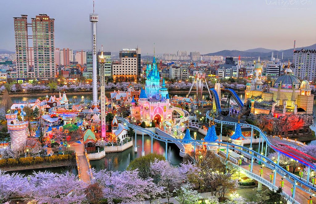
Yea assuming Lotte is similar to how we did Circus Circus in a lose recreation of it.
-
 Coasterbill
Offline
I'm in love with Lotte World. Great atmosphere, great interaction (especially between Wilde Maus and the Flume), great custom flats. I'm in love with this park. The area with Wilde Maus and the Flume just sold it for me. It's obvious that you guys went out of your way to maximize ride interaction and create a color scheme / theme that was just awesome. Love the castles, love the bridge... Bravo. Despite searching I really don't have a single bad thing to say about this park. The aquatrax was probably my least favorite part but even that was great.
Rat Pack had a cool park also, the abandoned entrance was clever and the ropes course was very well done. Schmetterling was adorable. It's a shame either park has to love but the Canes just hit this one out of the park.
-

 robbie92
Offline
That overview that Austin posted really puts the Canes park in a not-so-favorable light, I'd say. Taking away the colored lights, the real park still seems to have a real vibrancy to it, a sense of fun that really comes to define an amusement park. Lotte World, while technically superior, doesn't approach that same vibrancy, and almost becomes overwhelmingly "dry" with the use of that brown LOTR texture; that texture and approach works phenomenally for Atlantis, which is a season-high, but its spread to other areas and the use of primarily brown and white as the only real base colors for the entire park sucks a bit of the life out of the park that it could've had. Perhaps if certain areas like the castle courtyard (which seemed eerily reminiscent of New Fantasyland) had a bit more color variation, it could've really added in that layer of fun and whimsy that the real park possesses.
Conversely, the Rat Pack park is incredibly fun, with a lot of great colors and interactions. However, on a technical standpoint, it seems lightyears behind Lotte World. It's very reminiscent of a H2H5 park to me, like the car-themed park Magnus made. It's very solid, very fun work, with a lot of heart put into it, but from a technical and aesthetic standpoint, it doesn't hold up to Lotte World.
-

 Cocoa
Offline
^couldn't agree more. Lotte World had this almost-there sort of feel to it, like everything in it is technically very skilled. Each section on its own is beautiful, but they merge together into this samey brown theme-less thing. You can see the different European architecture that really adds variety and distinguishes areas in the real Lotte world, and brings the different atmospheres to life. Most of all, this park is dying for some warm colors. There's just so much blue and purple! I want to go in and scribble my cocoa-ness all over the different areas. It would honestly improve each section like 10x.
Anyway, this totally isn't my full review, I'll be back once I spend a bit more time in the parks.
-

 Fisch
Offline
I want to go in and scribble my cocoa-ness all over the different areas.
I honestly started doing the exact same thing after looking at the park for a while.
_______
also not my full review as well
-

 wheres_walto
Offline
Huh. The real overview is so much more Kitschy and gimmicky than the rct version. I agree with rob though. The skill level is so far above the village and park that it just doesn't stand a chance despite having more soul and variation. Also, screw you for making that tripsdrill tower perfect with the proper ride and everything

my comment sounds harsher than it was meant to; my loudest thought while viewing was "ugh, why is ___ always better at this than everyone else?"
-

 Austin55
Offline
As I go review of the Hurricanes
First thought, maybe I'm alone in this or something, but these jam filled parks like this should'nt be opened from a far out zoom. It's a lot to take in, I kinda like starting out fully zoomed in and then going around from there. Not anything that makes me like the park less, just this sort of presentation bothers me a bit.
First step is to zoom onto the castle and check it in detail, as that is what I've already seen in the screen. Really like how its set onto the circular island with the monorail track and bidges in every direction. Castle structure itself is fantastic, the heavy use of the LOTR textures is fresh. Works well being a Disney knockoff. It's pretty clear from just a single section of this park that its one of the best parks of this h2h already.
I'm drawn in by all the blue roofs and the carousel behind. I;m struck looking at this how many guests there are in here, I see 2500! Damn! So lively. Back to this area. I wonder if you have stolen Disneylandian from us for a moment. Ofcourse the 2nd story queues are always a fun thing.
The wild mouse/ log flume in the corner is so well done. The way the towers are utilzed by the rides is fantasitc and how the ground is artificial, cool stuff. A drop tower to, cool. Like how the monorail passes past it.I've moved on to the arabian area, I assume that is what its meant to be. The architecture is SOO GOOD oh my. The two large buildings are just great. Another advantage of having 2.5k guests is all the queues are full and they look amazing, even for non functional flat rides. Amateurs. Much like raptor. This area has another drop tower because why notte?
Getting back to the castle now. Yep, still good. Bridge is nice to. There's some asian archy, ohh aquatrax! I'm gonna look at that last. So I went to the other back corner.So this area is India. This is the first time I've seen really any warm colors anywhere, some orange in the flag and a bit of magenta. It's really starting to strike just how dense this park is, but not in an overwhelming sort of way like we saw with World's fair for example. The park is also so well layed out. Hub and spoke works, folks. This and Pridelands are the two best I've seen so far and both have exceptional planning to them. I've also noticed both of them are Canes parks. This is what I was expecting from such a stacked team. Anyway yea, India. Lots of LOTR texture again. The toon tower curved blocks on the roof of the rapids station theming building look like shit though. The rest of the structure is nice, but the roof looks like someone took a dump on it and the sprinkled to 1k rocks to try and hide their accident. That brown... The queue, again full, again nice, love how the bridge looks like the one from Salga just tiny. Rapids layout is rather dull but very well executed, and the new objects stand out.
Alright, zooming out, think I've seen 3/4 of it. Gonna go check out this asian stuff real quick. Yep its asian alright. Good to see someone still doing asian themes.
AQUATRAX TIME. Aww yea look at this castle with all this track and trains darting in and out of it. The tunnel bridge launch looks awesome, the architecture and scenery is just great. Love the flying buttresses before the water skimming drop. The layout is to hard to keep up with to bother. Best way to enjoy it is not to follow a single train but to just watch it all at once. Overall though I'm a bit let down. Not sure why. I think it could have had better archy, not a huge fan of the massive amounts of 1klandscaping, so many waterfalls, and a bit lacking in peep interaction. It's honestly not one of my favorite areas in the park.
Think I've seen it all about now. The park doesn't have any "details" like nin getting diseases or coupon drowning, clever ideas like boats hauling rafts, things like that. It doesn't need those things really. Even after a half hour of viewing, the park rating is at 996. No peep jams, no crashing or broken down rides, etc. It's all quite perfect. Like it was made in a german rct factory. It just does its job.
Zooming back out to where it started, it's obvious how coherent the park is. Again, hub and spoke ftw. It's great that its an entire park and not just part of one. It's obvious what it's meant to be. And again, the colors. It's nearly all the same, dark brown, white, light blues, and tree greens. Barely anything else. It's very strikingly beautiful.
Lotte world is a great decision for h2h. The size of the island is spot on. I initially heard you guys we're doing Lotte and assumed it would be the indoor portion, as indoor parks work so well in h2h's confined spaces. Ya'll built this on a fairly large map, I'd love to see it expanded upon after the contest, maybe include the interior spaces, the malls, maybe even some Seoul cityscape. The park as is would probably be a spotlight contender with some more substantial surroundings, like how Thorpe was a rather small park with loads of water and foliage and parking around it. I'd love to see it expanded.
Best park this h2h? Yea, I think so. The execution of it all was spot on. It hasn't been the most fun or most wowing, but it's overall the most well rounded. -

 Stoksy
Offline
Spent about five minutes just looking at the screen for the Canes park...damn. Rat Pack park looks like one of those real old-school, family-owned kind of parks. Very excited to check these out in-game!
-

 Kumba
Offline
Rat Pack - Okay, that's the best "read me" I have ever seen for a park. Loved it and as a journalist I can confirm the style is very accurate to how real headlines and leads are written. The protest idea was great and really well done. This is one of the best "fun" parks I can recall. RCT skill is there too without a doubt. I think the main screen does show off the best area of the park. Tho why not have the blue guy face Hein Blod? The hacks all over the park making even some really small things like a playground swing work were awesome, tho I did cringe a bit when I saw the water slide float off into the air. The puppet show should have had an interior too, still a great idea tho. Overall, a really fun park, tho not on the skill level of other top parks this season, but fun factor means a lot to me. Great work!

This is a really good match-up. I like Roomie's team a lot and it will suck for one of us to lose and be in a bad position on the standings. I think these are the top two parks this week and a couple of the strongest this season, reminds me of Bermuda vs. World's Fair. This will be a really tough loss for one team.
 Tags
Tags
- No Tags
