H2H7 / [H2H7 Round 2 Match 2] - The Rat Pack vs Heaven's Atlas
-
 30-April 15
-

 Louis!
Offline
I'll post reviews of every park with little screens like I have been doing, just a bit behind on it

-

 FredD
Online
I'm also a bit disappointed that there aren't much reviews. Though I'm glad with the win, and more with the park I could helpe create. A park to be proud of. More of all: I've learned so much with this. H2H rules!
-

 Liampie
Offline
Battle for New Elementia
This was very cool! It was pretty clear to me that Milo was involved, considering all the hacks that were clearly not in Roomie's style. Also, this reminded me of all his other science fiction work. Csw was quite obviously the partner, though I didn't expect his share to be 90%! Very impressice csw, you're becoming really good.
Anyway, about the park: the opening show was cool, I didn't think it lasted too long. It was not random explosions, everything made sense to me and it was fun to see the story unfold before me. All the ships were perfectly executed, even reminded me of pierrot who is the master of clean trackitecture. Great job! Also well done on varying all the ships. Battleships, paddleboats, submarines, hot air balloons, airships... Everything was there. The rest of the map was pretty cool too. The port area looked great, and there were some great hacks to be found like the coal and the mine carts. Unfortunately there wasn't enough to hold my attention for very long after the show ended. Exploring the park ended up being the clicking of track pieces and staff to see the names. And the names were quite disappointing actually, while the readme was hilarious and made a promise of a park full of meta jokes, all the frozen staff just had generic names. Why couldn't I find my team members on this map? Missed opportunity. Aside from better utilizing the frozen staff, you definitely needed some rides for more movement. Because of this, the park suffered like Assault on Earth Base Gamma Gamma did in H2H5. This match actually resembles that match a little. Space battle vs. Vietnam and Steampunk battle vs. India. Nice semi-parallel.
Regardless of the flaws, good effort, I enjoyed it!
Carreira Da Índia
Shame that this park didn't live up to its potential due to time constraints, but it's still an awesome park. Maharaja and Varanasi are two of the best coasters in the competition so far. Some archy was obviously rushed, but meanwhile some archy was breathtaking. The temple area for example came out great in my opinion, I don't mind the whiteness either. Landscaping was ace in the places where it wasn't rushed, for which all credit goes to Sulakke. I agree that there were too many LOTR pieces in places, but... time constraints. I'm really happy the amount of little things didn't suffer too much under these time constraints. The fakir on the nail bed, the holy cow, the mural, the huts on the Cape, there's a lot of fun on this map. Carreira Da Índia could've been this years Lijiang, but instead it's just an 80% gold winning park. Well done, all three of you. Thanks for the sacrifices you made at the end! Skipped lectures, disregarded family members and friends, building for so long that you couldn't distinguish RCT from reality anymore... It was a struggle, but in my opinion it was worth it.
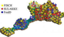
Here's the who did what map:
-

 Stoksy
Offline
Am finally getting around to these...
Carreira da Índia (Heaven's Atlas):
I was obviously unable to vote in this matchup, but I did for the most part enjoy HA's park. I agree with all who said that this isn't at La Revé quality but it's still quite a good park.
Whoever came up with the linear storytelling idea deserves massive kudos. Such a unique storytelling technique that I can't remember ever having seen in RCT before. I did enjoy the architecture in the entrance area, there were some great touches of colour as well as gorgeous use of texture. However, I think that the blank walls, despite facing the black tiles and therefore perhaps it shouldn't be as significant as I'm making it out to me, were a little unfortunate. I just think that it would have nice to see some interiors for those buildings instead of being faced with a flat, blank wall, textured as it was [I imagine time constraints came into this though]. Inquisition was a nice ride, and the integration of the venice boats [which I'm going to, rightly or wrongly, take complete credit for because of my micro haha] was really well done. My one gripe, and this translated into quite a few areas of the park, was just how rectangular and flat all the architecture seemed to be. Maybe that's exactly how the architecture was supposed to look in which case I apologise, but I still think that something as simple as balconies would have really helped everything from looking so flat.
Onwards toward the island. The whale was...interesting, I wasn't a huge fan of the execution although the shadow underwater was really great. I just think that it wasn't really necessary to have the whale there, you might have been better off maybe having some rockwork or underwater foliage in the transition area rather than a slightly out-of-place whale. I've never been the strongest advocate for suspended swinging coasters, tried building them, never really great to appreciate a good layout. Therefore, can't really judge the coaster on the island, the colours were a nice contrast is best feedback I can really offer unfortunately. The island itself was an interesting transitionally idea; not sure if it really worked though. I think that if the linear progression was meant as a storytelling device [which I think it should have been to be fair] then the island didn't really help that in my opinion. I think that something like another port would have looked a lot better [I imagine time restraints were an issue though].
BOATS! Another excellent one, and I hope that they're a theme throughout all the HA parks that are released this H2H. It would have been a cool idea if you had just one boat built exactly the same way in every park with all the members on it travelling through history and RCT.
Anyways, onto the main section. The boat transport around the holy cow was a piece of brilliance. A true H2H detail in my opinion, and one that I thoroughly enjoyed. The predominantly white area was, as some people have already said, a little too white. I think that maybe more could have been done with texture here, the primary problem I had was with the brick towers I think. Maybe you could have considered transitioning into the white by way of gray bases. Trims of gold could maybe have been added to the towers as well(?) The coaster in that area was...okay. I guessed it served it's purpose but it seemed to be in that weird middle-ground where it didn't do enough to offset all the white but didn't blend into the architecture quite enough either [except for the steep drop]. Maybe were some more peeps present in the area it might have helped. The bed of nails was another true H2H detail, which was well-integrated. The reincarnation of shiva ride maybe could have been better served coloured gray...or any colour other than white really haha.
While the previous area was too white, I'd argue that the central area at the back was a little too brown. I think that the architecture again suffered from being too flat and rectangular. It maybe wasn't quite as obvious as the entrance, but it was still problematic in my opinion. The coaster was solid, must admit that I got a few Lijiang vibes from it, but the similarities were merely because it was a GCI made by Liampie's H2H team that made use of diagonals. The rockwork, as a few people have said, wasn't my favourite. Again, time was clearly an issue, but you really need some support given to the LOTR rocks; whether by using the 1k ruins or 1/4tile landscaping. I did like the shrunken tree object in the pots, it's something that I definitely enjoy using but can never find a tree that has the right scale.
The tea farm could have been brilliant if it weren't for the constant glitching. I maybe would have considered making the ride invisible and then adding the foliage in.
The ganges was a necessary inclusion, and I think that it could have used some coloured water. The addition of the...well literally shit by the steps was a nice touch but just leaving the traditional water colour kind of ruined the atrocious state of the river. Relatively minor consideration but nonetheless one that would have been nice to see. Personal preference, but the brick roofing didn't quite work for me; unfortunately I can't think of an adequate solution so that's probably an issue with my own tastes rather than the park.
Facades looked better...but the architecture here was basically all squares. Again, maybe this is accurate to the architecture in real life, but I wasn't quite feeling it like some other people clearly were. Regardless, the coaster was beautiful. Great colours, solid layout, if anything was lacking the interaction was primarily with the landscape rather than architecture. But that's purely a nitpicky critique, because I frankly loved it.
The architecture by the untouchables was probably my favourite in the park. It just combine the texture that made all the areas so good with non-square form. Great dark ride. I failed to appreciate the theming around karma on first viewing, and it took a previous comment to realise the heaven -> transition. Really awesome touch that I somehow managed to miss.
Overall, certainly an enjoyable park! Not the best park from Heaven's Atlas in my opinion, but my appreciation for indian architecture is compromised because of my lack of knowledge about it. Awesome work though as there were some truly brilliant parts.
-

 AvanineCommuter
Offline
Carreira da India:
Pros -
- the architecture was flawless. Really captured the Indian vibe, which hasn't been done to this degree before.
- The layout of the park was genius. LOVED the storyline going around the Cape and discovering India.
- The rides in India were amazing, both the invert and the woodie.
- Karma was very well done!
- That mural of the woman... droolworthy
- Another great boat, I love the idea that this boat is a continuation from Tenochtitlan and we're travelling along with you guys through the Atlas of beautiful fantasy parks. Amazing conceptually narrative throughout multiple parks if this turns out to be the case.
- Tea picking was well done and so well placed, nicely nestled in the awesome woodie.
- The slums of the untouchables was a great touch, could have been more deeply themed though.
- Inquisition was an effective and simple ride. Nice touch.
- Moooooooo
- That whale.
- I'm a penguin

Cons -
- The water coaster was okay, as was the coaster on the Cape. Lacked in comparison to the other two rides.
Overall this is my favorite park of the season. Originality, beautiful and perfect amount of detail. Unique layout, new ideas, new aesthetic, new ideas, I loved this park, and it only reaffirms my love for Fisch's work. Great job HA!
90%
Battle of New Elementia
I wish I could say more but without LL I can't really do much but look at the screens. I do want to say though that CSW did an amazing job, and with each screen I loved the park more and more. I was worried about the park not having enough movement with the fact that it had no major coaster, but regardless I think conceptually and aesthetically it is a beautiful piece of RCT and I wish I could explore it in depth.
-

 inthemanual
Offline
Because it's a nonpark and LL, both of which reduce the attention it gets from the panel.
 -
![][ntamin22%s's Photo](https://www.nedesigns.com/uploads/profile/photo-thumb-221.png?_r=1520300638)
 ][ntamin22
Offline
Some of the H2H votes are also held up by team membership. I think I didn't vote on anything the Stallions went up against just to avoid any possible conflict of interest, which is probably overkill, but when you consider 2-3 of the LL panelists worked on a park the available voter pool is pretty small.
 Tags
Tags
- No Tags


