H2H7 / [H2H7 Round 1 Match 2] - Italian Stallions vs Robber Barons
-
 14-April 15
-

 FredD
Offline
Cycleal
Very interesting to see a fantasy-ish park build in a very realistic way. The archy is great and lanscaping is spot on. Foliage is not the most special I've seen but it fits the park very well. What a pity the supports of some trees are visible (see RCT2ER's post). What I really really really like was the sword droptower! What a brilliant idea to visualize that story! I'll be damned I never thought of that
 There were a few turn offs for me. It has some lifeless spots. It'd be cool if there were peeps running on those city walls for example... But the biggest turn off was the coaster. Lay-out was fun but why building a dive coaster without the holding back just before the first drop?! Now he just flies over it, that's a real shame because that holding back is just the best part of that coastertype...
Raptor
Before I opened it I thought 'oh a recreation, but why not a more interesting ride from CP?'. I was wrong. Raptor was the perfect choice to recreate. I've tried this layout a few times and know it is not easy to get it right. But this is the best recreation of this coastermodel I've seen! Spot on. Even more admirable is the fact while some call Cedar Point a concrete jungle, this recreation does NOT bore at all! There's so much to see. And personally, this recreation gave me memories to my USA trip 2 years ago when I visited CP. I loved it and still want to go back once. The recreation is just spot on, almost perfection... I recognize almost everything! It seems so perfect... Yeah memories, it took me 2 years back in time on my trip, I could see myself walking there.
Clearly Raptor is the winner here in my eyes. I'd love it when the builders continue with this recreation and recreate the rest of CP too, but that will be wishful thinking I guess

-

 Louis!
Offline
POLL IS NOW LIVE AND WILL REMAIN OPEN FOR ROUGHLY 72 HOURS.
If you cannot vote, please use the 'null vote' option underneath the poll which will enable you to view the results like everyone else.
-
 Coasterbill
Offline
I love your videos Version1,
As someone who was lucky enough to have you do a review of one of my parks I can say that it's really awesome when someone takes the time out to do such a thorough review and post it up for everyone. Feedback like that makes building a lot more fun.
So anyway I voted for Raptor... no shock there.
I think the layout was pulled off very well but as huge fan of the park and the ride the best part of this was how you absolutely nailed the look and feel of Cedar Point. Raptor's queue is breathtaking... anyone who hasn't been to the park might not appreciate how 100% perfect it is but the light poles, the walls, even the flow of the queue were all amazing. That really is exactly how they route the line when it's not filled.
The midway was great as well, the Sky Ride and Sky Ride stations were perfect, the surrounding buildings were perfect... everything about this absolutely screams Cedar Point. You nailed this.
As far as Cyleal, I enjoyed it but it didn't wow me like Raptor did. The landscaping was absolutely beautiful and I love the drop tower but nothing else really stood out. It was a great effort but it lacked the atmosphere and liveliness I like in a peepable park and Raptor was an atmosphere overload so this was an easy one for me.
-
 G Force
Offline
Raptor:
Everything was perfect except...
Shadows were a bit distracting, kind of wish there was a version without them, at least to make it easier to enjoy the buildings and such. Lazer tag was a cool idea, but the t-shirt stalls made every guest either have a blue or red shirt, which didn't look good in my opinion (plus there were possibly too many guests). The layout was very very strong up until the final corkscrew, it felt a little bit too compact, but its something that must happen in order to properly build the prelift and queue. The turnpike cars are no longer in the park and using the train track was nice but kind felt a little odd. All in all, probably the best recreation of all time, attention to detail and the little things just made the park incredible. My favorite park was probably the bit of Blue Streak and the power-lines next to the ride, they looked so nice and created a great border to the west side of the park.
Cyleal:
A pretty nice park, however it was a little to tan and white, more color and variance in the architecture would of helped the park a lot. The concept was very cool, I just wish it was more prevalent and a bigger part of the park. My favorite part of the park was the floating tower and waterfall, which was just incredible. The coaster was average, nothing really special, layout could have been a little better, but attempting to do something unique was definitely appreciated by me. The drop tower was probably the only ride that for me, fit into the park well, the tilt-a-whirl and spiral slide didn't seem to fit, (Heavens Kitchen had this same issue in my eyes), but this is something that is really hard to get past and is just a part of rct with this much of a focus on architecture. The terrain was very cool and definitely took skill to build and integrate with the castle and town, however, it kind of created odd illusions and almost a feeling of uncomfort for me when viewing the park. I felt as if i could never get a good look at anything because there was so many issues with line of sight. Overall, probably a 8/10 for me, I would have liked to see more integration with the alien theme and more color in the architecture.
Vote: Raptor
-

 SSSammy
Offline
these first two rounds have been very one sided when in reality i think they are both very evenly balanced
-

 G Force
Offline
these first two rounds have been very one sided when in reality i think they are both very evenly balanced
I don't think vote desparity is a good way to guage how close the matchups are, rather its simply the fact that both maps get votes. A truly one sided matchup would be a complete blowout, although I definitely think that the first match was much more balanced than this. -

 dr dirt
Offline
Had a chance to look at these in game. For me, Raptor got better than the screens showed and Cyleal remained below par imo.
Raptor: There were parts that were pretty much exactly what the standards for an amazing park are nowadays. The coaster was spot on, only thing I thought the transition between the first and second corkscrew was a tad long. Even though it's decently long IRL, it felt a tad too long for RCT. The station and queue you nailed, exactly as I remembered it. Then the vast majority of the architecture was superb. Johnny Rocket's and the interiors of the buildings especially. Pathing was nice and intricate and I like that you used the larger trees - really captured the realistic feel.
Then there were some things that dragged it down slightly. The large building with laser-tag just wasn't as well crafted as the other architecture. The inside was fantastic, so why not keep up this same level on the outside? As I mentioned in my last post, the planters where the bushes are straight on concrete.. ugh. Add a fence or chop down the mulch object that was made and add it there, either way, problem solved. The shadows were a miss for me, but understandable considering it did break up the path. The worst part was that they can't stay true to the games shading this way. You'd have to do a tree shadow object to get it right, and that's just too hard. I think tightening up the path and taking away the shadows would've been better imo. Also, I'm not sure if the inclusion of Blue Streak was necessary here.
Cyleal: I'll be honest, I didn't enjoy this one. Maybe the theme was based on something that I'm not familiar with? Because even with the readme, the theme just seemed so loose. It's some sort of castle and village turned floating wizard city? Powered by blue rocks/orbs/substance? Maybe I'm missing something, especially the connection to King Aurthur with the sword and the stone. That ride was well done and probably my favorite part of the park, but it seems like a random inclusion. The translation into a floating wizard city (or something along these lines) didn't go well into the park either. What was there, 1 floating tower to create this element of the theme? It seems like it was mostly the typical fantasy-medieval-lotr looking village that didn't serve to add to the concept you tried to convey. Had you built more to make this a bit more unique, I might not feel so critical of the theme you chose.
The craftsmanship wasn't bad in general, but below the other parks of the round so far. Some parts had some issues with the little nuisances/errors that are really easy to fix, like I mentioned in my previous post. For example, was there a reason for certain walls to be missing from the balconies/walkways in the structure that housed the dive machine? If something was supposed to be taking off and floating from there or something, I think you should have tried to convey that specifically rather than just removing some walls and ruining the structures cohesiveness. When you compare the boats in this to almost any boat built in the last few years, its like comparing 240p to 1080p. But, it wasn't all too bad - a decent standard I'd consider 'good', but that still feels below the other parks so far.
It was hard to view the coaster in action because my PC is decently slow, but judging my the looks and the mph on the trains, it takes that first dive-loop very very fast. It was at about 50mph, which seems pretty damn high to me.
tl;dr: vote = Raptor by a fairly good margin
-

 Tolsimir
Offline
Raptor:
I don't care if it's a recreation. I just judge the "park" and it's very well done. The inverted commas show my main complaint about it. To me, H2H is about whole completed parks and thats what Raptor as a part of Cedar Point isn't. This is really a big point for me.The shadowing was a bit confusing and even more inconsistent in some parts. But it didn't really disturb viewing the park.
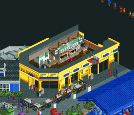
The rides were every one very nicely done, I liked the working carousels. The coaster was spot on, I think you can expect that on a rec. The trick on the sky ride was a nice one. The lazer tag game is an awesome idea, but taking the same "ride" for that one self-service restaurant was a bit inappropriate, as the restaurant was just a giant mess now. Though I liked the queue line for it. In terms of interiors Raptor easily wins over Cyleal.
All in all the park felt really clean, still detailful with all its games etc. A little let down for me was the dead back near the blue coaster, there wasn't really going on that much.
Cyleal:
What I liked most on this park was its total calmness. After viewing Raptor exactly what I needed. The custom music worked so well, maybe next time tune the volume a bit up as it couldn't be heard properly through some of the game's noises. The calmness really brought up my mood

Landscaping-wise this park was on top. Just some underwater parts were lacking and the part on the left of the bridge on the park's screenshot. PLEASE never forget to carry on building landblocks etc. under the surface of water!! Seeing this can kill a park for me. Atleast in your park this isn't that much as in the Cane's one.
The coaster was too fast for me, maybe taking just two cars would have solved it. The support work lacked with too long unsupported track. The droptower was awesome.
The architecture was nice throughout. To me it didn't feel too repetitious. Still the village felt a bit lifeless. You could have bring it up to life without giving up the calmness. This is true for the fortress and for the village. What I didn't understand was the lack of actual path for the peeps. You had some really nice places but the peeps couldn't reach them.
What me bothered was the story line given in the readme. The first paragraphs sounded really nice, but that shift to "tourism city" is just crappy and cheap. I liked the bits of blue source flying everywhere, but I couldn't make out the wizards' village (where the floating tower is?)
What really bothered me in both parks: The fast staff!!! The running handymen and mechanics just look are so unpleasently to see. This really destroys atmosphere. I don't even know why people are making them faster. I wouldn't really care if a broken ride is repaired in 30 secs rather than in 10.
All in all, I think this is a really hard decision. My vote goes to the Robbers. I really would like to vote for the Stallions but it wasn't enough. Maybe Raptor had more skill and was executed better, but if your park had a little more to offer and a better background that also would mirror more obviously in the park, I'd vote for you. Atmosphere wise your park was better but sometimes that's not all.
-

 Louis!
Offline
Cyleal:
This had the potential to be amazing when it was first being built. But then productivity seemed to slow and it was a rush to the finish line. It could have been so much more, but in the end its a solid entry rather than anything special.
I think the park needed a proper concept, I feel like the story of it was added on right at the end to explain certain aspects, when it should have been the other way around. The architecture is impressive in places, you know how to do city walls, unlike the Hurricanes, and you clearly know when to stop detailing, again unlike the Hurricanes, however in places the architecture is just nice, and thats because of the forms they take on. Be a bit more adventurous and not so 2x2 in places. I also felt that the architecture was quite standard because there was a lack of true theme to connect them all or to create areas.
The coaster was dire im afraid. The flow isn't there and the pacing is horrendous. It seems like the coaster was built after the rest of the park, or at least so far behind the rest that you struggled to make anything decent because it didnt fit in right. Had it been the other way around the coaster would feel more part of the park and the layout wouldnt be forced into situations that make it have no flow. The park also lacked rides, which in some cases, is fair enough, but I felt like here you could have added so much more as this is meant to be a fantasy style thing. You could have been much more creative with rides and things like the Sword in the Stone made me wonder whether the park was meant to be a theme park with rides themed to things, or whether it was meant to be a physical place. Rides don't need to be there to be rides, they can take on other functions. The rides that are there at the moment feel like they are part of a theme park, where you could have integrated them into the town/landscaping more, much like Liam's park did with a lot of their rides.
Altogether, another decent R1 park, and don't be disheartened if this round doesn't go your way, there is a lot more to come from your team and I look forward to seeing more. Here are some of my favourite bits:
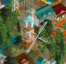
Loved this windmill.
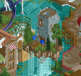
Lovely little floating tower and waterfall combination.
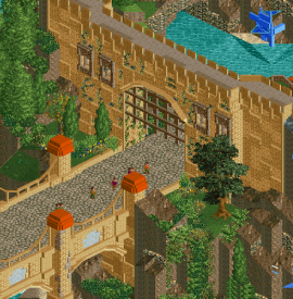
Fantastic city wall, the perfect amount of detail.
Raptor:
Whilst I haven't been to Cedar Point, I can appreciate the recreation. However, I cannot comment on how accurate it is, or really apply how well it has been translated into RCT. So a lot of my comments are probably going to be met with 'well that is how it is at CP', which isn't a problem, as this is meant to be a rec, but that is partly the problem I find with recs, that people eliminate the need to make something work in RCT as they try to make it look like it does in reality. Thats why I will always prefer semi-recs to outright recs, as they have the ability to change aspects that dont work and make them work in RCT.
Anyway, to start, the architecture is well done, and diagonal buildings are difficult to pull off, but you have done it well. My issue is the colours. In certain places they just feel too wrong in RCT. The blue of the skyride station is too blue, really ugly and I can't appreciate it, likewise some of the other colour combinations, like the yellow, purple and red awnings are difficult to find likable, because in RCT, I don't think the colours work.
The paths are very nice, I like that you took time to break them up with more worn down sections, however these sections feel too neat and organised and so lose that worn down look slightly. I dislike the shadows. They are an interesting concept but here, some things have shadows, other things dont, and I just think that they are a bit unnecessary and just add a touch of messiness to the park.
I love the new mud texture you've added into the game, but in places it felt it was being used wrong as its unable to be blended into the surroundings (as it is a path object) and so the lines it left in places, like under the coaster, felt too harsh. Likewise I found the use of Liam's trees to be out of place also, I feel they are too dark, and combined with the shadows and some of the colour options, they make certain areas diminish in quality.
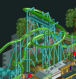
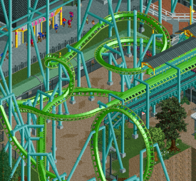
The layout itself, is obviously very accurate. It's just a shame that, like all recs, the flow can suffer because of it. Generally, the flow is there, but in certain places, the drawn out elements make the flow non existent. That being said, the coaster is very strong, and you've done the best you possibly can do to make the coaster flow as best as physically possible. So all I can award you on the 'datflow' front is #datflow #sogoodforarec (something, like liam mentioned, I cannot award to Kumba). The supports were absolutely phenominal btw, great stuff.
Overall, I think the park does feel like I've seen it before, mainly because it feels much like the more recent Cedar Point rec that was released unfinished on the site. I also think its a ballsy move to throw something like this out in H2H as it could risk being seen as unexciting due to it just being 1 layout and a part of a park rather than a whole park. However it has worked, and I somewhat hope that some more H2H parks become like this.
On the whole, this is a superb park, and I would say my joint favourite so far, and easily, like a couple of the other parks in this R1, one of the best R1 parks we've ever seen in H2H. I hope you don't see my comments as negative, I'm trying to just give a balanced view and not just sit here and say "omgz guyz thiz iz amazez" the comments I have given are pretty minor, and I am probably the only ones with those views. But anyway, great park guys, looking forward to seeing what else comes from the Robber Barons this season. Here are a couple of screens of my favourite bits:
Loved this building and the colouring was spot on
#datflow
#sogoodforarec
Overall my vote went to Raptor.
Please note the titles of the screens refer to the captain of the team, not the builders of the park.
-

 Louis!
Offline
POLL IS NOW LIVE AND WILL REMAIN OPEN FOR ROUGHLY 72 HOURS.
If you cannot vote, please use the 'null vote' option underneath the poll which will enable you to view the results like everyone else.
-
 PizzaWurscht
Offline
short.
Cyleal
It got a nice concept with cool , awesome landscaping. But I really had a problem with the architecture. For me it looks like its unfinished and also there are some many places where nothing is. Otherwise there are really cool places with a really big PLUS. Also the ships arent smooth and don`t fit.
The Ride/s are good. I love the dive with the launch because of the creativity.
There are some cool places , some cool architecture. There are some poor places , some bad architecture.
Raptor
In my opinion its one of the best realism Designs I`ve seen . . . but stop its H2H and for H2H its a bit small but therefor its soo fkn amazing. So funny and cool , good and awesome Architecture. Lot of work and good detailing.
The Ride is soo smooth, well its Raptor so no comment.
The are sooo cool places , nowhere is something lame and everywhere I have a happy feeling.
Ohh and , im the biggest fan of the Lasertag arena!
vote for Raptor
-

 chorkiel
Offline
Cyleal:
When I saw the screen you had posted of the park, I was afraid it would be unfinished. Because you only showed a bridge rather than something substantial.
However, on opening the park, Cyleal proved to be much more than that. Cyleal is lovely all around. It feels a bit unrefined at parts, but overall it was a very warm entry. The colors were nice as was the landscaping and foliage. It felt a bit inconsistent in terms of skill of the builders/buildings.
Raptor:
I had a harder time loving this as much as other people. Mostly because I'm not that familiar with Cedar Fair to know whether it's a perfect replica. I can't disagree with the fact that this is about as realistic as it gets in RCT2. It's also that from what I know about Cedar, I'm not that intrigued by its style.
Having said that. This featured plenty of brilliant ideas as well as brilliant solutions to very trivial 'problems'. The laser, diagonal buildings, walking buffet, the chairlift going off screen.
Another great matchup. I still have to think a bit about my vote, but for now I think I'm going to vote for Cyleal. Mostly because I had more fun exploring it. -

 chorkiel
Offline
Why is it that chorkiel's vote is always counter-culture in some way?

Are you referring to my vote on parapluie? Because while in hindsight I should have voted for parapluie, the classic didn't deserve a shutout.

Also, I'm well aware that in the future Raptor will be the one that will be remembered. Raptor is technically most groundbreaking, there's no discussion on that, but I really enjoyed Cyleal. More than Raptor.
Someone needs to stand up for the weaklings!
-

 5dave
Offline
Cyleal
Concept:
Fantasy-ish city with magic element and later added tourist attraction? I dunno - for me it's either fantasy city with fantastical coasters or themed park with realistic coaster. I'm not a fan of mixing parts together, it's neither fish nor fowl to me. The park offers a lot of potential but doesn't show much - where are the wizards? How are the rides connected to the theme? Doesn't get the idea across well unfortunately.
Macro (Park Impression):
From the overview, the park doesn't really have stand-out structures besides the drop tower. The palace should have been the main wow-structure here, but it really isn't unfortunately (at least it is from one viewpoint). Colors and landscaping are really harmonic and that waterfall from the floating tower is beautiful.
Rides:
For being a theme park, the main coaster wasn't realistic for me, although it wants to look realistic. It was too fast and only operating with one train. The queue for it was nice. The sword in the stone was a very nice idea and executed well, although the stone itself could have used more attention - it looked a bit plain. Also the naming of the rides were poor and not very magical. Drunken barrels? Could be in every other park (just to name an example).
Architecture:
The building structures are really nicely done, right amount of detail imo. I really liked the bridge and the city walls. The forms of the buildings could have been more experimental (besides being 1x2 or 2x2 buildings etc...)
Micro (Details):
My favorite details were definately those magical essence thingies, although I didn't really get the point at all. But they looked nice albeit static. The floating tower plus waterfall and the windmill were kinda cool, but besides that there wasn't that much too see I think. The music really added to the park and fittet perfectly. Frozen staff or just named staff at all could have helped the theme imo.
Raptor
Concept:
A recreation for H2H? Never thought about that - could have been a risky move, but not in this case!
Macro (Park Impression):
This parks looks so realistic from far away - it's scary. Nice midway feel - great organised layout and clean look from afar.
Rides:
The ride was spot on, while I've never been to Cedar Point (yet) I can really imagine being there. Comparing it to the POV it's really damn close to the real one. Shame for the ratings, though. The custom rides (carousels and laser tag) were hacked to perfection. I still don't get how shoestring works, so kudos for the work that went into them. Peepable rides are the supreme discipline of hacking in RCT imo - doesn't get any better than this. Well done! Also that buffet line and that sky car ride going to the map edge and back - awesome!
Architecture:
Dificult to judge the architecture here because it's a recreation. But from the looks it really looked like the original park again. Also again right amount of detail and good scale overall in the park.
Micro (Details):
The hacks where the parts that stood out most IMO, but there were also small details like the interiors (starbucks!) and those path details were really brought to perfection here. I didn't understand the shadows, those weren't really necessary. Oh and those new objects are also really nice (those footers!!) All in all amazing park for round 1 again.
As said I fear that if the parks continue like this there will be no steam left for the finals!
"MFG" -

 Steve
Offline
Stallions, you have a great little park here. Admittedly, it's just unfortunate it had to come up against Raptor. There were some things I liked in Cyleal, but there were more things that I didn't. Like others, the concept confused slightly but there were things about it I enjoyed -- like "the source" scattered about everywhere and the floating island is well done. The coaster was decent, but you had so many missed opportunities for it's queue! It could have weaved in and out of that castle and landscape and it was mostly underground! Bummer. However, there are a lot of things done sloppily and like others have said, just held it back for me a bit. Don't be discouraged though, this is still a map to be proud of!
Barons, wow. Just wow. Just an unbelievable map. The coaster, the innovation, everything. Not EVERYTHING was incredible, there were a few spots where I was thinking "eh, all right" but for the most part it seems like this is the work of a pro. Honestly though, there was one guest who summed it up for me and I'm lucky to have caught it when I did:
"Midway Market Buffet Line looks too intense for me!" Seriously Barons, get out with that fucking buffet line. Pure brilliance. I'm done with all of you.
-

 Kumba
Offline
I just want to make it known, after the contest I would be happy to help with... Son of Raptor!

Can't you just picture an invert launching out of a huge bird's beak!

 Tags
Tags
- No Tags
