H2H7 / [H2H7 Round 1 Match 1] - Hurricanes vs Heaven's Atlas
-
 13-April 15
-

 Sephiroth
Offline
I don't have as detailed of a review as everyone else, but I will say that HA's park appealed to me more for the reasons already typed out in the 5 pages of posts before mine (minus the bickering, lol
 ).
).Things that grabbed my attention - Hurricanes:
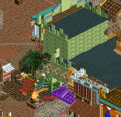
-Entrance
-Pathing
-Flyer was launched.
Things that grabbed my attention - HA:
-Underwater details, loved them.
-Ships, holy smokes.
-Intamin interaction.
-DAT REVERSE FREEFALL DOE! I don't know what the haters have jammed up their rear about this one, but(t) I feel if they took it out they'd be in a lot less pain and agony.
-Cohesion of theme
-Atmosphere
-Little details that really contribute to the theme (the shipwreck for example).
Good job both teams though, the time and effort in both of these parks is clear.

-

 Austin55
Offline
Really surprised at how the votes are falling actually, I thought it'd be a much closer race.
-

 GammaZero
Offline
Since I also suck at reviews, I'm gonna do it the Sephiroth way and list the things that I liked from each park.
PoE:
-That entrance
-Machina
-Architecture in general
Tenochtitlan:
-Huetzilpochtli (or whatever it's called)
-Its surroundings
-Pyramids (Yes, I liked them)
-SHIPS
-Atmosphere
-All the exploding shit at the beggining
I loved both parks, but my vote has to go to the Heaven's Atlas.
EDIT: Oh sorry, it's TenochTITlan...
-

 René
Offline
After opening the parks for the first time, I had the feeling that it was gonna be very hard to choose which one is better. They are both great, but you can't compare them to each other.
Port of Entry has great buildings, but after a while all the glitches get annoying. I think the buildings were even better if they had a litle bit less details. The rides were great, and I liked the rapids most with it's underground queue and the waterfalls. The flying coaster was good, but didn't something special except of the launch.
When I first opened Tenochtitlan I was a bit dissapointed. The park was dark and the buildings looked all the same. Then the sun started to shine and the park really felt like it was coming alive. I like the pyramids, especially after I saw the pyramid in progress and realised that the white park was chalk. The ships as already said are perfect.
Now that I opened both park multiple times it's clear for me who is the winner. Port of Entry is still great, but there isn't much more to explore yet. Every time I opened Tenochtitlan I discovered new thinks, such as the chalk mine, which I even didn't noticed the first two times. When I have to open one of the parks once more I would definitely open Tenochtitlan, which makes me vote for this park.
-

 Stoksy
Offline
Port of Entry (Hurricanes):
The entrance looks very much like a clusterfuck of texture and detailing which really detracts from the appeal of the area in my opinion. However, I did like the colours and adored the combination of monorail track and the land tiles/1k ruins. I'd actually say that the hotel and facades on that block of buildings make the least sense in the park overall, nothing really seemed to make much sense in that area whereas the buildings throughout the rest of park seemed to actually fit with their surroundings and therefore were more appealing. Other than the naming implications the interior of the hotel served its purpose quite well, I did especially loved the air hockey(?) table in the corner. Even though the buildings with the food/drink stalls inside first presented to the viewer weren't the best, I still preferred that kind of style to the enormous wall of texture that the hotel had.
I think that the plaza just after the entrance was probably the best collection of architecture + atmosphere in the entire park. Just awesomeness! If you could have done the rest of the park in the same style as the central plaza then this would have probably won hands down for me.
The rapids didn't really do as much for me as other people. Maybe it's because I prefer denser foliage around rapids [and I imagine that time constraints were a contributing factor], but it just felt unfinished and a little awkward to me. I definitely think that rapids done in this style [heavily influenced by the landscape] shouldn't really be placed on the map edge. If it relies on landscaping, which I feel this does, then you have to make the landscaping an important feature - not just cutting it off so suddenly. I did like the idea of the visible underground queue line, but something about the water tile objects just didn't quite work for me. It might be because it's not quite the same as normal water, or there not being any foliage underneath. Still, it was a great idea, just execution could have been better in my opinion. [The restaurant(?) at the edge of the map by Cutlass was very nice except for the odd colouring of the white poles at the entrance]
Just on Cutlass, I definitely liked the idea and having it peepable was a lovely touch. However, it looked a bit thin to me; ride itself didn't really look very solid. Maybe that's how they are IRL...
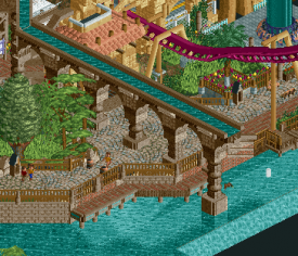
I did enjoy the coaster a lot, great colours and an interesting and unique layout. The station screamed _____, and had the same messiness as the hotel facades. I wish that it were cleaner because the buildings nearby were actually really nice. I liked the hill through the broken wall, and as others have already said the aquaducts were beautifully made. Awesome job there.
Overall I think this was a phenomenal entry, but the time spent on some of the intense texture/detailing [especially on the hotel area] would have been better spent finishing the park/fixing ghost objects. Still, this is more than finished enough to be a worthy Round 1 park; kudos to the builder(s).
-------------------------------------------------------------------------------------------------------------------------
Tenochtitlan (Heaven's Atlas):
I really need direction when I open a park, so the rather subtle entrance threw me a bit haha [doesn't impact my thoughts on the park, but it would have been nice to have opened it actually at the entrance - just for my own benefit :P]
Anyways, I think that _____ probably built on this purely because the use of texture was reminiscent of some past work. I have become a lover of interesting textures and this park has them in abundance. I think that the small houses were done really well, but [almost like PoE] the larger architecture is probably my least favourite. The pyramids just lacked...something, I completely understand that pyramids are [relatively] boring form-wise and that's why I loved the under construction pyramid. It added something really interesting to look at in contrast to the white and brown almost blobs that the other ones felt like. Still, nice touches with the yellow and green trims [apparently that's from AoE but I would never have known that] which added some much needed colour.
The chalk quarry was genius! Just a real H2H kind of park feature, and possibly the highlight of this park [other than the boats which I'll get to later]. Having the peeps walk around it really brought it home, and the camps outside were a perfect contrast to the denser foliage that would have overcrowded the area otherwise.
Jumping across to the other 'islands' the yellow coaster was a bit hit and miss for me. It's a unique ride idea that I think was executed very well, but I wasn't quite sure the reason for the car. I mean, I know it's the ride type and I wouldn't question the train of the major coaster but because it's such a unique ride car I just felt that maybe there should have been a reason behind it. Regardless, really nice interaction with the buildings and landscaping, and again the camps were done really well. The island where the vertical spike is from that ride was more of a focus on foliage/landscaping which was fine. I did love the execution of the well though. The statue on top, whilst brilliantly done, I kind of felt may have been better suited in a slightly more predominant area. I think that it gets a little lost up there, whereas maybe it could have been better served replacing or in front of one of the pyramids. Kind of taking the role of a statue of worship that the people can access for prayer. Also in this 'area' was the broken bridge which I loved as well. The idea of the exploding gunpowder boat was a great touch - genius!
The main coaster was solid, but maybe too unspectacular. The black colour, whilst it blended nicely with the surroundings whilst still sticking out, just reinforced how brown the park was. Nothing specifically wrong with that, and it's probably accurate to the theme, but it made everything a little dreary. If that's what you were going for then great, but I personally prefer brighter colours [nothing you really could have done there]. Anyways, layout was good and had nice interaction with buildings and the landscape.
The market place was a great way to add in colour, but I'm not sure that red was really the right one to go with. Maybe yellow or purple would have gone better with the browns(?) The guy burning bodies was really cool, and the architecture around the top spin [which were barracks apparently] was really well done. It broke the 2x2ism that the houses had, which to be fair makes sense that the houses are similar in form and style and the important buildings look different. With that view, I can forgive the repetitiveness of the houses; makes a lot of practical sense.
BOATS!!! Fucking loved these, like favourite thing ever. Well, not quite. Still, whoever made these is basically my favourite person ever. Just awesomeness all round; from the pulled up sails to the rigging, to just how awesome they look [from two angles specifically - when the diagonal boat is front-on/back facing viewer].
It's definitely worth mentioning some of the great underwater stuff that was going on; the anchor and broken boat with the drowning crew in particular. Awesome job with the frozen staff, really added to the park I think. Honestly wouldn't have noticed the changed date, but it's that kind of thing that can really push a park over the edge.
-------------------------------------------------------------------------------------------------------------------------
Really tough decision for me, I think that Tenochtitlan was superior in its execution of details and the atmosphere it created. However, personally, I think that the darker atmosphere from all the browns and peaches didn't quite sit as well with me as the bright colours of Ports of Entry.
Nonetheless, I have to go for the better park overall which I think is Tenochtitlan by Heaven's Atlas. Really, really close call though as I loved lots from both parks. Massive kudos to the builders, and I'm very excited to see what else the respective teams have got up their sleeves in future rounds!
-

 bigshootergill
Offline
A Review of the ReviewsWell, this is my first H2H, so I thought I’d just sit back and take in all the action of the first releases. It’s been quite interesting to say the least.First off, I know there’s all kinds of history between Heaven’s Atlas and the Hurricanes, and I’m impressed how both captains have kept their heads about them. They have a rivalry, but a fair amount of esteem for each other as well. Both of you have kept your comments in check and have handled the first match with respect.Ultimately what all of this boils down to is personal opinion, which obviously isn’t ground breaking news for NE, but when you look at what some have loved about each park, and what some have disliked about each one, it’s often the same point. Just a few areas where this has been the case:PoE- I don’t think there’s a question as to the amazing architecture involved. Some have complained about the glitching, while many have looked past it to see what the archy for what it really is, some incredible work!- Some have complained about minor details, like the poor choice in naming of staff and stalls, but I don’t think anyone would not vote for PoE for something so silly- Everyone seems to be all over the map with the main attractions, Machina and Pirates of Tripoli. Some serious love, and some serious, not quite hate, but dislike.Tech- The pyramids have been a major topic of conversation, many saying their too bland and boring, others feel that actually fit the theme well- The statue on top of Huitzilopochtli, some think it’s amazing, others say it doesn’t suit the park at all. And for many they felt this was a great use of a hacked, mixed ride... others felt it was out of place- Well only one person I think has complained about the ships, but still...Anyway, you get the idea. I think Sephiroth put it very well: “Wow. Such a shame that one of these has to lose. What an amazing first match.” I’m actually glad I didn’t have to vote on this one. Two great parks to kick off the tournament!Thank you so much for the hard work of the Canes and Heaven’s Atlas!
 -

 Louis!
Offline
Tenochtitlan:
I have the unique ability to watch all parks progress, and whilst I am not downloading the parks and viewing in game, I still view the screens and read a lot of the dialogue. To watch this park be built was quite something.
As you know, because I've told you already, I was initially very worried about this, I thought it was going to be a total flop, but as the weeks went by, the park turned into something really special.
I don't think there are many more parks as immersive as this one. The macro is spot on, and then the micro enhances it, and its a perfect composition of the two. The micro isn't messy in the slightest, because the macro is there initially, and this is why its done so well.
There are few people who can pull something off like this, its a remarkable achievement.
The 'blankness' of the pyramids aids the rest of the park, because the rest of the parks architecture is much more detailed, the pyramids act as a breath of fresh air in a busy environment. All the colouring was tremendous, colour in RCT is difficult to do, and you've done it exceptionally well here, so kudos to that.
The coaster was very very good. Brilliant flow, actually realistic too, which it didn't need to be in a park like this, but nice that you have done it as it helps to hit both sides of RCT within 1 park. The only downside to the layout was the pacing, it was launched a bit too quick IMO, slowing that down just a little bit would have helped, but nonetheless a decent ride. And also a great addition having the reverse freefall coaster, and having a unique start to it, actually giving it a layout.
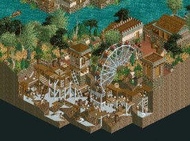
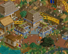
Great details with all the staff, really immersive, really interactive and I loved all the separate areas, particularly those inspired by architecture from AoE and the chalk quarry. On the whole, a fantastic park, kept me entertained for a long time. Here are a couple of screens of my favourite parts:
The chalk quarry.
The age of empires town centre.
This section of coaster had such good flow.
Port of Entry:
This was almost the complete opposite. Watching this progress I initially thought, wow, this is a winner right here. And you all thought the same, and I think that cockiness is what has made this park fail like it has.
The architecture was impressive, if a tad over scaled, but its so difficult to look at it because there is SO MUCH FUCKING DETAIL that there is no detail. Its just object layering and its a giant clusterfuck. I don't even understand how you could think it was good looking when every object is winking at you. Perhaps had you toned down the amount of objects you placed on a facade, the park might have gotten finished properly, for example, you started to do the hotel interior, but it doesn't make sense because it's not finished. A park like this relies heavily on architecture and atmosphere, both need to be done properly.
The flyer lacked flow in certain places, but the layout was solid, just nothing special. I personally felt the launch ruined it, and for a team who's captain criticised the opposing park for not being realistic when it wasn't ever meant to be, why the hell did you put a launch on a B&M flyer? I also felt you placed it in there because you knew that the park needed something more than just architecture, but because you put it in, it doesn't feel quite right, this is meant to be a 'Port of Entry' and it seems weird to me to place a major attraction right there in the type of park this entry is meant to be for. But still, it was a decent layout, decent pacing, decent colours, just like I said, lacked a bit of flow here and there.
One thing I don't get was the rapids. They totally didn't fit in the park. Looked like a last minute addition just added in for the sake of it. Rapids need bedding into a park, when they are right on the map edge, they just look out of place. Also from a realism point of view, that hotel is going to have a lot of damp issues in their lower floors with a water level that high up the side of it.
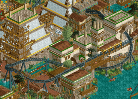
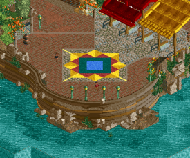
Don't get me wrong, I enjoyed the park, it is a solid R1 park, its just such a shame that it couldn't live up to it's potential. And I don't think it was the right thing to do for a H2H park as it can't keep you engaged for a long time. Also all the ghost objects, the over detailing to the point where there is no detail and the other 'rushed' issues take the park down several notches in quality. Here are a couple of screens of my favourite parts:
The compass style mural on the floor.
The blankness of this wall.
The aqueduct was well done.
Overall my vote went to Tenochtitlan.
Please note the titles of the screens refer to the captain of the team, not the builders of the park.
-

 Six Frags
Offline
Congrats to all the builders of Tenochtitlan for becoming a NE Parkmaker!
Btw, don't you guys think that system is kinda broken? I know the community decides who becomes a Parkmaker strictly speaking, and that being a NE Parkmaker lost quite a bit of appeal compared to the 'iris-age', but I think maybe up the requirements just a little bit and make it something really special again?
-

 Coasterbill
Offline
Congrats to all the builders of Tenochtitlan for becoming a NE Parkmaker!
Btw, don't you guys think that system is kinda broken?
Don't you still need to build 80% of the park to become a parkmaker? H2H or not, if someone built 80% of the park and it scored over 80% then I don't see why they wouldn't deserve it.
Obviously when it comes to Tenochtitlan I'm not at liberty to say who or how many people worked on it but if that were hypothetically the case I'd say it would be deserved.
-

 Six Frags
Offline
^Guess your right, totally read over that 80% bit. I do like how "H2H7" is a NE Parkmaker currently tho

edit; And that he is from The Netherlands

-

 AvanineCommuter
Offline
My reviews echo a lot of sentiments already stated but I'll say them anyway

Tenochtitlan -
Pros:
Loved the main coaster - the layout was unique and fun! Having that large loop being half buried was a great touch, and it flowed so well, interacted very well with its environment too. I loved how low key it was, with the launch going up such a small hill. Very nicely done!
The architecture was fantastic! Very old-school reminiscent but still having the details of new-school style. You made brown on brown exciting and lively instead of stale and boring. Unique take on the aztec theme and it's very appreciated.
LOVE the Spanish tents and boats everywhere. Great execution for such a simple idea. The supplies lying everywhere added to the fun.
Those boats. DROOLWORTHY RCT right there. They will go down in history as some of the best boats ever made. One of them is even a ride station. wow.
The clay mines. Nice touch...

The marketplace is fun and well done.
That bird sculpture is seriously one piece of work in itself. Amazing detail.
The pit with the ring for that sporting thing I don't know the name of... great reference!
Frozen staff naming was creative and funny. Loved the cryptic references to members with these names.
Cons:
Not a fan of the yellow coaster, though I appreciated the hacking of the ride. Just very boring to watch and the "adventure" style portion wasn't as well executed as the rest of the park.
Those pyramids... I can see what you're going for, it just didn't translate well in RCT. They just aren't aesthetically very pretty to look at and they DOMINATE the screen. It does offer a nice respite from all the brown though.
 I think the white chalky walls just doesn't look very good overall, especially in that quantity.
Port of Entry -
Pros:
The River rapids was really well constructed and executed. Beautiful queue underground too, loved how it weaved through!
The entry was grand and beautiful! I love the arched entry
Loved the use of canvas, there were some unique shapes and styles! I will be stealing this for my projects

Loved the crane by the river rapids!
The aqueduct was a nice touch, loved the supports and the way they were constructed.
The layout of Machina was nice, it's also welcoming to see unique layouts and coaster types. There are too many generic coaster layouts - I really appreciated the use of a launched flyer with a unique layout!
The pathing and foliage were top notch, I am hoping this style of pathing / foliage becomes standard in all future parks.
The architecture was AMAZING. Wow. THOSE COLOR COMBINATIONS! I'm in love with the wide array of colors used but used so effectively. Individual buildings (hard to pick out...) stood out: that peach and black building in the front. The deep blue/tan/white building. Some seriously great things going on here. I think the forms of the buildings were the most inspiring things here. Very beautiful and fitting of the theme, loved the way they framed sections of the park.
The Cons:
What was Machina about? I was a little confused about the idea / concept behind the coaster, maybe it was just lost on me. How does it fit into the port of entry theme? Is there a backstory?
Pirate ship named sssssssssssffs? Crude, sexual and tacky frozen staff names? Way to take us out of the immersive theming you guys took so long to make. It's very jarring when looking at such a beautiful park. Like Port of Entry is possibly one of the classiest entries to any theme park outside of Disneyland, and you choose to have these kind of names in it. And for example, the sculpture at the entry of Machina's queue" - I have no idea what that is and what it's supposed to represent, and instead of cluing us in on that with an appropriate title, you chose to name it "fuck nin". Just no.
The architecture. WAYYYYYYY overdetailed to death, to the point where I was shaking my head at the shame of it all. This could have been so much more if it were just edited! A lot of the details were completely unnecessary.The buildings would have looked much more beautiful if some of those stone pieces were taken off, if some of those border liners weren't there, etc. Using stone pieces as texture then using them as an unnecessary trim around the same tower's roof + 1k ruins everywhere even when it doesn't add anything: those the kind of unnecessary detailing I'm talking about.I think this is the epitome of the new style of overdetailing that killed a lot of RCTer's willpower to play the game anymore - because if you don't have 500 pieces of scenery per building, you get a community score of 60% ( exaggerated of course, but you get the point). This park would have hugely benefited from EDITING the buildings and their details down to an acceptable level. The overdetailing heavily detracted from my enjoyment of the park and was one of the main reasons it lost my vote.Overall both parks were AMAZING and set the standard very high for the next few weeks! Congrats to all the builders of these two parks as these were amazing achievements in their own right, despite the few missteps.In the end I think Port of Entry was an amazing park that ended up disappointing because of some missteps that could be easily fixed. It's a shame it wasn't. Vote - Tenochtitlan
 -

 alex
Offline
I've voted Tenochtitlan.
Pretty much for the same reasons everyone has already stated. Don't worry, I've thought hard about my vote I just don't have anything new to add to the discussion. Except that the white/shake pyramids look awesome - you're all wrong and have awful taste.
-

 dr dirt
Offline
Figured I'd post my thoughts on Port of Entry before the builders are revealed. Now that the voting's pretty much decided, I don't think my thoughts will affect the end result.
When I look at the technical skill that took to build this park, and the amount of time that was put into it (400+ years? is that legit?), I can't help be disappointed in the final product. Looking at it, barring some huge game-changing developments in RCT, I don't think the game can be pushed much further than what was in this park. It had pretty much the highest level of detail and divergence from the original game (in a good way) that is possible. While impressive, it just wasn't used in a way to make this what it could/should have been.
My biggest issue with the park is that you named it Port of Entry. When I saw that was what the park was, and glanced at the screen before downloading, I was so excited. IOA was one of my favorite memories from when I was younger and I thought I could get a bit of that nostalgia and excitement from this park. Then I opened it..
This didn't seem like anything an IOA type of park would have. There was nothing that would've made me feel like I was walking into another world when entering the park. The actual PoE has that magic to it, it's a gateway into something more exciting than the real world - like entering a storybook. Here we walk by a hotel and buildings that don't really have much theme besides a loosely Mediterranean-eque architecture. Most of it was drowned in generic detail, so it's hard for any theme to pop out. The problem was it looked like something I would expect in real-life - the opposite of what IOA is like. It's like all the magic was taken out. For example, irl you walk through a huge rock arch to 'begin your adventure.' Here, we walk beneath a building. People walk beneath buildings all the time, there's no sense of adventure in it.
There also wasn't any convincing indication that this was part of a port city. I could sort of tell that it was, but it for sure didn't have the in your face look that the real thing has. You walk through the actual PoE and you know you're in a bustling import/export port immediately; there are little details everywhere to capture it. Here, the details served to make impressive architecture instead. What's so adventurous about detailed architecture?
There were parts that had the look you should've gone for towards the front of the map. The compass path, the awnings (like the real thing), and that area. The magic had started to form, but then BAM, reach the architecture and it's gone. In all honesty, if I had viewed the park before viewing the name, I wouldn't even have thought this was PoE. I would've thought the front area was inspired by it, but that's where it ends. I understand that you didn't do a recreation, but that doesn't mean the the feel of PoE has to go too.
The ability was there, obviously, though. It was just used on everything other than the most important part.
-

 Louis!
Offline
Taking into consideration the removal of Coupons vote and the addition of Roomie's:
POLL CLOSED
Hurricanes 20 - Heaven's Atlas 57
Heaven's Atlas win. -

 Liampie
Offline
The creators will be revealed tonight. First time closing a match, it's a bit messy. In the future it'll be more streamlined.
-

 Liampie
Offline
Alright with me, just for this match. A rare opportunity, the time between the closing of a poll and the official conclusion of the match. Seize the moment, guys.
 Tags
Tags
- No Tags
