Micro Madness 2014 / [MM2014 Final] FK+Coastermind vs. inthemanual vs. Stoksy
-
 15-September 14
-

 Louis!
Offline

limited space, unlimited madness
Grand Final
__________________________________________________________________
FK+Coastermind (#2) - The Time Traveller
inthemanual (#4) - Cavumus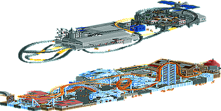
Stoksy (#6) - Ode to the Ood
__________________________________________________________________How to vote?
First of all, check out all the entries in this match. If you can't view one or more entries, for example if you don't own LL, then please, do NOT vote.
Once you've viewed all 3, select your favourite in the poll above.
After 3 days, we will close the poll and the highest scoring entry will proceed to the next round.
Comments on the individual parks have been disabled, so please leave your comments below.
Anyone found to be voting on their own match up will be disqualified from voting.
Anyone found to be voting when they cannot view all 3 entries will be banned from NE.
Votes are public and so any cheating of the system, betrayal of honesty or mistrust will be picked up on and will be dealt with. -

 5dave
Offline
You guys are crazy. This looks like a deserving final match to me.
Sorry for not participating, but I couldn't find the time (not even for a bush on a blank map )
)
"MFG" -

 thirteen
Offline
Wow guys. This game has gotten to a point, which is crazy. I mean, this isnt even rct anymore. This is art.
All 3 entrys were fabulous.
I will start with my favourite:
#1 Cavumus: I am speechless. I mean seriously? I dont think I even saw all the things in there but sweet jesus it is beautiful. The upper level has so beautiful buildings, the interiours are amazing. That lift with its interior and the water wheel on the bottom, the liftcage itself. Wow. But then I opened the night version and was like "wtf is going on!?". I mean, how did you even created this? Is this some kind of core hacking the game? Sometimes my colors are messed up starting rct, but you used it to create this night effect. And why wasnt this done earlier in the last decade? The illusion of the light inside the houses is just perfect. I pull my head off to you inthemanual, this is the winner do me.
#2 Ode to the Ood: This was awesome, too. I dont know any doctor who story lines or saw an episode, but I got the feeling you achieved with this park and the kind of parallel-dimension world thing. that space ship is neat, i love the colors and the coaster itself. I really liked the icy bottom level. those ice themes are kind of trendy right now it seems. the coaster was great and the station building, too. I really liked this entry, too. but it didnt blew my mind as cavumus did.
#3 time traveler: I see what your goal was to achieve and I really like that entry, too. The idea itself isnt as creative, but it was well excecuted. the archy is outstanding and uber-detailed. very passionate textures and those flying round buildings were neat. i wasnt too sure about that fence-structure. I understand its purpose story-wise, but it was way to distracting to me. this entry really is eyecandy on the small scale, but lacks on the bigger scale.
All three of you have done their best and I can clearly see the passion for the game in every entry. Keep up the good work guys and congratulations to all of you!
-
 RCT2day
Offline
[Will edit this later to give better reviews]
#1: Cavumus: Insane. Absolutely incredible. Like seriously. Maybe the best micro ever.
#2: The Time Traveler: I really liked this and came away figuring I would be voting for you (that was before I viewed ITM's). I loved how you executed the constants (the time traveling machine, the tree, the pond, etc.) so well. Definitely a solid entry that you should be proud of.
#3: Ode to the Ood: I don't really know Doctor Who so a lot was over my head. Anyway, I thought the Eurofighter could have been better but I loved the starship's (?) elevator. Impressive work. How unfinished was it?
Congrats to everyone and nice job, gents.
-

 Maverix
Offline
Am I seriously the only one who's voted for Fk so far?
inthemanual's was fantastic don't get me wrong but I really really loved both Fk's concept, and execution of it. (although I do wish you'd built it so you would rotate forward in time rather than backwards, but that's my only gripe)
It was seriously cool to see everything progress from each section (or regress depending on the way you looked at it) and playing around with that was amazing.
Also Stosky, your micro was fantastic and it's clear you deserve a spot in the final, your entry just happened to go up against two of the best micros this site has seen.
-

 Stoksy
Offline
Dammit you two! *shakes fist*
Btw, thirteen; Kumba and Six Frags did a similar thing [with a night-time] in H2H6 with Rowling vs Tolkien. Personally don't know how it's done but it has been done before.
@RCT2Day: The bottom layer is as finished as I could probably get it, but the space station should really have been a lot more detailed and less blocky. I also would [or rather should] have considered actually completing the top layer [with a base like under the tilted-whirler] so it was clearly a separate landscape.
Just woke up so don't have time to review the other entries at the moment but will make sure to do so as soon as possible; can't wait to see what you guys have done in-game!
EDIT: Should also acknowledge that the only reason I made it this far is because Faas dropped out. Obviously disappointing that you had to do so but it allowed me to make the final so thanks for that

-

 Faas
Offline
You're welcome Stoksy, but seeing the stuff you handed in in this contest, you deserved this place a lot more than me. You make me glad that I dropped out, because jesus, all three of these would have absolutely destroyed me and my will to ever take part in a competition. All three entries were seriously jaw dropping, good job guys!
1. ITM: Dude....
2. Stoksy: Really cool, I don't know about Dr. who, but especially that bottom layer is just pure old RCT fun for me.
3. FK: The idea was really cool, so was the execution. I didn't understand what the coaster was doing there racing around the micro to be honest.
-

 navalin
Offline
FK - beautiful work, but it took me a while to figure out what you were trying to accomplish. I think the coaster ended up being too bright and detracted from the landscapes, making it hard to realize that the landscapes were progressing through time (without reading the readme at first, at least). I love the story you are telling, but I feel like it should be a little bit easier to see right off the bat. The black "fields" blocking the past were a great idea, but I think poorly executed. I think they probably could have actually darkened the "past" a bit more; their current look just seems to add unnecessary noise to the screen without removing detail. Solid concept, just a few minor things didn't make it pop as much as it could have.
ITM - easily took this one. Am I wrong in feeling like you took inspiration from JimmyLaessig for the underground ride? I really love the subtle details with the suspended trains and such. Lots of thought put into the details of all the mechanical workings of the place, and it really pays off. Plus you managed to fit two very well crafted tracked rides into the place. Night mode was just an extra bonus that pushed it over the edge.
Stoksy - The Dr. Who objects were pretty solidly made, but I didn't get any crazy Dr. Who vibes from the rest (I'm admittedly not too well versed in the Dr. Who universe though). The ground area was super solid, but unfortunately maybe a little generic since it just felt like a typical (maybe a tad fast paced) eurofighter coaster. The elevator to the spaceship was cool, but the whole spaceship just felt kind of blocky and weak.
-

 Stoksy
Offline
Here goes...
Fk: As concepts go this was clearly one of the highest level! Although I definitely agree with Maverix in that I would have preferred a slightly clearer past -> future progression I would hazard a guess that the actual creation of the time machine would have occurred in the future so would have made more sense going backwards in time. Nonetheless, might have been cool 'ending' with the creation of the time machine but that's a tangent for another day haha. I think that the idea of blurring the past was brilliant; the mesh objects certainly allowed for that blurring to take place but there was a level of messiness about it...maybe I would have used a double-layered mesh fence just to further blur the other areas and hide the outline of the object a little better. The time machine itself was incredibly well done, and the attention to detail to ensure that it looked the same in each zone was a true reflection on the meticulous planning that went into this. I think that Time Zephyr was just your excuse to add some dark red in this to be honest
 and felt that whilst it certainly added some necessary movement you might have been better off trying to make it more subtle. Maybe the idea that there was something that followed the Time Traveller through these different time periods could have worked? Regardless; near perfect execution of a really complex concept, and I really hope that others can see that. Also; dat sunken Carousel
Just as a side note; was the idea based off of The Time Machine by H.G. Wells [I read it ages ago, but the idea of a Time Machine only being able to travel specifically on the 'time-axis' sounded familiar to me, and I imagine it would have probably been from that book]
inthemanual: Started with Earl Grey, and ended with this; glad you made the final
 . The levels idea was something that I tried to do; but it pales in comparison. I think that although the idea wasn't as complicated as Fk's the execution certainly made up for it. I'm still not sure I entirely understand the concept though; is it that the fungus-infested cavern is the result of the inventor being allowed to do whatever he wants? If so, then why is there gold there? I'm probably just failing to understand the obvious but when I think 'crazy' I'm imagining some weird creatures roaming the caverns and then [at night-time] perhaps crawling up the lift in an attempt to get to the town. But that is a concept query and in no way takes away from how great the execution of this was! Although I think that the rapids were way too fast, the idea of a river rapids in a cavern was perfect; it allows for some really great interaction between ride and landscaping which you accomplished brilliantly here. The subtle touches of the lit-up flowers in the cavern is especially noteworthy. The best thing was that the top layer was quality also; especially the coaster that you had. It added plenty of movement but there was no suggestion that it didn't 'fit' with the rest of the layer. The coaster type was spot on, and was therefore able to add so much to this [especially the interior of the station and the steel walls under the coaster floor instead of mud or the land texture]. Furthermore, the hangcar was perfect; it made sense [as a way of viewing the cavern without being too close to the fungus] and the execution again; stunning. The addition of the rescue car and just how perfectly the falling Kumba was integrated into it was just wow. Stunning entry, and certainly deserving of a grand final!
I think this boils down to the brilliant execution of itm against the simply unbelievable concept of Fk for me.
-
 Coasterbill
Offline
I loved all three of these but for me Cavumus is the clear winner. I love the little details as I mentioned last night in the stream, the coaster on top is a great blend of fantasy and realism and the area around the lift was stunning. Bravo.
The Time Traveller was amazing as well, though I actually think I prefer the Mirage. Maybe that's just my taste for realism talking though and that's not a knock on this park which was excellent. The thick spine track is simple but gives this a really nice extra dimension and the architecture is great. Great job.
Stoksy, the Euro Fighter was a bit fast at times but it was really well made and fun to watch. There were some great merges here and the area really reminded me of Antarctica at Sea World only with an awesome coaster as the focal point. The top level unfortunately didn't do it for me like the lower level did. This was great but it had some really tough competition.
-

 wheres_walto
Offline
Wow, great work all 3 of you. I think you guys were the standouts of the contest, with FK really showing what he was capable of and both manual and stoksy emerging as top new players on the site. I'm so glad we got to see 3 more outstanding entries for the final.
It's an incredibly tough decision. All 3 entries has aspects that I absolutely adored. FK, while I didn't quite understand what the mesh fences represented, I did like the fact that they slightly blurred some of the aesthetics of the park without being too much of a hindrance. I really enjoyed your stylized architecture, it reminded me a lot of the Parapluie-esque detail that's become so en vogue these days. I felt the coaster was a bit fast as it zoomed around and I didn't much care for it's colors, but overall this was a worthy entry for the final, and you should be very proud of the work you've submitted for the contest.
Stoksy, I really think you can become a top 5 player on the site. Your body of work in immersive themes has been just outstanding, and this was no different. Although I'm not really a Dr. Who fan, I recognize the work that went into recreating the theme. I really thought your 2 coasters were the strongest of the round, and it was really cool how you blended a realistic eurofighter with a fantasy launch track. I did enjoy the bottom half significantly more than the top half though. The ice work, architecture, and supports were all gorgeously done, but it seemed to me like the spaceship at the top still needed a few days of work. The satellite was great, but the overall shapes seemed too simple and the walls too plain. But like FK, your entry was marvelous and your body of work is very impressive.
manual, I found this to be the most complete entry of the round. I really enjoyed the detailed-without-being-overdone cave and the constant motion throughout the entire micro. Your architecture was strong, but the real appeal to me was the motion and life you managed to fit everywhere. When I opened the night-time version, I actually said out loud "oh that's clever" and I started looking for spots where you snuck gold into the map. I really can't say enough how impressed I am with your work; like Stoksy, I think you have emerged as a top player consistently capable of accolade work.
This is an extremely tough vote, and I haven't submitted mine yet. Great work, all 3 of you
-

 csw
Offline
The best three entries of the whole contest, without a doubt.
My vote goes to inthemanual, with FK in a very close second.
-

 5dave
Offline
Cavumus - Inthemanual
Really the whole backstory about this one. A crazy inventor who builds whatever he wants - really nice! The spinnig wild mouse on top is really solid - strong theming and layout (although you could improve the hacking a bit -> continues block circuit mode), then it would be perfect! Maybe some shops on the upper level might have been good. Peeps in RCT are mostly too stupid to figure out 2 level-parks only connected by a lift... Those towers (church? and the lift tower with the mechanics) were really nice! The archy plust its colors in general are really strong and atmospheric. There were so many nice details in such a little area - great work! The lower level was also themed incredibly well. My only gripe is the fast drop of the rapid ride, maybe lowering and therefore lowering the upper part too would have been better. What also bothers me a bit was the visible floating text of the ride entrances. But it's not that bad, just a further step to perfection. Also the rapid ride boat departure time could be improved so that no boats will stay too long in the loading area. But all in all a really really awesome entry and my gripes were just little things - so well done! Oh and that night idea was just the icing on the cake.
The Time Traveler - FK+Coastermind
First off - I really love the fact of using the isometric perspective to your advantage (again!) . Twisting the map around seeing the changes in history really is a unique experience. Again a very nice backstory to the entry, I love the thoughts you put in there with blurrying the other times on specific parts - great work! Maybe you could have expanded the idea with blurrying it even more to suggest details being forgotten in time? IMO the middle periods are to close to each other and maybe some more radical changes in time would have been nice - a catastrophe which explains the underwater future, or a warzone explaining radical changes in architecture? Frozen staff would have helped creating atmosphere and supporting story in each time zone. I wasn't a fan of the coaster that much - while it outlined the parts quite well more could have been done with it - coaster elements that change through time? Maybe some inversions interacting more with the inner parts creating paradoxons or something? All in all a very strong entry again. You have the storytelling ideas, but you could take it to another level with those hints I gave I think. Great work!
Ode to the Ood - Stoksy
Yay - Doctor Who theme! Pretty risky to use in a finals park and take the risk to lose potential votes, but I like that fact! The coaster on top was quite nice, nothing mindblowing but really solid. I liked the black-yellow contrast you made. Using an invisble lift to represent the TARDIS was a really great idea - loved that one! The lower level coaster was also quite nice, but I think it suffered from all the different track types. Also you could have tried hacking a below 90 degree drop to it (Roomie did that once). Would have been cool to see. It also goes through the elements pretty fast which is a bit of a shame. But the layout itself was really strong - loved the diagonal and over&under parts of it. Theming was also top notch throughout, I loved the implementation of the little story driven details and some different TARDISes(?) throughout the entry. I think the song of the Ood could have somehow be implented into the micro. Again a very very strong entry which lacks only a few minor things, but impressive considering you wrote it was rushed to some extent. Great work!
I'm happy how many sci-fi entries we had this MM.
Really awesome entries and sorry for not competing, but I'm on Erasmus right now and therefore don't have that much time to sit in the dorm playing RCT, haha! My plan was to finish the Guardian, so I wouldn't have won anyways I guess. Pity the contest lost interest in the end considering those amazing parks created!
"MFG"
 Tags
Tags
- No Tags


