RCT Discussion / Can I have an opinion?
-
 05-September 14
-

 Ling
Offline
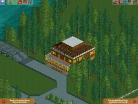
Well, it's a giant square. Try making it have a more realistic footprint. Look at pictures of real restaurants (?) or theme park architecture.
-

 csw
Offline
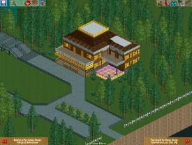
The shape is much better. But I would think about the flat grey roof sections. What's the point of them? All I can think is that they would collect rainwater and breed mosquitoes. At the very least I would make it a less contrasting color than grey.
-

 PicklePotPie
Offline
Agreed about the grey roof sections, the color contrasts too much.
The main thing that puts me off is the expanse of boring roof across the front section. Break it up with a dormer window or two (even a dormer without a window), or a western facade type thing, or a sign centered along the roofline.
 Tags
Tags
- No Tags


