Related Games / Theme Parkitect, new RCT-based game
-
 25-August 14
-

 Six Frags
Offline
Looks the most true to a 3d RCT game, but what do you guys think?
Bit too cartoony imo tho
-

 Stoksy
Offline
I agree, remember seeing this on reddit a few days ago. This is as close to a true '3D' RCT2, still holding true to using isometric view but trying to keep the 'old school' feel of the game. It's definitely too cartoony, as you said, although I'm really glad to see an extra level of customisation with ride elements. Should be interesting to see how this develops, I think if they can move more towards a realistic simulator then it'd be a lot better.
Funny how there are seemingly so many RCT-esque games coming out, or at least being advertised, over such a short amount of time. Unless I've just be completely oblivious to them over that last few years...
-
 Chocotopian
Offline
Reminds me very much of the original Theme Park by Bullfrog. I don't think it's too cartoony at all. It is cartoony, but I think this helps give it its unique style and keeps everything looking fun. Once it gets too bogged down in realistic details it becomes, well, like some of the parks on here, where people get nit-picky over air vents and dustbins and the depth of a support footer. I like what they've got going on here, and agree that it'll probably provide a bit of light-hearted fun, or else could serve as an introduction to the park building genre. I dunno, it might even help people work on basic park layouts (for RCT parks) without becoming distracted by the finer details.
-

 Version1
Offline
I actually like the look of the game, and it's past time for a new good theme park game.
-

 RRP
Offline
Been following this for a few months now. I think its gonna be a winner. Not based on the graphical style but the highly flexible coaster builder and little tool improvements over RCT. Like full 3d rotation,scalable scenery,semi realistic auto supports.
The small development team seem to be listening aswell. Made a few suggestions over at another forum about common rct gripes like rotatable entrance/exits. They seem to be taking note and not just ignoring/dismissing any input.
Parkitect will probably be my return to themepark games,gonna have to brush up my skills before release

-

 Steve
Offline
This actually looks pretty great. And if RRP wants to make a comeback with it, I'm on board, haha.
-
 Sephiroth
Offline
Scale of Aesthetic Pleasantness:
>Supermodels
>Landscapes
>Sunsets/sunrises
>Art/Architecture
>Broken pavement
>Dirt
>A potato
>Human feces
>A naked 110-year-old flaccid dude
>That roller coaster
-

 RRP
Offline
Scale of Aesthetic Pleasantness:
>Supermodels
>Landscapes
>Sunsets/sunrises
>Art/Architecture
>Broken pavement
>Dirt
>A potato
>Human feces
>A naked 110-year-old flaccid dude
>That roller coaster
Ignore the screens and player ability. Having watched a bit of game play footage the coaster flexibility is great.Full 360 degree banking to 1 degree, curves and inclines that scale in units. So a size 1 bend occupies 1 grid unit,a size 3 (3x3 grid units).A size 5 drop is 5 tiles long and 5 tiles down but with the same exit angle as a size 1 drop depending on angle of drop chosen.The same with diagonals. You also appear to be able to go into a 45 degree bend,then continue normal building on that angle. So 45,90,loop,45,loop,45,90,45 etc etc.
Kinda like what people did with custom rct3 coaster (if anyone played with those) but with even more flexibility
-

 RRP
Offline
We haven’t done a lot of UI work in a while, but now that shops can finally be selected it seemed like a good time to start with the shop info window.
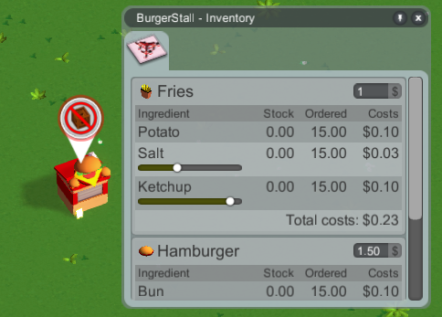
What we have here so far is the product settings tab, listing all the products and their required ingredients (which need to be delivered to the shop). For some ingredients you can tweak how much of it goes into the product, so you have a bit of an influence on how many delivery crates need to be hauled around and the production costs. Guests might not be willing to pay as much/are less satisfied with lower quality products though.
Most ingredients have a status effect on the consumer (for example, coffee reduces tiredness a bit), so you might not want to be too stingy with those.
Adjusting the ingredient amounts should not really be required in the end as that could easily become tedious, but it’s something you can do if you want to.
The costs in the screenshot above are placeholders. We’ll have to do a big balancing pass someday and assign some proper values.
The tunnels from last week received their art and work for other coasters now too: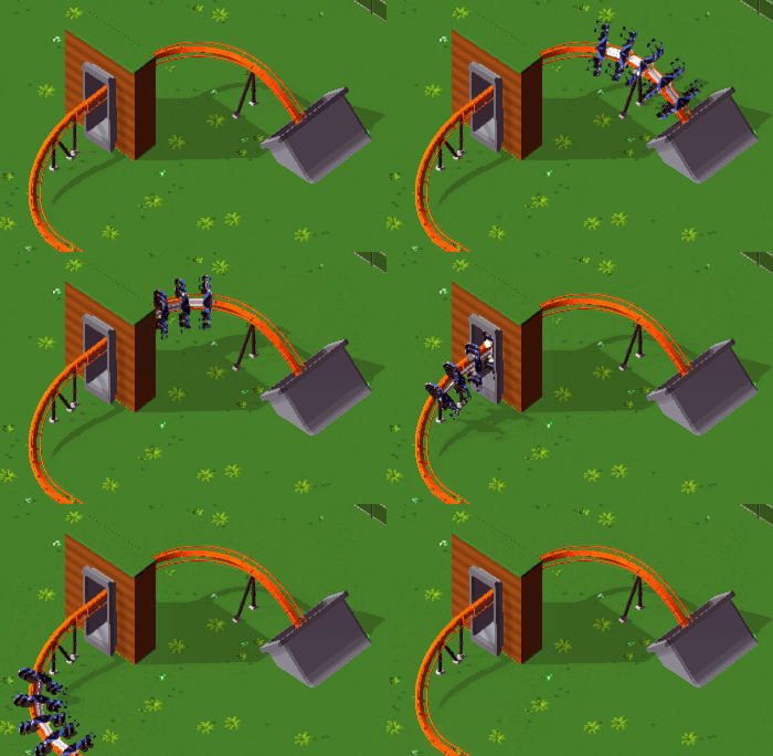
They’re just simple concrete tubes, but that’s what a lot of real coasters use. We might add other types of tunnels later - for now though I’m pretty satisfied with these.
Working on the coasters wasn’t really planned for this month, but after the work on tunnels I felt like it and the result is that corkscrews can be built diagonally now: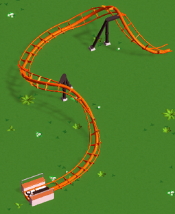
Same for regular hills: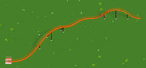
Naturally, diagonal elements are a bit longer and thus have a slightly different shape, but that’s the trade-off for keeping everything properly aligned.
Here’s a comparison showing the shape difference of diagonal hills (orange) and regular ones (blue):
I was told that it would be a good idea to allow building brakes on flat slopes, so that’s possible now: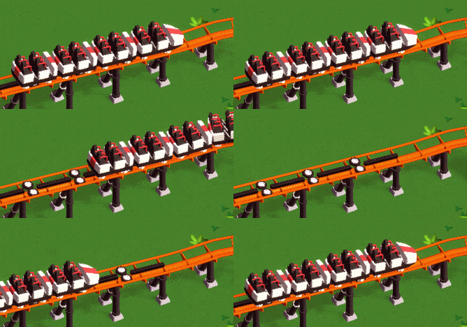
I think it’s mostly useful for accelerating a train out of a block brake a little bit quicker.
The drive tires and brakes received some simple animations.
We’ve added a follow camera mode for guests: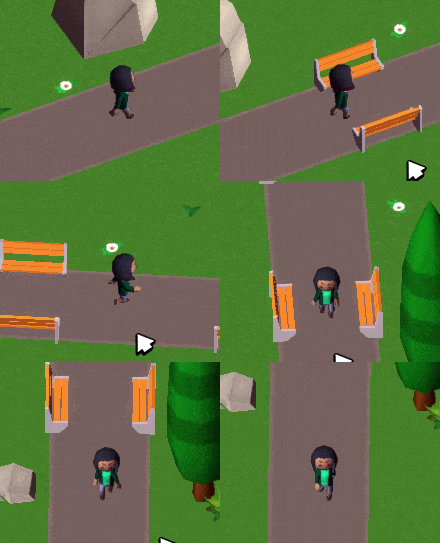
More things than usual that we did this week were possible to show on a screenshot/gif and interesting enough to show here, so this got a bit longer
Too bad not every week is like this!
http://devlog.themeparkitect.com/
sloped brakes <3 -

 Cocoa
Offline
well I'm pretty sure there's none atm. they've mostly got some very simple rocks and trees as scenery. I imagine that stuff is pretty low on their to-do list.
-

 RRP
Offline
This week they mostly been talking feedback on loop shaping.
Update 37
We upgraded our shaders to Unity 5′s new PBS system, giving us slightly nicer looking lighting. We also added a bit of rim lighting.
Here’s a comparison showing before (Unity 4) and now (Unity 5):

The difference is small, but it’s noticeable (note the top of the burger or the tree). As a bonus it allowed us to get rid off a couple of shader variants.
You’ll notice that shadows are slightly softer/nicer too, but we simply got that from the switch to Unity 5.
Supports and paths properly react to terrain changes below them now:
You can still raise the terrain to “bury” stuff though, but that’s a different problem.
Tracked rides received s-bends:
They can be scaled and banked and built diagonally like most of the other track segments.
And we finally replaced the weird old loops we’ve been using pretty much since the beginning of development with some properly shaped ones:
They look a bit circular due to the perspective, but they really aren’t. Here’s a before/now comparison:

Thanks to everyone over on our subreddit for helping to make sure we get them right this time
Finally they ended up with this

-

 Coasterbill
Offline
I must be missing something because I think this looks like pure shit. I read the thread, some of the functionality is cool but the graphics are horrible and I can't get over that.
 Tags
Tags
- No Tags
