Micro Madness 2014 / [MM2014 R2] Kumba vs. 5Dave vs. gdb
-
 30-July 14
-

 Liampie
Offline

limited space, unlimited madness
Round 2
__________________________________________________________________
Kumba (#1) - Comic Con Miami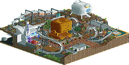
5Dave (#1) - 42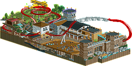
gdb (#6) - Conquest for the Forgotten Empire
__________________________________________________________________How to vote?
First of all, check out all the entries in this match. If you can't view one or more entries, for example if you don't own LL, then please, do NOT vote.
Once you've viewed all 3, select your favourite in the poll above.
After 3 days, we will close the poll and the highest scoring entry will proceed to the next round.
Comments on the individual parks have been disabled, so please leave your comments below.
Anyone found to be voting on their own match up will be disqualified from voting.
Anyone found to be voting when they cannot view all 3 entries will be banned from NE.
Votes are public and so any cheating of the system, betrayal of honesty or mistrust will be picked up on and will be dealt with. -

 Stoksy
Offline
So much respect to 5Dave for doing a Hitchhiker's Guide to the Galaxy reference haha.
-

 FredD
Offline
It was hard to chose between GDB and 5Dave's one, didn't feel very excited about yours Kumba but that's because I'm not in to comic con stuff. At the end, I think 5Dave's micro is the winner of this group for me. Most original idea and excellent coaster lay-out!
-

 wheres_walto
Offline
Another real tough matchup.
Darren, this is probably the most Kumba park of all time. And I mean that in both good ways and bad. It was full of great ideas: the arcades, movie theater, guest tables, the whole thing was very believable, but at the same time I felt it was very cheesy. There's no doubt you're one of the best players ever but I think you're too entrenched in your style sometimes, and I think that has a tendency to bite you in the ass during contests nowadays.
Dave, I've never seen the movie so a lot of the content was lost on me. I have no idea what the white and gold sculptures were but to me they looked blocky and unclear. I did love that coaster though; very majestic for how compact it is.
gdb, there were parts of this that I loved (the whole aesthetic of the coaster, the tower and drawbridge, that airplane was simple but pretty, and the architecture throughout was impressive) and others that I didn't much care for (the layout was fairly weak and I thought the elephants looked a little odd) but overall I think you have the best micro this round. The colors were rich and I felt your work was the most impressive.
-

 zxbiohazardzx
Offline
wow this is a tough one.
GDB performs nice with his super micro, i think it had the most detail and therefor barely won this one for me
5Dave's park comes in close at 2nd for me. Good flow, nice theme layout
Last for me is the Comicon build. I dont know Comicon other then from stories (im EU) and i didnt connect to the building that much.
-

 Kumba
Offline
Liam hit me with a dose of reality the other day when he said the Comic Con theme might be lost on the European players. I thought it was pure gold since Comic Con is the Mecca of all things nerd in the US and took place last weekend, making my entry very timely. Not helping my case was not being able to build on Friday/Sat. The last 15-20% got rushed and I had to cut some things out. A few things to point out:
- Harrison Ford was not at the Con due to breaking his leg on the set of Star Wars VII, so Shia LaBeouf was the last min replacement and the Ford fans should be attacking him. Kinda forgot the fan mob tho, but did have the extra security there
- There should have been more Walking Dead stuff
- Walto, there is no theater, that's a Comic Con Panel with some of the cast of Game of Thrones. If there is anyone here who does not know what a Comic Con panel is, get on YouTube now and find out a lot more about some of your favorite (mostly American) shows!5Dave - Very cool entry, I love the tiny dolphin ride. The coaster was nice too and great supports like always. Great use of peeps and I liked the custom stall and phone booth. The landscaping (or what was there) disappointed me because it was pretty typical messy style and you can be the best at landscaping. If this is a HG theme, sorry but it was lost on me.
gdb - Very nice work here, I would put this just a touch above 5Dave's (tho again, idk what theme this is, if any). Great touch with the plane going over the field. It looks like you had a lot of time on this and were able to really finish and possibly add the underground details. While I really enjoyed it and it was a skilled entry, I think you should have tried for more wow factor.
No idea how this will go... I think all our entries are fairly even. Whoever does not win will have a good shot at the wildcard. After he won with a totally unfinished entry in R1, I get the feeling Dave will win... He must have a few extra NE accounts for contest votes

Also, if you don't vote for me, your not allowed to use the T-Shirts or any of the other new objects... j/k

-

 Lotte
Offline
everybody in this matchup certainly does have a decent chance to advance through a wildcard, so far i think i have a chance at advancing that way but there's still a lot of high quality players left to beat me there
-

 Faas
Offline
I still don't know what to vote on. Maybe if I write stuff down.
Kumba - I know what comic con is but I just don't really care about it and I'm not that much into pop culture like Game of Thrones and Big Bang Theory and stuff. It's well made of course but at the end of the day I like to see more rides and stuff. I didn't notice the new objects so they kind of missed their target for me as well.
5Dave - I never read Hitchhiker's Guide so the two big sculptures didn't do anyting for me. I liked the coaster and the little stuff though.
gdb - There was a lot of cool stuff going on, but I don't know what theme you were going for exactly. It was a nice entry though, showing more creativity from you than I'm used to, so props for that!
-

 Ling
Offline
Glad 5dave made it through to this round, even though his round 1 group kind of sucked. Loved all three entries, and for very different reasons.
The sheer magnitude of content in Comic Con Miami kept me engaged the longest. The structure was boring and the colors clashed, but I understand that that wasn't the focus. I liked the "Dimensions Resort" sign. I did feel the size constraints and the scale you were trying to go for created a super awkward clash of interior layout and visibility - everything could either be visible but then you're cutting out the context that makes the layout of the building make sense, or you could flesh out the structure more but the booths would suffer. This is probably the better option of the two but it meant the flow was very strange and I have a hard time imagining how this would actually work (presumably more of a grid network than a thin bazaar-style thing on each level).
42 had the best layout of the round, and actually just a straight-up great layout in general. Supports were a little weird in places but that's not the end of the world, really. Loved the inclusion of the world-generation room and Slartibartfast. I may be forgetting something but I'm not sure what the teal lumps are supposed to be. Heart of Gold was well done, as was Deep Thought. The jet skies seemed like a major afterthought. The statue by itself might almost have been better. Also I'm not sure why you didn't lower the land at the bottom one more unit, maybe add in some stars or something. Overall fantastic, though I do think it will suffer from lack of people knowing the source material (dirty plebes).gdb, you had the best architecture of the round in my opinion, although the colors were strange and some of the details didn't work. The top of the hill with all the foliage was just a huge clusterfuck. I read the readme, and while it's still a really cool concept I get no sense of either the discovery or the battle to take the city (and why both happening simultaneously?). The ground is also covered in trash and there only seems to be one handyman that I couldn't locate. Basic but kind of detracts.
Vote: 5dave
-

 FK+Coastermind
Offline
am i the only one who can't open 5Dave's park? Every time i try, i get an error trapper while it checks object data. Tried deleting it and redownloading the park, same problem. Ideas?
-

 Stoksy
Offline
Kumba: The statement 'the overview really doesn't do this justice' couldn't be more relevant here. The front of the building is incredibly bland and boring but the inside was incredible. Although I've never been to a comic-con I do know what's going and am aware of how they work which perhaps allowed me to appreciate this more than others(?). The panels were really great touches, although I felt that this would have benefited from having even more peeps in the park just to reinforce how crowded many areas are. I felt that the bottom layer was a bit too boring, the grey path really didn't help at all unfortunately. Some great attention to detail, the Game of Thrones area was a particular highlight.
5Dave: Having seen the film quite a while ago, and it being even longer since I read the book being able to get 'most' of the references here was quite rewarding haha. Unfortunately, I can definitely see how some of the details would be lost on people who are unfamiliar with Hitchhiker's Guide to the Galaxy which is quite unfortunate as I think that's what makes this such a good micro. Loved the whale by the way. Whilst perhaps not as 'busy' as Kumba's entry, I felt that this was a little more cohesive despite so many different references that you managed to fit in.
One that I didn't get however was the dull red statue near the Millibands sign; could someone enlighten me please.
gdb: The plane was quite incredible. Unfortunately, other than that the rest of the park didn't really 'do' much for me. I liked the idea of the coaster going into the clouds, but despite the readme I don't think it helped in better explaining what was going on in the park. Agree mostly with Ling about neither the discovery nor the battle really being portrayed in the park. The architecture was quite good, especially the entrance gate, but I felt that there was a lack of cohesion despite the similar colour scheme. The use of that glaring blue/cyan colour was really odd in my opinion.
Ended up being quite a difficult decision, but I ended up giving it to 5Dave purely because of how much I enjoyed trying to remember and find all the references. Strong showing from everyone.
-

 Coasterbill
Offline
Based on the overview I would have put Comic Con Miami last and couldn't decide between the other two as they were both phenomenal. When I opened them in game it became a lot more difficult... I personally think this was the best matchup by far.
42: This coaster is great Good pacing, interesting elements and a great indoor section... it really has everything (and I always love a little Nemesis inspiration). The only real critiques I have are that the restroom doesn't really fit in and some of the structures are a little bland, the coaster, landscaping and dolphin jumping through the hoop are great though. My critiques are really, really minor but since this matchup was so close I really had to scrutinize the hell out of these parks.
Conquest for the Forgotten Empire: Wow, there's been a lot of Le Reve influence so far in this competition. Anyway I still can't believe how good you got so quickly. I really like the architecture, detailed but not over-detailed (though I'm no architecture expert). I loved the waterfall, plane and castle entrance. This is really, really good. If I had to criticize anything it would actually be the coaster itself because I felt like the ending was a little odd. Overall this is outstanding though. Amazing little park.
Comic Con Miami: This is an odd one because I really don't like the outside of the building at all and I really hate the concept (i have no interest in comic con at all) but I voted for you anyway. The outside of the building seemed like a less impressive version of Virginia key and while it was interesting it seemed a little sloppy due to the constraints of the game.
That being said the inside of the building was mesmerizing. I spent at least 30 minutes looking at this micro. The level of detail is amazing and there are a lot of funny moments inside. The hacks were excellent, it was incredibly creative and I had a lot of fun looking at it (probably more fun than I had looking at any other entry in the competition). I was so close to voting for GDB and 5Dave at different points but I couldn't ignore the detail and creativity with this one. I hate myself for feeding your already massive ego but I have to admit that this is fantastic. lol
I'm not just saying this to be nice though, all 3 of these were awesome. Also, Kudos to GDB for building a park that's on the same level as two #1 seeds because this one is really, really close.
-
 JJayMForce
Offline
Such of tough match..
Comic Con Miami- Love your style, like always, and this park was sweet. I've never been into comic cons, but you made it look very appealing. Loved all the details, everything really. That custom ride in the back was really cool, and you packed the whole map with fun. I didn't care that the outside of the building wasn't an architectural masterpiece, and I think it served its purpose well.
I know i'm not supposed to vote biased and should just base my vote on skill and execution, but you make it soo hard to root for you, Kumba. In a competition with so many good players and close match ups, it's very difficult to give you the go. Anyway, if you don't win this match, like you said, you would be on the forefront for a wildcard spot, so hope you get it.
42- Loved the movie, and really liked the entry. I was more impressed with your overall design and layout than the little things, I think. Everything looked good and it just all came together for a very enjoyable micro, for me. The coaster was great, along with all the references and everything.
What I thought could've made it better, to me, would be to 'enlarge everything'. Mostly the sculptures and behind the scenes, with the planets. Making them bigger, more detailed, and possibly having a cutaway with the spaceship would have been cool. Really happy to see you come out with a kick ass entry this round, thanks.
Conquest for the Forgotten Empire- Pretty cool. I thought the castle looked nice, along with most of the other details, but there were more cons than pros for me in this, however. The airplane reminded me way too much of the one Coups made a while ago and took away any inventiveness there for me. If the castle was the focus I would have liked to see more of it, a lot larger, with interiors etc.. Also the coaster supports were confusing in that you didn't fully support it, only in some places. You certainly surprise me constantly with your style and seem to always be getting better, nice job.
-

 Liampie
Offline
42: I wasn't a huge fan of the movie, but the 42 thing of course is classic. I like how you did Deep Thought and all the other references. The coaster was amazing for a micro, among the best micro-layouts I can recall. Not too short, good flow, plenty of good interaction. All in all a great micro!
Conquest for the Forgotten Empire: I wasn't a fan of this. Some elements like the plane were cool, but it looks like you had several random ideas and tossed them together. I mean, what am I looking at? City walls, an inner city farm, low flying airplane, random clouds, an underground maze, an elephant market, a library... The execution is questionable too. I don't think the coaster is very good, and the purple and blue bits in the architecture are awkward. Less is more, gdb. Also in terms of concept.
Comic Con Miami: this is as entertaining as a micro will get without rides. I liked it, tons of stuff to see, but I think there should've been more movement. Relying only on pop culture references is risky and it shows in the voting. I hope you can still make it through to the next round but I fear the worst. Bad gamble, but still a good effort.
 Tags
Tags
- No Tags

