Micro Madness 2014 / [MM2014 R2] Ling vs. nin vs. Maverix
-
 30-July 14
-

 Liampie
Offline

limited space, unlimited madness
Round 2
__________________________________________________________________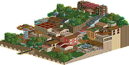
Ling (#4) - Rencrest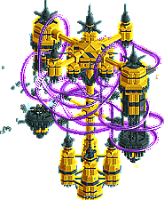
nin (#1) - SKM-011K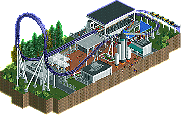
Maverix (#2) - Zaturn
__________________________________________________________________
How to vote?
First of all, check out all the entries in this match. If you can't view one or more entries, for example if you don't own LL, then please, do NOT vote.
Once you've viewed all 3, select your favourite in the poll above.
After 3 days, we will close the poll and the highest scoring entry will proceed to the next round.
Comments on the individual parks have been disabled, so please leave your comments below.
Anyone found to be voting on their own match up will be disqualified from voting.
Anyone found to be voting when they cannot view all 3 entries will be banned from NE.
Votes are public and so any cheating of the system, betrayal of honesty or mistrust will be picked up on and will be dealt with. -

 Liampie
Offline
Ling: it's fairly nice, but random and underwhelming at the same time. Ran out of time and ideas? The best thing on the map is the freefall tower structure.
Maverix: fairly nice again. It's quite well done and it's impressive that you fit a believable realistic coaster on a micro map, but it offers too little to hold my attention. It's not particularly pretty, atmospheric or complex.
Nin: the hardest thing with floating structures/maps is coaster layours. I don't know what to think of your coaster, but for the rest this map is top-notch. Pierrot-esque, but even cleaner. I love how HUGE this thing looks, it would look great in IMAX as well. Lovely, easily the winner here and one of the most memorable creations of the second round. -

 csw
Offline
Ling: For whatever reason I loved this. So quaint and cute.
Nin: Very cool structure, and even better backstory. You even made your own logo?!
Maverix: A solid entry, but not enough there to go on.
My vote has to go to Ling.
-

 Lotte
Offline
Ling: very nice LL entry, the levels were nice and it showed a lot of skill
maverix: this really shows that you're capable of a lot, however it felt empty because of the realism you were going for. still nice
Nin i love the structure, very cool. the coaster didn't hold my attention for very long though, it wasn't anywhere near as interesting as the main structure. however my vote still goes to you
-

 Ling
Offline
 Ling-MM2014-002-Rencrest2.png (760.57KB)
downloads: 68The other side for anyone who can't open it.
I agree, nin's is on an entirely different level.
-

 5dave
Offline
Rencrest - Ling
Don't really know what this was about, I think the theme is Asian mountain - something? Structure-wise it was nicely done, but unfortunately there wasn't that much to see besides those 3 flatrides and some differently textured structures... But as I said, the mountain as a whole looks very harmonic.
SKM-011K - nin
I really loved the look and feel of this one. While the coaster and the station didn't really work together as a whole, the station structure and the explosion really looked impressive nontheless! Maybe some sort of explanation what went wrong and maybe some other details would have added a lot to the story. Right now there's just an exploding station and a purple coaster going around, I just wished there was more between those elements.
Zaturn - Maverix
Nice little semi-recreation there. Nothing really spectecular, but solid work all in all. I liked the support work, the detailing and the little rocket, although I wished you would have gone more crazy about the theme and the ride. Right now it's pretty boring unfortunately. Why not place the rocket at the top hat? Why not theme the whole ride as a rocket launching space station thingy? But really solid stuff all in all!
"MFG" -

 Stoksy
Offline
nin: Was waiting for someone to do something space related. Really impressive that you made something using such bold colours yet it doesn't look out of place. Everything was obviously technically brilliant, the little details on the exploding part were really impressive. The coaster seemed a little out of place though, especially with the uncovered station essentially just placed (seemingly) randomly on the map. I think it would have been better if it was better integrated with the rest of the structure. Still; really great micro particularly because it was an idea that hadn't been built yet.
Maverix: Quite simplistic, but still very well built. I felt that whilst the rocket was a nice touch it should probably have been better supported. Given that this was a heavily realistic park I would think that just having the rocket held up by the 'fake' thrusters was a little odd. There were some great touches such as the seating area and I actually thought the toilets were quite well done.
Can't vote on this one, but nin's is very impressive...
-
 Chocotopian
Offline
3. Zaturn.
Very well constructed, and I'm sure it’s a very worthy recreation of the original (I had a look at the pictures). It’s neat and sleek, and it’s clear what’s going on. The buildings look good, and the foliage adds a nice bit of colour and open space to the area. Unfortunately for me, I didn't feel that there was enough there. Undoubtedly, you've included as much as possible given the coaster, but I feel that a more immersive and themed coaster would've been more impressive for this kind of competition.
2. SKM-001K.
Highly original with a very distinctive atmosphere. The coaster flowed nicely around the scenery and kept a good pace, and the colours all worked well. The destruction of one of the wings was nicely done too. Overall though, I felt that there could've been more, perhaps with regards to the scenery/coaster interaction. I think that there were opportunities for specific moments, like a part where the coaster breaks into the structure (with steam and fire and stuff) or where it slowly worms and barrel-rolls through a complex computer system etc. So, while it was a distinctive design, I felt that it didn't quite utilise some of the unique chances it had.
3. Rencrest.
A charming entry. Nothing too exciting, but that seemed to be the idea. I enjoyed the colour scheme and the texture choices, and the areas of foliage were pleasant too. I also like the way the entire area was stilted on archways. While I wasn't too sure on the theme, I wasn't particularly bothered, as I felt the entire area gave off a good vibe and everything seemed to fit. I voted 1st for this entry.
-

 FK+Coastermind
Offline
This was a very difficult vote for me. I just didn't feel like there was a clear "best" park here
Ling-this was nice, and i thought pretty well structured on a Macro level, but it was just lacking that "wow" factor, and not having at least some kind of tracked ride was hard.
Maverix,-i felt the same way about this as i have about alot of the more traditional "realistic" micros. This was top notch, really well done, but it just didn't feel "impressive" given the other micros we have seen. I didn't look at this as see something new or innovative that benefited being on a micro, rather it seemed like a cross-section from any other park.
Nin-i wanted to love this so much, but in the end i think it was the idea that i loved far more than the actual outcome. I mean, the structure is hella impressive, and the idea is too fresh (if you hadn't done a park like this, i would have next round, lol). Obviously, it's got unfinished bits, such as certain details around the structure, which held it back a little bit. The explosion was so wonderful, but i felt like it needed more stuff, space explosions always create so much dust and debris. The coaster was a nice idea, but i felt intrusive to me. I would have preferred an invisible track or something a little less "in your face". Overall, i just felt like i preferred this zoomed 1 out then all the way in. All in all, i still voted for it, because i can't no applaud the beauty of the structure and the idea, but more finished this would have been killer.
vote: nin
-

 nin
Offline
Thanks everyone. I will admit that this was built very quickly and the coaster was a bit of an afterthought, only because I was running pretty close to the deadline before even building the thing. I didn't want to suffer from the same issue I had last round, that being that I had only built a single structure with nothing else to look at.
This is something thatI'm hoping to expand in some way in the future as I know that there was no explanation given alongside this. I want to tell stories with the game somehow, in some way other than a traditional theme park setting. nin doing fantasy?? It may be so.
Also props to both Ling and Maverix, who gave great entries as well. I love the custom flat on your entry Ling, I just wish I could view it in game. And Mav, anything with a space theme is instantly cool. Love the rocket.
-

 FK+Coastermind
Offline
Many, you gotta do fantasy, fantasy is ALL ABOUT telling stories. I'm at the point that my entire parks are usually guided by development of a story (and all my micros thus far, lol). I gotta show you my next design, its like 100% story, lol.
-

 Xeccah
Offline
Many, you gotta do fantasy, fantasy is ALL ABOUT telling stories. I'm at the point that my entire parks are usually guided by development of a story (and all my micros thus far, lol). I gotta show you my next design, its like 100% story, lol.
Eh, i'd say the better fantasy/the fantasy i like usually is. Some guys like kumba take a theme and just go complete fucking overboard with everything, and then there's the complex shit that really brings you to a place like avanine's shit
-

 Ling
Offline
I think Maverix's entry was technically lovely and perfectly realistic, but rather boring for a micro like this. It's just a coaster and a queue, even though it was done well. See the Comet entry from one of the other matches.
-

 Maverix
Offline
Aww gee <3
But yeah, I think this goes to show realism isn't the best for micros. Still enjoyed building this one though.
-

 Liampie
Offline
Voting Closed
Winner: Nin with 13 votes (proceeds to next round)
Runner-up: Ling with 2 votes (proceeds to wildcards)
3rd place: Maverix with 1 vote (is eliminated from Micro Madness 2014)
 Tags
Tags
- No Tags
