Micro Madness 2014 / [MM2014 R1] disneylandian192 vs. Camcorder22 vs. gdb vs. Version1
-
 09-July 14
-

 Liampie
Offline

limited space, unlimited madness
Round 1
__________________________________________________________________
disneylandian192 (#2) - Escape from Naboo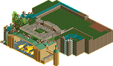
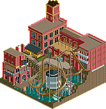
Camcorder22 (#3) - Ghirardelli Gardens
__________________________________________________________________How to vote?
First of all, check out all the entries in this match. If you can't view one or more entries, for example if you don't own LL, then please, do NOT vote.
Once you've viewed all 4, select your favourite and second favourite in the polls above.
After 3 days, we will close the poll, the results of the two polls will be added together, and the 2 highest scoring entries will proceed to the next round.
Comments on the individual parks have been disabled, so please leave your comments below.
Anyone found to be voting on their own match up will be disqualified from voting.
Anyone found to be voting when they cannot view all 4 entries will be banned from NE.
Votes are public and so any cheating of the system, betrayal of honesty or mistrust will be picked up on and will be dealt with. -

 Corkscrewy
Offline
.... Holy shit disneylandian.... You need to finish this! Ahh!, it looks amazing whats there!
 -

 Faas
Offline
gdb was the best for me this matchup. But one question man, why are all your buildings always made of white bricks? Vary a bit more.
I'm having a really tough time voting for my number two. I don't really like the other three. Disneylandian's entry is pretty cool, but I think it was too unfinished to vote it over two entrys that were more finished. I voted for Camcorder as number two, since Version1's entry contained way too much bare gray wall. Cool ride though! -

 ida
Offline
1 - gdb
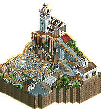
No-one else decided to quit MM2014 in your pot. Not what you expected, but i don't think they need to, since for me, this already is clearly the winner of this matchup. The architecture is quite simple but it strikes, and although i don't want to complain about the things i didn't like about Faas' entry all the time, you did (like many other micros) the opposite of what he did with the cliffs. They're detailed and have nice rockwork and details (such as the wooden poles), and the open cave under the church where the coaster goes through with the supports really looks nice, you perfectly managed to make it connect to the "micro-hell" too. The coaster itself is wonderful for being crammed in such a small spot, it slows down and goes fast at the right areas and alltogether looks very good. Also, nice idea of adding a backstory, it really adds to the park. I definitely don't see how you're disappointed with this entry!
2 - disneylandian192
Even though it's unfinished, i'm putting this one second. The other two micros just didn't appeal to me as much. With that said, i don't want to imply i'm a Star Wars fan or anything, because i'm not. Still, the ship looks incredibly detailed and i think i actually can recognise it somehow, very nice use of objects and everything. Again, yes it's unfinished, but i just liked this one a lot more than the others, if only for the imposing ship. I love the surroundings too, i would've loved them more if they were finished, so not number 1 but number 2 for me. Good job.
3 - Camcorder22
Ehh... I'm not entirely sure about this one. What is it really supposed to be? The name implies a beautiful Italian garden, but even "plain red factory with a dive machine" would've been a better title. I think the coaster itself isn't that good, it's too fast around parts and it is INCREDIBLY short. It just didn't appeal, just like the buildings. They're not bad, but they're very simple. It's just a collection of red brick and windows. And what are those wooden things on the tower supposed to be? A clock? I couldn't even tell, really.
4 - Version1
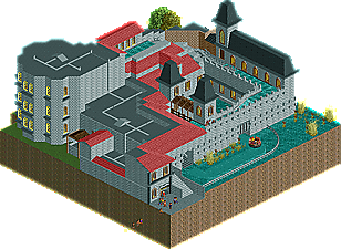
Your micro feels unfinished. I'll agree with Faas, it's just a ton of grey walls and black roofs. The air conditioning pipes or whatever they are look nice, i must say, but besides that, nothing here really worked for me. There's not that much detail, and the detail there is has just been repeated over and over. Such as the weirdly-shaped eyesore building on the left. The windows on there are just the same thing stacked on top of each other. Not only that, but where's the foliage? Around it is only some grass, and nothing but that. The roof on it is just a black slab without any detail or anything (just like most of the roofs). I don't like it. Besides, that whole building goes out of the castley theming and breaks the micro for me. It's not bad, but it's too boring and repetitive.
-

 Lotte
Offline
i guess the reason why was because after seeing all these wonderfull micro's, i felt like my micro was just scenery with a coaster on the side. apart from that i didn't make my thing peepable and only had 2 buildings one of which was a station and in my opinion wasn't really interesting and didn't contribute much. i knew my micro was good but i just think i could've done better. i definitely got lucky by drawing disneylandian who didn't finish, otherwise i probably would become 3d
-

 disneylandian192
Offline
I was disappointed that I didn't have the time to finish the map. The attraction idea is intricate with a great story line, i can't wait to give it the space it deserves. This map served merely as an architectural drawing board.
The other three entries are fantastic, its funny how much of a staple the brick texture turned out to be in this matchup. Each of the three maps were well planned it appears, and show strengths of each builder. If I could vote, I would go GDB then Cam. The Conspiracy appears more visually appealing and the woody layout was great.
The Gardens is another nice map, making great use of the vertical space. I'm not as much of a fan of the brick red color, its a shame there isn't an object that really represents the traditional brick but in a more visually striking manner.
River Quest was good, but I would have liked to see more of a story associated, especially with the show building, which was a great opportunity to really go over the top with interior show scenes. The archy was very traditional and relatively historically accurate european castle, but taking a more creative and whimsical approach would have made the map seem a little more fun and lively.
Great job all three!
-

 Version1
Offline
I'm just happy I finished something that's not the worst submission in this contest.
-

 ida
Offline
I'm just happy I finished something that's not the worst submission in this contest.
Indeed, my Minilooper is still to come...
-

 Camcorder22
Offline
Wouter, didn't have time to put together a readme unfortunately but its a semi-recreation of Ghirardelli Square in San Francisco. If you look up some pictures you'll see a lot of the buildings are heavily influenced or recreations of Ghirardelli Square. As for the gardens part, I'll admit I dropped the ball on that one haha. Although there's plenty of places with "gardens" in the name without actual gardens ie Elitch Gardens, Madison Square Garden, any LA suburb with "garden" in the name.
Disneylandian, I really wish there was a brick object like you're talking about as old brick buildings are my favorite and I would honestly play a lot more. Unfortunately, the beauty of these brick buildings seems to come from the unique coloring of each brick and their unique placement, which translates badly into RCT objects. Maybe there's some way a set of brick walls could be programmed as a bush or tree object with multiple random frames.
-

 Ling
Offline
From the overviews I thought gdb would come second, but after watching them in-game his is the clear winner. The coaster felt like a part of the landscape, and the attention under the ground was great. It wasn't perfect and perhaps the stairs took up too much space, but on the whole absolutely lovely. Escape From Naboo was a fantastic idea - shame it wasn't finished, and I look forward to a more final, larger version. Ghiradelli Gardens was nice but the coaster felt very bolted on, and the red was overpowering. Architecture was nice but not great. River Quest needed more details - maybe some white water and ramped waterfalls and things on that curved drop to help hide it a bit. So much was hidden by the structure, and the structure itself wasn't very interesting. Maybe cut the actual structure in half and have more of the area in the open air, including path, queue, ride, shops, etc.
-

 nin
Offline
disneylandian, we nearly had the same entry. Like I was damn close to building that. If you're planning to do what I think it is you're doing (building the entire ride), than I can't wait to see the rest. Unfortunately I can't justify voting on a very unfinished entry, so please forgive me!
I think gdb is the clear winner here, Cam22 being second. Both were well done, but gdb's was that much better (for reasons mentioned above). -

 disneylandian192
Offline
Funny you say that, check out the misc tab on escape from naboo. Didn't mean to release it but its in there.Wouter, didn't have time to put together a readme unfortunately but its a semi-recreation of Ghirardelli Square in San Francisco. If you look up some pictures you'll see a lot of the buildings are heavily influenced or recreations of Ghirardelli Square. As for the gardens part, I'll admit I dropped the ball on that one haha. Although there's plenty of places with "gardens" in the name without actual gardens ie Elitch Gardens, Madison Square Garden, any LA suburb with "garden" in the name.
Disneylandian, I really wish there was a brick object like you're talking about as old brick
buildings are my favorite and I would honestly play a lot more. Unfortunately, the beauty of these brick buildings seems to come from the unique coloring of each brick and their unique placement, which translates badly into RCT objects. Maybe there's some way a set of brick walls could be programmed as a bush or tree object with multiple random frames. -

 FredD
Offline
4. Disneylandian192
Since it's unfinished, I have to place you 4th... What a shame, because what is build looks fantastic and really promising! I hope you finish this anyway.
3. Version1
The concept is not so bad but it was executed poorly. Archy was not very likeable, too much gray and too blend walls. Those black roofs don't match the theme to my opinion.
2. Camcorder22
This park looked better on the overview... Looked promising but bit of disappointed in-game. Archy was just not top, it felt like there was missing something to make it good interesting. The coaster layout was neat, good job on that one.
1. GDB
Well you stepped your game up. Great lay-out, landscaping and theming. But you gotta stop with them white bricks men, lol. Only let down is you didn't make the entrance and exit hut of the coaster invisible. But clear winner of this group, congratulations!
-
 Chocotopian
Offline
4. Escape from Naboo.
Clearly shaping up to be a great entry, but the unfinishedness brought it down too much for me. The spaceship was cleverly done, and the present water features and landscaping was pleasant, but yeah, I really wish this was complete.
3. Ghirardelli Gardens.
A nice entry, but I'm afraid there wasn't anything that kept my attention for long. I have to agree with others that the coaster felt a little tacked-on, but it wasn't bad by any means. The little details like the clock hands were good, but I felt that there could've been more variation on the building, or else more interaction between the coaster and the scenery. So, a nice entry, but not enough to keep me interested.
2. River Quest.
What I liked most about this was the actual rapidness of the rapids. The spiral lift hill and curved downward slope helped keep the pace and made the ride much more enjoyable to watch. The building could've been better though, with much of it being samey and obscuring the ride for the most part. I think a half heavily detailed, half cut-away building (revealing the rides and perhaps some dark-ride scenery) would've made this better. That said though, I liked the ride for what it was, so I voted this 2nd.
1. The Conspiracy.
The coaster layout was very tidy and had some good interactions, both with itself and the scenery. The backstage Hell area was good too, and I especially liked the rickety looking supports on the coaster as it travelled through that area. The colurs were well chosen, and the architecture gave off the Italian feel to me. This was my #1 vote.
-

 Stoksy
Offline
Little underwhelmed by these, nonetheless:
Disneylandian: Really unfortunate that this was unfinished; would probably have won in my opinion. Even in its unfinished state there were already more little ideas than in the other entries. Unfortunately, I don't think it was finished enough to warrant a vote here although it'd be nice to see this finished.
Camcorder: The overuse of red brick really didn't help this. Perhaps you might have considered using the stone texture pieces to make a nicer texture. You could also have combined the stone with other objects and I think that would have helped. The coaster was a little odd in my opinion, I could kind of see the reason behind having it but it didn't really fit in with the rest of surroundings [granted, this is really difficult to accomplish in micro]. Decent effort, but I think peeps + stalls/path objects like lamps would have significantly improved this.
gdb: Solid without being spectacular I felt, probably the best out of some okay entries. Really liked the church [the cross was really cool despite its simplicity], and therefore it would have been nice to see some more buildings. Like I said above, I'm not really sold on having a coaster dominate the landscape as it prevents you from adding in the details that keep a viewer looking at the micro for an extended period of time. Nonetheless, the concept was quite interesting and I could kind of get the Italian theme that you were going for. Decent attempt on the underground section as well, but the supports should probably have been thicker there; I mean it's holding up part of a mountain with a church on top and they're essentially sticks.
Version1: Decent attempt for your first foray into CS. Pretty much how most people start; using the larger objects to create the outline and then just filling in the roof. Would have loved to see some cutaways as that would have significantly improved this. Also, considering how small the map is there is always room to add details where possible; ie you could of had rockwork under the water. Still a solid entry, obviously lacked a lot of detail but a nice entry.
-

 Louis!
Offline
1) gdb
Lovely entry. One of the better entries of this round. Nice archy, nice layout, nice landscaping. It all fitted together nicely and flowed well. Good job! Your best work yet.
2) version
This is where it got difficult. I placed you above the others because I spent more time looking at it. Yes, the backside is plain brick, but the rest is actually not too bad. I liked the structure and you've improved with your CSO a lot.
3) camcorder
I was just disappointed tbh. The overview is a lot better than the actual thing in game. I think I was let down by my own expectation based on your previous success in this contest. The buildings weren't bad but nothing was majorly exciting and the layout wasn't all that. Sorry.
4) disneylandian
Sorry buddy, just it was so unfinished that I couldn't even complete it enough with my imagination to place it any higher. Looking forward to seeing more of your work in the future.
 Tags
Tags
- No Tags

