Micro Madness 2014 / [MM2014 R1] nin vs. Shotguns? vs. Richie vs. MarshmallowPeeps
-
 08-July 14
-

 Liampie
Offline

limited space, unlimited madness
Round 1
__________________________________________________________________
Richie (#5) - Escape from Balota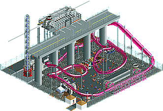
MarshmallowPeeps (#8} - Concrete
__________________________________________________________________How to vote?
First of all, check out all the entries in this match. If you can't view one or more entries, for example if you don't own LL, then please, do NOT vote.
Once you've viewed all 4, select your favourite and second favourite in the polls above.
After 3 days, we will close the poll, the results of the two polls will be added together, and the 2 highest scoring entries will proceed to the next round.
Comments on the individual parks have been disabled, so please leave your comments below.
Anyone found to be voting on their own match up will be disqualified from voting.
Anyone found to be voting when they cannot view all 4 entries will be banned from NE.
Votes are public and so any cheating of the system, betrayal of honesty or mistrust will be picked up on and will be dealt with. -

 Liampie
Offline
Shotguns, your work is so good without all the terrible trackitecture. Dramatic improvement. Lovely, lovely entry. My #1 for this match.
Second place is harder... Nin's has quality, but it's also boring as fuck and unfinished. Richie's is even more unfinished, but the design is in place and superior to the other two. Concrete is way too basic. The highway is nice, but the rest of the map was plain scenario-esque crap. Something tells me you wanted to do more here, Marshmallow?
My second vote goes to Richie.
-

 trav
Offline
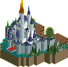
Ehhhhh, we've seen a better castle from Nin in the past
 Looks like an interesting match up.
 -
 Coasterbill
Offline
Great entry from Shotguns? The coaster is a little under supported but other than that it's damn near perfect.
 -

 Faas
Offline
Shotguns' entry was my number one and really cool. Could have done with peeps though.
Nin was my number 2, because the rest was worse.
-

 5dave
Offline
Escape from Balota - Richie
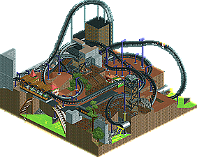
Man, this could have been nice! It has all the great ingredients: Cool coaster, interesting theme, nice colors and structures (so far). Pity this isn't finished, could have been one of my favs!
New Society - Shotguns?
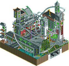
Wow, where did that came from? Really strong stuff, the whole multi-layered futuristic city looks awesome, I love the colors! Good idea to use only one car on the coaster, makes it look unique. I also like the underground part. I feel dumb repeating, but: peeps & path details! Also try to plan your next entry better (path from map entry point to the park), otherwise excellent!
Concrete - MarshmallowPeeps
While I do appreciate the concept of a theme park beneath an elevated road, I kinda feel the naming of the park says it all - it's pretty much grey and concrete. Why not make the park a green oasis for the exhausted people living in the city district around that road? Right now I wouldn't wand to visit that park. Also work on your rides and detailling - vanilla RCT rides and stalls rarely look good. Otherwise nice initial idea!
Preview center - Nin
Great castle structure, but it feels like a leftover of H2H or something. If there was a rollercoaster integrated into this castle (maybe a Wild mouse or a Jet star) it would have been really nice. The architecture and overall feel is really top notch, though!"MFG"
-

 Xeccah
Offline
It is "peepable" but the peeps end up in a massive jam whenever I tried it. Also unfinished lol
 -

 Ling
Offline
nin and Shotguns? for me. The other two entries are too unfinished to really comment on.
-
 JJayMForce
Offline
This match is easy to judge.
Shogo- I wish you would have finished, would have loved to see what it looked like in its completion. I liked how you made all the structures so visible while being so compact, and you had a very cool theme there. Interested to see what you will make later on.
NIn- Your classic work here, very good archy, and hilarious when you make scenery invisible lol.
Interested to see what the other two entries would have looked like fully completed.
-
Airtime Offline
1# Shogo that was brilliant. Highly impressed with that even if it felt like some of the architecture techniques were very Pac-esque.
2# Nin, while the idea is there I feel like you really played it safe with the use of objects. There's no round roofs or innovation with objects to really create a magical castle, it felt very bland. Everything else was lovely but I wanted to see it pushing the boundaries and make me go wow.
-

 Louis!
Offline
1) Shogo
Very impressive and totally your own. Loved it, one of the best entries of the round. Architecture was perfect and the layout was nice too. Good work.
2) nin
Wasn't really sure on this. It felt unfinished because of the total lack of detail on the castle. It felt really sterile and lifeless and well, not very Disney like at all. The structure was good, but nothing really impressive.
3) Richie
Shame this wasn't finished as it could have rivalled the other two if it was. Good start, lovely layout, just needed finishing.
4) Marshmallow
Again, needed finishing, but you were on to something, it wasn't bad for a totally unknown player.
-
 Marshmallow Peeps
Offline
Thanks for all the input, I'm currently using the concept on a larger park with more room for my ideas. Hopefully it will be more up to par. My job has been really busy lately, along with important IRL things it has cut into my free time.
-

 disneylandian192
Offline
C'mon Nin, I was just about to start my castle, no point now. I might as well scrap the whole map.
-

 FK+Coastermind
Offline
If Richie's had been more finished, i may have chosen it over Nin, the castle just felt unoriginal, kinda a bit too safe a choice, but it was beautiful, and more finished.
Shogo wins by miles, amazing archy, a unique idea (fantasy is killing it in MM, who'd figure?) and some very smart choices. Oh, but wait, it's not finished? Alas, my thirst for finished shotguns work will continue...
FK
-
 Stoksy
Offline
Nin: As solid as it can get I think; almost rivals FK's entry purely based on one single building. But like what's already been said kind of lacked that 'magic' to make this a truly top notch entry. Not really sure how you could have added to the building though...
Shotguns: Such brilliance. Other than the missing window that I spotted I probably would not have guessed that this was unfinished [obviously peeps but that's just personal preference]. Great concept, even better execution; I particularly enjoyed the underground railway line.
Richie: Finished = ranked above nin's I think. Could have been really cool...Interesting idea with the toxic water that has not been done in any of the other entries.
Marshmallow: Fix yo' ghost objects! Wasn't really much to comment on unfortunately, very bare and grey; I get that the park was called 'Concrete' but seriously; colour goes a long way.
-

 FredD
Offline
4. MarshmellowPeeps
Didn't get the concept of your micro... When I hear Pink Panter, I think of a diamant. Or a goofy detective. But didn't recognized something of that in your micro. So strange name you gave your coaster. The layout was not really good either. There wasn't really something interesting to see, sorry.
3. Richie
What a shame it's unfinished. You got a nice concept over there and I really liked the coaster layout. A flying with a 90° drop looks insane! Would really want to ride that if that coaster existed IRL! You could have finished way higher if it was finished...
2. Shotguns
It looked way more interesting in-game than from the overview. Brilliant archy and a great coaster layout. So I think it's a shame the coaster can't function... I also thought there should be more life in it, especially when you build an urban environment. If you keep that and a functioning ride in mind, I think you can do well in the rest of the tournament.
1. Nin
I loved it being a Disney fan myself. Great archy and the peeps give the needed life in the micro. But I think it would have looked better when the castle was painted pink
 Congratulations!
 Tags
Tags
- No Tags
