Micro Madness 2014 / [MM2014 R1] Maverix vs. Sulakke vs. navalin vs. meznator
-
 08-July 14
-

 Liampie
Offline

limited space, unlimited madness
Round 1
__________________________________________________________________
Maverix (#2) - Welcome to Columbia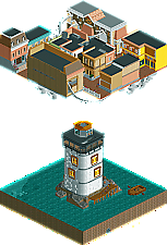
Sulakke (#3) - The Mothman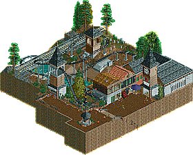
navalin (#6) - Escher's Waterfall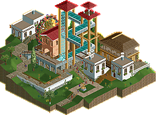
meznator (#7) - Firefly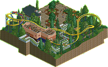
__________________________________________________________________How to vote?
First of all, check out all the entries in this match. If you can't view one or more entries, for example if you don't own LL, then please, do NOT vote.
Once you've viewed all 4, select your favourite and second favourite in the polls above.
After 3 days, we will close the poll, the results of the two polls will be added together, and the 2 highest scoring entries will proceed to the next round.
Comments on the individual parks have been disabled, so please leave your comments below.
Anyone found to be voting on their own match up will be disqualified from voting.
Anyone found to be voting when they cannot view all 4 entries will be banned from NE.
Votes are public and so any cheating of the system, betrayal of honesty or mistrust will be picked up on and will be dealt with. -

 trav
Offline
Okay, looks like it's a good thing I didn't enter considering the theme I posted in the other topic hahaha. Will edit this post later with my thoughts.
-

 Six Frags
Offline
Liked Maverix' the most tho I had no clue what the story behind it was. When I searched on google I found it's about Bioshock Infinite.. So maybe a readme the next time would help some of us who don't know where it's from. I think you could've done a bit more with this theme as the real "Columbia" looks so awesome, but i guess time was an issue there.
Sulakke's was kinda nice, but I wished there was more content.
navalin's was a nice idea, but I still have cBass' Escher's waterfall in my memory and this kinda pales in comparison. Maybe a coaster would've helped spice it up.
meznator's was nice and quaint, but the coaster is a bit short and there's not much other stuff to check out unfortunately.
-

 5dave
Offline
Welcome to Columbia - Maverix
While I don't really know the 'real' thing from Bioshock, I think this looks a bit less vibrant and whimsical. I think the whole upper city is much to 'ordered' both vertical and horizontal so it feels kinda boring. The ride helps a bit though. The lighthouse looks nice, although a bit wide? The idea of the entry is good, but the execution lacks imo.
Escher's waterfall - Navalin
Great concept and execution! I also love the surrounding landscape and architecture and the fact that it is peep-able. In my opinion you should have blocked the views from the other angles like Cbass did back in the days. Also I think it would have been nicer if the rapid track wasn't disconnected at some parts. But all in all, nice little entry there!
Firefly - Meznator
Sweet little NCSO entry! I like the whole composition, looks really nice and everything is on the ride place. The peeps add a lot too. The only thing I didn't like was the glitch at the roof and maybe one more eyecatcher to make it stand out more.
The Mothman - Sulakke
Similar to Firefly, but with CSO - a nice, rarely used family ride with great atmosphere again. I really like the haunted theme although it doesn't feel that haunted. I would have liked it to see more ride/queue interaction and maybe even a hacked train passing that bridge to give it more life.
"MFG" -

 Ling
Offline
Sulakke takes this one for me. Having played BioShock and BioShock Infinite, the city did not feel at all like Columbia to me. No vegetation, too much peach and yellow and not enough white and blue. There's no sense of the patriotism or fervent obsession with the founding fathers. One or two buildings worked quite well, the rest just seemed strange. That said, at least it was interesting enough to keep my attention, and the music choices worked well, as did the lighthouse. The Escher one was a cool idea, but I feel like I've seen it done before where it works from all angles somehow... don't remember where. As it stands, it's kind of a one-trick pony that only works from one angle and only has a ferris wheel to back it up. Sorry navalin, I still love you. Firefly was empty and lifeless and scenery was glitching all over. Also the track only turns one direction - left.
1. Sulakke
2. Maverix
3. navalin
4. meznator
-

 Faas
Offline
I voted for 1. Navalin and 2. Maverix.
Both cool ideas executed well. The other two submissions were cool as well but a bit too unoriginal and plain if you ask me. -

 FredD
Offline
Don't have time for a big text, but I voted Sulakke 1 and Maverix 2. Those 2 entries jumped out in this group. Meznators micro was decent but not really special. The idea of Navalin was great, but sadly the other parts of the micro were not as good/interestering. I'm not into those games so I don't get the story behind (readme would have been handful over here). Maverix's micro looks very interesting but I found it really annoying that the facades of the building aren't really visible because of the height of the buildings... Sulakke has sent in the best micro in this group. Good archy, good coaster layout.
-

RCTER2 Offline
Escher's Waterfall-great concept. it's classic! And I think this is a micro should be. If you just want to build a part of big park or a corner of a realistic park then that will not be that intresting and creative which is less of "madness" although they are all pretty nice.
-
 JJayMForce
Offline
Welcome to Columbia- I don't know if you rushed this entry a bit, but I think you are capable of more. I didn't get the commentary in the music, and think you depended on the viewers knowing the subject a bit too much.. The archy didn't look great, and it seemed like I was looking at the back of the buildings mostly. Not an interesting ride either. If you move on, I want to see the best you have. 4/10
Escher's Waterfall- Pretty cool little gimmick here, very neat. One viewing angle on a micro is bad, for me. The archy was ok as well. 4/10
Firefly- Quite charming with the idea of the firefly and all. It all looked 'cute'. 3/10
The Mothman- Overall, decent entry, and easily the best of the round for me. Foliage, archy, path, ride, all good. I liked your naming of the eateries as well. 5/10
-

Atomik Offline
While not thrilling I really like The Mothman, just about everything fits and looks awesome. Great athmosphere. Vote 1 for me. After that comes Escher's Waterfall because I think it works really well for such a micro madness park.
Firefly was a little to plain for me and while I LOVE Bioshock I didn't really like Welcome to Columbia. Everything is just too cramped and overall it just looks like a floating cube instead of a nice looking city, sorry.
-

 Faas
Offline
So in this situation Sulakke and Maverix would go through, eventhough Navalin has twice as much first place votes than Maverix and only one less than Sulakke?
-

 trav
Offline
Actually it'd be Maverix and Navalin that go through at the moment, even though Sulakke has the most first place votes.
Mav has 15
Navalin has 13
Sulakke has 12
-

 Faas
Offline
This is weird, but since I'm really bad at skills like counting (might accidentally hand in a 350 tile micro next round
 ) and logical thinking, I'll just wait till the end of the voting to see who goes through.
 -

 Stoksy
Offline
Maverix: Having not played Bioshock Infinite but seen videos of the game and the intro cutscene I was able to see what you intended here. It was so close to be really quite incredible; but really lacked execution; especially the 'sky' city. The lighthouse and boat were quite incredible I thought, and both custom music tracks were brilliantly atmospheric. I think that a better execution of the 'sky' city would have made this my favourite entry of the entire round so far. Yes it's a micro, but there's still merit to 'dead space;' I think that you had the ability in this case to have a much more open area which would have made this that much better. Decent effort nonetheless.
Sulakke: Probably the best out of the other three in my opinion. Really great use of space and foliage that created quite a wonderful atmosphere. Solid but not spectacular in my opinion.
Navalin: Apparently I was unable to appreciate this as much as other people. Great concept from the overview and it looked really cool, but it really fell apart from there. I completely understand that in order to execute this you needed to sacrifice how the park looked from other angles and evidently this appealed to other people, but unfortunately I didn't see it. I just couldn't appreciate this unfortunately.
Meznator: Meh. In my opinion it's way too difficult to make a solid NCSO entry if you plan on doing a theme such as this. The generic theme can be accomplished so much better in CSO that you really have to try to come up with something really unique. The layout was also quite poor, especially the sharp underground turnaround. There was an air of calm about this which I quite liked, but that wasn't really enough.
-

 Lotte
Offline
Actually it'd be Maverix and Navalin that go through at the moment, even though Sulakke has the most first place votes.
Mav has 15
Navalin has 13
Sulakke has 12
that doesn't make sense, sulakke has the most #1 votes and still doesn't qualify?
-

 navalin
Offline
Are first place votes not counted for more at all? I definitely would have expected Sulakke to take first place.
Ling, it looks like cbass made an Escher themed park 7 years ago that made a waterfall that was just very well hidden. Cool park if you look it up, I hadn't realized my concept wasn't entirely new to RCT. -

 Version1
Offline
Okay, next matchup
4. Firefly:
A nice little micro with decent theming and an interesting layout for this coaster type. I really liked the simple and down to earth style of it. That being said, I think it was a little bit too simple for a micro. Great style for a park, not that great for this contest in my opinion.
3. Escher's Waterfall:
Nice idea and concept, and overall well executed. I really love the idea of building a micro about this paradox, but the ability to view it from different angles just destroyed the illusion for me. In my eyes it takes away a lot and so the main part of the park is only enjoyable from one angle, which isn't enough for me. It was pretty close nonetheless.
2. The Mothman:
Good architecrute, great atmosphere, an interesting ride. What else is there to expect of a micro? I voted for this one, because the concept worked on every level and it was just perfectly executed in my eyes. Just a great micro.
1. Welcome to Columbia:
The buildings in Columbia are were cramped, so I couldn't really admire the architecture a lot, but what I see is very good. I have to say, that I am propably voting with fan bonus here, as I loved Bioshock Infinite and I loved all these little references to the game. Very well done and my first place.
-

 thirteen
Offline
eschers waterfall... oh my god i so wanted to do this for years. isometric just screams for escher stuff. this is very well executed. my vote on this one. second vote goes to columbia. bioshockstuff is always good and this one was very neat with the skyrail. loved it!
 Tags
Tags
- No Tags

