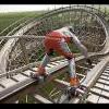
Micro Madness 2014 / [MM2014 R1] FK+ vs. wheres_walto vs. JimmyLaessig vs. PizzaWurscht
-
 08-July 14
-

 Liampie
Offline
I can see why, but I agree with Rawrylol... FK's micro is very very high quality. Out of scale and devoid of rides, but still very very high quality. As atmospheric as it can get without rides.
Very though matchup. Will reply more in-depth later, hopefully. -

 trav
Offline
Totally agree. His submission is still second best looking at the votes right?
Currently it'd be Jimmy and Pizza going through, with FK in 3rd and Walto in 4th.
-

 trav
Offline
Going by what Louis posted in the other topic, the way the voting works is their #1 and #2 votes are tallied together, meaning currently Pizza and Jimmy are tied at 18 apiece while FK has 13 and Walto has 5.
-

 Ling
Offline
It's more about totals. The total number of people that think JimmyLaessig's/PizzaWurscht's entries are deserving of moving on is more than the total number of people that think FK's should.
-

 FK+Coastermind
Offline
You're getting robbed here FK, gotta say.
If i had a penny for every time someone said that to me, i could pay people to like my parks
Hopefully matches will be decided by totals? I mean, i still expect to loose this one, but if not done by totals, someone could receive the first or second most votes and not advance from the round.
FK
-

 ottersalad
Offline
I thought this was really difficult to pick a top 2. I thought FK's, Jimmy's, and Pizza's all deserve to move on. I voted for FK and Pizza. I think FK's is just so much work and detail.. and making such a large structure while still having a good scale wins it for me. I'm not too bothered by the lack of rides because of how well it was all done.
Jimmy:
This micro was really nice, and from the overview it was my favorite. I can't wait to see a completed park from you. You screens/work on r/rct are amazing and some of the best work I've seen anywhere. But, although I liked your micro, the lack of speed on your ride for some reason killed it for me. I think the waterfall/splash zone could've been more interactive. But, thats nitpicking.
Pizza:
I liked the entry the more I looked at it in game. I'll admit the overview wasn't impressive. I think the mini golf ramp was unnecessary, but the chaotic composition was very interesting. I enjoyed having to look at everything from different angles. Having to look at multiple angles and the little details put this ahead of Jimmy for me, but by a super slim margin.
Walto:
Your entry was cool, but there was no story. At least FK's had character and some story to it.
edit: and in my humble opinion, the beauty and the fault in this voting system is that some really really good entries won't make it past the first round. It is the reality of it that we all signed up for. I'm very thankful for Louis and Liampie and any other admin who put in their time and effort into putting this together. I have enough problems reading my books for school and I can't imagine putting this contest together. -

 Camcorder22
Offline
So after opening everything decided FK's was the best with PizzaWurst in second. Both had a level of details in game that kept me captivated that the other two did not.
FK:
While I wasn't a fan of the overall form of the exterior, the details, especially the interiors more than made up for it. The deco details on the windows, roof arches, chandeliers, and staircases are all incredible and I can't imagine how much time that all took. Meanwhile the open space on the floors and some of the walls allowed me from getting overwhelmed and allowed me to concentrate on the other details. Also, just noticed the mirrors with the ghosts going through them, brilliant. I'm sure there's more tricks you've hidden that I haven't seen yet.
PizzaWurst:
This is my favorite type of micro to watch, a unique coaster with an interesting layout that compliments the landscape instead of completely dominating it. The interactions between the ride, landscape, paths, and water are all extremely well done. Also really like the station. Only complaint is the top of the mountain looks a bit bare but that's being picky.
Jimmy:
While your entry looked nice from the overview, it just didn't hold my attention like the other two. I felt I had seen everything after watching the ride run once. And while the area under the ride could have been a good opportunity for more cool details, it was instead just mostly grey. Still looks executed very professionally and probably would have placed in any other round of this contest so far.
Walto:
Entry just felt lifeless compared to the others. The patterns on the floor are cool, but the lobby is just missing those additional details (such as a hotel/casino by Kumba for example) that make this type of park really work. I also just really don't like the types of blocks used for the walls in this instance for some reason. There's still some cool touches, I liked the patio halfway up the building as well as well as the deco trim around it.
-

 Stoksy
Offline
Surprisingly difficult second place for me...
FK: No rides or peeps was a bit of a let down but that didn't stop me from appreciating the brilliance of this. There were some really great touches, especially the naming of the ghosts and the attic, which edged this over Pizza and Jimmy's entries for me. It would have been nice if you had built this more centred on the map and perhaps taken out one more wall as a cutaway. Nonetheless from the chandeliers to the attic and what I interpreted to be paintings this was true quality. The overview certainly does NOT do this justice.
Walto: This + interiors would have been the winner for me I think. As SixFrags said, there was so much that could have been done to reference the fact that this was supposed to represent NE HQ. Without the name, I certainly wouldn't have seen it like that. A bit like how FK implemented the names of some NE members you definitely should have some something similar here. Architecturally sound, but lacks the detail to have won in quite an unexpectedly close matchup.
Jimmy: Very nice, what made this more impressive was how unexpected it was; posted one screen and then this! Unfortunately, it was an equal second for me and Pizza's edged this because of the more interesting coaster. Whilst I thought it was clearly sound on a technical level, there was an element of inspiration that I missed when viewing. Just the hyper-realism element was a little lost here as it doesn't allow enough content for such a small area; for example including the backlot was necessary but generally they are very boring and for the purposes of this contest take up valuable space.
Pizza: I thought that the overview was more impressive than the actual park, opposite of FK's really. Whilst I commend the execution of using mine track, having the train float above it certainly ruined the immersion a little. Furthermore, this didn't really scream 'China' to me; it's all well and good making those stereotypical chinese roofs out of wooden coaster track but that doesn't necessarily make it chinese in my opinion. Still a decent entry though and I found it slightly more interesting than Jimmy's.
-

 thirteen
Offline
I loved China Rising for its atmosphere and rugged-ness. very nice one. Wildalpenbahn got my second vote, because of the great hacking and execution. this is some high level stuff guys!
-

 RCT2day
Offline
Best round so far for sure. In any other group all of these would easily stand a good chance of advancing.
4.) Walto: solid entry but needed to be more creative to get past I think. In my mind, it would have been cool to see the names of many of NE's greatest players on the highest floors or something like that, but I digress. Great architecture
3.) Jimmy: where did this come from? Seriously, this was great. The lift could have been improved but not a big deal.. Looking forward to more from you.
2.) FK: Scary yet beautiful building and very creative. Looking forward to more from you in this competition.
1.) Pizza: such a surprise. I'd go so far as to call this entry the best in Round 1. Very fun to watch, great hacking and scenery, and overall phenomenal. Quite an upset.
-

 Louis!
Offline
1) FK
Originally had this placed in 2nd. But the more I looked at it, the more I loved it. All the names of the ghosts were hilarious, and it was just an exceptional entry. All the little ornate details, the chandeliers, the staircase, the fucking ghosts walking through the fucking mirrors, just really something special. I can't wait to see what you have next.
2) Pizza
Was originally placed in 1st, until I saw the mirrors in FK's entry. A surprising entry from you, the coaster was exceptional, architecture was impressive and in general, the entry was very solid. The coaster though, really made the micro, it was very impressive.
3) Jimmy
I've always had a soft spot for water rides like these and this was no exception. I had a tough time placing you here in third, because you deserve to be higher, but again, the mirrors in FK's entry changed the whole way I looked at this round. I hope you will visit NE more often, your work is of high quality, and had this been in some of the other matches, could have potentially won.
4) Walto
You kind of drew the short straw here. To place this magnificent structure in 4th is ridiculous, but unfortunately, that's just the way this match up was. You could have won a numerous amount of other match ups with this, but here, it wasn't enough. I find that if you go for an entry with no rides, you need to rely on other things to make your micro interesting, like FK did. Had you added a few jokes here and there and added a bit of movement to the micro, you would've soared up into the top 2 because the architecture was really impressive.
-

Airtime Offline
I don't get FK's. It's nice and all with the brilliant interior but Walto has the nicer looking and more interesting structure. Tough to choose between the two for 3rd and 4th.
Jimmy, brilliant to see one of these, I think an NE first? For that reasoning and it being so well executed you get my first place vote. Really enjoyed this entry, up there with my favourites of round 1. Great job.
Pizza, you stepped up there dude. Very impressed. Nice layout, it got a little wierd when it took that dive at the end underground, but good job overall.
-

 Louis!
Offline
Jimmy, brilliant to see one of these, I think an NE first?
Nope, egg head did one years ago for PT3.
-

 Louis!
Offline
Voting Closed
Winner: PizzaWurscht with 47.5 points
Runner-Up: FK+Coastermind with 34 points
3rd Place: jimmylaessig with 33.5 points
4th Place: wheres_walto with 7.5 points
PizzaWurscht & FK+Coastermind go through to Round 2 -

 Louis!
Offline
Tightest vote yet. I had to double check several times.
Congrats jimmy, unlucky FK. Half a point in it. Unbelievable.
Just goes to show the level of quality in this match.
-

 Lotte
Offline
ouch, but you have to be proud of us 6 and 7 seeds! though we probably did the best we could while the higher seeds underestimated us
 Tags
Tags
- No Tags

