Micro Madness 2014 / [MM2014 R1] FK+ vs. wheres_walto vs. JimmyLaessig vs. PizzaWurscht
-
 08-July 14
-

 Liampie
Offline

limited space, unlimited madness
Round 1
__________________________________________________________________
FK+Coastermind (#2) - The Haunted Estate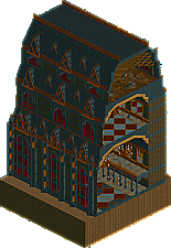
wheres_walto (#3) - New Element HQ
JimmyLaessig (#6) - Wildalpenbahn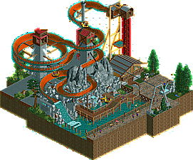
PizzaWurscht (#7) - China Rising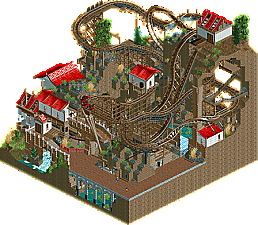
__________________________________________________________________How to vote?
First of all, check out all the entries in this match. If you can't view one or more entries, for example if you don't own LL, then please, do NOT vote.
Once you've viewed all 4, select your favourite and second favourite in the polls above.
After 3 days, we will close the poll, the results of the two polls will be added together, and the 2 highest scoring entries will proceed to the next round.
Comments on the individual parks have been disabled, so please leave your comments below.
Anyone found to be voting on their own match up will be disqualified from voting.
Anyone found to be voting when they cannot view all 4 entries will be banned from NE.
Votes are public and so any cheating of the system, betrayal of honesty or mistrust will be picked up on and will be dealt with. -

 Version1
Offline
Okay, the theme of this round is: Architecture against Theme Parks.
4. New Element HQ:
Nice Idea but, well frankly, I want to see something related to theme parks in a rct2 contest. And although it's aimed at being the NE HQ I don't see that. Additionally, it's basically just a lifeless huge building, and the architecture alone isn't enough to earn my vote.
3. The Haunted Estate of the Fantastical Lord Fredrick Kent:More interesting in terms of architecture, but still. I like Theme Parks and this just doesn't fit my taste in this perspective. It has a little more life, just because there are more moving objects, but still.
2. Wildalpenbahn:
Great entry. Nice architecture, some interesting hacks and a pretty well pulled of ride. The End-Splash is a little weird, but I'm okay with that because the rest is absolutely awesome. I love that someone finally pulled that kind of ride of in RCT. Great, even without knowing how the real attraction looks like.
1. China Rising:
As I suspectet PizzaWurscht makes a great impact into this contest with this micro. It just has everything I want to have of a micro: Nice architecture, a little bit of fantasy, interesting Ideas and an interesting structure in terms of heights and landscaping. The coaster isn't fantastic in terms of how it rides, but it looks absolutely amazing and the hack really helped the visual. My number one and in my eyes one of the best round 1 entries so far.
-

 Six Frags
Offline
Wow, best matchup so far! Gonna take a while to decide which to vote for, but from to overview pizzawurscht and jimmylaessig's seems the most interesting to me. I'm curious to find the little things in the architecture ones tho..
Gonna check them out in-game, but job well done guys!
-

 ida
Offline
Seeing as i'm in the same pot as Pizza, this seems really interesting to me! Checking them all.
EDIT: I've decided not to vote because of the fact that Pizza is competing and we're in the same pot.
-

 trav
Offline
Now this is a very difficult choice. Best matchup by far.
1. FK;
Okay here we go with the massive fuck off buildings. This was absolutely magical and has now become my favourite park of this round. The scale of this thing is impressive enough but the fact you managed to keep up the level of detail you did makes it even more impressive. The inside of the building is also fucking brilliant as well, those lights/chandeliers are just the icing on the cake. Shame that it was raining when opened, but ah well. Easy win for FK here.
90%
2. Jimmylaessig;
Wow, where the hell did this come from?! I've literally never heard of you before and what a way to introduce yourself! This would not look out of place in Starpointe; the hacks are fantastic and clean, the one house is really nice and atmospheric and the rockwork is possibly the best of the first round. Add to that some really nice details like the walkway, the cart thing and the backstage area and you've got yourself a very very solid first entry. Well done and congrats on being my first 'upset' of the competition!
85%
3. PizzaWurscht;
I actually really liked this! The little bits of architecture were quite nice but the landscaping and little details were fantastic! I loved the way the track looked, and the whole thing had a very Expedition Everest kinda feel to it. This was a big shock as it seems to be a huge step up from your past work. It's a shame that this was in this matchup because if it had been in either of the others I've voted on, I'm pretty certain I'd have put this through.
75%
4. Walto;
I feel really bad putting this in last place because I still very much liked it. The scale of this thing was even more incredible than FK's, but the details just weren't there as they were in his. It's a shame for you that FK put up a huge building in this round as well, otherwise this might have scored a lot higher. Still, I'd rate this around the same as China Rising, maybe a little less, but if it had been in either of the other matchups I've voted on, I'd have probably put this in the #2 spot on either of those.
75%
-

 nin
Offline
What an awesome round. The underdogs are shining through with this one, both JimmyLaessig's and Pizza's entries are great.
-

 FredD
Offline
4. Wheres_Walto
That's a huge tower... Respect for building such thing because it ain't easy. Though the archy is very good, I miss some action. It looks so lifeless, it would have helped if you hired some staff. I think this is a good entrie but I prefer to see themeparks, sorry. I like to see good archy, but there has be some life in it.
3. FK+Coastermind
What a coincidence we have 2 entries in one group purely focused on archy. What I said about Where's_Walto entrie is also applicable on your entrie. But this wasn't as lifeless because of the ghost(buster)s. The theme of your building is nicely chosen, it gives more content to the entrie. What a pity one side seems kinda unfinished. You know I think you're a top builder but I liked the other two entries more...
2. JimmyLaesig
It's not your first work here at NE, but you surprised. The type of ride you chose to build around is original, didn't see it much in RCT so that's a plus. Technically it's good, though not stunning. I liked the rock work very much just as the moving mine car. What I didn't like was the drop, the boat doesn't get enough time to slow down enough. That corner after the drop comes way to fast.
1. PizzaWurscht
What you submitted is a really good micro. It has everything: an interesting coaster layout & theme, atmospherical, very good landscaping and good foliage. Archy wasn't bad either but did not really like the roof of the house above the lift hills. Great job, congratulations!
Hardest group to chose so far! PizzaWurscht and Jimmy stepped up their game and surprised in a very good way.
-

 wheres_walto
Offline
Wow. Great work, new guys. Looks like me and FK could both be in serious trouble
-

 Six Frags
Offline
From best to least;
1) Jimmy
Loved the hacking, so clean and adding to the ride. Also loved the architecture and realism on the backlot part. The ride itself was well thought out and unique. Dark horse right there.
2) FK+
a+ for effort. Can't imagine how much time this would've taken to get right, but I love the atmosphere. The ghost names were quite funny, tho why'd you kill Louis and Liam?
 Love the chandeliers, stairs, attic and patterns on the ground. Great entry overall, tho I always love to see some kind of ride.
3) Pizzawurscht
Nice atmosphere, but the ride itself was lacking for me. It makes speed at some points but then suddenly falls into a brake section. Also didn't really like the fast underground part; almost feels like you ran out of time and made a quick finish to it. Nice architecture and landscaping in places tho, really adding to the atmosphere.
4) Walto
I can't help but compare this to FK+'s entry and then it kinda lacks details. Now it seems like one big tower with no depth to it. I mean, when you make a NE HQ, you could've incorporated some awesome details, like staff with names, iconic NE happenings or things like that. Bit bland now imo, tho technically I can imagine it took some time to construct it.
-

 Ling
Offline
#datrockflow
Ironically I felt like The Haunted Estate was a better NE HQ than the NE HQ was. The little touches and attention to staff names was great. NE HQ could have been just any building, and the scale felt wildly off (the bottom floor is, what, 4~5 stories?). China Rising and Wildalpenbahn were pretty equal theming-wise, but the layout in China Rising was too height-focused and the layout didn't really flow. It feels strange but I actually put NE HQ at the bottom.
My order:
1. The Haunted Estate
2. Wildalpenbahn
3. China Rising
4. New Element HQ
-

 5dave
Offline
China rising - PizzaWurscht
Wow, what a nice entry! I pretty much love it all. The theme, the track and support work, the atmosphere. Really great. My only complaint is maybe the hacking - it feels overhacked at times (floating trains on the track, boat hire mode). But that's no big deal as it works fine as it is. And the ending of the ride wasn't that elegant. But all in all one of my favs so far!
Wildalpenbahn - JimmyLaessig
Also really string entry here. I've been on that ride in reality and I think yours is more beautiful and pleasing to the eye. Nice hacks and good composition in general. If it's really supposed to be a recreation, then dare to be imperfect next time, especially when recreating rides from the Vienna Prater, haha! Good job!
New element hq - Wheres_Walto
So this is how the place of the admins looks like. Seems they have something to compensate. Nice structure, but it would be nice to see how it works too (the entrance doesn't seem to connect to the great hall and maybe some elevators would have been nice). It feels kinda unfinished and lifeless too. So many missed chances to mock all NE members in there...
The Haunted Estate of the Fantastical Lord Fredrick Kent - FK+Coastermind
Really insane brickwork! I love all the details in the structure, from the outside to the inside. The staff (which is really funny btw) is adding life to the whole structure, but a ride or something would have added even more (maybe a dark ride could have told the story of Frederick Kent quite effectively? The use of color (black-brown-gold) is also really great!
"MFG" -
 JJayMForce
Offline
The Haunted Estate- pretty good archy, names of ghosts were funny ( uninformed ghost XD), roof beams and attic looked nice, mirrors looked cool. Didn't like how it was just archictecture, kind of boring imo. 6/10
New Element HQ- pretty cool idea, decent architecture, and good size to it all. But it was way too one-dimensional for me with no interiors, movement, rides etc.. 5/10
Wildalpenbahn- Very nice surprise with this entry. The enzian souvanire building was well built, the bridge nicely done, and the rockwork was pretty good. Nice backstage area, good foliage, details on path, statue, supports. Hated the color of the ride though. Overall very clean and well done, nice job. 6/10
China Rising- The coaster looked pretty cool, but there was horrible brake placement imo, especially near the end of the ride. I liked your idea of using all the height, but I think you could have done more with the cutaway interiors. Archy was ok, but a little basic. The paths couldv'e used a little love with nice details, benches etc.. Overall nice attemp here. 5/10
-

 Camcorder22
Offline
Wow, all four entries are impressive. I might have to go with the underdogs but I'll review them all in depth when I get home.
-

 RCTER2
Offline
Here are two tall buildings and two awesome rides so I picked one building and one ride I prefer.
 Tags
Tags
- No Tags

![][ntamin22%s's Photo](https://www.nedesigns.com/uploads/profile/photo-thumb-221.png?_r=1520300638)
