Micro Madness 2014 / [MM2014 R1] Liampie vs. PokeCoasterEmpries vs. Stoksy vs. Noahnator3
-
 08-July 14
-

 Liampie
Offline

limited space, unlimited madness
Round 1
__________________________________________________________________
Liampie (#1) - Europa Report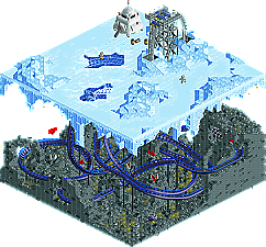
PokeCoasterEmpires (#4) - Skull Castle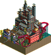
Stoksy (#5) - Canali di Venezia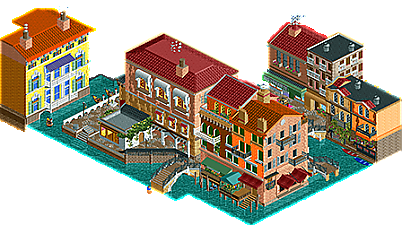
Noahnator3 (#8} - Vortex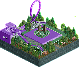
__________________________________________________________________How to vote?
First of all, check out all the entries in this match. If you can't view one or more entries, for example if you don't own LL, then please, do NOT vote.
Once you've viewed all 4, select your favourite and second favourite in the polls above.
After 3 days, we will close the poll, the results of the two polls will be added together, and the 2 highest scoring entries will proceed to the next round.
Comments on the individual parks have been disabled, so please leave your comments below.
Anyone found to be voting on their own match up will be disqualified from voting.
Anyone found to be voting when they cannot view all 4 entries will be banned from NE.
Votes are public and so any cheating of the system, betrayal of honesty or mistrust will be picked up on and will be dealt with. -

 -Piggynator-
Offline
I absolutely loved Canali di Venezia but Liampie's Europa Report was A-M-A-Z-I-N-G! how did you have the time for this, there so much detail!
-

 Version1
Offline
Okay, this is kind of a three way battle for who gets the votes and for me it was the first time I had to really think about who I will vote on the second place.
4. Vortex:
Not much to say, because there is not much there.
3. Skull Castle:
A very good entry of PokeCoasterEmpire, who once more shows off his good NCSO skills. The micro is clearly dominated by the huge castle and consists mostly on medieval/horror theming. The atmosphere of the park is pretty solid and I like how you used the big castle to fit basically three attractions in there (counting the Top Spin). The only problem in my eyes is the typical NCSO Problem of not having to many walltypes to use, so that the castle looks kinda repetitive.
2. Canali de Venecia:
It was hard to decide weather I reward the good NCSO work of PokeCoaster or the good CSO work of Stoksy, but I had to give this one to the australian building an italian city. The architecture is very well done and the micro has a great atmosphere to it, that really conveys "Venice" in my eyes. My only problem with it is, that it's not the most creative submission, but it's well executed and also a little brave seeing, that it only consists of architecture.
1. Europa Resort:
In my eyes, this is an almost perfect micro submission by Liampe. I kinda knew someone would go for the two level concept, but Liampie pulls it of perfectly. The theming above the survace is really great and just spot on, while the part under the surface is really well done. Not much to say about it, for me the number one in this round.
-

 wheres_walto
Offline
I hate to sound like a dick, but Noah, why did you submit this? I feel your spot in the tournament could have been better used on a replacement. I don't like to publicly tear apart anyone's work, but this just isn't up to the par of the site.
Anyways...
Poke-
This was a nice little submission. I liked that the park was raining upon being opened in-game, I thought that was very fitting for your theme. I really like the atmosphere and the movement of your park. It felt alive, but unfortunately you came up against 2 very good entries in this round.
Liam-
My first thought when opening your park was "neat." I haven't seen the movie, but a quick google search brought up images that very clearly were represented in your work. I really like the bottom of your ice surface; the jaggedness just looked really nice to me. I also loved your landscaping for the underwater segment. I didn't much like that the default supports for the coaster were still there, but that's not a big deal. Nice entry, I can't wait to see what else you've got planned.
Stoksy-
Wow! You've been posting some really promising work lately, but I definitely did not expect this. The colors are very rich, and taking the time to detail interiors wins your major points in my book. I think you really nailed the feeling you were going for. One thing though: your rooves were a little too plain I thought. It was either just spanish tile or flat. Great entry, I don't think there's any doubt we'll be seeing you in round 2.
-

 Faas
Offline
1. Stoksy.
Cool park man. Awesome buildings! Maybe one more ride could have been better, since there was nog much going on other than the buildings.
2. Liampie.
Which movie? I liked all the cool little details, but somehow I expected more from you. I always like parks to be peepable and to see guests riding the rides, but still cool nonetheless.
Sorry Poke, it was a close call between you and Liampie, but I thought you could make the castles a bit more interesting. -

 Liampie
Offline
how did you have the time for this, there so much detail!
You'd be surprised about how quickly this was one. I can't believe it myself either. Look at the date, I'm still in year 8...I hate to sound like a dick, but Noah, why did you submit this? I feel your spot in the tournament could have been better used on a replacement.
Plot twist: Noah is from the replacement list! No one was left out in this contest. We made a new bracket which we will release soon, everything will be explained.
Which movie? I liked all the cool little details, but somehow I expected more from you. I always like parks to be peepable and to see guests riding the rides, but still cool nonetheless.
Europa Report. A crew goes to Jupiter's moon Europa to find out if they can find any traces of life in the ocean layer.
I'm really glad that I can't vote in this match, because I can't decide whether I like Stoksy's or Poke's better. Poke's is amazing. Love the atmosphere, very dark yet fun and alive. The red building is awkward in a good way. I would never think of putting a huge red building there if I wanted to achieve a dark horror atmosphere... But you succeeded. Stoksy, great architecture! This is probably the best Venice interpretation I've seen on NE so far. I didn't mind that there were no real rides other than the gondolas, but it would've been nice. I had high expectations of you and you surpassed them. Great work. -

 Faas
Offline
I hate to sound like a dick, but Noah, why did you submit this? I feel your spot in the tournament could have been better used on a replacement. I don't like to publicly tear apart anyone's work, but this just isn't up to the par of the site.
He handed something in because he likes to be a part of this contest, and he has every right to. You do sound like a dick, especially when you talk about the 'par of this site'. You can see he tried to build someting cool and at least he handed in a submission. Way to go treating new members like that. -

 ida
Offline
OH MY GOD STOP IT I CAN'T KEEP UP WITH ALL THESE MICROS AAAAAAA
Ofcourse i'll try to check them all.
-

 ida
Offline
An easy vote until i actually had to choose between Liam and Stoksy.
1 - Liampie
Awesome. Great use of the balloons, and the coaster is very nice for being crammed in such a small area. I loved all the details everywhere, from the "creature" going around the coaster to the paths you made in the ice. There's detail everywhere and it's a really solid micro.
2 - Stoksy
Also very nice! The buildings look nice and have lots of details, really nice how you've actually made an interior for them. I really like all the stuff everywhere, the detailed paths and everything really. If Liam's micro wasn't so atmospherical, this would've been number 1, definitely.
3 - PokeCoasterEmpires
I really liked that it's a simple NCSO park. What really pops out is how unique it is even though it's not. The buildings look kind of rushed, they're just the standard walls stacked on top a bunch of time, i didn't really like it. The purple building has some nice combinations of walls and objects, it looks very solid! The rest just doesn't, it looks just average.
4 - Noahnator3
What do i need to explain about this? It feels unfinished and it technically is, seeing as it's just a corner of a park. Even if the coaster WAS finished, i doubt it'd be safe to ride (with that loop and then the hills, just no). I do kinda like the buildings, they look nice and less cluterred than Poke's micro, but because they're plain, i don't think they're very good.
-

 wheres_walto
Offline
Faas, the quality of the site is what has kept most of us around for so long. He has every right to submit an entry, and good on him for taking the time to do so, but I think we've all come to expect a certain level of skill, thought, and effort in the work that we see here.
-

 Lotte
Offline
Sorry if i'm going off topic withthis, but good job wouter with saying positive things. Keep it up
 -

 ida
Offline
I like a lot of stuff, but i've just not commented on anything i liked yet (except Kidron since it's awesome).
-

 FredD
Offline
4. NoahNator3
Since you didn't show work at NE I wasn't expecting something. And that's what you gave us, no offense. I can understand why you only placed a piece of a coaster but that was a very bad idea in a micro contest. Also, the piece of coaster is weirdly supported. There's no action, I don't have anything against peepless parks but there's really nothing that takes the attention of the viewer. No peeps, no staff, no moving rides. Well you placed a working ride but it's just not visible for the viewer and it's even closed when you open the save game. Participating is more important than winning, come and show your work at NE and we can help you to improve your work.
3. PokeCoasterEmpires
The second NCSO in this one group, remarkable. I'm not a big fan of NCSO because it limits your options but I can throw that aside. Your micro has a lot of atmosphere and like Liam said, amazing how you succeeded to fit an orange building in the theme! I also liked the coaster layout a lot which stayed very realistic for a micro. Apart from being not really into NCSO, Stoksy and Liam submitted a better entrie. No shame, you made a positive impression in this micro madness!
2. Liampie
Well well well... Obviously I have high expectations from you. And you didn't really disappoint, it's genius work. Not only the concept but also the details are genius. I loved those floating creatures under the ground and the snail etc. Als great landscaping. But why not my number 1? That's just personal taste...
1. Stoksy
You sure there shouldn't be a Costa Rican flag before your name? Because you surprised me a lot! In a positive way of course, otherwise you wouldn't be my number 1 in this group! It's very hard to chose who's micro is better: yours or Liams... I chose for you because I love good archy in RCT2 and that micro of yours is full with amazing architecture. Just like Liams entry, there were many little details, I appreciate the Italian names very much! Congratulations!
-

Atomik Offline
Really close race between Liampie and Stoksy for me, in the end I had to take the glitchyness of Stoksy's Park into account. Of course that happens with such a detailed park, but because I liked both equally that was why I gave my #1 vote for Liampie.
-

 ottersalad
Offline
Liampie:
I really enjoy your entry. I guess I'm not seeing all the minor details others are.. it is just a clean composition. I don't know the movie, but I get the idea. I expected from you a realistic entry, like Stoksy's, but this micro was pretty neat.
Stoksky:
Yours was my favorite. Although the gondola's look a little weird being a custom ride, it still fits. The architecture is awesome. The behind-the-scenes stuff is great. I agree with others that a coaster or another ride would've been nice. I enjoyed looking for all the details.
Poke:
I think my issue with your micro is how busy it is. The cha-ching of umbrella sales and how tight everything is bothers me. The castle didn't captivate me for that long.
-

 Fisch
Offline
I thought Liampie's was an amazing idea and very well done. The coaster's layout could've been better though and it seemed to me there's just a lot more going on in Stoksy's despite Liampie's being on a higher technical level if you ask me. What makes this so close is how atmospheric Stoksy's was even without a coaster whereas Liam's idea was amazing but there wasn't really a lot going on even with the coaster there.
Not sure how to vote to be honest, will decide later.
Good job to Poke and Noah as well, everyone who hands something in deserves applause anyway.
 I think Stoksy and Liam just had the better submissions this time though.
 -

 trav
Offline
Again in order:
1. Stoksky;
I enjoyed this, although I don't think as much as other people. The details on the architecture were absolutely fantastic, however the architecture was just far too huge for me to really get a Venetian feel from. I've said it about your work on your solo but I just think your scale is way too big compared to a peep. Personal preference I guess. But I did really like the ground floor of every building, that's where you can sort of get away with the scale and it's where your skill really showed in this one.
70%
2. Liampie;
The only reason I'm voting for this one above PokeCoasterEmpires is because of the ice level. The landscaping with the ice blocks was fantastic, and the little lunar lander was really really well done. Underneath the ice I wasn't too keen. The landscaping was chaotic, which I assume is what you were going for, so it fit it's purpose, but I didn't see many of these 'little details' that people have mentioned. I don't know, I just don't think of a vanilla-Rct snail as a little detail. Either way, a very solid entry and I can't wait to see what you can do in future rounds because I really do love some of your more fantasy-based work.
65%
3. PokeCoasterEmpires;
People say it about CSO, so it applies to NCSO as well - not every wall needs a window/portcullis on it. The form of the buildings were really nice but the excessive use of windows/portcullis' just made it a bit too chaotic. I think it shows great potential if you can maybe just leave a few walls flat though.
60%
4: Noahnator3;
Uh...not sure what to say about this one. I know you're new and haven't shown any work around here before, but I struggle to see what you were really going for with this one. It's literally like a corner of a coaster with some big ass gazebo underneath it. On the positive side, I think that the foliage was pretty nice; you picked trees that compliment each other pretty nicely. In future, I'd take a look at the other NCSO stuff on this site and see how they're able to use the vanilla scenery to create their work, especially someone like Shotguns and the way he layers walls to create details that you can't otherwise create.
 Tags
Tags
- No Tags
