RCT Discussion / Coaster Classifieds
-
 27-March 14
-
![][ntamin22%s's Photo](https://www.nedesigns.com/uploads/profile/photo-thumb-221.png?_r=1520300638)
 ][ntamin22
Offline
that's an outstanding job of spaghetti-bowling. My only criticism is the tight turn after the sea serpent roll - I would say its worth moving the station out a few tiles if needed to get a bigger turn radius there.
-

 Bubbsy41
Offline
Looking for a Rct2 GCI design. 100ft or less with good pacing and preferably a station flyby. and in a 45x45 area. Open to anyone.
 -

 Liampie
Offline
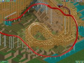
That looks huge, but in a good way. Epic would be a good way to describe it. I do not like the slope from the bottom turn into the diagonal steep hill. Can be smoother, or alternatively cover it up with trees.
Wrong topic, by the way. -

 F0ndue
Offline
Ok, so where can I post it? I'd rather not spam screenshots for every little occasion where I'd need some advice.
-

 Liampie
Offline
It's better to spam the front page than posting it somewhere off-topic! Maybe open a new topic.
 -

 F0ndue
Offline
This is exactly why I miss the old advertisement district. You could have your dedicated topics there and easily ask for feedback.
Aside from that. I usually build valleys of diagonal slopes this way (and put a straight piece of track between them), do you think it only looks bad at the bottom of the flying snake dive?
-

 Liampie
Offline
Oh, there too. Didn't notice that before. I think this just looks bad when done with diagonal track. Diagonal track doesn't really need it anyway, in my opinion, it already has a larger radius than straight sloped track.
 -

 F0ndue
Offline
Well shit, I used it a lot in my park, at least for the wooden coaster (which arguably is a lot bigger than the launched coaster, and it's already a nightmare to properly scale everything else to it). But the short slope doesn't look quite right either when you compare it to the steep-to horizontal piece. Makes me really wish there was a horizontal to steep diagonal piece. I'll tinker around a bit (probably need to raise the track at the bottom anyways, it is way too close to the water I think).
-

 Jappy
Offline
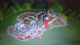
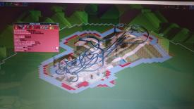
Been trying to build an Intamin launch... Since I suck at layouts, I want the opinion from the experts.

-

 G Force
Offline
Middle of the layout feels too high off the ground, and a bit spaghetti bowl like. Coasters like iSpeed have a bit more of an organized layout and flow a bit better. I'd re-work from the first station fly-by on. I feel an Intamin coaster would never pass under a break run like that.
 Tags
Tags
- No Tags


