(Archive) Advertising District / Welt der Wunder - Bayern
-
 05-September 13
-
 Doomblade
Offline
Hi there!
So this is my first thread at NE, hope you guys enjoy some of the stuff I'll be showing you.
FIRST OFF: This whole park will be NCSO and so far I've been planning on only using the 8cars-trainer in the case of being out of money.
The park is supposed to be located in Bavaria, Germany and is a theme-park with multiple parts based on regions like Scandinavia/The north (the only part I've been working on so far) and stuff like egypt, movie-based stuff etc.
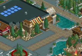
So here are the first pics I'm going to show you besides one I already posted in the pic dump!
The dump-one:
______________________________
First off:
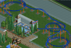
The parks first attraction: Rock'n'Ride. The park bought this one from an old fair and tried to modernize it a bit, yet more changes will be done in the future, for example regarding the station-building.
Next up: The children's playground
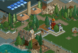
Guests of a younger age can enjoy their day on this playground, although the big slide is a fun for guests of any age. Everybody can have a nice meal at the park's first restaurant that presents special food from the sea.
Right next to it: The entrance to "Odin"
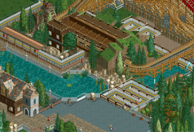
Fans of the bigger thrills will meet their first experience here with the park's wooden coaster "Odin" (mabye to be renamed in the future). The entrance of the coaster pictures a nice view of the nordic landscape and guests get a nice impression of the wooden monster!
The coaster's layout offers a thrilling experience:
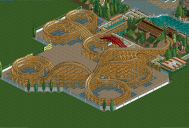
Riders experience high speed, fast curves, flyby's and are left breathless by this coaster!
Obviously, many parts are still unfinished and certain things will be replaced!
Criticism and advise are welcome, "I don't like that colour"-Posts pleasy stay at home />/>
/>/>
Doomblade -

 bdawgtk1982
Offline
I really enjoy that wooden layout. It looks like it would be fun to ride in real life. I would very much like to see what the rest of this looks like when it is finished.
 -

 csw
Offline
Not sure I like the element at the top of the screen on the wooden coaster, but the rest looks pretty good.
 -

 ottersalad
Offline
The wooden coaster layout is great except the helix after the first airtime hill on the left of the screen.. I feel like a swooping turn would look nice and be another good element. Maybe add some bushes or something inside your layouts. I like the Zamperla layout.. I'm curious to what layout changes you are hinting at making..
 -

 Doomblade
Offline
Thanks guys!
@bdawgtk1982: Thanks! I'm not quite sure about how I'll finish the scenery around this one, but that gate at the left hand side is there for a reason. I thought I could put a look-out in the free space! But I'm not quite sure yet, what I'll put on this side of the ride, so that'll be a project in the future
@csw: Do you mean the knot-like part or the small red roof above the track? Either way I guess I'm going to leave it that way now, I do often break down things and rebuild but in this case I'm already too used to that layout
@ottersalad: Thanks, glad you like it! I guess such a turn would be nice as well, but in fact the train goes through the part shortly after it with the unbanked curve with quite a low speed and if I put another hill-element in there I'm afraid I'd have to change the rest as well. And the scenery at the inside of the coaster's area will be added of course. I guess the layout of Rock'n'Ride won't be changed anymore since I suck at those coasters actually, I'm happy I got one of that quality. I was referring to the grey station and stuff like that!
-

 Doomblade
Offline
So here's an update:
The space next to Odin received an update with a small place to chill out in the woods while having a nice view to the parks next big coaster! ( + a non-popular fast-food place)
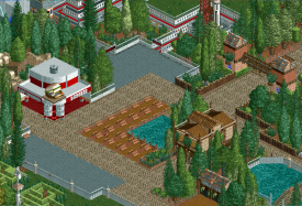
At the other side, next to "Rock'n'Ride" there's a cinema now! Visitors can watch classic blockbusters in here (it stands a little lonely atm, there will be more around it later).
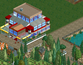
As mentioned before, the park's next coaster: "Mission X" offers a thrilling Launch-Start and the park's first inversion:
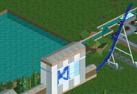
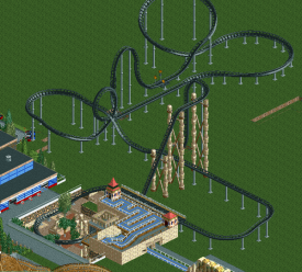
This next one here will be relocated since it is right at the ass of "Odin". But you can expect it to become an instant park-classic.
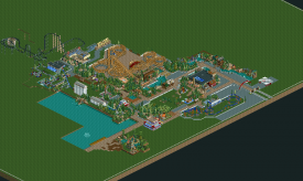
Just a small overview to show you how big this park is atm. many parts are unfinished or just in a sort of "Alpha-Version" since they are just there to mark certain locations (such as the entrance).
That's it for now, as always: excuse the unfinishedness. />
/>
-

 Ling
Offline
A lot of that vertical coaster's layout looks incredibly forced. The top hat thing is weird... it might work if that were an element specifically made to interact with path, but it doesn't look like that's what you intend to do. And then following that up with a launch just makes it even more odd, then it was clear that you wanted it to go through its own loop, but had no more ideas after that, so it's just a set of long straight sections. If you want to make it a more intense style, change the trains to floorless and employ more inversions in place of the big sweeping turns. If you want a more classic vertical drop style, ditch the loop and make it more "swoopy", with larger, more relaxed turns taken at high speeds. I would also make it a lot shorter, and either way, ditch the launch. It's totally out of place.
I think the first screen has too many path types, and they don't have much of a design to them, they're just organized in clumps.
Architecture for the most part looks solid. I read that you only want to use 8cars for money, but I would consider using zero clearance every once in a while to help encase rides and shops without having 3+-story-tall buildings, and fill in the ground underneath full-tile trees with quarter-tile shrubs and flowers. -
 Luketh
Offline
I like it! Consider playing with the objects on your bench to see if you can create little tables for the peeps; the first screen's outdoor eating area would really benefit from something along those lines. The rest is really cool. I especially like how Mission X's supports look! Good job.
-

 Fizzix
Offline
Paths don't have to be prefect squares either. Try varying the width and curving them along through the park. Let them flow. It's a good start though.
 -

 Doomblade
Offline
Thanks guys!
The vert-layout will indeed remade entirely! The top-hat was supposed to get a special theme and the "launch" is actually a straight piece of track which was about to get covered as well! But I decided to stop this project when I realized that my scenery-plan for the loop and track around it won't work...
I'll also change the path design, it's one of my biggest weak points!
Maybe I will also do the 8cars thing for the shops, but I won't touch it yet for connecting tracks etc. since that's usually the suicide-button for my rct
One thing I'd like to do with the 8cars is making ride huts and stations invisible but I've tried so often and failed everytime, either because my RCT didn't want to or because I did certain steps wrong, so that's not an option here.
But yeah, many things from those last screens will be redone! -

 Doomblade
Offline
So I sort of restarted this park!
I wasn't quite happy with the way the latest additions were "stuffed" into the park, so I decided to start over since I think it might be a problem of path-organization and the lack of landscaping except for foliage.
However, "Odin" will most likely be "copied" into this park at a later moment and "Mission X" and "Rock'n'Ride" might appear as well! Also, the location, setting etc. will stay the same. I just felt I want to build the best I can and if something doesn't fit somehow, I just have to cover those things up because I wasn't focused while building it (which is what happened before the last post).
So here's a screen from the new rural entrance concept of the new park:
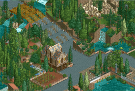
And what do you guys think of this layout? I suck at building these but I felt it might fit into this park quite nicely!
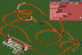
Ah and before I forget about that:
@Ling I did indeed start using the 8cars trainer again and after some technical problems it seems to work right now! You'll see some more ZC-usage soon />
/>
-

 Hex
Offline
The atmosphere in that first screen is really good. I really like the Egyptian rocks, but I'm not sure if others will agree or not. Not much to comment on the second screen. Sorry to hear you're restarting the park, but your skill has improved so in the long run it may be a good thing!
-S.C. -

 Doomblade
Offline
SuicideCarz: Thanks, yeah some people hate those rocks, some love them. I'll keep them because they're awesome
 />
/>
Just a quick update:
"Die Große Reise" is the parks newest flat ride. The scenery around the ride is done but of course the background is unfinished!
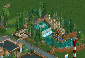
Started to add some landscaping etc. around the park (going to be changed one day anyway) to give it some "real-life-touch"
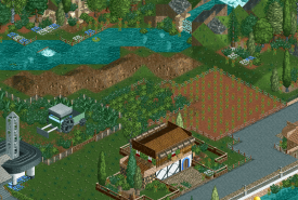
The park's drop-tower: "Edelweiss-Turm"
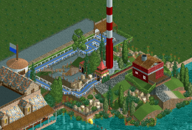
Information-Stall and the entrance to the "Bootsverleih", where you can take a rowing-trip on the park's Great Lake.
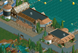
Hope you like the new stuff! -

meznator Offline
I am not sure what it is about that drop tower that I really like. Maybe it is just how simple and elegant it is.
I don't really understand what the purpose of that red building next to it is supposed to be.
Great stuff though!
Also, you should make the land edges behind the waterfalls ice. -

 Liampie
Offline
Except for the second screen, this is pretty good! The second screen is way too random in every way.
 Tags
Tags
- No Tags