(Archive) Advertising District / Dream Heights
-
 08-August 13
-

 xRBz
Offline
Hi guys,
As I'm new to this i've to step up my game when it comes to use with custom scenery and 8cars.
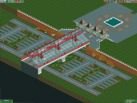
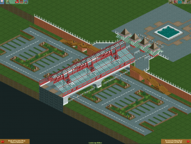
I'm trying to make a park but I stumbled upon my first problem, I was trying to recreate an entrance like Adventure Island in Tampa Bay, where the parking area is beneath this bridge who leads to the entrance .. The guests aren't walking to the entrance, is this because of the bridge or the entry points?
Also this topic will be updated with progress when I have it, I don't want to redo alot of work so i've to fix the guest entry first.
Thanks,
xRBz -

 Faas
Offline
Ok try this: In 8cars, press "Own all land", then press "Deown border land" or something. This will probably solve your issues with the peeps.
I like your entrance pretty much, but I suggest you use more cheerfull colours so that guests are attracted towards the entrance. It looks a bit boring. -

 xRBz
Offline
Thanks Faas, the border works but I want to stick them out of my park until I have something, but they DO enter my park when I do "deown border land"
 ..
..
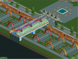
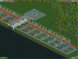
I also made it more colorful and also tried to make the parking area more colorful.
I made arches so the guests know where they parked their cars
In the bottom right of the second screen I was thinking about adding some sort of car entrance where the guests have to get their ticket, I'll probably do the main entrance first so I can make it the same style. -

 posix
Offline
Good work. You seem talented.
I prefer your original colours. You've gone too wild with them now. Also the coaster tracks as arches are quite bold. They create a strong visual impact on the overall composition. Too strong in my opinion. I would try using thinner (and thus calmer) objects to create the arches.
 Tags
Tags
- No Tags
