(Archive) Advertising District / CSW Advertising Thread
-
 31-July 13
-

 csw
Offline
It is time to start a general work thread for all of the RCT playing I have been doing lately. I will also keep this first post updated with overall percentages of my WIP parks, along with general screens posted in the topic.
Gravity Gardens Redux - 20-25% - expansion stage, area planning
More screens can be seen here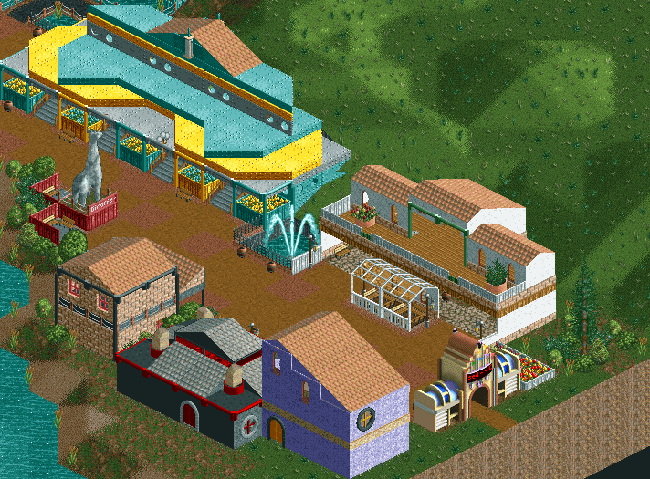
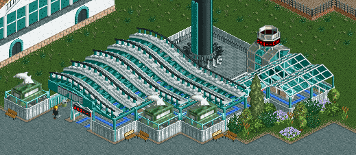
Some entrance shop area architecture
Project codename "Daffy Duck" - 25-30% - theming and ride placement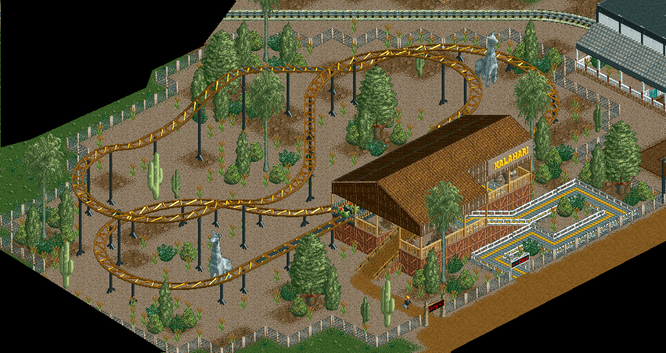
Kiddie coaster in an 'African Safari' area
Both parks are NCSO. -

 Xeccah
Offline
You need to have a better vision as well as planning out how everything fits and looks as a cohesive whole.
 -
 inthemanual
Offline
Needs more around it, I think. That much empty overgrown grass doesn't look good
 -

 csw
Offline
I haven't decided what to do with that yet...if you see empty grass in any of these screens, it probably means I haven't filled it in yet.Needs more around it, I think. That much empty overgrown grass doesn't look good
Nice to see someone finally use those dolphin statues.
I know! They're such nice statues -
 Luketh
Offline
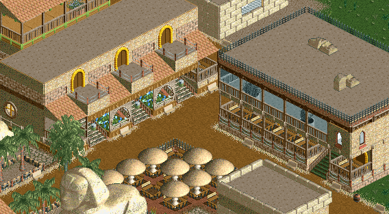
Duude, egyptian theme? Sweet! I like this screen, although replacing that grass (which I understand is unfinished) with sand would have made the whole thing feel more "deserty."
I'm not so sure about the sandstone blocks on top of the building to the right, either. I'm not sure if they're just chillin' or if they're supposed to be the building's AC unit or something. I'd also suggest adding some details to that top floor; maybe more chairs. It looks rather plain with just two planters, y'know?
Overall, I like the atmosphere of the screen. I'm happy to see that Sphinx for some reason.. not sure why.
-

 Lotte
Offline
you should post to reddit more often, i haven't seen you around there lately, last time i saw something yours was during the april contest, a park that ended up winning a bronze accolade here (turtle hills)
 -

 Hex
Offline
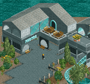
I like the structure itself but it's a bit gray. I don't get having the tables and benches on top of the pboto booth. It is a very clean cut NCSO screen, and you are very good at clean NCSO atmospheres.
-S.C. -

 inthemanual
Offline
This last one is my favorite so far. I think more "muddy grass" or just grass instead of the dark sand would bring more color to the screen, and might be all it needs.
 -

 csw
Offline
Thank you everyone, advice will be taken into consideration. I have addressed the 'grayness' of the screen already, and it's partially my fault for focusing on that specific building.
New screen: Wild West Bumper Cars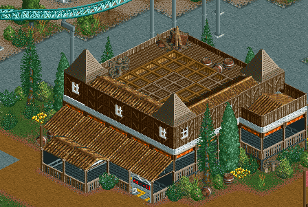
The wild west theme has not been fully implemented yet. Loosely inspired by the Rough Riders bumper cars at Holiday World & Splashin' Safari
EDIT: Also, updated percentage in first post. New codename "Daffy Duck". -

 Faas
Offline
I don't know man. I think it's pretty boring. The walls look plain and there is not much going on. I like the small bits of foliage though.
 Tags
Tags
- No Tags



![][ntamin22%s's Photo](https://www.nedesigns.com/uploads/profile/photo-thumb-221.png?_r=1520300638)