(Archive) Advertising District / Coastal Adventure
-
 24-June 13
-

meznator Offline
My 1st submission (Woodland Adventure) was supposed to be more of a simple park.
So with this upcoming submission I was aiming a little bigger.
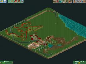
I plan to have 3 themes; a wild west, a Spanish, and a smaller Medieval area.
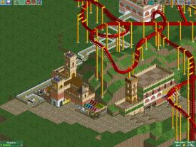
The wild west theme is the only one with any real progress. The wooden coaster, Lone Ranger,is a GCI.
The Spanish themed coaster,Matador,is a floorless. I plan to add a rapids that interacts with Matador(Not sure on the name).
The area to the left of the train station is meant to be the "main street" type area of the park.
I also plan to have a neutral themed area at the back (similar to the front train station) that would hold the second train station. This area would give guests an option to enter any themed area of the park.
The back left area, beyond Matador is to be the Medieval area.
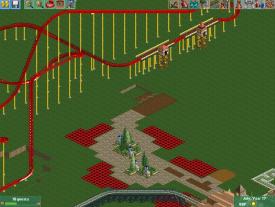
Just looking for thoughts on the coaster layouts, the scenery (Train station and Lone Ranger station, as well as the entrance), and the overall layout/outlook of the park.
Entrance to the park
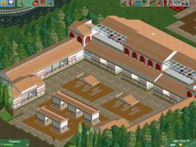
The train station
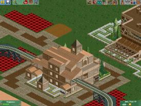
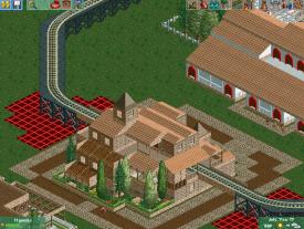
The station of Lone Ranger
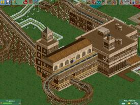
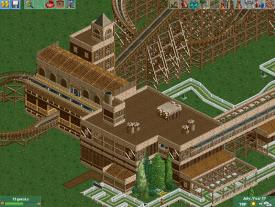
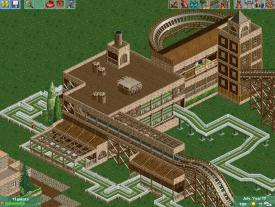
Lone Ranger
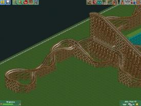
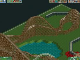
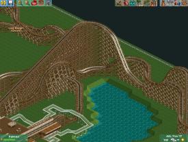
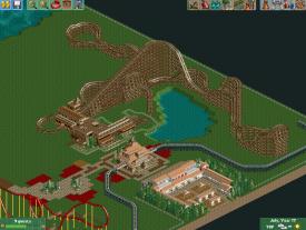
Matador
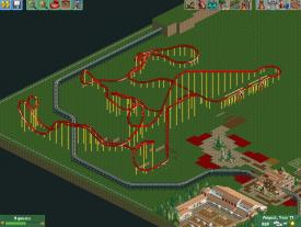
Outlook of Main street
Whole Park
Just looking for feedback.
Sorry, it is Time Twister.
 Project #1.SV6 (409.56KB)
downloads: 133 -
![][ntamin22%s's Photo](https://www.nedesigns.com/uploads/profile/photo-thumb-221.png?_r=1520300638)
 ][ntamin22
Offline
Congrats on scaling up to a bigger project! My biggest critique if what I see here is that it is all very monochrome. The buildings come off as very flat because they are just brown on brown.
 -
 Luketh
Offline
I like that start! I'd definitely suggest changing up the terrain texture on the steep mountainous bit; a combination of dirt and the grey rocks would make the little cliff look more menacing and atmospheric. Also consider adding some small shrubbery up there.
I'm not sure about the four multi-colored awnings sitting in a 2x2 square. Try making it all one color and see if it looks better.
I like how the corkscrew into half-loop (is there a name for that element..?) wraps around the lift hill! -

meznator Offline
Thanks for the feedback!I like that start! I'd definitely suggest changing up the terrain texture on the steep mountainous bit; a combination of dirt and the grey rocks would make the little cliff look more menacing and atmospheric. Also consider adding some small shrubbery up there.
I'm not sure about the four multi-colored awnings sitting in a 2x2 square. Try making it all one color and see if it looks better.
I like how the corkscrew into half-loop (is there a name for that element..?) wraps around the lift hill!
This is very unfinished so I do plan on making the terrain better and putting in foliage.
I also made the awnings the same color and I think it looks much better.
 Tags
Tags
- No Tags
