(Archive) Advertising District / Disney’s Wonderful Worlds
-
 04-May 13
-
Xcoaster Offline
Thanks for the replies!
So the original idea behind this project was a Disney park based on various fantasy worlds, with a big composite castle as the centerpiece (I think I sketched this about 4 years ago, when Wizarding World was under construction at IOA):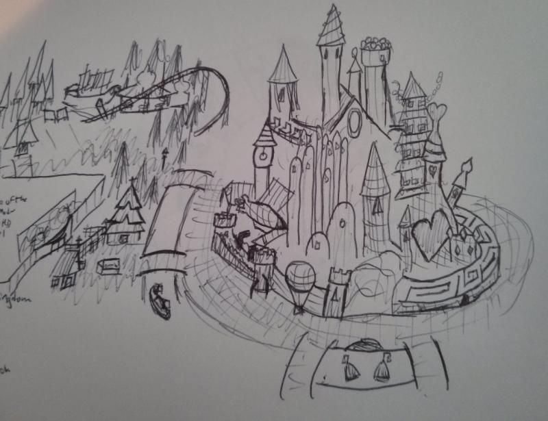
Since then, with the purchase of Star Wars and Marvel, I’m thinking of it more as a Next Gen Disney park (possibly Disneyland’s Third Park), and I've subsequently all but dropped some of the original planned areas (Northern Lights, Harry Potter, and the like). I'm still trying to go with the same basic theme, so Marvel might not be included as it doesn't really fit (even though it would almost certainly be part of any new Disney park). Here are the planned areas:
* Star Wars Galaxy (Hoth, Coruscant, & Tatooine)
* Wonderful World of Oz
* Narnia
* Ghibli Land (Europe & Japan)
* Electronic World
* Wonderland
Potential Areas (in approximate order of likelihood):
* Fairytale Kingdom
* Earthsea (Ghibli subsection)
* Land of Legend
* Marvel Universe
* The Golden Compass/Northern Lights (it's that area on the bottom left of my sketch, Narnia is above)
* The Labyrinth (mini area - will probably depend on whether or not Wonderland has a maze already)
* Willow (yeah... probably not)
I originally had planned Diagon Alley as the entrance, and Hogwarts as the front part of the castle, but I’ve since decided to cope with reality. Now I'm trying to figure out how to theme the entrance (a mythology or fairy tale themed area would make sense).
Anyways, a screen of the Spirited Away ride entrance.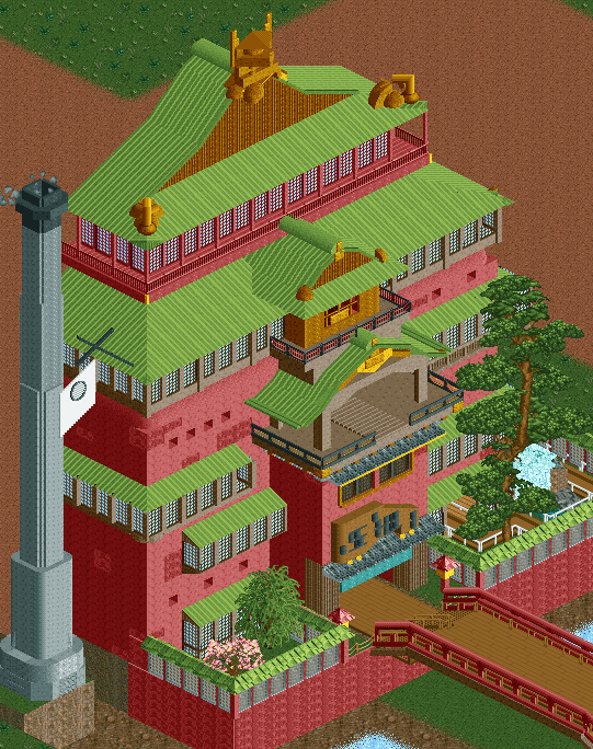
So I think it’s about spot-on as a recreation, but now I’m concerned that it may be way too big for a Disney park. The ride itself only needs a show building about half that height, at most. Thoughts? -

 Liampie
Offline
You should've seen my face when I noticed the tree. Fucking love it, I might even make a new custom tree object based on that thing.
However I think there's no way that building is not too big. It'll look fine at 2/3 of its current height too.
The plans you have for this park sound very ambitious. I'm looking forward to Coruscant, Oz, Ghibli Land and Electronic World mostly. The latter because I have no idea what it will be, but if it's anything like what you did in Shadowlands I'm a fan. -
 AK Koaster
Offline
Pleez, muhr, must have muhr...!
Also, wonder if you could figure out some hack to get spirits to walk around on the bridge, not sure how easy it is to create custom entertainer outfits, but still,
MOTHER OF GOD THIS IS WONDERFUL -
 Highball
Offline
Right now I'd say it is too big, but any chance you can post a picture of the building you're basing this on? I think that will help me be a better judge of if I think it's too big or not. It looks good though.
ShanghaiI'm still trying to go with the same basic theme, so Marvel might not be included as it doesn't really fit (even though it would almost certainly be part of any new Disney park).
 (According to some Chinese official at least)
-

Xcoaster Offline
^^^^ Yeah, I think the smoke-stack placement is a a little off. Should be a block further out, and the base should be much further down.
^^ Has anyone ever made custom staff? Similarly, is there a way to unlock all staff without selecting each applicable theme group?
^ Yeah, the Shanghai park is kind of the start of what I mean by the Next Gen parks. I think from this point forward, any new Disney parks will probably make a point of trying to include Marvel, Star Wars, and Tron sections. At least the first two are no-brainers. I was going to include Tron anyways, since it has such a unique visual, and the franchise was revived since I last used it. Star Wars makes sense for the overall theme. Marvel doesn't quite work for my original idea since it doesn't really take place in another world (unless if you count the Thor movies), but it might be a fun theme to play with, since there's certainly plenty of good source material.
Here you go: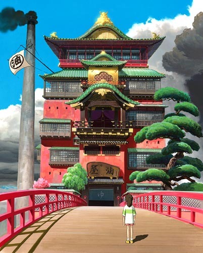
I think I'll try to reduce it to about 2/3 current size, like Liampie suggested (about the level of the 2nd roof from the top) and bring each side in by 1 or 2 squares.
And for fun, here's a photo I took of a building that the bathhouse was based on. It's about 6 floors shorter, more Japanese in color, but it contains several details that are dead on: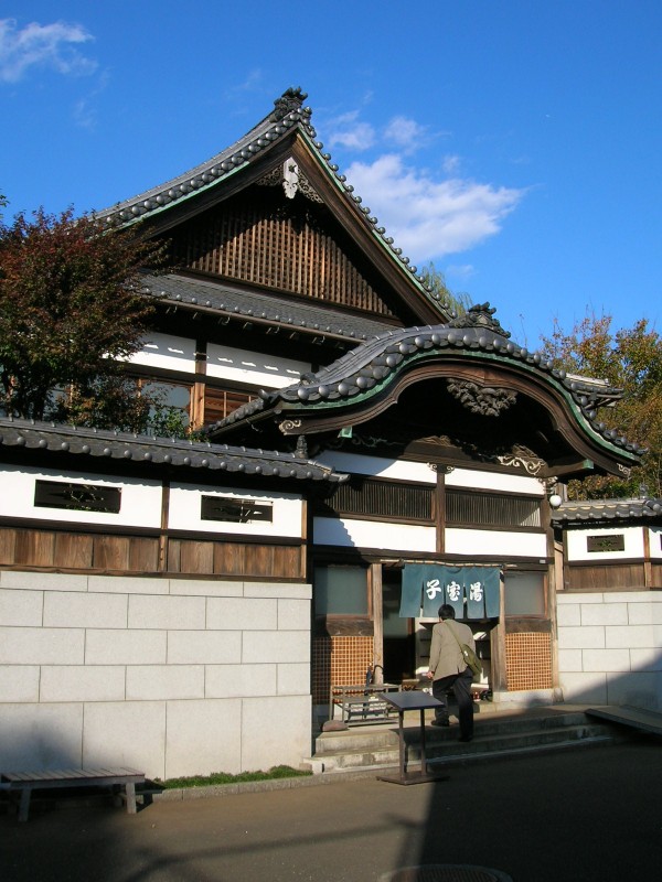
-

 Highball
Offline
After seeing that picture, I think the building is a little too fat. That combined with a slight reduction in height (not too much though) and it would be perfect.
If you really want to include a Marvel area, you could always try themeing the area after a particular Marvel storyline instead of an all encompassing land like Marvel Super Hero Island. Since you're going with a fantasy based park I wouldn't think it would have to be something that is instantly recognizable as Marvel or comic book-ish. Fantastical story arcs that immediately come to my mind are The Infinity Gauntlet and Secret Wars. -

 Cocoa
Offline
OMG YES
agree about the scale though. maybe something a little closer to this scale could work, but obviously the bathhouse is bigger than any of those buildings. or is there some big dark ride/tower of terror thing going on there? you should add the purple curtains to the middle balcony too />
/>
also, imo a marvel area sounds super boring... all I can imagine is the myriad concrete and glass boring-ass sections that used to pop up. maybe if you make a universal studios-esque nyc area though, it could be exciting. although i certainly don't doubt your ability to make it work />
/>
JUST NOTICED YOUR AVATAR TOO... YES AGAIN -

 Turtle
Offline
I missed this!?
Looks AWESOME. Love the idea of Spirited Away as a ride, one of my favourite movies. All of these ideas sound fantastic also, and those first few Star Wars screens are unbelievable. So happy to see new work by you man. -

 AvanineCommuter
Offline
You should definitely try to use curved monster track + wooden coaster for that curved roof in the center; I think that will fit perfectly with the shape in that picture. Also try to do the upturns on the corners, it'll make the asian influence more prominent.
I love the themes you're making and cannot wait to see more! -

 tyandor
Offline
The building is a bit too big and I think that is causing it to be a bit too bland. Extra texture could help. Especially the brown windows need some texture to stand out and I wouldn't make the window's glass blue (glass is always a b*tch in rct though).
I love the Star Wars stuff though btw
-

 Kumba
Offline
Amazing stuff, this could be one epic park. Not a huge fan of that last building, but I don't know the theme. Not to beat a dead salmon (sadly it died after the fucking...), but the scale does seem to large. Scale it done and it should be just right.
Your style and a Marvel theme would be incredible. You MUST do something related to it. What you could do with Thor (Asgard) or Iron Man... WOW...
Oh and Ryan. Your present is Logos, build well my friend
-

 leonidas
Offline
I watched Spirited away yesterday, recognized it instantly!
Scale it down a bit and it's perfect. -

 nin
Offline
Being a huge fan of yours I'll have to speak up and say that I don't like it and know that you could do better. I too am familiar with the material, but won't let that blind me as much as it seems to have done with others...
The scale is obviously [too] huge, but I really dislike the detail you've put into the thing, as when compared to the actual bathhouse many details are missing or simply not to scale in relation to the overall size of the thing.
For instance, the shape of the roof could be better executed, as it doesn't have that pagoda-like flare seen on the source, or anything from old Japanese architecture, and much of the golden flare could be done better, especially coming from you. I think my biggest issue is the the windows, which is the main issue as they have a huge influence on the structure (the biggest, I'd say). They're just out of scale and lack the detail seen on the actual bathhouse, so it doesn't look good.
Obviously much of the other detail is missing, which is a disappointment. I guess I'm going with what everyone else is saying, that being that the size of the building is too huge, but it's not just that. It's that the execution of it could be much better, especially coming fro you. The custom tree is a cool touch, though.
 Tags
Tags
- No Tags
