(Archive) Advertising District / It´s been a long time...
-
 16-April 13
-
![][ntamin22%s's Photo](https://www.nedesigns.com/uploads/profile/photo-thumb-221.png?_r=1520300638)
 ][ntamin22
Offline
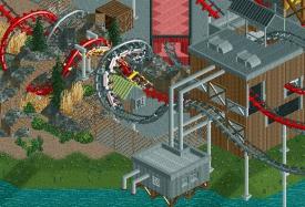
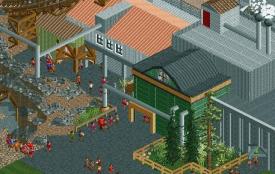
Those duelers look to be very well done. The blue trash bins are popping out at me, but otherwise that is a great industrial environment.
 -

 Steve
Offline
Wow, that interlocking corkscrew element with the rock work is just excellent. Really nice stuff all around, too.
 -

 Dimi
Offline
These are some refreshing screens! I like how you took inspiration from that defunct duelling rollercoaster in Movie Park Germany without copying it. Love the pirate area too.
 -

 Fisch
Offline
krass Mann was machst du denn hier?
Schön dich mal wieder zu sehen. Gute screens, definitiv kreativ und das ist etwas was momentan in der Community selten ist. -

 muuuh
Offline
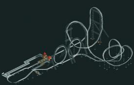
hey GT, I really like that layout, but these supports look kinda weird imo.
Except for the first hill I assume these huge track-supports aren`t necessary, better use custom scenery supports for the rest of the layout. -

 Liampie
Offline
I somehow really like the industrial look of that. Very original and refreshing too. I'm not too keen on the layout however... The part after the top hat and the weird but cool turnaround doesn't look very good and takes away all credibility of the ride... I like the loops, but then the ride ends abruptly with a too small and ugly hill and a simple uninspired turn. I'd connect the first turnaround and the loops in a short and elegant way, add some modest turns and hills to get back to the station. It's your ride however. Can't wait to see more!
 -

GoldenTowers Offline
i´m thinking about buildiung even more massive supports. as if nothing else can hold this beast in it´s cage
-

 Phatage
Offline
You start out with a really nice and refreshingly original first half of the ride but this caged beast looks like it loses steam towards the end in terms of originality. Seems like you should have plenty of speed left after the first loop to do something else noteworthy of the rest of the layout.
 -

GoldenTowers Offline
reworked the layout of the track a little... but i won´t show you now.
decided to keep those massive inverted supports that you all hate. kinda works for me. and i´m too lazy to start all over haha.
but here another impression with a little theming done. part of the entrance building and so on... not finished at all. i named it "The Catalyst":
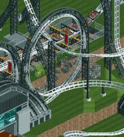
and here´s another picture of a coaster that most-likely would appear to be the oldest one in a park like this. Might be the family coaster of the park. Here´s "Sandstorm":
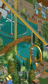
there you go. let me know what you think or keep it to yourself. never mind
hey and btw: would someone like to hop the wagon and build with me on this park? as i always liked it to build on something together. maybe just pm me or something. i´ll get back to whomever next week, cause i won´t be around my computer for the next 6days. -

 Fisch
Offline
Your stuff always fascinates me!
Back in the day your old parks were the only reason why I signed up to an rct forum. You've paused for such a long time but the talent is obviously still there. Loving your work, I hope you'll finish it and send it in for an accolade! If you do decide to disappear for a while again then definitely post a DL to this first!! />
/>
-

 Liampie
Offline
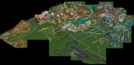
There's not much to comment on the overview. Just nice to see that you've got quite a lot of work done already.
 Tags
Tags
- No Tags
