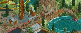
(Archive) Advertising District / It´s been a long time...
-
 16-April 13
-

 Cocoa
Offline
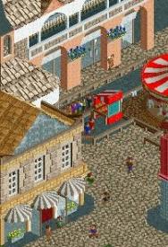
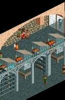
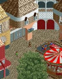
i like those first two screens. not so sure about the building in the third- brown roof, brown bricks with a white stripe, and an awkward centered pink pillar? also, red interior really seems weird, and those grey doors make it seem really dead inside.
 -

GoldenTowers Offline
the more often i look at that screen, the weirder it gets... so maybe you´re damn right, but on the other hand maybe it´s just that picture detail. if you will get to see the whole building(one day) it´ll change your mind... maybe
whatsoever...
some little improvements on foliage and buildings:
entrance plaza with sandstorm in the back:
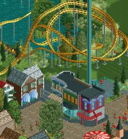
old townish buildings with the catalyst on the right:
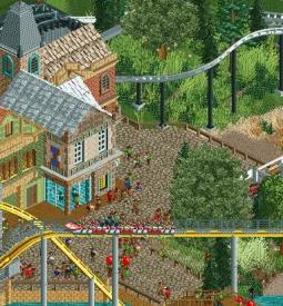
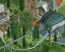
part of the catalyst and the passage between the old town and the sci-fi-whatever part:
-

 Cocoa
Offline
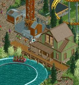
I love it, especially the massive window on the green building. well executed for sure
 Tags
Tags
- No Tags
