Fiesta! / PT2
-
 24-March 13
-

 FK+Coastermind
Offline
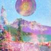
Usually im not as big a fan of old styled nostolgic stuff...but i love this. It looks so PT2 fun and wonderful!
LONG LIVE HK!
FK -

 Cocoa
Offline
the one thing I don't like about old school is that its definition of a theme is often just 'choose a color and a particular type of detailing'. In this case that would be blue with brown rooves and wooden trims. Why not define a particular theme? Am I looking at Hawaiian or polynesian? greek? spanish?
disregarding that though, the screen is really great. very classy. I just want to know what it is meant to be. -

 Chocotopian
Offline
I like the way the buildings and path lean over the edge of the cliff. At the moment, I'm not sure if the blue is too contrasting for me. It's obviously a refreshing bit of colour to accompany the browns, but I'm wondering if it would fit in slightly better if it were a little more covered (with wooden crossbeams etc.)
 -

 disneylandian192
Offline
Its got a theme, tropical-type jungle-type theme with blue walls and brown roofs. This brings me back Liam, it looks great.
 -

 chorkiel
Offline
More people should use that trick with the waterfall again. It looks really cool.
Great screen, Liam, as always! -

Airtime Offline
Beautiful. Far better than the other PT2 screen you showed a while back. I love the building at the top of screen. -

 Liampie
Offline
Thanks guys!
Liampie
Offline
Thanks guys!the one thing I don't like about old school is that its definition of a theme is often just 'choose a color and a particular type of detailing'. In this case that would be blue with brown rooves and wooden trims. Why not define a particular theme? Am I looking at Hawaiian or polynesian? greek? spanish?
Not denying that there's no theme. I just want to build something pretty here.
Sorta reminds me of Artist with a little Liampie-tang to it, if ya know what I mean?
That's what I'm going for. I've been wanting to imitate artist since I first saw Islands of Enchantments many years ago. This is the first time it's actually not turning out shit, I think.
-

 AvanineCommuter
Offline
the one thing I don't like about old school is that its definition of a theme is often just 'choose a color and a particular type of detailing'. In this case that would be blue with brown rooves and wooden trims. Why not define a particular theme? Am I looking at Hawaiian or polynesian? greek? spanish?
disregarding that though, the screen is really great. very classy. I just want to know what it is meant to be.
That's actually what I love about old school parks. Why does there need to be a theme? That feels so limiting. Building fantasy parks shouldn't be limited to coherent themes and architectures... why constraint creativity? It doesn't have to be based on real-life architecture and ideas, which is why I find fantasy parks so much more entertaining and interesting: it has the potential to be based completely off the imagination and the creativity of the builder. -

 Hepta
Offline
Liam, though I haven't commented on it yet, I think this project is fantastic.
It appeals to my personal familiarity with RCT, as I started looking at NE in 05 just after Bijou, and after Isole I joined. That era of parkmaking just strikes such a chord with my aesthetic taste, and you're nailing it here.
The atmosphere is magically immersive. All of the objects are intended to fill the aesthetic, there's nothing there just for the "sake of realism". That's the magic of this era, the magic that inspired me to join this site.
PT2 FTW.
Liam FTW.
 Tags
Tags
- No Tags


