Fiesta! / Continuation of Condor
-
 24-March 13
-

 Xeccah
Offline
 other.png (160.77KB)
downloads: 94
 shops.png (187.67KB)
downloads: 116
 train_station.png (117.44KB)
downloads: 83
I don't take credit for the pathing, it's mostly Liam's doing for some, and me continuing that formula for the rest. Cheers. -

 Austin55
Offline
The foliage in the planters could use some work for sure. I like the archy, but I do think you could still deal with it being just a few units larger. The colors used on them is pretty nice throughout.
 -

 Mattk48
Offline
-I don't like the random benches in the first screen, other than that its nice.
-The buildings in the second screen are great, but the large brown gate, and the huge gray backstage section doesn't work
-That train station looks isolated and lonely
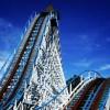
-overall i like it, but not the new coaster colors. I think the orange looked better. -

 Xeccah
Offline
I rather like it, actually. To me it gives a different vibe than most of the other foliage people are putting out, and I think when I get the rest of the foliage added in, the station will bond better to the area.
 -

 FK+Coastermind
Offline
You are just SOO close developing a style that is distinct to you. My advice, if you want to listen to little old me, would be to FINISH THIS, then start something COMPLETELY new and completely you! IMO, you are getting too wrapped up in trying to be alot of things. Finish some things and BECOME who you are!!
Gandalf speech over!
FK -

 Louis!
Offline
Yeah looks great. As FK said, finish this up and start something that is completely you.
 Tags
Tags
- No Tags
