(Archive) Advertising District / Condor/ NCSO
-
 10-March 13
-

 Cocoa
Offline
when i go through doorways, I always have at least a couple feet of space above me (I'm 5'9"). And under balconies, there should be even more as there is usually more room in between floors for pipes and whatnot. For the building that says enterprise, I really doubt that it would have two floors. Even if the balcony is just for show, it should still 'pretend' to be part of a floor, if that makes sense. its like putting a window halfway in between floors, it just looks wrong.
 -

 FK+Coastermind
Offline
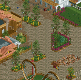
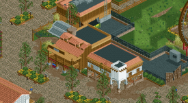
Not sure how i feel about the purple flowers, but the archy is looking very good, particularly love the white building in the second screen. So clean and defined.
NOW FINISH IT
I'm looking forward to seeing it in game
FK -

 Austin55
Offline
I think some flat rides in the empty spaces between buildings and stuff would help alot.
 -

 Steve
Offline
Try out sticking to strictly yellow flowers and see how that looks. Otherwise, nice job and good to see you settling into your style and fitting color scheme.
Also please don't make the coaster brown! The orange or blue you had before was much better. -

Wicksteed Offline
I think the purple flowers are really nice. they give it a very nice, different feeling. however you should use less of them. -

 chorkiel
Offline
It's getting better. One thing though, the purple flowers are too linear, overdone and stick out in a bad way because they're too linear and overdone.
 -

 Liampie
Offline
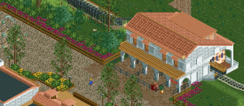
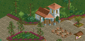
The foliage I made was supposed to be only for the planters. Though it doesn't look that bad in some places (last screen is alright), I think it'll be better if you used your own foliage here. I suggest making the foliage denser than you're used to as well.
I obviously half assed the planters. Not the design, just the execution...I didn't smooth out the diagonals and the trees were placed after the bushes, meaning they're glitchy. Easy to fix.
Lastly, I like the new shop you made. The train station also looks good, but it desperately needs a contrasting colour (black!). Some chimneys on top would look great too. -

 Angroc
Offline
Very nice buildings there. Really like the last screen. Very quiant. Your screens do seem to have a general lack of rides/coasters, though. I'd love to see some more fun lookin' rides in there.
-
 Mattk48
Offline
I think its coming along very nicely. I agree with liampie about the contrasting color. Why did you change the coaster colors, the orange looked much better?. other than that its nice. the planters and the purple flowers work nicely in my opinion. Just switch the color back to orange
 -

 Faas
Offline
I think the last screen will look very cool with peeps.
However, I think the other screens lack atmosphere and fun. -

 Xeccah
Offline
I've decided to merge my ncso park into this topic... Don't worry, Condor will be finished- it's around the 70% now...
When do you plan to release/finish condor?
I want to do a simultaneous release with my ncso park, which stands at around 25%.
So here's some more goods:

Entrance- 50%
Camelot- 60%
Oriental(?)- Planning -

 csw
Offline
Looks good Shotguns, but I'm not a big fan of the tavern color...I would make it gray, something darker.
 -

 Fizzix
Offline
Reeeaaally nice. I like the tavern as is, but it can't hurt to try gray and see how it looks.
 -
 RCT2day
Offline
Foliage could be a little better. But the park is great so far. Like Fizzix, I really like that tavern the way it is but you might consider sampling different colors.
 -

 Maverick
Offline
I feel like it's too small. Maybe it's just because it's taller than it is deep so it feels cramped.
And I think someone mentioned previously, your brown queue line and boardwalk path is custom scenery.
Otherwise, it's coming along nicely.
-

 inthemanual
Offline
Paths aren't *REALLY* scenery. And I really like that tavern, it's probably my favorite thing you've shown of this project so far.
 -

 Cocoa
Offline
why would you make that lovely circle awning only to put ugly flowers and shrubs underneath? that shit should be the restaurant entrance, or maybe a pavillion with seats!
 Tags
Tags
- No Tags
