(Archive) Advertising District / Baker Lake Amusement Park
-
 18-February 13
-
 inthemanual
Offline
It blends into the back of the building behind it (entrance building right?) and just gets lost in the surroundings, rather than popping out like I think most Carousels should.
I agree with this. I looked at the image before reading the caption, and thought it was another part of the entrance building because its so close and has the same colors. -

 Steve
Offline
Listen to Maverix, nin!I love the structure itself, but the colors are killing it. It blends into the back of the building behind it (entrance building right?) and just gets lost in the surroundings, rather than popping out like I think most Carousels should.
-

 Phatage
Offline
-You've created a carousel that is symetrical all the way round, a standard thing to do, yet you've placed it on the edge of the park, and thus there is no point to the symetry and it makes the carousel look out of place. I'm a massive fan of carousels that don't sit in the centre of path, so am glad to see you took this approach, but as I said, because of these overhangs that stick out, it makes it look out of place.
I really agree with this. The carousel kind of has an identity crisis where the architecture itself is elaborate enough to signify some sort of showcase ride but the location is not. Not saying that it has to be a centerpiece but I think some sort of symmetry with the surrounding path/gardens/fountain would frame the carousel much better. -

 Fizzix
Offline
I like it, but I'd change the top half of the top monorail track black to round out the roof.
 -

 Pacificoaster
Offline
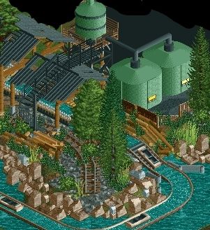
It's a good screen but I dislike how much you use that roofing method and does your water tower really need a water tank that needs another water tank? The way you have cropped this is also pissing me off.
 -

 Fizzix
Offline
Except for the water tower comments, please disregard Pacific-angst's comments. Thank you.
 -

 Arjan v l
Offline
C'mon Pac, loosen up.
It looks nice Coups, although one water tank would probably be enough. -

 Steve
Offline
I think it looks excellent. I like the water tanks, whether they're theming or inaccurate, they still still look badass. You have a really refreshing and clean style, Coupon, keep it going, dude!
 -

 Liampie
Offline
Don't get me wrong, I definitely like the screen, but I feel the area would benefit from a greater amount of water tanks.
 -

 Pacificoaster
Offline
I wasn't trying to come off the like an ass, but the whole cropping statement probably made it seem that way. I've told him this before though. "Why not present a finished screen rather than cropping it sloppily."
 -

 Pacificoaster
Offline
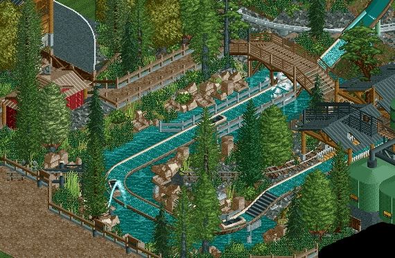
Is that a black hole in the bottom right or is that just another terrible crop job?
All jokes aside, looks great coups. Keep it up bud. Hope to you see in PT4. -

 Louis!
Offline
If you produce work like this in the prelims, you'll have no trouble getting a spot. Great stuff.
 Tags
Tags
- No Tags
