(Archive) Advertising District / Baker Lake Amusement Park
-
 18-February 13
-

 Austin55
Offline
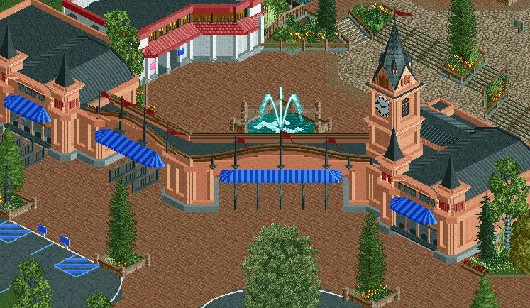
The new entrance has a very different feel to it for sure coups. Where as the old one had that "forest pac-nw feeling, the new one is certainly much better! But if you still wanted to maintain that "northwesty" feel, you've lost it.
That is not a bad thing at all though, just be sure that you don't lose sight of the overall character of the park, if that makes sense.
Btw-I think this new style of yours would look great in a Disney park. -

 Wanted
Offline
The only proper response to D_H:

Boy, oh, boy, do I like playing RCT. I practice and practice all day long, but I never get any better.
Dude. You killed me here. Officially won the thread. Sorry, Coupon, your park will reach the amusement I just got from mr.walto. Stop building. -

 Corkscrewy
Offline
Walto... Ice loved you from the momenti saw your avatar... This just escalated those emotions ten fold
 -

 robbie92
Offline
Wow, you and Pac did a great job on that entrance. The white bathroom feels off, though.
 -
 JJayMForce
Offline
I love that architecture so much. Its very neat and clean and those diagonals along with the trackitecture make it so good for me.
 -

 Faas
Offline
Very cool entrance but I don't like that top tower on the right. The fact that its texture doesn't fit the game keeps drawing my eye to it in a bad way. But nevertheless this is awesome.
 -

 AvanineCommuter
Offline
Super clean. Like the color combo too, the blue/peach/black looks great!
I agree about the restrooms though, do parks usually have restrooms smack dab in the center of the entrance plaza? I would tuck them away in a side corner of the plaza, maybe by a lockers/nusery area. Who likes looking at restrooms right when they enter a park? -

 AvanineCommuter
Offline
^
People that really have to go to the toilet?
I'm sure they can handle the extra 10 seconds of walking into a lockers/nursery/restrooms side plaza and save the rest of the crowds from having to enter into a park just to be greeted by a white restroom building...
-

 Fizzix
Offline
It reminds me of the entrance to Tivoli Gardens,very classy. If it were my park, I'd change the path steps out for the scenery object.
-

 Louis!
Offline
You've instantly killed your park by using road lines as fences. When will people learn THEY LOOK STUPID
 Tags
Tags
- No Tags

