(Archive) Advertising District / Baker Lake Amusement Park
-
 18-February 13
-

 Coupon
Offline
Before:
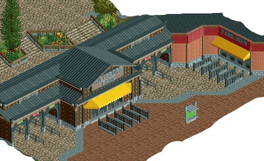
After: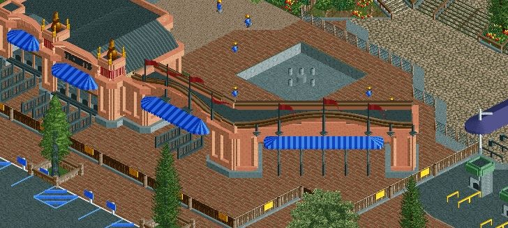
New entrance for a park with a new name! />
/>
btw new macklemore video came out today you guys should check it out cause its sweeet -

 Cocoa
Offline
I love how you've put it under construction. That is not effort that I would ever bother going to
Looks great! -

 Fizzix
Offline
Looking good Coups. Thunder Park Ridge, the only thread where you can simultaneously recieve updates on this park, and Macklemore.
 -

 Steve
Offline
Wow, what an improvement. Seriously great forms going on, and really liking the color scheme. The diagnol is a great touch and it's even better since you pulled it off really well. How much is Pac doing in this?! Definitely seeing a mix of you two here.
 -

 chorkiel
Offline
I did really like the atmosphere in the before screen but this new screen is great!
And mack's new video is indeed awesome. -

 Dark_Horse
Offline
Your planter borders seem a bit oversized for the scale you are going for. What's with the fountain too? Why is not in the middle? It seems fairly textureless to me. Also, where is the season pass processing building? First Aid? Other shops and eateries? Sorry, but imo you are missing things that make an entrance area come to life. Overall, the structure is decent, but I just can't place myself here if this was a real park.
 -

 Wanted
Offline
Your planter borders seem a bit oversized for the scale you are going for. What's with the fountain too? Why is not in the middle? It seems fairly textureless to me. Also, where is the season pass processing building? First Aid? Other shops and eateries? Sorry, but imo you are missing things that make an entrance area come to life. Overall, the structure is decent, but I just can't place myself here if this was a real park.
Mr. Negativity is at it again! Missing key things once again! 1. Maybe the first aid, season pass processing, etc is off screen? 2. Maybe JUST MAYBE, this is a 'construction' photo and the fountain is unfinished. I mean with all your bullshit nitpicking you might have noticed the short fences and THE MECHANICS. 3. This is bright and bubbly. I can def imagine being there. Maybe it's your obsessive nitpicking and lack of imagination that doesn't allow you to imagine being there.
I swear almost all of your posts over analyze everything and you miss the point of every screen.
Anyway Coupon, I love it!
-
 ScOtLaNdS_FiNeSt
Offline
I agree wanted i love it to, The diagonal just adds a different element to the screen. Its fun that you added the mechanics and fences and shit so that its under-construction.
Very good coups. -

 nin
Offline
In Dark_Horse's defense that fountain off-center, which is creating a small bottleneck at the top of the screen. I think you should slide it to the right 1 tile to line it up with the stairs and turnstiles, and to give peeps more room to walk all the way around.
 -

 Coupon
Offline
nin youve seen the park you should know that the fountain isnt even there anymore
Wanted:<3 -

 Dark_Horse
Offline
Sorry if I am being negative, but all I am reading is "it's great" "i love it" "great work" etc. Maybe I am being nitpicky, maybe I am not. I'm just offering the same level of criticism that I receive on screens I post. I AM allowed to have my opinion, ya know?
 -

 wheres_walto
Offline
The only proper response to D_H:
Boy, oh, boy, do I like playing RCT. I practice and practice all day long, but I never get any better. -

 Dark_Horse
Offline
oh you are so funny, w_W. Unlike you though, I actually have a life and don't have time to play RCT 24/7.
 Tags
Tags
- No Tags


