(Archive) Advertising District / Baker Lake Amusement Park
-
 18-February 13
-
 RCT2day
Offline
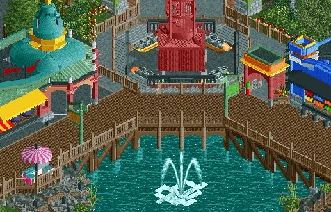
I agree with In:Cities about those green and orange roofs. Good ideas, but paint it black (to quote the Stones). I would move that red and white canvas-roof building into the middle of the path rather than near the corscrew just for efficiency and practical reasons.
But wow. This is my favorite screen of yours yet. Nice job. -

 nin
Offline
The brick path near under the photo stand... currently the two diagonals dont match (the one on the right is a clean diagonal while the other is a square corner with a quarter tile diagonal0. I think you should mirror those to be the same size (as in, make them both full tile).
I also agree with In:Cities about the green/orange overhangs. Those are ugly. The little eatery is classy, but the neon colors ruin that feel. Just color them black. -

 Steve
Offline
Agreed, you're really stepping up your game, Coupon. Obviously I agree with the neon roofs, but actually the scale of the eatery seems off to me. It looks too tall, I'd suggest either making it a full two stories or keep it just a bit over one story instead of the half story there. Also maybe even lower the awnings, too.
Really digging the coaster/coaster details and the station, and the corkscrew placement! Well done, dude! -

 Pacificoaster
Offline
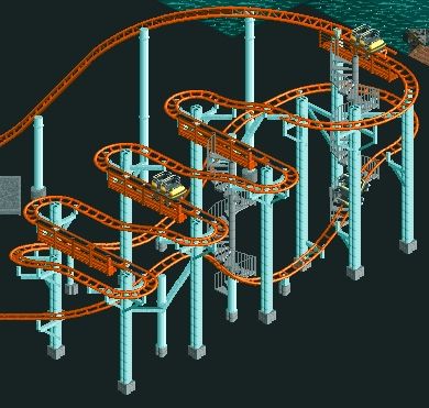
I don't believe that screen does the coaster much justice. It would look much better with the proper surroundings and scenery. That will be your job Coups. With that said, I had quite a good time making this coaster in today's stream. I've always wanted to do an extended wild mouse and I am pretty jealous that it isn't in my own park. Thanks for allowing me to build in your park Coupon. This is easily your best work yet and I could see a high accolade if you keep the quality of work up.
 -

 Fizzix
Offline
Sweet stuff Coups. I highly anticipate this release. I agree with Justin, this could go over very well. Now go build on ours.
 -

 zburns999
Offline
I feel like there are one or two too many colors on that building to the left. Rest is great!
 -
 Maverick
Offline
Hi Coupon, I'm Maverick and I hardly update anything. At least nothing that looks as good as that.
 -

 Steve
Offline
There seems too be too many colors in general, actually. I know its a boardwalk and is suppose to fun but it just feels a little all over the place to me. I do like the structures, but yeah the roof on the left could use some love. I'd change the colors of the arch entrance of that ride too, maybe. Definitely like that you're using colors, and you have style which is all your own, which is awesome. It's looking good Coup! Keep moving, dude!
 Tags
Tags
- No Tags

